
npm install --save uigradients
or
yarn add uigradients
// Import the component...
import { Gradient } from 'uigradients';

// Now, use it!
class App extends Component {
    // If no gradient preset is provided,
    // a random preset will be used.
    return (
      <Gradient preset="cherry">
        <h1>This will draw a div with a cherry gradient, like the one you're looking at right now.</h1>
      </Gradient>
    );
}
cherryis only one of the many presets provided byuigradientsA complete list of the gradient presets can be previewed here. You can use your own preset library via
GradientProvider
import { Gradient } from 'uigradients';

class App extends Component {
    return (
      // Add a "type" attribute on your component and
      // set it to "radial" for a radial gradient!
      // NOTE: If a "type" attribute is not on
      // your component, the gradient type will
      // default to linear
      <Gradient preset="aubergine" type="radial">
        <h1>Wow, a radial gradient!</h1>
      </Gradient>
    );
}import { generator } from 'uigradients';
generator({preset: 'intuitive_purple'});
/* The function above returns:
background-color: ,#DA22FF,;
background-image: -webkit-linear-gradient(
left,
,#DA22FF,,
,#9733EE,);
background-image: linear-gradient(
to left,
,#DA22FF,,
,#9733EE,);
*/import { generator } from 'uigradients';
import styled from 'styled-components';
const Pre = styled.pre`
${generator({preset: 'electric_violet'})}
border-radius: 4px;
display: block;
`;
import { Gradient } from 'uigradients';
import styled from 'styled-components';
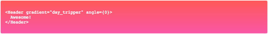
const Header = styled(Gradient)`
min-height: 300px;
text-align: center;
width: 100%;
`;
import { generator } from 'uigradients';
import styled from 'styled-components';

const RadialComponent = styled.div`
  ${generator({gradient: 'electric_violet', type: 'radial'})}
`;
This package is released under the MIT License
