
ToggleIconView is a collection library of animated two-stage toggle icons for Android.
- Android 5.0 (API 21) or higher
// Project level build.gradle
allprojects {
    repositories {
        ...
        maven { url "https://jitpack.io" }
    }
}
If the above doesn't work for you, try the following:
// settings.gradle
...
dependencyResolutionManagement {
    ...
    repositories {
        ...
        maven { url "https://jitpack.io" }
    }
}
...// App level build.gradle
dependencies {
implementation "com.github.ozgurg:ToggleIconView:3.3.0"
}<!-- See "Built-in icons" section for other icons -->
<og.android.lib.toggleiconview.rounded.PlayPause
android:layout_width="24dp"
android:layout_height="24dp" />ToggleIconView, uses AnimatedVectorDrawableCompat under the hood and extends AppCompatImageView. So you can do
anything you can with AppCompatImageView like tinting and other stuff. That's why I called it "collection library".
| Attribute | Description | Type | Default |
|---|---|---|---|
app:checked |
Sets the initial state of the icon | Boolean |
false |
app:checkedContentDescription |
Sets the initial checked content description of the icon | String |
null |
app:uncheckedContentDescription |
Sets the initial unchecked content description of the icon | String |
null |
app:checkedTooltipText |
Sets the initial checked tooltip text of the icon | String |
null |
app:uncheckedTooltipText |
Sets the initial unchecked tooltip text of the icon | String |
null |
| Method | Description | Return |
|---|---|---|
toggle() |
Toggles between the checked and unchecked state of the icon | - |
.isChecked isChecked() |
Returns the checked state of the icon | Boolean |
.isChecked = Boolean setChecked(isChecked: Boolean) |
Sets the checked state of the icon | - |
.checkedContentDescription getCheckedContentDescription() |
Returns the checked content description of the icon | String? |
.checkedContentDescription = String? setCheckedContentDescription(value: String?) |
Sets the checked content description of the icon | - |
.uncheckedContentDescription getUncheckedContentDescription() |
Returns the unchecked content description of the icon | String? |
.uncheckedContentDescription = String? setUncheckedContentDescription(value: String?) |
Sets the unchecked content description of the icon | - |
.checkedTooltipText getCheckedTooltipText() |
Returns the checked tooltip text of the icon | String? |
.checkedTooltipText = String? setCheckedTooltipText(value: String?) |
Sets the checked tooltip text of the icon | - |
.uncheckedTooltipText getUncheckedTooltipText() |
Returns the unchecked tooltip text of the icon | String? |
.uncheckedTooltipText = String? setUncheckedTooltipText(value: String?) |
Sets the unchecked tooltip text of the icon | - |
| Event | Description |
|---|---|
onCheckedChanged(view: ToggleIconView, isChecked: Boolean) |
Triggers when the checked state of the icon changed |
All icons have the same duration (@android:integer/config_shortAnimTime) and interpolator (@android:interpolator/fast_out_slow_in), but I manually capture their previews; so timings may look different.
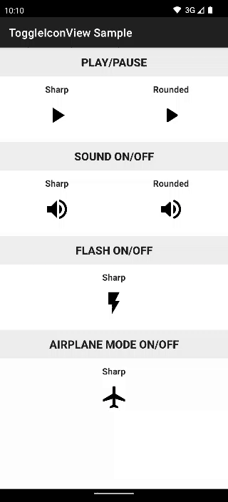
| Preview | Package |
|---|---|
 |
[Rounded] PlayPauseog.android.lib.toggleiconview.rounded.PlayPause |
 |
[Sharp] PlayPauseog.android.lib.toggleiconview.sharp.PlayPause |
 |
[Rounded] SoundOnOffog.android.lib.toggleiconview.rounded.SoundOnOff |
 |
[Sharp] SoundOnOffog.android.lib.toggleiconview.sharp.SoundOnOff |
 |
[Sharp] FlashOnOffog.android.lib.toggleiconview.sharp.FlashOnOff |
 |
[Sharp] AirplaneModeOnOffog.android.lib.toggleiconview.sharp.AirplaneModeOnOff |
 |
[Sharp] CameraSwitchog.android.lib.toggleiconview.sharp.CameraSwitch |
 |
[Sharp] Refreshog.android.lib.toggleiconview.sharp.Refresh |
First, you need to create an AnimatedVectorDrawable icon. I highly recommend using Shape Shifter.
After creating and exporting your icon, add the icon to your project's drawable folder.
Extend ToggleIconView class and set checked and unchecked icon you created.
package [PACKAGE_NAME]

import android.content.Context
import android.util.AttributeSet
import og.android.lib.toggleiconview.ToggleIconView

class [NAME_YOUR_ICON] @JvmOverloads constructor(
    context: Context,
    attrs: AttributeSet? = null,
    defStyleAttr: Int = 0
) :
    ToggleIconView(
        context, attrs, defStyleAttr,
        R.drawable.[CHECKED_ICON],
        R.drawable.[UNCHECKED_ICON]
    )
Then, use it in your layout.
<[PACKAGE_NAME].[NAME_YOUR_ICON]
    android:layout_width="24dp"
    android:layout_height="24dp" />