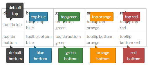
CSS Only Tooltip. Balloon is displayed slowly.
Display in the position of the top or bottom, change the color.
  <div class="tooltip bottom">tooltip
    <div class="tooltip-inner">bottom
      <div class="tooltip-angle">
        <div class="tooltip-angle-inner"></div>
      </div>
    </div>
</div>.tooltip {
position: relative;
}
.tooltip:hover .tooltip-inner {
visibility: visible;
opacity: .9;
}
.tooltip .tooltip-inner {
position: absolute;
display: block;
text-align: center;
text-decoration: none;
font-weight: bold;
left: 10px;
padding: 4px 6px;
max-width: 200px;
color: #ffffff;
background-color: #444;
border: 2px solid #333;
-webkit-border-radius: 4px;
border-radius: 4px;
visibility: hidden;
opacity: 0;
-webkit-transition: opacity .6s ease-in-out;
z-index: 10;
}
.tooltip.top .tooltip-inner {
bottom: 32px;
}
.tooltip.bottom .tooltip-inner {
margin-top: 8px;
}
.tooltip-angle {
position: absolute;
border-left-width: 0;
line-height: 0;
left: 20%;
}
.tooltip-angle-inner {
position: absolute;
border-left-width: 0;
line-height: 0;
left: 2px;
}
.tooltip.top .tooltip-angle {
bottom: -10px;
border-right: solid 10px transparent;
border-top: solid 10px #333;
}
.tooltip.top .tooltip-angle-inner {
bottom: 5px;
border-right: solid 5px transparent;
border-top: solid 5px #444;
}
.tooltip.bottom .tooltip-angle {
top: -10px;
border-right: solid 10px transparent;
border-bottom: solid 10px #333;
}
.tooltip.bottom .tooltip-angle-inner {
top: 5px;
border-right: solid 5px transparent;
border-bottom: solid 5px #444;
}- MIT