A library to help you make multi-step modals, such as a multi-page registration form.
It depends on bootstrap for the modal and jQuery for everything else.
Add the js file at the bottom of the page.
<form class="modal multi-step" id="demo-modal">
<div class="modal-dialog">
<div class="modal-content">
<div class="modal-header">
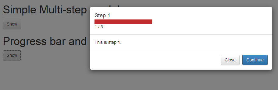
<h4 class="modal-title step-1" data-step="1">Step 1</h4>
<h4 class="modal-title step-2" data-step="2">Step 2</h4>
</div>
<div class="modal-body step step-1">
This is step 1.
</div>
<div class="modal-body step step-2">
This is step 2.
</div>
<div class="modal-footer">
<button type="button" class="btn btn-default" data-dismiss="modal">Close</button>
<button type="button" class="btn btn-primary step step-1" data-step="1" onclick="sendEvent()">Continue</button>
</div>
</div>
</div>
</form>
<button class="btn btn-default" data-toggle="modal" data-target="#demo-modal">Show</button>
<script src="/path/to/multi-step-modal.js"></script>
<script>
sendEvent = function() {
$('#demo-modal').trigger('next.m.2');
}
</script>Follow these conventions:
- Your modals should have the class
modal multi-step(boostrap requirement) - Buttons that bring the user to the next step should have class
step, and also the attributedata-stepset to whichever step this button appears on. e.g. a button that is on step 1 (brings the user from step 1 to 2) should be<button type="button" class="step" data-step="1"></button> - Content you want to show at step 1 should have class
step-1, and so on.
There are conventions to follow
This depends on bootstrap for modals, which are elements with the class
modal.
For each modal on the page it attaches event listeners to
1. the modal
2. the buttons in the modal
The modal and its buttons reac to a events of the form next.m.x, where x
corresponds on the step the button show trigger the visibility of.
The close button is visible in all steps.
Progress indicators are available, visible in the demo.
Buttons have events bound, and modals also have the same events abount. When you want to transit into the next step, trigger the event on either a speicifc button or on the modal (which is easier).
This is not supported natively by the library, but you can do something like what is describe here.
MIT