A visualization of the Correlates of War Militarized Interstate Dispute Locations v2.1 dataset using d3js, Flask and SQLite3.
- Marc Herschel (@mynttt)
- Marten Meinhardt (@mMeinhardt)
A demo version of this data explorer has been deployed under: cow.herschel.io
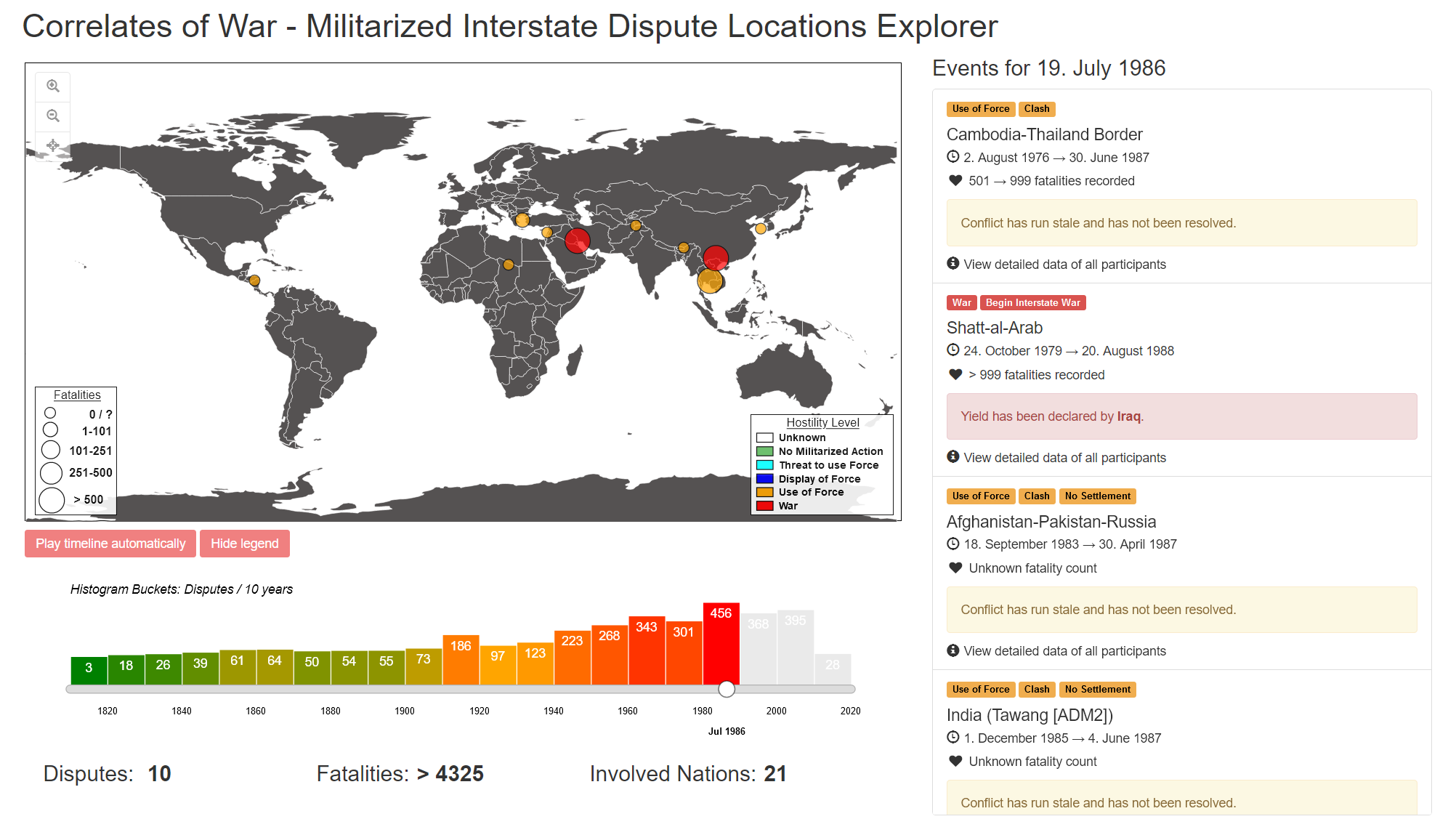
The Correlates of War[3] dataset has been used. Conflict locations are visualized via the MIDLOC-A records of the MIDLOC v2.1[5] dataset. Additional metadata is fetched by relying on the MID[6] dataset. The National Material Capabilities v5.0[7] dataset is used to gain more information over the participating countries military capabilities. World countries[8] is used to display the flags of participating countries. To populate the histogram data ui/hist_war.csv we've used the tooling/create_date_histogramm.py script. The CSV data has been imported via SQLites[2] import-function.
- A zoomable/pannable map has been used to visualize the location of an ongoing conflict. Double clicking on a country on the map zooms in on that country. Alternatively the mouse wheel can be used for zooming. The map is drawn as an SVG (Scalable Vector Graphic) and is made up of polygons. The data needed to draw each country as a polygon is supplied by the file
ui/world-countries.json. Hovering the mouse over a country shows its name as a tooltip. - A histogram with a bucket size of 10 years has been used to visualize the amount of conflicts in that decade, the goal of this is to give an overview about the conflict rich decades when seeking via the date slider. 10 years has been decided for as smaller amounts are hard to process by a human. Color coding (green, yellow, red) together with linear interpolation is used to highlight the magnitude of a bucket (green = least conflicts, red = most conflicts).
- Conflicts are displayed as colored circles on the map. The size of a circle shows the magnitude of fatalities within a conflict. As 99% of fatality data is only available as a bucket entry, (i.e. 10 - 25 deaths or 100 - 200 deaths) we have decided for merging several buckets and scaling roughly linearly (0/?, 1-101, 101-251, 251-500, > 500) with the diameter of a circle. As only six different conflict hostility levels exist in the dataset, we've decided to hard code the colors here as well (unknown = white, no militarized action = green, thread to use force = aqua, display of force = blue, use of force = orange, war = red) choosing the colors by guessing the associations of humans for a color (i.e. green = minor, red = severe, white = unknown, blue = medium importance) and keeping some form of triadic color harmony and adding some arbitrary colors in between.
- In order to show the detailed data of the conflicts of the map we have a list on the right side of our dashboard. That list shows the active conflicts of a date. Clicking on a circle on the map will scroll and highlight to that entry of the list. Clicking on the location of the list item will zoom and move the view to that corresponding circle on the map.
- Such an item contains several labels regarding the hostility level, highest act of force applied and forced settlement status. The location, date and fatality count are also included. Then the settlement status is rendered with an outcome (green = victory, red = yield, yellow = stale, grey = unknown).
- Hidden, to not flood the user with informations, are stats of the participating countries ordered by on which side they participated in of the conflict. These hierarchical sub entries contain the flag of the country, the hostility level and highest act of force and (if available) the CINC (Composite Indicator of National Capability) [12] value. This value is color coded linarly from 0 to the highest value in our dataset i.e. red for low and green for high. The CINC can also be extended to display more detailled facts about the population, military strength, iron and steel production and military expenses. To get information regarding the CINC, the mouse can be hovered over the small blue questionmark next to the CINC label. Doing so will render a tooltip, explaining the CINC-Value.
- Python 3 with version 3.7 or greater
- Requirements:
Flaskandflask-cors - Modern Internet browser i.e. Mozilla Firefox or Google Chrome
- Just run the startUnix.sh Bash script
- In your browser open the application via http://localhost:8080
- Run a Flask-Server with api/api.py
- Then start a Python 3-HTTP server on port 8080 with 'ui' set as the root folder
- In your browser open the application via http://localhost:8080
- The lightweight Python-based Web-Framework Flask[1] is used for the API-server. An embedded SQLite 3[2] Database is used as the source for the datasets from the Correlates of War[3] project. The API-server serves the needed data in JSON-format over REST endpoints.
- For the visualization part the d3js v4[3] library is used in conjecture with bootstrap v3.22[9] for easier styling of the web application.
- Glyphicon[10] is used for basic inline symbols and icons.
- Furthermore jQuery[11] was used for easier DOM-Tree manipulation and event handling
- [1] https://flask.palletsprojects.com/en/2.0.x/
- [2] https://sqlite.org/index.html
- [3] https://correlatesofwar.org
- [4] https://d3js.org/
- [5] https://correlatesofwar.org/data-sets/MIDLOC
- [6] https://correlatesofwar.org/data-sets/MIDs
- [7] https://correlatesofwar.org/data-sets/national-material-capabilities
- [8] https://github.com/stefangabos/world_countries
- [9] https://getbootstrap.com/
- [10] https://www.glyphicons.com/
- [11] https://jquery.com/
- [12] https://en.wikipedia.org/wiki/Composite_Index_of_National_Capability