bower install excalibur-duallist --saveImport to your project the excalibur-duallist(min).js and excalibur-duallist(min).cs files in bower_components folder
  <script type="text/javascript" src="/bower_components/excalibur-duallist/dist/js/excalibur-duallist.min.js"></script>
  <link rel="stylesheet" href="/bower_components/excalibur-duallist/dist/css/excalibur-duallist.min.css">
Then refer to your module
var app = angular.module('app', ['excaliburDualList']);$scope.myModel = {selectItem: {}};
$scope.options = {
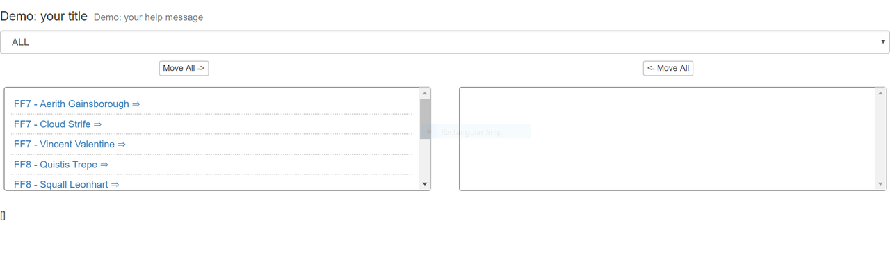
title: {label: 'Demo: your title', helpMessage: 'Demo: your help message'},
selectOptions: {initialText: "ALL", isDisable: false, uppercase: true},
boxItemsHeight: 'md',
items: [
{ 'category': 'FF8', 'name': 'Squall Leonhart' },
{ 'category': 'FF8', 'name': 'Quistis Trepe' },
{ 'category': 'FF8', 'name': 'Zell Dincht' },
{ 'category': 'FF9', 'name': 'Zidane' },
{ 'category': 'FF9', 'name': 'Garnet' },
{ 'category': 'FF9', 'name': 'Vivi' },
{ 'category': 'FF7', 'name': 'Cloud Strife' },
{ 'category': 'FF7', 'name': 'Aerith Gainsborough' },
{ 'category': 'FF7', 'name': 'Vincent Valentine' },
],
itemsOrderProperty: '[category, name]',
categories: ["FF7", "FF8", "FF9"],
button: {leftText: "Move All" , rightText: "Move All"},
selectedItems: []
}; <excalibur-dual-list ng-model='myModel.selectItem' options="options"> </excalibur-dual-list>- title:(optional): Title that will be displayed in the directive input text.;
- title: {label}(optional): Label in input text.;
- title: {helpMessage}(optional): Sub label in input text.;
- selectOptions:(optional): Information about the input select.;
- selectOptions: {initialText}(optional): First text that will displayed in first select input element.;
- selectOptions: {isDisable}(optional): Indicates if the first select text is disabled.;
- selectOptions: {uppercase}(optional): Indicates if the all text options in select input is uppercase.;
- boxItemsHeight:(optional): Indicates the size of the item box. [{'xs': 150px}, {'sm': 225px}, {'md': 300px}, , {'lg': 450px}];
- items:(required): Item that will appear on the no dual list.;
- itemsOrderProperty:(optional): Order of the items will appear in the duallist.;
- categories:(required): Items that will appear in select that it be used to filter the duallist.;
- button:(required): Information about the input button that is used to move all elements.;
- button: {leftText}(required): Button left text;
- button: {rightText}(required): Button right text;
- selectedItems:(required): Items that were selected by the user.;
"version": 3.3.7
"version": 1.2.32
It is available under the MIT license. License