ContrastKit is a Swift library designed to facilitate colour contrast handling within iOS, iPadOS, macOS, and tvOS applications.
It provides developers with tools to automatically generate colour shades from any base colour and determine the most readable contrast colours according to established accessibility standards (AA Large, AA, and AAA).
This package is particularly useful for UI/UX designers and developers focusing on accessibility and readability in their applications.
The ContrastKit package uses Swift Package Manager (SPM) for easy addition. Follow these steps to add it to your project:
- In Xcode, click
File -> Swift Packages -> Add Package Dependency. - In the search bar, type
https://github.com/markbattistella/ContrastKitand clickNext. - Specify the version you want to use. You can select the exact version, use the latest one, or set a version range, and then click
Next. - Finally, select the target in which you want to use
ContrastKitand clickFinish.
Remember to import the ContrastKit module:
import ContrastKitThe default usage of the ContrastKit package is quite straightforward. Here's an example:
import ContrastKit

// Example usage in SwiftUI
let baseColor = Color.purple
let shadeColor = baseColor.level(.level100)
let contrastColor = shadeColor.highestRatedContrastLevel
let fixedContrastColor = shadeColor.aaLargeContrastLevel

// Example usage in UIKit
let uiColor = UIColor(contrastColor)  // Convert from SwiftUI Color to UIColor
The main call sites are designed for SwiftUI - but you can call UIColor(color:) too.
Note
Using UIColor(color:) has been available from iOS 14.0+, Mac Catalyst 14.0+, tvOS 14.0+, watchOS 7.0+, visionOS 1.0+, Xcode 12.0+ so we're fairly okay, I hope...
import SwiftUI
import ContrastKit

struct ContentView: View {
  private let baseColor = Color.green
  private let contrastColor = baseColor.highestRatedContrastLevel
  var body: some View {
    Text("High Contrast Text")
      .foregroundColor(contrastColor)
      .background(baseColor)
  }
}
Or if you want to select a specific shade in the UI (suppose you've built a consistent theme):
import SwiftUI
import ContrastKit

struct ContentView: View {
  private let baseColor = Color.green
  var body: some View {
    Text("Set themed text")
      .foregroundColor(baseColor)
      .background(baseColor.level50)
  }
}import UIKit
import ContrastKit
class ViewController: UIViewController {
override func viewDidLoad() {
super.viewDidLoad()
let baseUIColor = UIColor.systemBlue
let contrastKitColor = Color(baseUIColor)
let highContrastUIColor = UIColor(contrastKitColor.highestRatedContrastLevel)
let label = UILabel()
label.text = "High Contrast Label"
label.textColor = highContrastUIColor
label.backgroundColor = baseUIColor
label.frame = CGRect(x: 20, y: 100, width: 300, height: 50)
label.textAlignment = .center
self.view.addSubview(label)
}
}import AppKit
import ContrastKit
class ViewController: NSViewController {
override func loadView() {
self.view = NSView()
let baseNSColor = NSColor.systemRed
let contrastKitColor = Color(baseNSColor)
let highContrastNSColor = NSColor(contrastKitColor.highestRatedContrastLevel)
let textField = NSTextField(labelWithString: "High Contrast Text")
textField.textColor = highContrastNSColor
textField.backgroundColor = baseNSColor
textField.frame = CGRect(x: 20, y: 20, width: 300, height: 50)
textField.isBezeled = false
textField.drawsBackground = true
self.view.addSubview(textField)
}
}ContrastKit provides two core enums to assist in designing UIs with appropriate colour contrast: ColorLevel and ContrastLevel. These enums help developers standardise the visual accessibility of their applications.
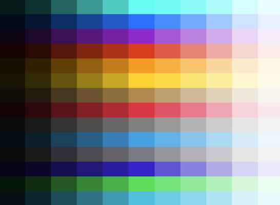
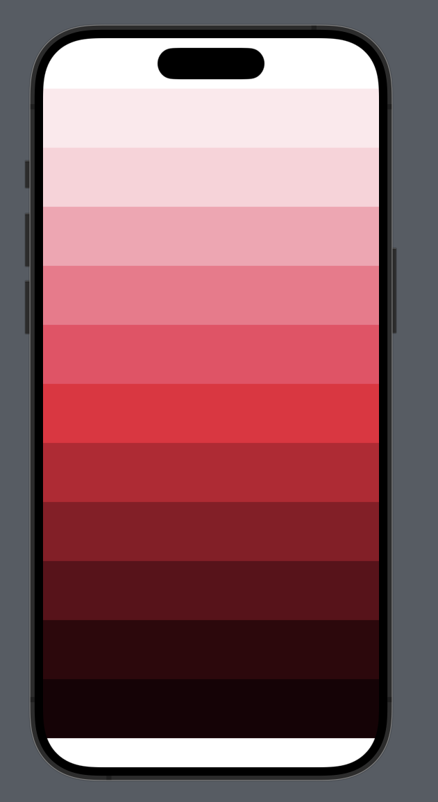
The ColorLevel enum defines different levels of lightness for colours, which can be used to generate various shades from a single base colour. These shades range from very light (near white) to very dark (near black), suitable for different UI elements like backgrounds, text, and interactive elements.
| Level | Lightness | Description |
|---|---|---|
level50 |
0.95 |
Very light shade, almost white. |
level100 |
0.90 |
Very light shade. |
level200 |
0.80 |
Lighter shade, for subtle backgrounds. |
level300 |
0.70 |
Light shade, good for hover states or secondary buttons. |
level400 |
0.60 |
Medium light shade. |
level500 |
0.50 |
Neutral base shade, often used for the primary variant of a colour. |
level600 |
0.40 |
Medium dark shade. |
level700 |
0.30 |
Darker shade, suitable for text. |
level800 |
0.20 |
Very dark shade, often used for text or active elements. |
level900 |
0.10 |
Very dark, closer to black. |
level950 |
0.05 |
Extremely dark, almost black. |
| Light mode | Dark mode |
|---|---|
 |
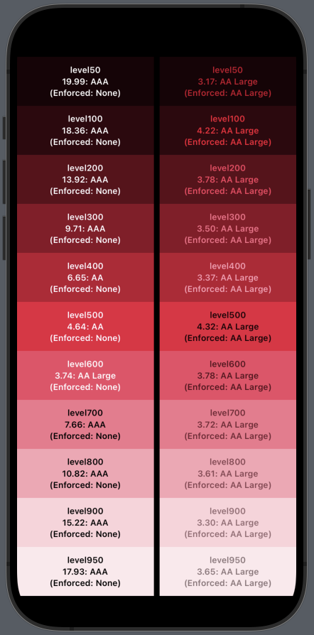 |
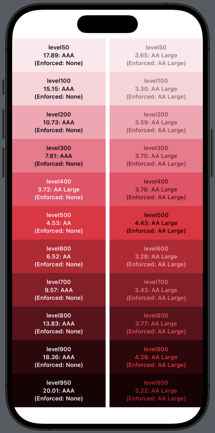
The ContrastLevel enum specifies minimum and maximum contrast ratios for three accessibility standards: AA Large, AA, and AAA. These levels are based on the WCAG guidelines to ensure that text and interactive elements are readable and accessible.
| Level | Minimum Ratio | Maximum Ratio | Description |
|---|---|---|---|
| AA Large | 3.0 |
4.49 |
Suitable for large text, offering basic readability. |
| AA | 4.5 |
6.99 |
Standard level for normal text size, providing clear readability. |
| AAA | 7.0 |
.infinity |
Highest contrast level, recommended for the best readability across all contexts. |
ContrastKit also provides an optional dark mode (as pictured above) if you need the colours to adapt dynamically with your UI.
You can do this by passing the @Environment(\.colorScheme) directly into the level(_:scheme:) function.
struct EnvironmentShadeView: View {
  @Environment(\.colorScheme) private var colorScheme
  var body: some View {
    VStack {
      Color.red.level(.level100, scheme: colorScheme)
      Color.red.level(.level900, scheme: colorScheme)
    }
  }
}
When the device switches colour schemes, the ColorLevel will flip:
| Level | Light mode | Dark mode equivalent |
|---|---|---|
level50 |
0.95 |
0.05 |
level100 |
0.90 |
0.10 |
level200 |
0.80 |
0.20 |
level300 |
0.70 |
0.30 |
level400 |
0.60 |
0.40 |
level500 |
0.50 |
0.50 |
level600 |
0.40 |
0.60 |
level700 |
0.30 |
0.70 |
level800 |
0.20 |
0.80 |
level900 |
0.10 |
0.90 |
level950 |
0.05 |
0.95 |
The PreviewTesting file is a vital part of the ContrastKit package, designed exclusively for debugging and visual inspection purposes during the development process.
It allows developers to quickly view and evaluate the contrast levels and colour shades generated by the library directly within the SwiftUI Preview environment.
This file contains sample views and configurations that demonstrate the practical application of ContrastKit.
The file includes an Example+SwiftUI file that utilises ContrastKit functionalities to display a series of colours with varying levels of contrast. This visual representation helps in understanding how different colours and their respective contrast levels appear in a UI context.
There are two previews available - StandardShadeView and EnvironmentShadeView.
The first is an example, where the shades of colours and their contrast colours are fixed regardless of the device colour scheme.
In the EnvironmentShadeView example, you can see how to pass in the @Environment(\.colorScheme) to the level(_:scheme:) function and it will update the colours automatically for you.
To use this file effectively:
- Open your Xcode project containing the ContrastKit.
- Navigate to the PreviewTesting file.
- Ensure your environment is set to Debug mode to activate the #if DEBUG condition.
- Open the SwiftUI Preview pane to see the results.
Caution
This file is intended for development use only and should not be included in the production build of the application.
It provides a straightforward and effective way to visually inspect the accessibility features provided by ContrastKit, ensuring that the colour contrasts meet the required standards before the application is deployed.
The PreviewTesting file demonstrates the integration of ContrastKit with SwiftUI, showing how easily developers can implement and test colour contrasts in their UI designs.
By modifying the baseColor or the ColorLevel, developers can experiment with different combinations to find the optimal settings for their specific needs.
- Immediate Feedback: Allows developers to see how changes in colour levels affect accessibility and readability in real-time.
- Accessibility Testing: Helps in ensuring that the UI meets accessibility standards, particularly when creating inclusive applications.
- Ease of Use: Simplifies the process of testing multiple colour schemes without needing to deploy the app or navigate through different screens.
The PreviewTesting file is a crucial tool for developers who are serious about integrating effective contrast handling in their applications, making ContrastKit a practical choice for enhancing UI accessibility.
| iOS | iPadOS |
|---|---|
 |
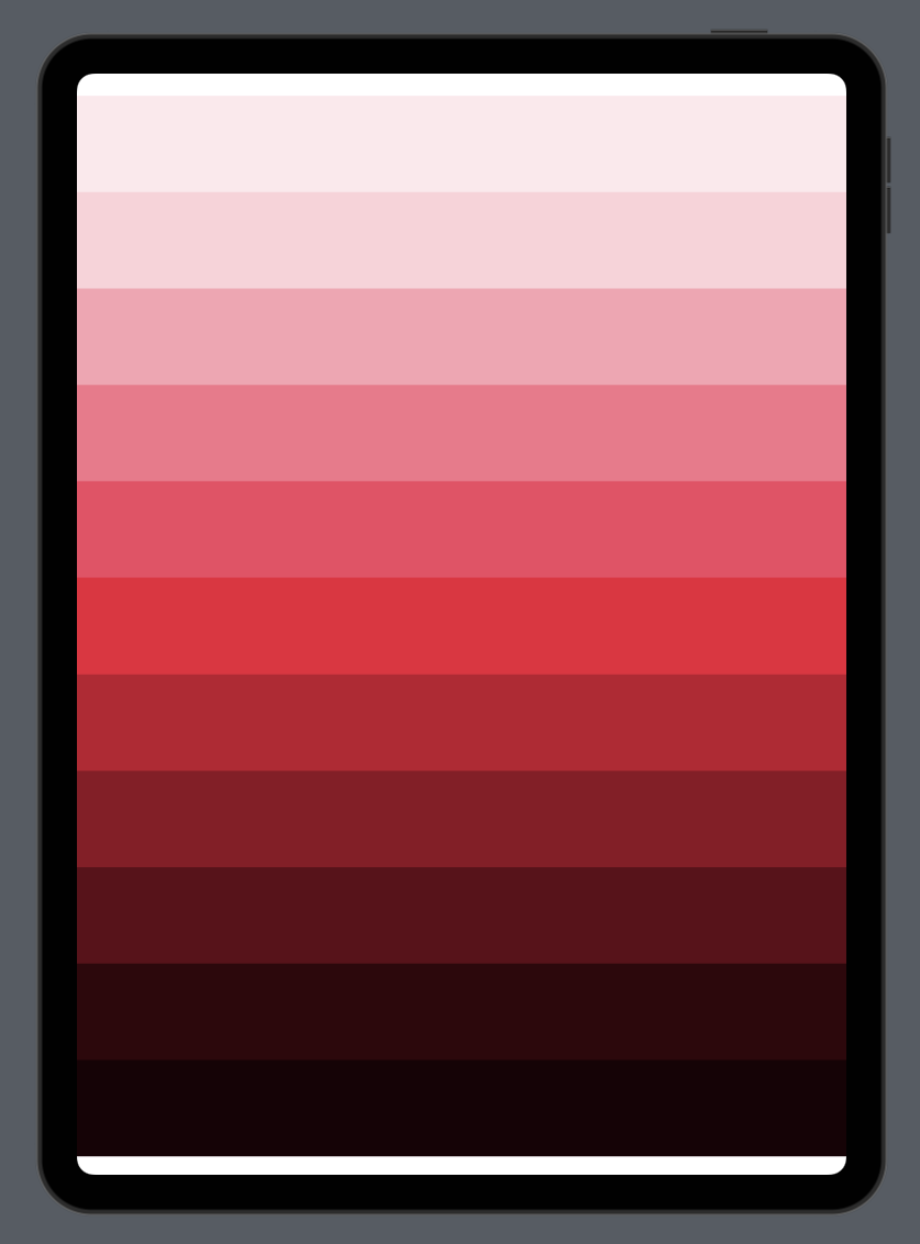 |
| tvOS | visionOS |
|---|---|
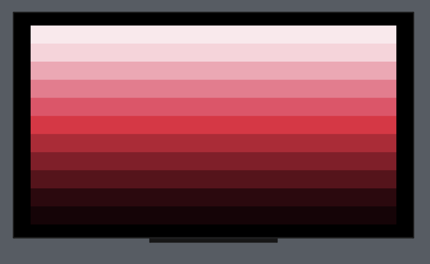 |
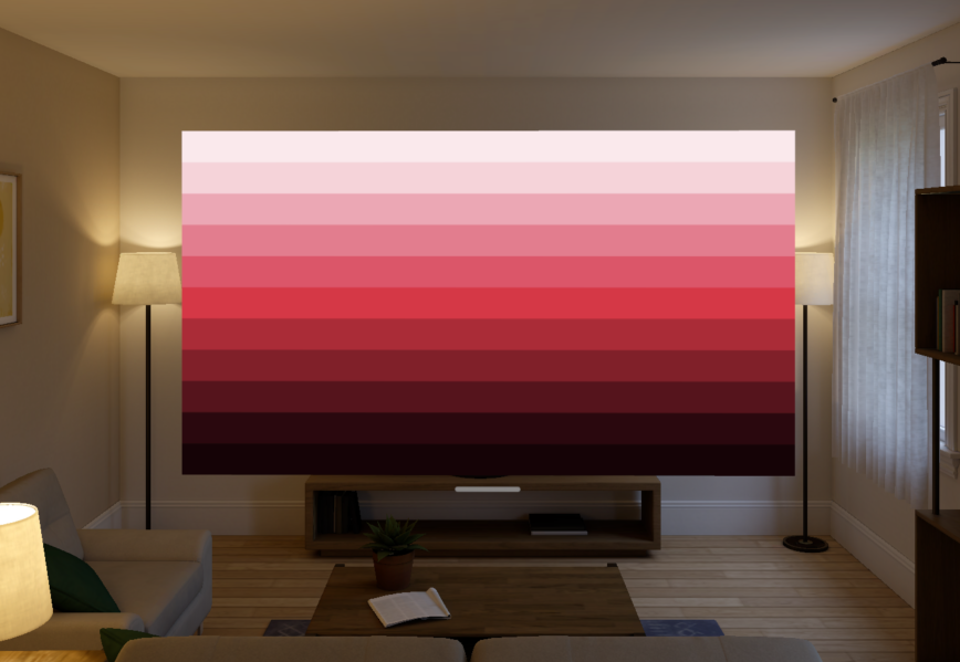 |
Contributions are highly encouraged, as they help make ContrastKit even more useful to the developer community. Feel free to fork the project, submit pull requests, or send suggestions via GitHub issues.
ContrastKit is available under the MIT license, allowing for widespread use and modification in both personal and commercial projects. See the LICENSE file included in the repository for full details.