


Reanimated-animation-library with react-native-reanimated, react-native-gesture-handler and react-native-redash
This library provide multiple components but most importantly the BottomSheet. The BottomSheet is highly customizable. Visit the homepage for example: https://marcuzgabriel.github.io/reanimated-bottom-sheet/
Props
| Prop | Type | Description | is required |
|---|---|---|---|
| backgroundColor | string | Sets the background color | false |
| borderTopLeftRadius | number | Sets the border top left radius | false |
| borderTopRightRadius | number | Sets the border top right radius | false |
| closeBottomSheetRequest | object: { isEnabled: boolean; callback: ((cb) => void) => void } | Custom trigger function to make the bottom sheet go to bottom onPress | false |
| contentComponent | node | Content component | true |
| contentHeightWhenKeyboardIsVisible | object: { takeUpAllAvailableSpace?: boolean; resizeHeightTrigger?: number; resizeHeight?: number; offset?: number, closeIcon?: { topOffset?: number, rightOffset?: number, icon: () => React.ReactNode }} | manipulate the content height when keyboard is visible and add a close icon | false |
| extraOffset | number | If you need some extra offset when it comes to the panning event hitting the footer | false |
| extraSnapPointBottomOffset | number | Minor differences occours depending on the Platform. This prop helps to get the perfect snap point on all platforms | false |
| fadingScrollEdges | object: { isEnabled: boolean, androidFadingEdgeLength: number, iOSAndWebFadingEdgeHeight: number, nativeBackgroundColor: string, webBackgroundColorTop: { from: string to: string}, webBackgroundColorBottom: { from: string, to: string } | This prop ensures that there is a scrolling edge when the content is scrollable | false |
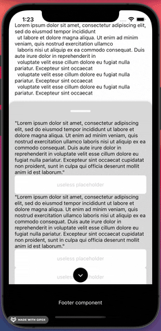
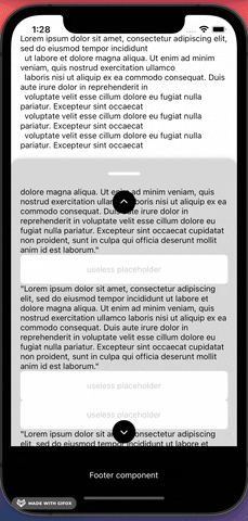
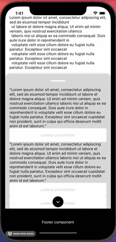
| footerComponent | node | Footer component | false |
| getCurrentConfigRequest | function with callback | This function will provide the current configuration | false |
| header | object: { height: number } | If there is no header component then this object can be used to style the header | false |
| headerComponent | node | Header component | false |
| hideContentOnCardCollapse | object: { isEnabled: boolean, offset: number } | Hides content when gesturing down | false |
| hideFooterOnCardCollapse | object: { isEnabled: boolean, offset: number } | Hides footer when gesturing down | false |
| initializeBottomSheetAsClosed | boolean | In some cases it might be relevant to show the background content before showing the bottomSheet | false |
| isBottomSheetInactive | boolean | Set the bottom to an inactive state. Can be used for async handling og UX requirements | false |
| keyboardAvoidBottomMargin (currently disabled) | number | An extra margin wrapper is implemented instead. The prop was used to create extra spacings when an input field is focused | false |
| maxHeightRatio | float | max height of the bottom sheet in 0.1 - 0.9 ratio | false |
| morphingArrow | object: { isEnabled: boolean, offset: number, fill: string } | As there currently is a bug on web when interpolating SVG's with reanimated, then the morphing arrow can be disabled for specific platforms using this prop | false |
| offsetAddition | number | Used to have extra offset for the snap effect | false |
| onLayoutRequest | function with callback | In some cases the card height of the BottomSheet might come in handy. This prop returns the height | false |
| openBottomSheetRequest | object: { isEnabled: boolean; callback: ((cb) => void) => void } | Custom trigger functions to make the bottom sheet go to top | false |
| outerScrollEvent | object: { isEnabled?: boolean, scrollY?: Animated.SharedValue, autoScrollTriggerLength?: number } | Connect an outer scrolling event that the bottom sheet should react to | false |
| pressableSafeAreaToContent | number | Stronger handling for controlling safe area to content so a press event on the BottomSheet do not interfer with the content within the BottomSheet | false |
| scrollArrowBottomComponent (currently disabled) | node | Scroll arrow bottom component | false |
| scrollArrows | object: { isEnabled: boolean, fill: string, dimensions: number, topArrowOffset: number, bottomArrowOffset: number } | When there is no scrollArrowBottom- or top component then this object can be used for styling the scroll arrows. | false |
| scrollArrowTopComponent (currently disabled) | node | Scroll arrow top component | false |
| smoothAppearance | object: { waitForContent: boolean, emptyContentHeight?: number } | Ensures a smooth appearance animation of the BottomSheet to eliminate flickering | false |
| snapEffectDirection | Animated.SharedValue | Used together with SnapEffect component. It tells the BottomSheet how to react to the effect. Please look in examples for more information | false |
| snapPointBottom | number | This prop is required for the BottomSheet to work | true |
| springConfig | object { damping?: number; mass?: number; stiffness?: number; overshootClamping?: boolean; restSpeedThreshold?: number; restDisplacementThreshold?: number; } | Overrule default spring config with custom configuration | |
| testID | string | add testID to the bottomSheet | false |
| webBoxShadow | object: { offset: number; opacity: number } | Set a box shadow for web | false |
Progress
- ScrollViewKeyboardAvoid. Personally I have had troubles using the KeyboardAvoidView from react-native where I am limited to only use one behaviour. This approach uses two behaviours at the same time with reanimated. First it manipulates the translationY position so the content container floats above the keyboard. Secondly it changes the height of the content container so a nice scroll-to-focused-input gets triggered. A minimum requirement for this approach to work is to use this library's
<InputField />. Multiple examples can be found in the project Example folder. - InputField. This is a component that is connected to the above ScrollViewKeyboardAvoid. When focused and the minimum requirements for ScrollViewKeyboardAvoid is met, then a smooth scroll-to-focused-input field event will trigger.
- BottomSheet
- Static event: When background content is not scrollable then the background content should not be snappable
- Scroll arrows that appear / dissapear
- Fading scroll edges for alle platforms
- Drag resistance when using the snap effect
- InputField component that accepts a unique id so no matter where the component is located then a nice scrollTo animation effect to the input field is achieved
- If the background content is not scrollable but there is content hiding behind the card, then make the component snappable so the card will collapse if the user tries to do a scroll gesture on the background content
- Morphing arrow that follows the Y axis animation of the card
- Card is collapsable by either clicking, gesturing, overlapping from scroll to pan gesture or scrolling the background content
- The card should be able to handle input fields. When an input field is pressed, then the keyboard should press the card upwards and a scrolling animation should scroll to the input field
- Add a ScrollView component in a PanGestureHandler component
- iOS + Android: Overlap from a scrolling gesture to a pan gesture by creating a scroll-to-top snapping effect
- Basic animation features (scrolling and pan gesture event)
- Header component
- Content component
- Footer component
- Appear
- Slider
- Morphing SVG Graph
- Unit tests
Integration
import React from 'react';
import { Platform, useWindowDimensions } from 'react-native';
import styled from 'styled-components/native';
import Animated, {
  useSharedValue,
  useAnimatedScrollHandler,
  useAnimatedRef,
} from 'react-native-reanimated';
import { BottomSheet, SnapEffect } from '@marcuzgabriel/reanimated-animation-library';

const HEADER_HEIGHT = 50;
const EXTRA_SNAP_POINT_OFFSET = 30;

const isAndroid = Platform.OS === 'android';

const fakeScrollItem = [
  {
    text: `Lorem ipsum dolor sit amet, consectetur adipiscing elit, sed do eiusmod tempor incididunt
  ut labore et dolore magna aliqua. Ut enim ad minim veniam, quis nostrud exercitation ullamco
  laboris nisi ut aliquip ex ea commodo consequat. Duis aute irure dolor in reprehenderit in
  voluptate velit esse cillum dolore eu fugiat nulla pariatur.
`,
  },
];

const Wrapper = styled.View<{ windowHeight: number }>`
  position: relative;
  height: ${({ windowHeight }): number => windowHeight}px;
  width: 100%;
`;

const Content = styled.View`
  width: 100%;
  height: 400;
  background-color: purple;
`;

const Header = styled.View`
  width: 100%;
  height: 100px;
  background: black;
  justify
`;

const Text = styled.Text``;

const FakeContentWrapper = styled.View<{ windowHeight: number }>`
  background: white;
  height: ${({ windowHeight }): number => windowHeight}px;
  width: 100%;
  padding: 32px 16px;
`;

const ScrollViewWithSnapEffect: React.FC = () => {
  const scrollViewRef = useAnimatedRef<Animated.ScrollView>();
  const scrollY = useSharedValue(0);
  const cardHeight = useSharedValue(0);
  const snapEffectDirection = useSharedValue('');

  const windowHeight = useWindowDimensions().height;

  const onScrollHandler = useAnimatedScrollHandler({
    onScroll: e => {
      scrollY.value = e.contentOffset.y;
    },
  });

  return (
    <Wrapper windowHeight={windowHeight}>
      <Animated.ScrollView
        ref={scrollViewRef}
        bounces={false}
        alwaysBounceVertical={false}
        onScroll={onScrollHandler}
        scrollEventThrottle={16}
      >
        <SnapEffect cardHeight={cardHeight} snapEffectDirection={snapEffectDirection}>
          {fakeScrollItem.map(({ text }, i) => (
            <FakeContentWrapper windowHeight={windowHeight} key={`${i}_${text}`}>
              <Text>{text}</Text>
            </FakeContentWrapper>
          ))}
        </SnapEffect>
      </Animated.ScrollView>
      <BottomSheet
        scrollY={scrollY}
        fadingScrollEdges={{ isEnabled: false }}
        morphingArrow={{ isEnabled: Platform.OS !=='web', offset: 20 }}
        keyboardAvoidBottomMargin={isAndroid ? 16 : 0}
        snapEffectDirection={snapEffectDirection}
        snapPointBottom={HEADER_HEIGHT + EXTRA_SNAP_POINT_OFFSET}
        onLayoutRequest={(height: number): void => {
          cardHeight.value = height;
        }}
        contentComponent={<Content />}
      />
    </Wrapper>
  );
};

export default ScrollViewWithSnapEffect;npm install @marcuzgabriel/reanimated-animation-library@1.0.0 https://github.com/marcuzgabriel/reanimated-animation-library/packages/813007
Update app.json accordingly and remember to pod install and build the projects properly.
{
  "name": "MyTSProject",
  "displayName": "MyTSProject",
  "expo": {
    "name": "MyTSProject",
    "slug": "MyTSProject",
    "version": "1.0.0",
    "assetBundlePatterns": [
      "**/*"
    ],
    "web": {
      "build": {
        "babel": {
          "include": [
            "@marcuzgabriel/reanimated-animation-library"
          ]
        }
      }
    }
  }
}
Performance
The only time a performance decrease occours is when the native keyboad appears. This type of performance decrease will always happend with or without reanimated. If you experience any other performance decrease, please let me know :)
Observations / notes
Latest react-native-gesture-handler version vs old and latest react-native-reanimated vs old
| Package | Platform | Observations / bugs |
|---|---|---|
| #react-native-reanimated | web | The package has a bug on web when it comes to interpolating SVG's. software-mansion/react-native-reanimated#1951 |
| #react-native-gesture-handler | all | There are quite some limitation from previously. Before react-native-gesture-handler handled the touches automatically with no further control to it. Now all pan gestures needs to be controlled with waitFor and simoustanously. |
| #react-native-gesture-handler | web & Android | react-native-gesture-handler and the props waitFor and simultaneously don't work properly for either web or Android. The behaviourial indefferences can be observed when you play around with simultaneously handlers. On iOS simultaneously handlers follow along (works as expected) where on Android and web they don't. Please ask if you need an example. software-mansion/react-native-gesture-handler#420 software-mansion/react-native-gesture-handler#927 |
| #useAnimatedGestureHandler | all | this approach is nice for simple use case but has no gesture state control. The same goes for useAnimatedScrollHander. Mixing, constraining and manipulating gestures directly is no longer achievably. |
| #useAnimatedReaction | all | The oldschool approach with react-native-animated have a global scope for animations also known as the <Animation.Code> scope where values from different events can be mixed together and manipulated in direct time. It is rather difficult to achieve the same flexibility with the new hooks approach. Positively the new approach is probably more effective with the hooks and provides a smoother animation experience. useAnimatedReaction scope is the hook that comes the closest to <Animation.Code> |
| #react-native-reanimated | all | A much better control of animations is now achieveable with HOA's (higher-order animations) as the animations functions as a first-class citizen. A few examples can be found in the library under ./src/hoas |
| #useWindowDimensions | Android | A micro difference occours when setting the child height within a Animated.ScrollView component to the window height with the use of useWindowDimensions. When exctracting the child height with (onContentSizeChange) then the height says 683.4285888671875 vs the windowheight 683.4285714285714. An offset constant is therefore needed to determine scrollability. |
| simulator update behaviour | all | As reanimated is using worklets and other functionality that runs on a different thread, then a change in props might first work when the simulator is refreshed |
| #useAnimatedStyle | iOS | Avoid attach dependencies to this type of hook. Freezing behaviour is likely to occour. Have multiple examples where iOS crashes without any further information. |
| iOS simulator / Xcode bug | iOS / Xcode | Initially the keyboard is NOT toggled on the iOS simulator. This causes an 'in-between' animation to occour when an input field is focused. If the keyboard is toggled while the BottomSheet is in an 'in-between' state and it is the first run on the simulator then the simulator will crash while trying to collapse the BottomSheet. The crash message is cryptic. This bug has something to do with Xcode / simulator and is not reproducable on a live device where the keyboard is always shown / toggled by default. This bug dissapears when restarting the simulator after the crash. Ask for an example. |
| #react-native-reanimated | all | As a programmer there is little to no information on why a worklet crashes in the console. The troubleshooting with reanimated is therefore (from a personal point of view) quite messy and time consuming. |
| #react-native-reanimated | iOS | Rarely the simulator can crash when selecting an input field that also have an animation. When the crash occours it is reproducable until the moment the metro bundler and simulator is refreshed. The crash is not reproducable on a real device. |
| debugging | all | Debugging tool has to be flipper: Turbomodules on the native side is not supported with Chrome software-mansion/react-native-reanimated#1663 |
| useAnimatedStyle | web | It is not possible to have both a translate and interpolate opacity animation at the same time. Flickering will occour. |