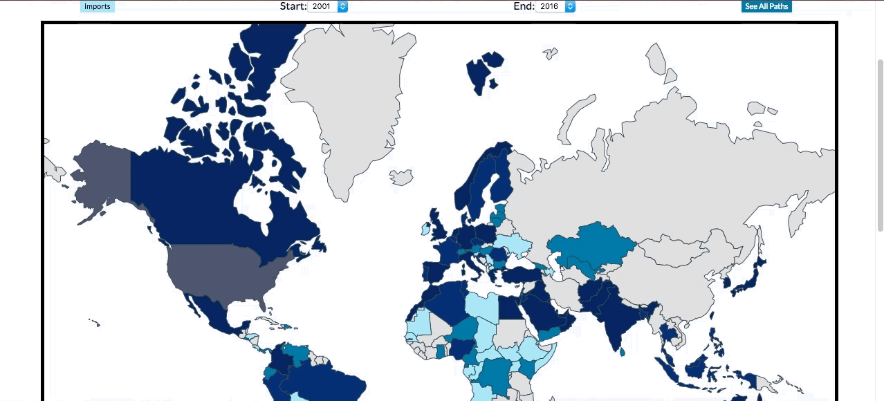
The Price of War is an interactive map illustrating the role of the United States in the global arms trade. It uses data from the Stockholm International Peace Institute's Arms Transfer Database Upon hitting the website, users are greeted by a short instructional blurb, some options to interact with the map, and of course the map itself.
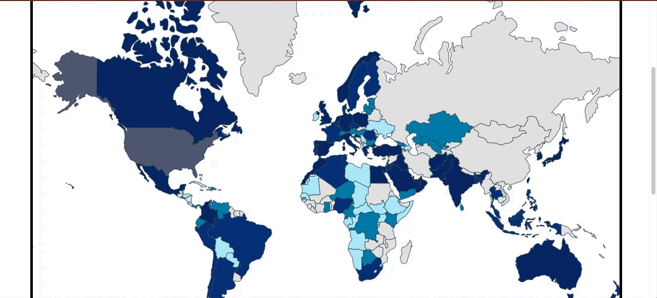
The United States is the world's largest exporter of weaponry, having sold $123,440,000,000 (that's 123 billion, plus some) worth of arms in the past fifteen years, with $9,894,000,000 (almost 10 billion) of that coming in 2016 alone. This map attempts to illstrate some of the scale of that trade using data from the Stockholm International Peace Research Institute's Arms Transfer Database.
The largest importer of arms from the U.S. is South Korea ($12 billion since 2001), followed by the U.A.E. ($9.3 billion), Saudi Arabia ($8.3 billion), Australia ($7.6 billion), and Israel ($6.4 billion). Notably missing from this map are the $460 million sold to international institutions (mostly to the North Atlantic Treaty Organization, but also to the African Union and the United Nations), as well as the sales to Singapore ($5.2 billion), Bahrain ($295 million), Malta ($15 million), Mauritius ($1 million), and The Seychelles ($1 million) -- all of which were excluded for technical reasons. Finally, the $4 million in sales to 'Unknown Recipients' have been excluded for obvious reasons.
While certainly not the titan in arms imports it is in imports, the U.S. has bought a respectable $11.7 billion worth of arms from the rest of the world since 2001. The largest exporters of weapons to the U.S. are the United Kingdom ($2.7 billion), Canada($1.8 billion), Germany ($1.4 billion), Switzerland ($1.2 billion), and Israel ($763 million). As with the exports, the $17 million in weapons sales to the U.S. from 'Unknown Suppliers' have been excluded from the map.
- Switch between maps for imports to and exports from the U.S.
- Slice data by year.
- Hover over countries to see details about their weapon transfers to and from the U.S.
- Click a country to see an arc representing the flow of arms between the U.S. and that country.
The data for this map is kept in a keyed JSON format, in which the country name points to a list of key-value pairs in which the key is a year and the value is the dollar amount of weapons trade to that country from the U.S. (or to the U.S. from that country.) For example, here is the data for Afghanistan:
"Afghanistan": {
   "2001": null,
   "2002": null,
   "2003": null,
   "2004": null,
   "2005": 19,
   "2006": null,
   "2007": 22,
   "2008": 78,
   "2009": 280,
   "2010": 245,
   "2011": 520,
   "2012": 410,
   "2013": 144,
   "2014": 69,
   "2015": 94,
   "2016": 72
}
There were two problems with this format. One, Datamaps does not recognize country names, only country IDs; and two, this data needed to be aggregated. The first problem I solved by grabbing a JavaScript object of all of Datamaps' country names and codes that would let me quickly and easily input names (Afghanistan) and get out country codes (AFG). With a country code, I could take that country's data and add up its arms purchases. When I eventually came to slicing my data by year, I modified that aggregation function to take in a start year and an end year, add up the sales between those years, and store all that data on the map. The code for that can be found here.
While Datamaps made drawing arcs a breeze, drawing arcs from and to specific places on click took a little bit more work. To get that working, I had to turn to d3's event handlers. Essentially what I did was select all of the SVG units representing the countries and extract their IDs. With that, I could get at the data stored in the map by my data formatter. This handler checks whether the map is in export or import mode, and sets up the arcs to draw from or to the U.S. depending on which direction the weapons are flowing. The width of the arcs is determined by a logarithmic function that turns the somewhat exponential data into nice, linearly scaling arcs. The code for this can be found here.

- Zoom in and out
- Add missing countries
- Expand analysis
- Expand scope to more than just the U.S.