
Surround an <input type=file> element by this <FileDropZone> Blazor component to making a zone that accepts drag and drops files.
- Live demo site - https://jsakamoto.github.io/Toolbelt.Blazor.FileDropZone/
Step 1. Add the NuGet package of this Blazor component to your Blazor app project.
> dotnet add package Toolbelt.Blazor.FileDropZoneStep 2. Surround <InputFile> component by the <FileDropZone> component.
Before:
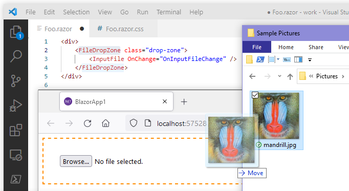
<!-- "Foo.razor" -->

<InputFile OnChange="OnInputFileChange" />
After:
<!-- "Foo.razor" -->

@using Toolbelt.Blazor.FileDropZone
...
<FileDropZone class="drop-zone">

  <InputFile OnChange="OnInputFileChange" />

</FileDropZone>
Step 3. Styling the <FileDropZone> component as you want to see.
[Tips]
The <FileDropZone> component will render just a single & plain <div> element outside of child content.
That means the <FileDropZone> component doesn't provide any UI styles.
Instead, <FileDropZone> the component adds/removes the "hover" CSS class to that <div> element when the mouse cursor enters/leaves the component area.
/* "Foo.razor.css" */

::deep .drop-zone {
    padding: 32px;
    border: dashed 2px transparent;
    transition: border linear 0.2s;
}
::deep .drop-zone.hover {
    border: dashed 2px darkorange;
}
After doing the above steps, you will get a drag & drop file feature like the following image.
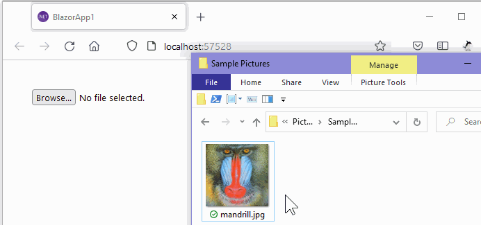
When any files are dropped into the div element that the <FileDropZone> component rendered, the <FileDropZone> component finds a <input type=file> element from an inside of its child content.
And then, the component dispatches the file object that the user dropped to the input element that the component found.
- .NET 5 or later is required.
- Both Blazor WebAssembly and Blazor Server are supported.