Changed rendering of percentgraph #29
Conversation
* Always 100px wide.
* Starts with green, then red
|
Jenkins » jacoco-plugin #98 SUCCESS |
|
Thank you for a pull request! Please check this document for how the Jenkins project handles pull requests |
|
Similar to how JaCoCo's HTML generator handles the size of the bars, these shouldn't be 100px each - the more code a package has (as in, lines, methods, etc.) the longer the bar should be. Likewise JaCoCo has red first, then green. Your statement abotu the percentage of the red bar is absolutely valid and should be changed. |
|
I definitely see why it would be good to keep the behavior similar to the main HTML generator of Jacoco... But after introducing Jacoco at work almost everyone complained that the bars were more or less unusable since sometimes there were too small to actually be rendered and many found them unintuitive. Would it be okay if I made this into an optional setting? — On Mon, Sep 16, 2013 at 5:37 AM, mabako notifications@github.com wrote:
|
|
I believe so - though @ognjenb would know better as he's the plugin maintainer. |
|
Of course, an optional setting would be good. Do you want to change on the pull request, or I should check the existing? |
|
@simedw Do you have time maybe to work on this optional feature? |
|
The coverage bars show percentages. So there's absolutely no need to let their width vary. There are even cases where the varying width renders the coverage report completely useless, as can be seen here: https://issues.jenkins-ci.org/browse/JENKINS-23588 |
|
Waiting for a fix for some years now. Hope we will see useful Jacoco coverage reports some day. |
|
@veita From what I read here, there is not even a clear understanding how the report should look like. So without a spec we all agree on we will not see any progress here. (Beside the fact that we need somebody who is willing to implement it. Maybe you?) |
|
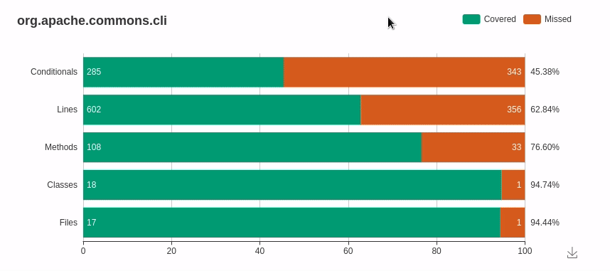
Just use https://plugins.jenkins.io/code-coverage-api/ which support jacoco out of the box then you will have graph that looks like this:
See more details at https://www.jenkins.io/blog/2018/08/17/code-coverage-api-plugin-1/ |
The bars indicating code coverage were a tad confusing so I changed them: