This project is under active development and its actual status is in alpha or “preview” phase. Some parts can drastically change in short term.
Use under your own risk. Bug reports, pull requests and any kind of collaboration are welcome.
The Titanium UX project arises to solve some common UX patterns that we use in our apps every day with Titanium Alloy.
The added value of this project is that each template and component is the result of a collaboration between an UX expert and a Titanium developer, and improved with cool designs done by pro apps designers.
The result is a collection of Templates with all the sources (mock up files for Omni-Graffle, designs in Illustrator and code in Titanium Alloy).
Regarding the code, the project now includes 3 templates with more than 20 reusable and customizable widgets of all kinds.
We are doing a big effort in creating useful widgets, with performance in mind and specially high integration with Alloy, so they can be added to your xml files and 100% customizables from style files.
Find more info about ux mobile patterns in our website www.uxmobilepatterns.com or contact us by twitter at @jrayon and @sonianoneka
##Multiplatform Support
The project has been developed for and fully works on iPhone. Although the UX has been designed with iPhone users in mind, most components also work on android and our intention is to give full support to the templates and widgets working in both platforms.
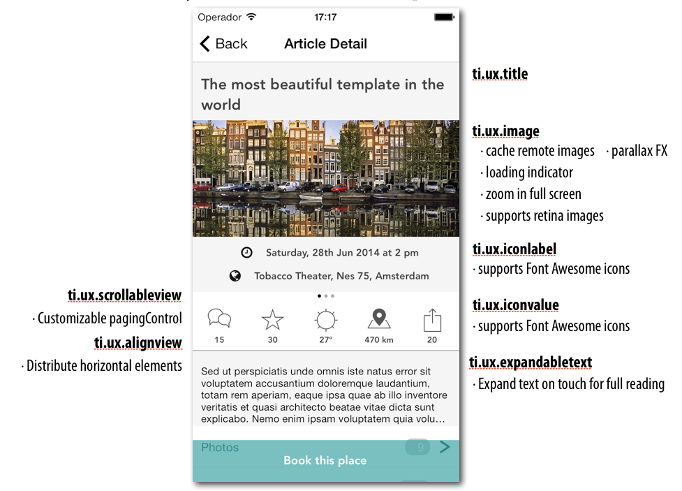
Franky is our little monster. After review hundred of detail views in mobile apps, Sonia found the kind of components more usable and used and put them all in a unique view, as a sample of what a detail view commonly includes.
This pattern will help you understand not only how to structure a kind of window like this, but also to have quick access to a library of ready-to-use components that you can reuse.
It uses several custom widgets ready to reuse and support for FontAwesome icons
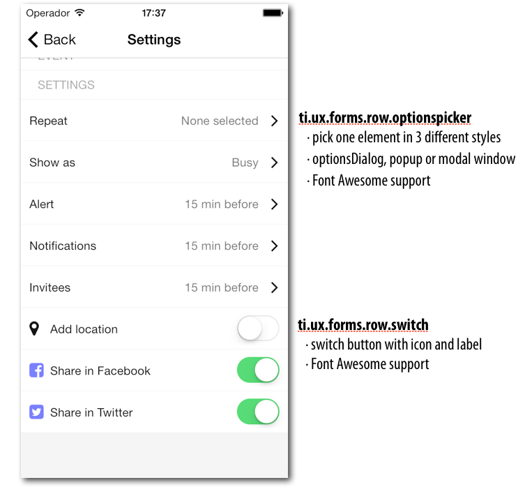
All we know what a settings form is, how often we use and develop them for apps and how long it takes to get fully working, including data validation, option pickers and so on.
This template will boost the process of creating new forms and will do it super easy to edit and maintain.
It is becoming more than usual that some input data processes, as for example sign up, buying process and so on, are made in a step-by-step way, so the user is more comfortable and not swamped by a large quantity of data to fill in.
This example adds all the needed logic to create the step-by-step navigation and also adds an high level of customization for your process.
By now, only text fields are supported, with several validation methods, support for custom validation methods, synchronous and asynchronous validation and invalid data detection.
coming soon...
An image view that downloads and automatically manages its own cache. Also works with local images.
It also adds properties to the image, doing it zoomable, it is, click for view fullscreen and pinch for zoomin.
Features:
- manages its own local cache
- shows a loading indicator with progress while loads a remote picture
- set zoomable property to true open a new window with a zoomable fullscreen image, showing an small loupe icon
- Support for retina images after saving in cache
- Also works with local images
Distributes horizontally all children elements added in its creation.
If no width property is set, it takes the parent width. You can set width property if the view is smaller than the parent or if the parent view is a
scrollView where you want to align all the elements.
A clickable label that expands its size. Properties accepted:
height
Uses style paragraph
this component envelopes com.criteriastudio.RemoteImageView widget for easier management. Also adds vertical parallax FX to it.
Use innerMargin to set the limits of the parallax fx. Use realTop property indicating the real from the window top edge. This is required to correctly manage
the scroll event by the parent container (tipically a table view or a scrollview)
Extends TableViewRow to be used in a settings form. Clicking on it, opens a selector of options.
Properties:
title: Title to show in the row
options : array of string with the options to show to the user
type: Type of dialog to show. optionsdialog | popup | modalwindow //modal window not implemented yet
value: index of the selected value by default
cancel: cancel option index in options (optional)
Extends TableViewRow to be used in a settings form. Adds a switch and a title to the row
Properties:
title: Title to show in the row
value : true | false Default value for the switch
Extends TableViewRow to be used in a settings form. Adds a text field to the form
Properties:
title
hintText
type: text|email|url|number|textarea
value
If textarea is used in type property, a modal window opens with a big text area when the control receives the focus.
Email, url, number and so on uses their own validators and customizes the keyboard
Extends TableViewRow to be used in a settings form. Shows a datepicker.
Properties:
title
value
minDate
maxDate
format: format used in the value field
If textarea is used in type property, a modal window opens with a big text area when the control receives the focus.
Email, url, number and so on uses their own validators and customizes the keyboard
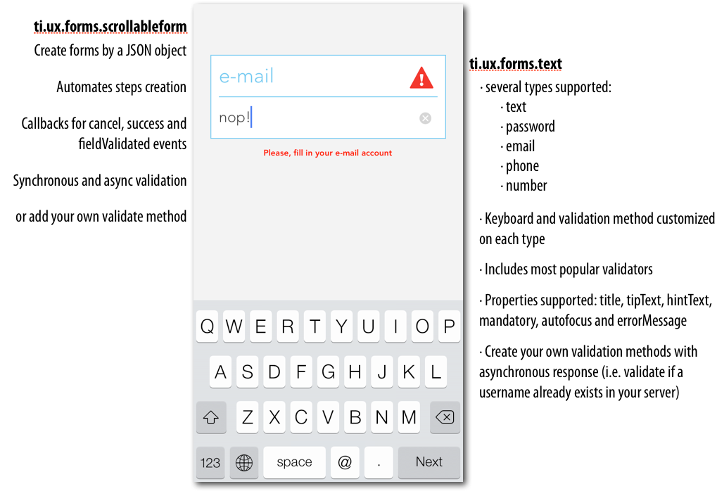
<Widget src="ti.ux.forms.scrollableform" id="form"></Widget>
Creates a form assistant (each field in one scrollable view). Initialize the widget with a json data structure, indicating the fields to create, properties for each field, callback methods (in case it is cancelled or validated).
A validation method is automatically assigned to each field depending on its type property. A custom validator method
can be declared for each field.
Declaring a type customizes the keyboard, passwordMask and validator method. Supported types are:
text
password
email
phone
number
url
Default type is text
This is an example of json form data:
var formData = {
	fields: [
		{
			id: 'username',
			title:'username',
			inputType:'text',
			mandatory: true,
			tipText:'Please, fill in your name',
			autofocus: true
		},

		{
			id:'website',
			title:'Your website',
			inputType:'url',
			mandatory: false,
			tipText: 'Please, fill in a valid website or leave it blank.',
			autofocus: true
		},

		{
			id:'email',
			title:'e-mail',
			inputType:'email',			//e-mail includes its own validate method, so no need to overwrite it
			mandatory: false,
			tipText:'Please, fill in your e-mail account',
			autofocus: true
		},
		{
			id:'password',
			title:'password',
			inputType:'password',
			mandatory: true,
			hintText:'6 characters at least',
			tipText:'Set your password',
			errorText: 'The password must contain at least 6 characters',
			autofocus: true,
			validate:function(value){	//customize our own password validation
				Ti.API.info('custom validation called w value: ' + value);
				return value && (""+value).length >= 6;
			}
		},
		{
			id:'confirm-password',
			title:'Confirm password',
			inputType:'password',
			mandatory: true,
			hintText:'6 characters at least',
			tipText:'Repeat the same password, please.',
			errorText: 'The passwords does not match.',
			autofocus: true,
			validate:function(value){	//customize our own password validation
				return value == $.form.getFieldValue('password');		//you can query any form password already introduced
			}
		},
		{
			id:'phone',
			title:'mobile number',
			inputType:'phone',
			mandatory: false,
			tipText:'Insert your phone number',
			autofocus: true
		}
	],
	onCancel: function(e){						//Cancel callback function
		alert('form cancelled');
	},

	onFinish: function(data){					//Callback called after last field is validated
		alert("This is your form result: \n\n" + JSON.stringify(data, '', 4));
		$.win.close();
	},

	onFieldValidated: function(data){			//Callback called each time a field is validated
		Ti.API.info('Field validated: ' + JSON.stringify(data));
	}
};
To create the form, just call it in you onOpen window event:
function initForm(){
	$.form.init(formData);
}Validators may include or not a callback function. A callback function can be useful when the validation requires a remote connection (for example, to check if a username already exists). If a callback function is used, an activityIndicator is shown during the validation.
Have a look to lib/validators.js to see a few examples of validators.
A boxed label and textfield with validation methods. Includes a title above the textfield. Thought to be used in scrollable step-by-step forms.
A button that accepts FontAwesome 4.1.0 codes. Fully customizable.
Properties:
icon
size
iconColor
A label that accepts FontAwesome 4.1.0 codes codes
icon the font awesome icon code
iconColor
size
An icon with a label besides it. The icon can be an image, using image property or a
FontAwesome 4.1.0 codes code using icon property.
An icon with a label below it. The icon can be an image, using image property or a
FontAwesome 4.1.0 codes code using icon property.
A paging control that can be embebbed to any scrollable view and stylized in style files.
The widget can be declared in Alloy in the xml view file, but must be initialized in code, after the scrollable view is drawn.
<ScrollableView id="scrollableView" onPostlayout="linkScrollableView" onScrollEnd="updatePagingControl">
	<Label text="View 1" />
	<Label text="View 2" />
	<Label text="View 3" />
</ScrollableView>
<Widget src="ti.ux.pagingcontrol" id="pagingControl" backgroundColor="#fff" top="0"/>
In the controller
/* SCROLLABLE VIEW FUNCTIONS */

function linkScrollableView(){
	$.scrollableView.removeEventListener('postlayout', linkScrollableView);
	$.pagingControl.linkScrollableView($.scrollableView);
}

function updatePagingControl(e){
	$.pagingControl.setActiveDot(e.currentPage);
}
This is an example of pagingControl styling:
".view-pagingcontrol":{
	height:"10",
//	backgroundColor:"#fff",
	zIndex: "999",
	width: Ti.UI.SIZE
},
".view-pagingcontrol-dot":{
	height:4,
	width:4,
	borderRadius:2
},
".view-pagingcontrol-dot-active":{
	backgroundColor:"#000"
}
".view-pagingcontrol-dot-inactive":{
	backgroundColor:"#999"
}
Note that the pagingControl can be in or outside the scrollable control.
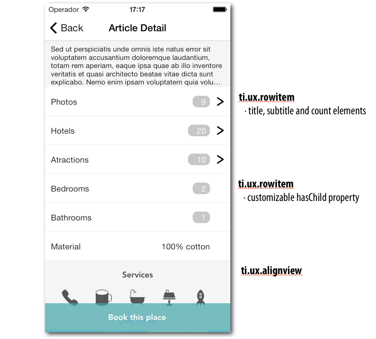
A TableViewRow widget, that accepts title, subtitle and count properties.
A customizable fullscreen popup window, to add any content to it.
use closeButton to show a cross button in the top right corner of the content. The popup also can be dismissed touching the background.
<Widget src="ti.ux.popup" id="mapPopup" platform="ios" closeButton="true">
    <Module id="mapview" module="ti.map" method="createView" />
</Widget>
to show the popup
$.mapPopup.show();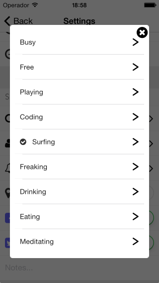
A customizable fullscreen popup list to show a closed list of options.
closeButton shows a cross button in the top right corner
selectable determines if the items in the list are selectable (use false for showing a list of items)
options array of strings, each element is an item in the list
value selected item in the list (only if selectable is true)
You can define the popup in the alloy view or inside the controler in runtime.
This example shows how to declare a selectable list and retrieve the selected option
	$.OPTIONS = ['bike', 'car', 'canoa' , 'plane', 'wings'];

	var popupDialog = Alloy.createWidget('ti.ux.popup.list', 'widget', {closeButton:false, selectable:true, options:$.OPTIONS, value:2});

	popupDialog.getView('table').addEventListener('click', function(e){
		Ti.API.info('optionSelected ' + e.index + ', name: ' + e.row.data.title);
		popupDialog.hide();
	});

popupDialog.getView().show();A Titanium ScrollableView with customizable pagingControl through alloy styles.
A white space widget to leave blank spaces between rows or components.
A title label styling class label-H1
Dreamed up by Sonia Villanueva and Javier Rayon in 2014.
UX strategy and mock-ups by Sonia
Titanium code and documentation by Javier
Themes designs and extra energy push by Mai Berreando. She has contributed with some of the coolest designs we have seen, among some beautiful cactus. ;)
We use the incredible work and technology done by:
Orignal FontAwesome Titanium module by Kosuke Isobe
All parts of this project are fully open source and released under Apache license 2.0.
You can use it for commercial projects, open source projects, or really just about whatever you want.
Code is provided as it is, no support or maitainance is guaranteed.
Attribution is not required, but appreciated. Among anything else, we will love to know how this project may help you.
.
.
.
.
.