The initial goal of our program is to find customer satisfaction in America for fast food restaurants by analysing tweets and creating a sentiment analysis using a technique called lexical analysis (matching words for positive/negative words). From the sentiment analysis, we scored the restaurant on a scale of 0-100 with a higher number indicating a higher satisfaction rate. Rather than just showing a text result of the sentiment score , we have created a histogram and a bar chart to view our sentiment scores in a better and more visual manner. We also implemented a word cloud so that you can see the words that frequently pops up in the tweets! However, we took things a lot further than just analysing sentiment scores! We also forecasted next year's satisfaction score by using linear regression techniques. We can then forecast the linear regression line and see whether it looks like it will go up or down and forecast the value of the satisfaction score too! In total we analysed 7 restaurants consisting of KFC, McDonald's, Burger King, Starbucks, Domino's, Pizza Hut, and Wendy’s.
To be able to run this Shiny app, you will need to have the following prerequesites and have follow the instructions below.
Libraries needed on R:
- shiny
- RCurl
- wordcloud
- tm
- tmap
- plyr
- stringr
- xml
- ggplot2
Make sure you have all the prerequisites installed and you are connected to the internet. Then copy the following into R console to run the app:
shiny::runGitHub("jamesadhitthana/UPH_SentimentForecast")
If all works well this is the main view when our shiny program is first run.
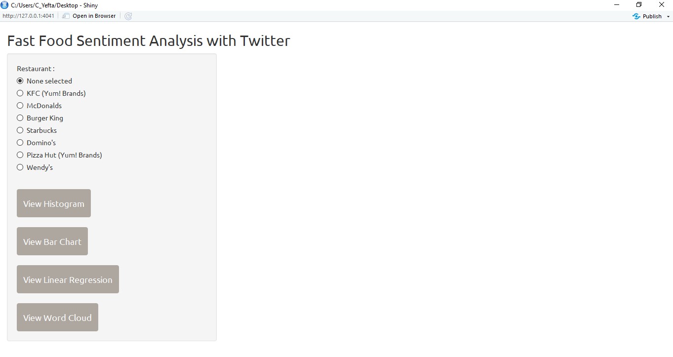
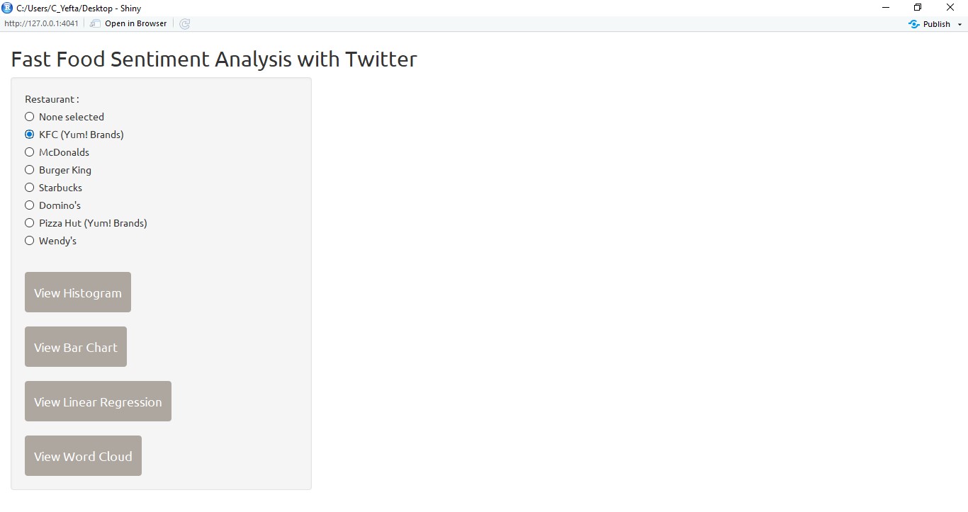
User can see information related to the brand that will be seen by pressing the radio button available. After choosing a brand, the user can select the type of information that will be displayed by pressing the existing action button. There are 4 graphs that can be displayed: Histogram, Bar Chart, Linear Regression, Word Cloud. Specially for the Histogram and Bar Chart will show the graph of all existing brands in order to show the comparison.
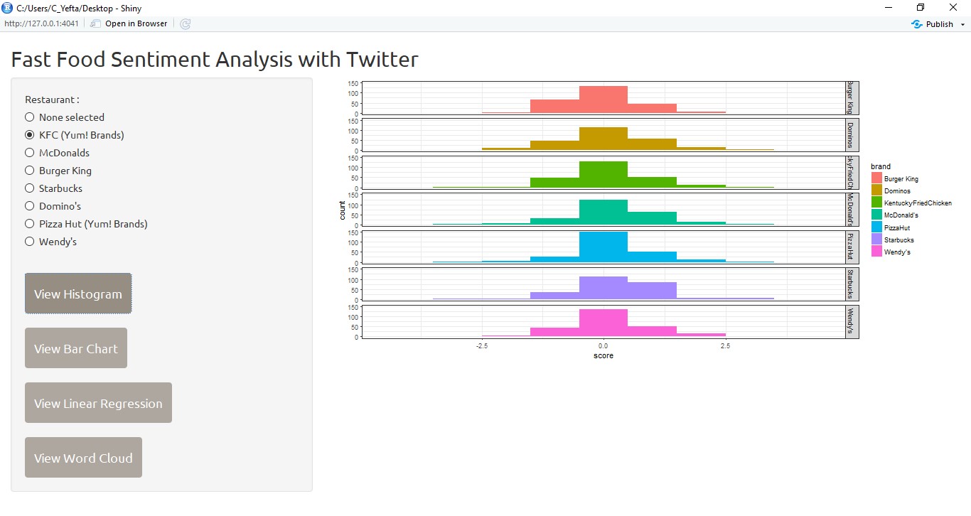
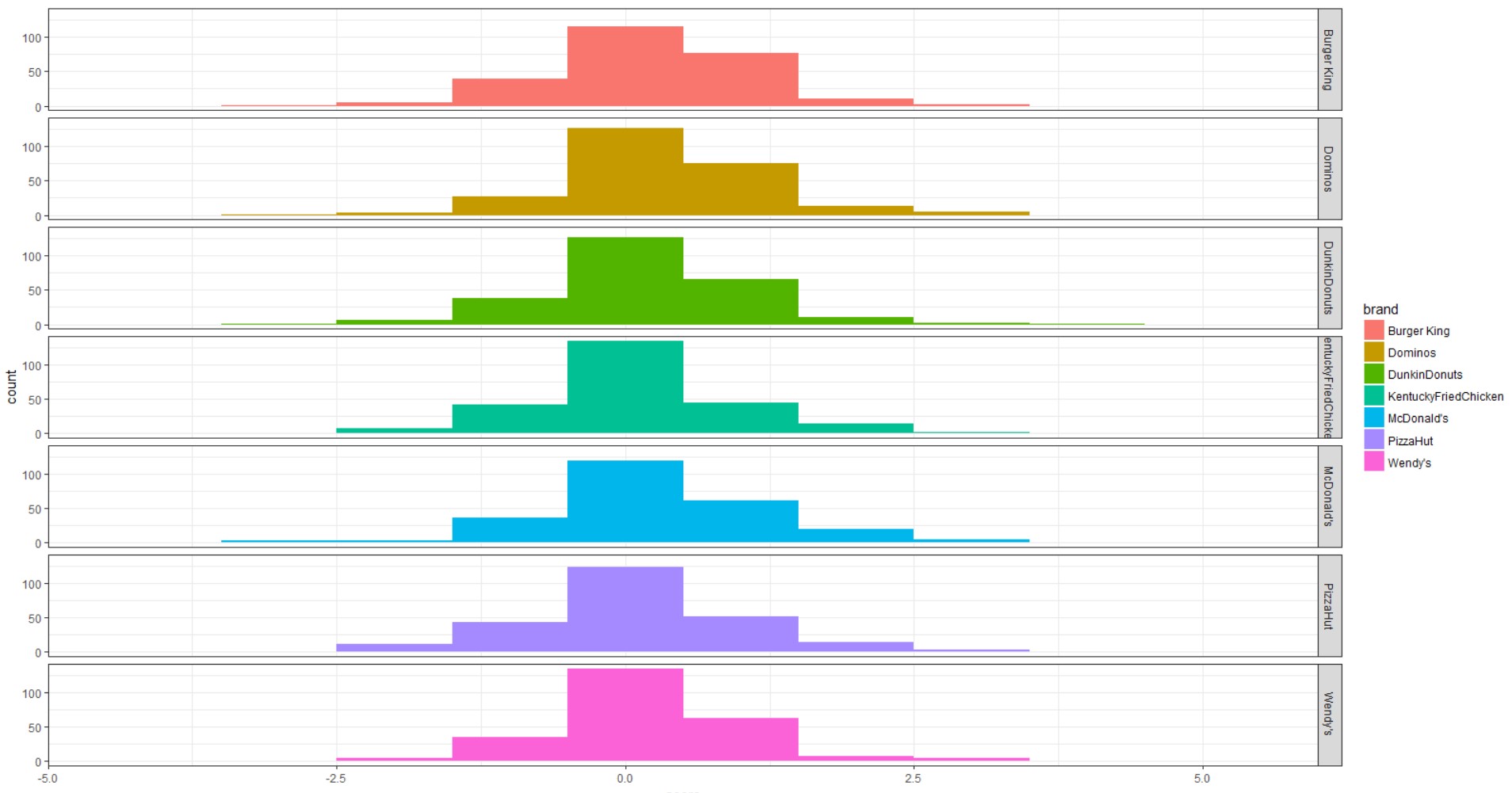
This is the view of the histogram after the user hits the view histogram button.
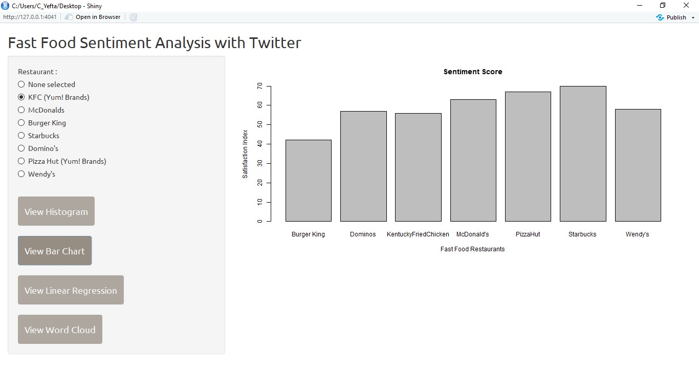
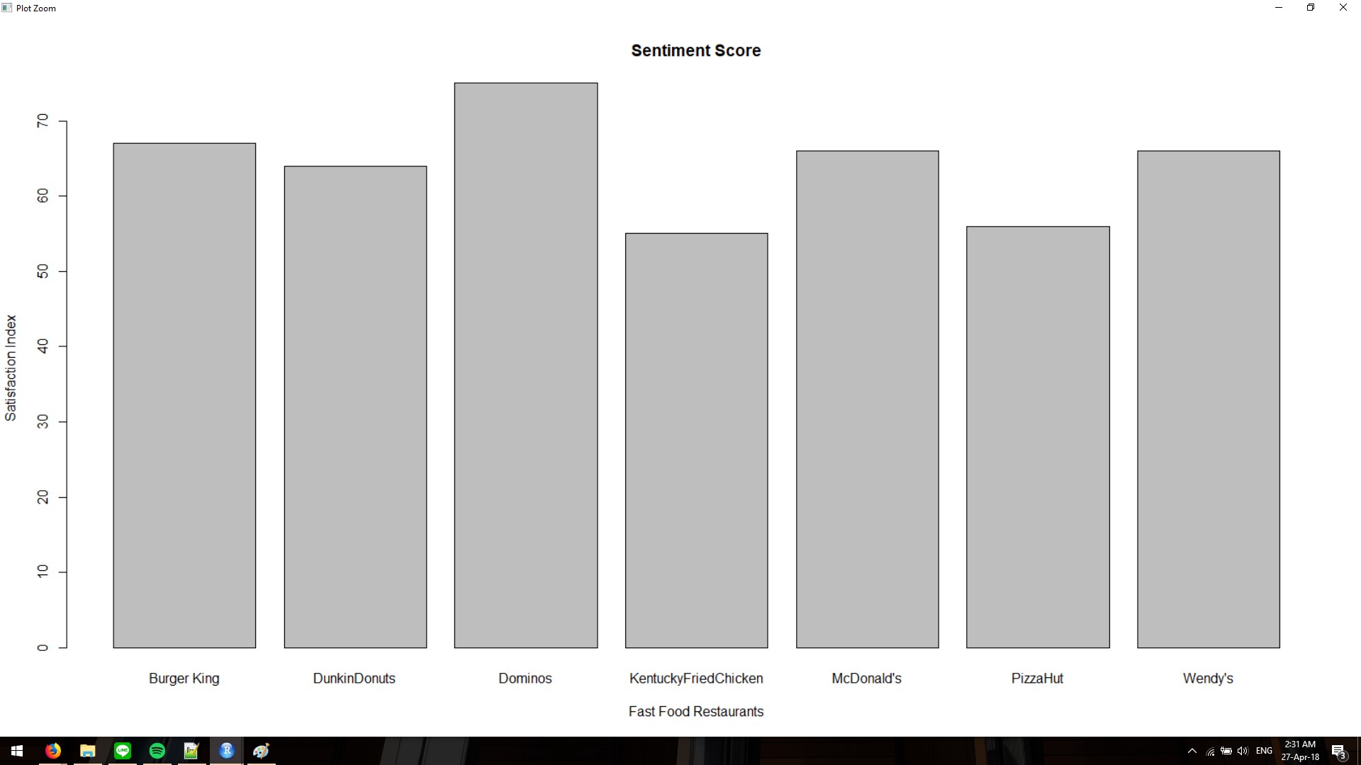
User can also display graph bar charts to show the sentiment score of each brand.
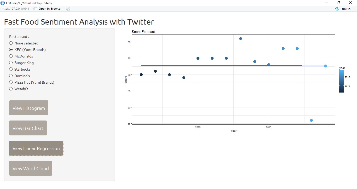
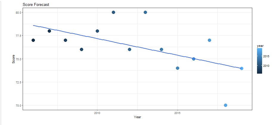
Then, user can see the linear regression of each brand to see the analysis and prediction of customer satisfaction for the next year.
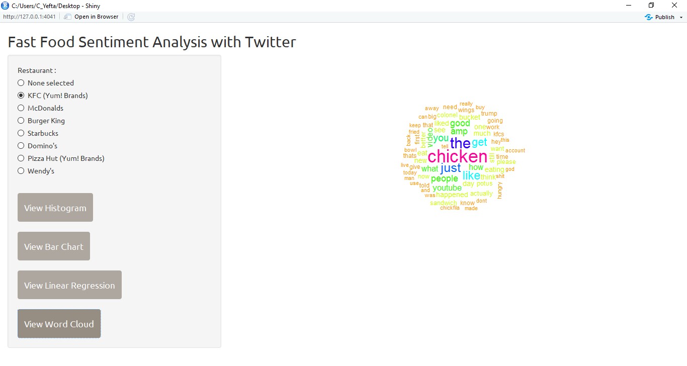
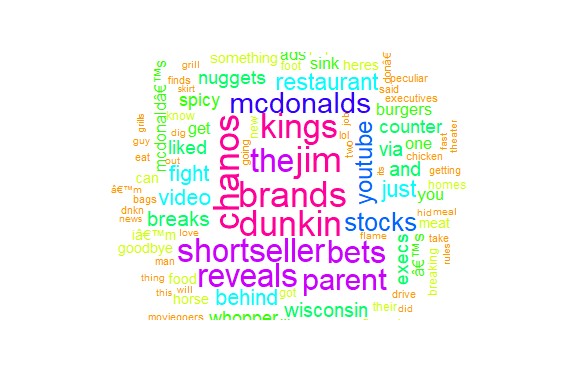
And the last, the user can see the word cloud that shows the word that often appears on Twitter related with the selected brand.
On this section, we will explain the techniques that we have used to achieve our results.
To grab and download the tweets from twitter the ‘twitteR’ library is used. Before we can get started the consumer_key, consumer_secret,acces_token, and access_secret has to be activated first before we can access the twitter API via the twitteR library.
setup_twitter_oauth(consumer_key,consumer_secret,access_token,access_secret) #loads the keys
To actually search for the tweets, the searchTwitter() function is used and the data is put into the appropriate variables. For example for the kfc_tweets variable, the searchTwitter() function is used to search for the keyword: 'kfc'. Then "-filter:retweets" is used to prevent retweets from being downloaded. The "lang=en" parameter is used to search for only English tweets, and then "n=250" sets the number of tweets to fetch which is set to 250 tweets. The resultType is set to recent because we want the latest tweets. Last is the geocode which is set to the latitude, longitude, and radius that covers the map of USA so that we only get tweets from America.
kfc_tweet <- searchTwitter('kfc -filter:retweets', lang="en",n=250,resultType="recent", geocode='37.0902,-95.7129,1500mi') #download kfc tweets
After recieving the tweets in the “restaurant_tweet” variable (ex: kfc_tweet variable), it is converted into the character vector by extracting the text from tweet variable using the getText() function and then putting it into its appropriate variable. This is done so that the tweets can be converted into a corpus.
kfc_text <- sapply(kfc_tweet,function(x) x$getText())
#creates a function that gets the text from the each tweet in the variable (looping) and places it in the variable
After it is converted into a character vector of name “restaurant_text” (ex: kfc_text), it is converted into a corpus and placed into a variable called “restaurant_corpus” (ex:kfc_corpus). It is converted into a corpus so that the tweets can be proccessed word by word.
kfc_corpus <- Corpus(VectorSource(kfc_text))
#converts the previous character vector into a corpus and put it in kfc_corpus
Since we do not want to process the unimportant parts of a tweet such as punctuations (marks, such as period, comma, parenthesis, etc.), numbers, stop words (the, a, to, you etc.), and whitespaces we have to clean up the corpus for each variable. This is done by using the tm_map() function from the tm and tmap libraries. This variable takes the corpus as the first parameter and the attributes to clean up in the second parameter. Below is the example for KFC’s variables.
kfc_clean <- tm_map(kfc_corpus, removePunctuation) #get corpus, remove punctuation, then put into a new variable called kfc_clean so that it doesnt affect the original corpus
kfc_clean <- tm_map(kfc_clean, removeNumbers) #remove numbers
kfc_clean <- tm_map(kfc_clean, removeWords,stopwords('en')) #remove stopwords (english)
kfc_clean <- tm_map(kfc_clean, stripWhitespace) #strip whitespace so that we can compare the words later
After cleaning it up, the corpus is converted into lower case so that it can be processed in the sentiment analysis process.
kfc_clean <- tm_map(kfc_clean, content_transformer(tolower)) #switch to lower-case
After it is cleaned up, using the data.frame() function and the plyr library, the cleaned up and lower case corpus is returned back into a dataframe called “restaurant_cleaned_dataframe” (ex: kfc_cleaned_dataframe).
kfc_cleaned_dataframe <- data.frame(text=sapply(kfc_clean, identity), stringsAsFactors=F)
#converting back into a data.frame and then putting it into the appropriate variable name, it also makes sure that strings arent made into a factor type class by using stringsAsFactors=F
To calculate customer satisfaction in 2018, we used a sentiment analysis. Sentiment analysis can be done using previously obtained dataframe from Twitter. First of all it needs to be given information about positive and negative word (load lexicon).
enPositiveWords <- scan('enPositiveWords.txt',what='character',comment.char=';') #loads all english positive words (ignores comment with char ';')
enNegativeWords <- scan('enNegativeWords.txt',what='character',comment.char=';') #loads all english positive words (ignores comment with char ';')
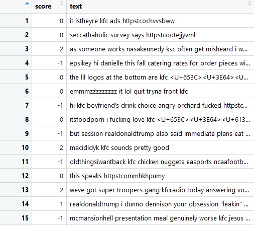
Then put into a function called sentiment.score() that serves to calculate the sentiment score of each brand by searching the number of positive and negative words from each related tweet that also performs the cleaning of some unnecessary characters. Essentially what it does is that it takes the tweets from the previous variable and matches it with the positive and the negative lexicon and then if it matches it either adds a positive score or adds a negative score. For example if a tweet contains a word “terrible” it will add -1 to the total score. On the other hand if a tweet contains a word “awesome” it will add +1 to the total score. The function sentiment.score() is inspired by Jeffrey Breen’s algorithm which is credited on the bottom of this page.
Scores can be calculated using the following basic formula:
score = sum(pos.matches) - sum(neg.matches)
#((sum of all positive matches) - (sum of all negative matches))
The scores obtained will be included in a new data frame called “restaurant_scores” (ex: kfc_scores). Then the brand and the restaurant code is added to make graph making easier.
kfc_scores = score.sentiment(kfc_cleaned_dataframe$text,enPositiveWords,enNegativeWords, .progress="text") #progress bar
kfc_scores$brand = "KentuckyFriedChicken"
kfc_scores$code = "kfc"
After all of that, all of the scores from all the restaurants are compiled into a variable named “compiled_scores” by using the rbind() function. This will create a table with the scores for each tweet.
compiled_scores = rbind(kfc_scores,mcD_scores,bk_scores,sb_scores,dom_scores,ph_scores,wen_scores) #bind scores into a variable
With all the scores combined, the total sentiment score will now be calculated. But first we have to extract the positive and negative numbers first which is done by this function.
With the current results, we can graph a histogram that shows the sentiment scores from each of the restaurants using the ggplot library.
ggplot(data=compiled_scores) +
  geom_histogram(mapping=aes(x=score, fill=brand),binwidth=1) + #geom_bar
  facet_grid(brand~.) + #make separate plot for each brand
  theme_bw() + scale_colour_brewer() #add colors
compiled_scores$bigPositive = as.numeric(compiled_scores$score >= 1)
compiled_scores$bigNegative = as.numeric(compiled_scores$score <= -1)
#this returrns the scores that are above 1 and less than -1 (we dont need to calculate the 0 score)
Then we use the ratio of bigpositive to bigNegative as overall sentiment score for each brand. This is done by creating a dataframe called sentimentDataFrame by using the ddply() function. Other than creating a dataframe it adds a few columns and calculates the total.
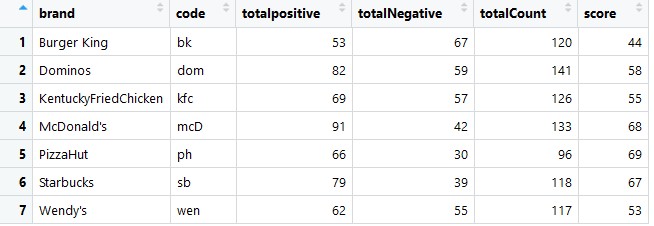
sentimentDataFrame = ddply(compiled_scores, c('brand','code'),summarise,
                           totalpositive=sum(bigPositive),totalNegative = sum(bigNegative))
sentimentDataFrame$totalCount = sentimentDataFrame$totalpositive+sentimentDataFrame$totalNegative
sentimentDataFrame$score = round(100*sentimentDataFrame$totalpositive/sentimentDataFrame$totalCount)
We can create the bar chart from the data frame ccompare_data_frame.
barplot(
        compare_data_frame$score.tweets,
        main = "Sentiment Score",
        names.arg = (compare_data_frame$brand.tweets),
        xlab = "Fast Food Restaurants",
        ylab = "Satisfaction Index"
      )
Since the twitter API has its limitations for the free version, we were stuck with only being able to search tweets that has been tweeted for the past couple of days. Since we wanted to make a forecast of the future satisfaction score of customers, we enlisted the help of ACSI or the American Customer Satisfaction Index. This organization scores the customer satisfaction levels on various companies in the United States and gives out a customer satisfaction rating per year.
Therefore we went into their website and got this table: http://www.theacsi.org/index.php?option=com_content&view=article&id=149&catid=&Itemid=214&i=Limited-Service+Restaurants and then extracted the data using the xml library and the readHTMLTable() function to extract the table into a dataframe.
readHTMLTable(benchmark_url,header=T, which=1, stringAsFactors=F)
The table is then processed so that we only get the columns that we need.
The columns are the years that are going to be analyzed. We have chosen to use their data from 2006-2017 score and then combine it with our 2018 sentiment score to forecast 2019’s score. With the value of customer satisfaction that has been obtained from 2006 - 2018, it will be made a linear model to perform the analysis. First, take a score table from ACSI from 2006 - 2017 and then combine with the score of sentiment analysis 2018 that has been obtained. To get the predicted value for 2019 from the previous year value, we created a function like the following: predict_score = function(x, y) In that function, we form a linear regression formula that will aim to get customer satisfaction predicted value for 2019. The formula is a standard linear regression formula that we have mapped out in R and adapted into our variables so that it would work with our graph and what we are trying to make.
After the prediction value is obtained, it will be re-combined with customer satisfaction value in previous years, and then displayed in graph form. The result will be something like this:
The cross technique we use in this program is one-cross sectional with sentiment analysis. Cross is done by taking data from several tweets on twitter and searching for positive and negative words from each tweet. The purpose of cross here is to describe the sentiments of many Americans on twitter about various fast food restaurants in the area.
To create a wordcloud the wordcloud library is used. Then after processing the text by using the wordcloud() function from the wordcloud library. Basically the tweet will be cleaned first by removing the word “kfc” (removing the word that contains the searched word) and then made into a new variable “restaurant_wordCloud” then created into a wordcloud using the wordcloud() function.
kfc_wordCloud <- tm_map(kfc_clean, removeWords, c("kfc")) #remove the words that contain the searched word
wordcloud(kfc_wordCloud,min.freq =4, random.order = F, scale = c(3,0.5), colors=rainbow(10))
#The parameters are used to add the aesthetics and make it more readable.
Shiny is used for GUI to display the dataframe that has been calculated. Shiny has 2 parts : Main Panel and Side Panel. Sidebar Panel is used to display button that react according to user input. On the other hand, main panel is used to display plot that react according to which button is pressed. There are 2 type of button that has been used in Sidebar Panel : actionButton and radioButton actionButton is used as a trigger to plot something to Main Panel like Word Cloud, Histogram, Bar Chart, and Linear Regression radioButton is used to change restaurant to plot and to make word cloud. UI Part is about putting every button in Sidebar Panel and giving space to plot in Main Panel and the Server Part is about connecting each button in Sidebar Panel to Main Panel. All of the code is made into one file called app.r which contains the code for the ui.R and server.R.
shinyApp(ui, server) #function to run the ui and server on the same app.R file
This code is used for getting input from View Histogram button and displaying the plot. Using observeEvent function, server anticipating input from user and change the Main Panel.
observeEvent(input$viewHist, {
   output$Hist <- renderPlot({
     ggplot(data = compiled_scores) +
       geom_histogram(mapping = aes(x = score, fill = brand),
                      binwidth = 1) + #geom_bar
       facet_grid(brand ~ .) + #make separate plot for each brand
       theme_bw() + scale_colour_brewer() #add colors
   })
 })
This code is for displaying word cloud to Main Panel. By clicking View Word Cloud Button, this function is going to activate. The radio button is nothing selected at default. By selecting other restaurant, the Main Panel is printing word cloud according to which radio button is pressed.
observeEvent(input$word, {
   output$Hist <- renderPlot({
     word <- switch(
       input$rest,
       kfc = wordcloud(
         kfc_wordCloud,
         min.freq = 4,
         random.order = F,
         scale = c(3, 0.5),
         colors = rainbow(10)
       ),
...#code continues on...
There are many other codes that are used to set up the template and the design of the application.
- R - R Programming Language
- RStudio - RStudio
- Javascript - Shiny
- James Adhitthana - jamesadhitthana
- Christopher Yefta - ChrisYef
- Deananda Irwansyah - hikariyoru
This project is licensed under the MIT License - see the LICENSE file for details
- Customer satisfaction index of (2006-2017) by ACSI - American Customer Satisfaction Index
- Positive and negative word list by Minqing Hu and Bing Liu
- score.sentiment() function by Jeffrey Breen