The coxcomb chart was first used by Florence Nightingale to persuade Queen Victoria about improving conditions in the military hospitals during the Crimean War.
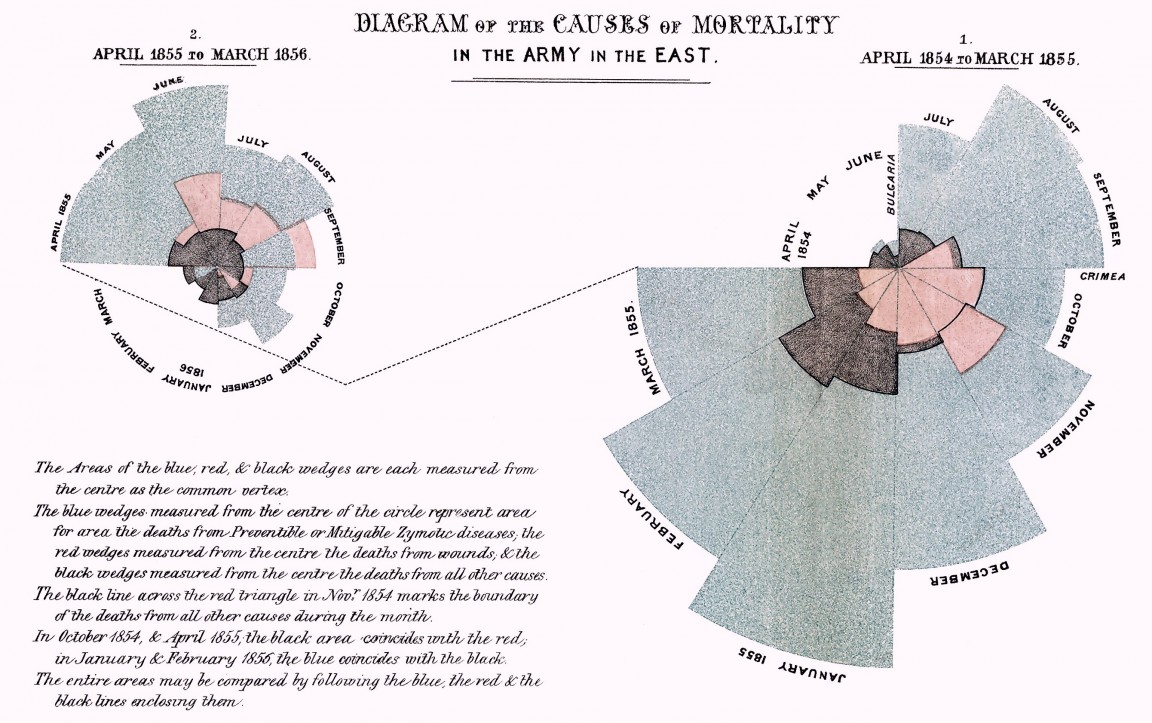
It serves the same purpose as a traditional barchart, but displays the information in a coxcomb flower pattern.
It's slightly modified from the original design, since it doesn't display the bars stacked but side by side, I think it's better to display superposed labels that way.
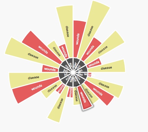
Feeding data into the chart is straightforward
  deaths = {
   data : {
       jan : {
          disease : 180,
          battle : 20
       },
       feb : {
          disease : 140,
          battle : 35
       },
       mar : {
          disease : 80,
          battle : 50
       },
  },
  colors : {
    category : "#2B2B2B", //color of the category
    opacity : 0.8,
    fontColor: "#fff",
    bySeries : { //this color scheme repeats the same color for the same series
        disease  : {
          color : "#E9E581",
          opacity : 0.8,
          fontColor: "#000",
        },
        wounds : {
          color: "#DE1B1B",
          opacity: 0.7,
          fontColor: "#fff"
        }
    }
   }
  };
  var lastSelection;
  var properties = {
      categorySize : 0.20, // percentage of radius used for categories
      categoryFontSize: 10,
      seriesFontSize: 10,
      onClick: function(polygon, text) {
          if (lastSelection) {
              lastSelection.remove();
          }
          lastSelection = polygon.glow();
      },
      stroke: "#fff"
  };
  var paperWidth = 600;
  var paperHeight = paperWidth * 0.8;
  Raphael("deaths", paperWidth, paperHeight)
.coxCombChart(paperWidth / 2,paperHeight / 2, paperHeight / 2, deaths, properties);The bars can be colored using two different strategies:
This coloring scheme assumes the same series repeat for each category and you want the same color for the same serie in each category.
    bySeries : {
        disease  : {
          color : "#E9E581",
          opacity : 0.8,
          fontColor: "#000",
        },
        wounds : {
          color: "#DE1B1B",
          opacity: 0.7,
          fontColor: "#fff"
        }
    }
You can check out a running sample here
This coloring scheme assumes categories are not related and lets you specify a different color for each category bars.
    byCategory : {
        Tools : {
            color : "#E9E581",
            opacity : 0.8,
            fontColor: "#000000"
        },
        Languages : {
            color: "#DE1B1B",
            opacity: 0.7,
            fontColor: "#fff"
        },
    }
You can check out a running sample here
The received values are normalized and the maximum value takes the complete radius of the coxcomb. Be warned, each value is normalized and only the radius is affected, not the complete area of the disc sector. This may introduce visualization problems as the ones pointed by Edward Tufte, with x10 lie factors or more.
The area formulas are on this website