This web-component shall give users an easy and highly configurable way of creating their own tech-, trend- or ...-radar.
You may customize the number, styling and name of rings, the number and name of the sections and add entries to those sections. Additionally, your host-application can set the highlighted entry from outside (making the radar-element show a tooltip) and be informed via an event, whenever the user mouses over or clicks an entry.
The web-component follows the open-wc recommendations.
npm i radar-elementNative HTML & JS
<script type="module">
  import 'radar-element';
</script>

<radar-element diameter="800"></radar-element>

<script>
  const rings = JSON.stringify([...]);
  const sections = JSON.stringify([...]);
  const entries = JSON.stringify([...]);

  const radar = document.getElementsByTagName("radar-element")[0];

  radar.setAttribute("ring-configs", rings);
  radar.setAttribute('section-configs', sections);
  radar.setAttribute('entry-configs', entries);

  radar.addEventListener('entry-mouseover', function(e) {...})
  radar.addEventListener('entry-mouseout', function() {...});
  radar.addEventListener('entry-click', function() {...});
</script>
Angular
To include this element in e.g. an Angular project, you must first import it into your Angular component and define the properties:
import 'radar-element';
import { Component } from '@angular/core';

@Component({
  ...
})
export class AppComponent {
  title = 'test';

  rings = [...];

  sections = [...];

  entries = [...];

  onHighlightEntry() {
    ...
  }

  onUnhighlightEntry() {
    ...
  }

  onClickEntry() {
    ...
  }
}
Next you simple instantiate the element in the HTML and pass the properties / event-bindings:
<radar-element
  diameter="800"
  [ringConfigs]="rings"
  [sectionConfigs]="sections"
  [entryConfigs]="entries"
  (entry-mouseover)="onHighlightEntry()"
  (entry-mouseout)="onUnhighligthEntry()"
  (entry-click)="onClickEntry()">
</radar-element>
To make Angular understand this component you'll have to add the following to your module:
import { CUSTOM_ELEMENTS_SCHEMA } from '@angular/core';

@NgModule({
  ...
  schemas: [CUSTOM_ELEMENTS_SCHEMA],
  ...
})
lit-html
Another example on how to use this element via lit-html can be found in demo/index.html.
All properties can be converted to attributes by going from camelCase (e.g. ringConfig) to kebap-case (e.g. ring-config). Properties can be bound by applications like Angular or lit-html, while Attributes have to be used in native HTML.
The diameter of the whole SVG.
{
  "id": "adopt",
  "displayName": "ADOPT",
  "backgroundColor": "#841339",
  "headlineColor": "#fff",
  "entryStyle": {
    "color": "#fff",
    "labelColor": "#000"
  }
}| Parameter | Data-Type | Description |
|---|---|---|
| id | string |
The id of the ring |
| displayName | string |
The name of the ring that should be displayed |
| backgroundColor | string |
The background color that should be used for the individual ring |
| headlineColor | string |
The color of the headline. Make sure that it has enough contrast to the ring's backgroundColor |
| entryStyle | {} |
The styling of the entries belonging to that ring |
The entryStyle exhibits the following config-parameters:
| Parameter | Data-Type | Description |
|---|---|---|
| color | string |
The color of the entry's circle |
| labelColor | string |
The color of the entry's label |
{
  "id": "languages",
  "displayName": "Languages"
}| Parameter | Data-Type | Description |
|---|---|---|
| id | string |
The id of the section |
| displayName | string |
The name of the section that should be displayed |
{
  "id": "73bef846-9177-4d48-b8d6-dcaa79dbaa28",
  "labelShort": "1",
  "labelLong": "TypeScript",
  "sectionId": "languages",
  "ringId": "adopt",
  "clickable": true
}| Parameter | Data-Type | Description |
|---|---|---|
| id | string |
The id of the entry |
| labelShort | string |
The character that should be printed on the entries circle. |
| labelLong | string |
The label of the entry |
| sectionId | string |
The id of the section that entry belongs to |
| ringId | string |
The id of the ring that entry belongs to |
| clickable | boolean |
Marks the element as clickable making it fire the entry-click event |
The ID of the entry to be highlighted. You can use this parameter to e.g. programmatically set an entry to the highlighted state. This results in the same state, as if the user would place her mouse on the entry.
If the radar-element itself recognizes a mouse-over by the user on one of its entries, the entries ID is reflected back to this property.
The radar-element will fire the entry-mouseover event whenever the mouse is placed above on entry and the tooltip appears. The event will contain the following data-structure:
detail: {
  entryId: "The ID of the entry that has been passed in through the entry-config"
}
This can be used to e.g. synchronize the highlighting with another structure outside of the radar-element.
The entry-mouseout event will be fired, whenever the entry is not highlighted anymore and does not contain any detail payload.
For entries where clickable is set to true, the radar-element will fire the entry-click event whenever the user clicks on that entry. The event will contain the following data-structure:
detail: {
  entryId: "The ID of the entry that has been passed in through the entry-config"
}
This can be used to e.g. open a new tab with further information regarding the entry or display a modal dialog.
The following css properties can be used to style the radar.
| Parameter | Data-Type | Description |
|---|---|---|
| --radar-element-background-color | Color |
The background color of the radar. |
| --radar-element-grid-color | Color |
The color of the grid of the radar. |
| --radar-element-section-color | Color |
The color of the section label. |
| --radar-element-tooltip-background-color | Color |
The background color of the tooltip. |
| --radar-element-tooltip-accent-color | Color |
The color of the tooltips bottom border. |
| --radar-element-tooltip-label-color | Color |
The color of the tooltips label. |
| --radar-element-tooltip-section-color | Color |
The color of the tooltips section label. |
The whole application is designed to be lightweight and that it must integrate easily in all different kinds of applications. Therefore, we chose the web-components standard for implementation.
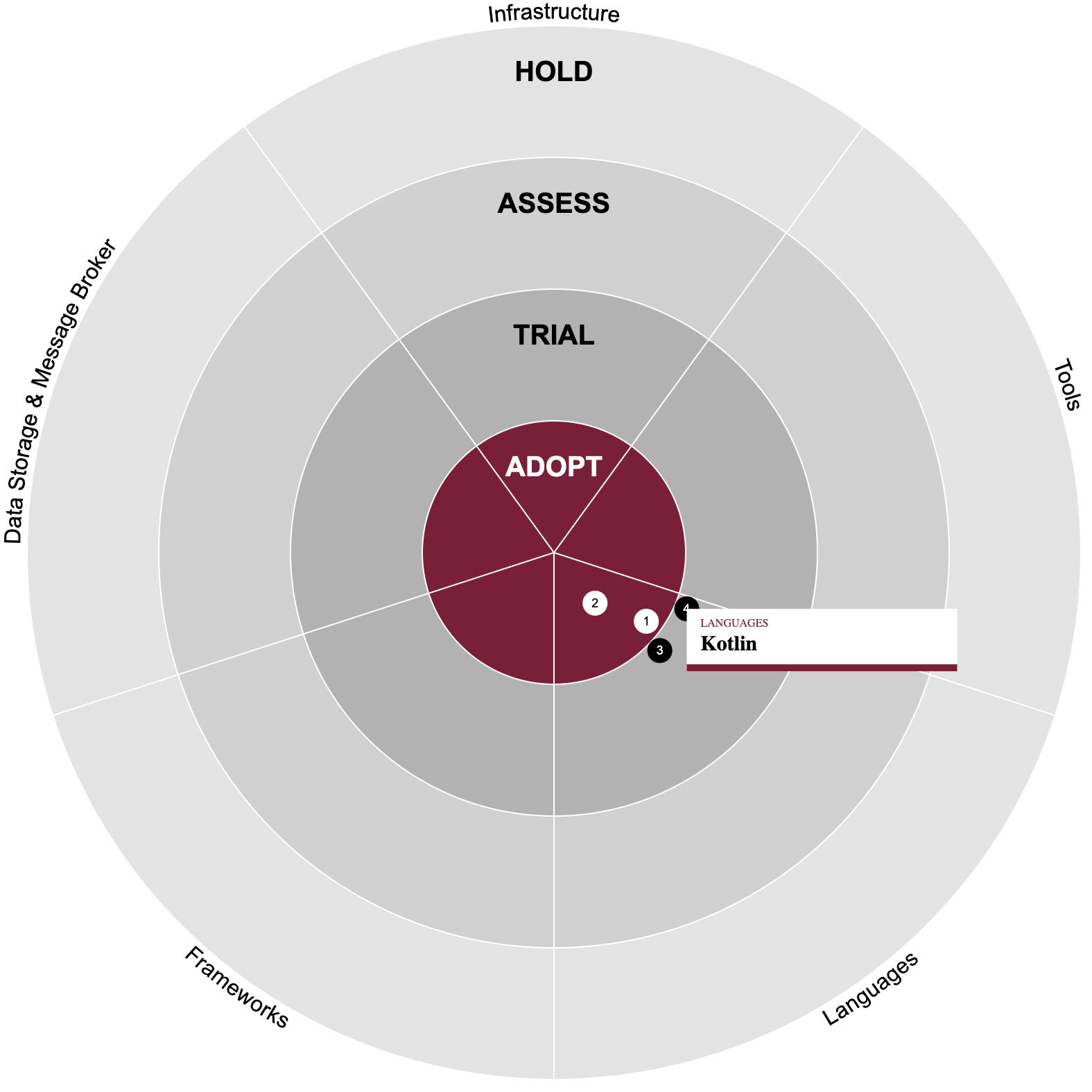
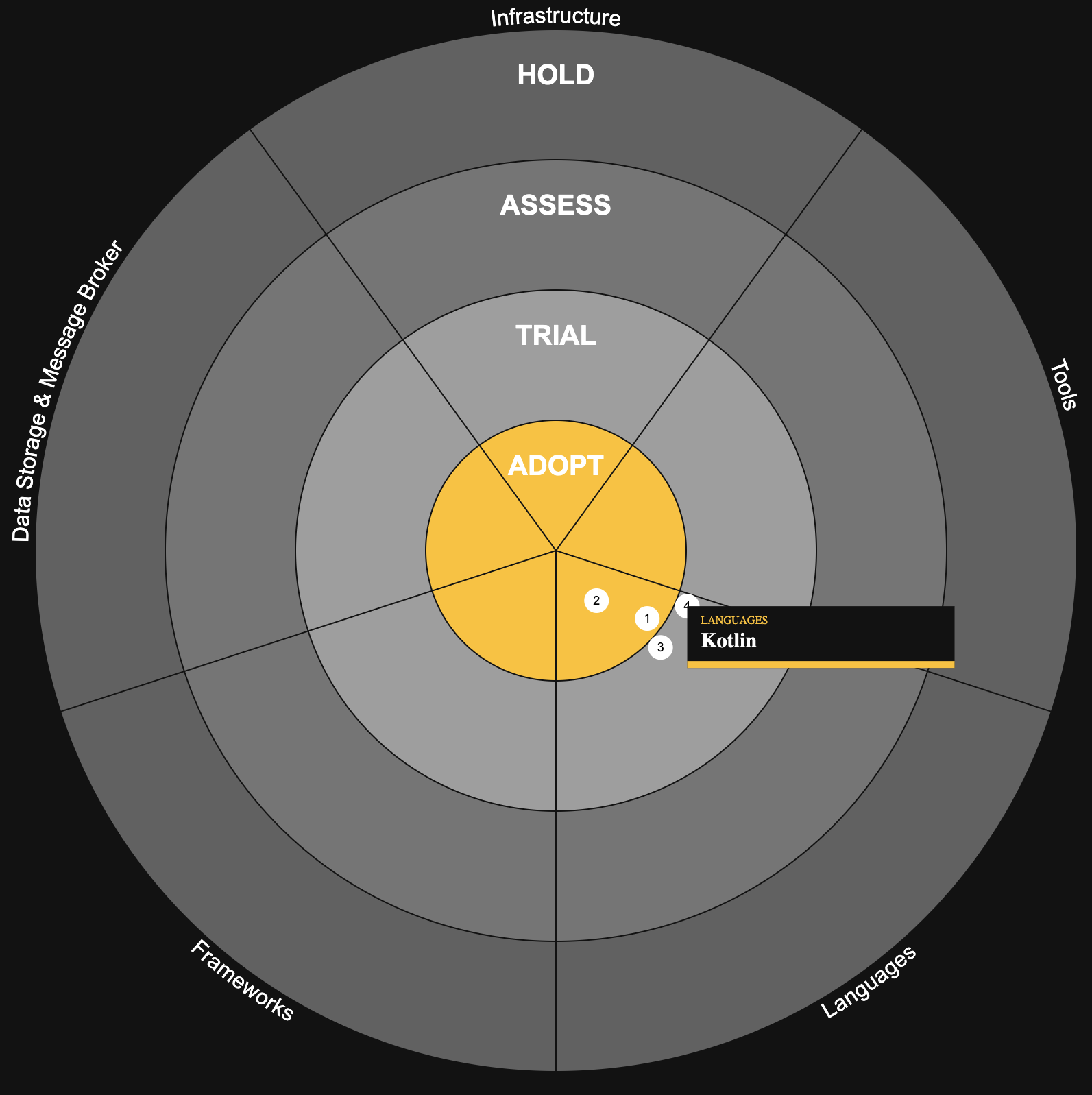
When drawing a radar we split the whole circle into different parts, mainly rings and sections.
A ring depicts the maturity (or whatever scale the user of the radar chooses) while sections partition the entries into categories. We call the overlap between a ring and section a segment. On those segments we position the entries.
The application is structured as follows:
/
  /demo
    /index.html - a simple page to integrate the element to for testing purposes
  /src
    /domain - contains the domain objects
    /generators - contains pure functions that generate SVG or HTML code based on input parameters
    /utils - basic math and svg utilities
    /RadarElements.ts - the backing class for the web component implementation
  test
    /generators - contains tests for the generators
    /utils - contains tests for the utils
    /radar-element.ts - contains test for the web-component
/index.ts - the entry point if this whole package is included via npm
Some standard files (like LICENSE, or package.json) are omitted for brevity.
Install dependencies
npm installRun the server
npm startThis will serve the basic demo located in demo/index.html.
To scan the project for linting errors, run
npm run lintTo detect formatting errors, run
npm run formatAnd to automatically fix them:
npm run format:fixTo run the suite of Web Test Runner tests, run
npm run testTo run the tests in watch mode run
npm run test:watchThe configuration for the different tools used in the project are located inside the following files:
.eslintrc.cjsfor ESLint config.editorconfigfor your local editor configuration.lintstagedrc.jsonto run scripts only on git staged filesprettierrc.jsonfor Prettier configtsconfig.jsonfor TypeScript compiler configurationweb-dev-server.config.mjsfor the local development serverweb-test-runner.config.mjsfor the local test runner
MIT License
Copyright (c) 2021 Felix Thiele (dev@felix-thiele.eu)
Permission is hereby granted, free of charge, to any person obtaining a copy of this software and associated documentation files (the "Software"), to deal in the Software without restriction, including without limitation the rights to use, copy, modify, merge, publish, distribute, sublicense, and/or sell copies of the Software, and to permit persons to whom the Software is furnished to do so, subject to the following conditions:
The above copyright notice and this permission notice shall be included in all copies or substantial portions of the Software.
THE SOFTWARE IS PROVIDED "AS IS", WITHOUT WARRANTY OF ANY KIND, EXPRESS OR IMPLIED, INCLUDING BUT NOT LIMITED TO THE WARRANTIES OF MERCHANTABILITY, FITNESS FOR A PARTICULAR PURPOSE AND NONINFRINGEMENT. IN NO EVENT SHALL THE AUTHORS OR COPYRIGHT HOLDERS BE LIABLE FOR ANY CLAIM, DAMAGES OR OTHER LIABILITY, WHETHER IN AN ACTION OF CONTRACT, TORT OR OTHERWISE, ARISING FROM, OUT OF OR IN CONNECTION WITH THE SOFTWARE OR THE USE OR OTHER DEALINGS IN THE SOFTWARE.