-
Will Ashfield
-
Kammy Chiu
-
Rik Ghosh
Dr. Micheal McDonald is a political science professor at the University of Florida, where he runs the US Elections Project: an innovative and important data collection and reporting project. A summary of the work can be found on McDonald’s Website. In his own repository, McDonald uses elections data scrapped from a number of states in order to create visualizations for both his website and blog positings for the Huffington Post and other publications.
The work produced in the Elections Project takes on two forms: histograms and maps. In regards to the histograms, the plots appear to be made in excel, with no predictability and low-image resolution. Additionally, the histograms are generated from large data files, which are downloaded manually on a frequent basis. The maps are similar, in that they are not reproducible and appear to be made in an inefficient manner.
The goal of this project is to assist Dr. McDonald in creating “timely and accurate election statistics", by producing interactive, automated visualizations that are fully-reproducible.
Our group focused on North Carolina, where voter registration data is free and readily accessible from their Board of Elections.
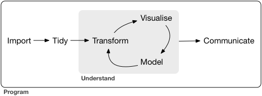
As a way to spead up the flow of importing data to visualizing data (see image), the process of importing voter registration data was automated with a web-scrapping process. In turn, this automation allows for futher visualizaitons to be created with real-time data, without the step of a manual import. Using this method, two web apps were created to generate visualizaitons of elections data: NC Elections Explorer (nc_final.R) and ncVis. NC Elections Explorer is an interactive histogram, where users can change the variable on the x-axis, and map additional variables to different visual cues like color and faceting. ncVis is an interactive map, where choropleth maps colored at the precinct level are generated by user-defined voter demographics.