
| 样式说明 | Gif 图 |
|---|---|
| 下划线 |  |
| 下划线2 | 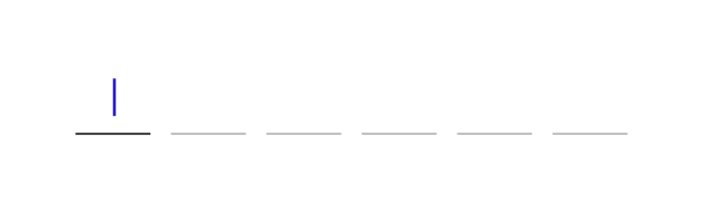 |
| 下划线密文 | 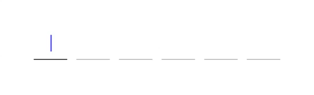 |
| 边框 | 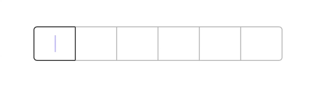 |
| 边框2 | 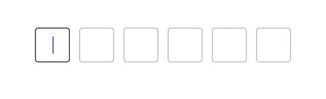 |
| 边框3 | 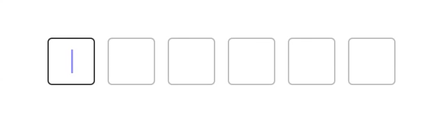 |
- 自定义的验证码、支付密码输入文本框,支持明文、密文输入等
- 支持内容的验证错误处理
支持的布局样式
enum Style {
    /// 分割下划线
    case splitline
    /// 分割边框
    case splitborder
    /// 连续边框
    case followborder
}
在属性参数对象 KeenCodeUnitAttributes 中可查看支持定制的参数属性
/// 视图背景色 默认 white
public var viewBackColor: UIColor = UIColor.white

/// 样式 默认 splitline
public var style: KeenCodeUnitAttributes.Style = .splitline

/// 位数 默认 6 位
public var count: Int = 6
/// 控件间隔 默认 12 pt  style 为 followborder 失效
public var itemSpacing: CGFloat = 12
/// 控件左右边距 默认 15 pt
public var itemPadding: CGFloat = 15
/// 默认情况下首个控件是否高亮显示 默认 true
public var isFirstAlive: Bool = true
/// 是否单个高亮 即仅针对获取焦点的控件高亮 默认 false 其中 style 为 followborder 失效
public var isSingleAlive: Bool = false
/// 内容是否自动填写 默认 true
public var isAutoFillin: Bool = true
/// 文本是否加密 默认 false
public var isSecureTextEntry: Bool = false

/// 文本颜色 默认 black
public var textColor: UIColor = .black
/// 文本字体 默认常规 15pt
public var textFont: UIFont = UIFont.systemFont(ofSize: 15, weight: .regular)

/// 光标颜色 默认 blue
public var cursorColor: UIColor = .blue
/// 光标宽度 默认 1.6pt
public var cursorWidth: CGFloat = 1.6
/// 光标高度百分比 即占视图高度的百分比 默认 0.5
public var cursorHeightPercent: CGFloat = 0.5

/// 下划线高度 默认 1pt
public var lineHeight: CGFloat = 1
/// 下划线圆角 默认 高度 * 0.5
public var lineRadius: CGFloat = 0.5
/// 下划线颜色 默认 lightGray
public var lineColor: UIColor = .lightGray
/// 下划线高亮颜色 默认 black
public var lineHighlightedColor: UIColor = .black
/// 下划线错误颜色 默认 red
public var lineErrorColor: UIColor = .red

/// 边框高亮时是否视图呈现出覆盖完全 默认 true 仅针对 '连续边框' 样式有效
public var isSingleCoverAll: Bool = true
/// 边框宽度 默认 1pt
public var borderWidth: CGFloat = 1
/// 边框圆角 默认 4pt
public var borderRadius: CGFloat = 4
/// 边框颜色 默认 lightGray
public var borderColor: UIColor = .lightGray
/// 边框高亮颜色 默认 black
public var borderHighlightedColor: UIColor = .black
/// 边框错误颜色 默认 red
public var borderErrorColor: UIColor = .red/// 方式 1 通过代理配置属性参数、输入回调等
let rect = CGRect(x: 30, y: 200, width: CGFloat.screenWidth - 60, height: 44)
codeUnit = KeenCodeUnit(
frame: rect,
delegate: self
)
.addViewTo(view)
/// 方式 2 通过闭包处理输入回调
let attr = KeenCodeUnitAttributes()
codeUnit = KeenCodeUnit(
frame: rect,
attributes: attr,
callback: { codeText, complete in
if complete {
/// 验证输入的是否为指定内容, 不是的话给出错误处理
if codeText != "202103" {
self.codeUnit.verifyErrorAction()
}
print(codeText)
}
}
)
.addViewTo(view)
/// 方式 3 通过闭包处理输入回调
var attr = KeenCodeUnitAttributes()
attr.style = .followborder
codeUnit = KeenCodeUnit(
frame: rect,
attributes: attr
)
.addViewTo(view)
codeUnit.callback = { (codeText, complete) in
if complete {
/// 验证输入的是否为指定内容, 不是的话给出错误处理
if codeText != "202103" {
self.codeUnit.verifyErrorAction()
}
print(codeText)
}
}/// 属性参数 可选 不设置取默认值
/// - Returns: 属性对象
func attributesOfCodeUnit(for codeUnit: KeenCodeUnit) -> KeenCodeUnitAttributes
/// 输入回调事件 优先级高
func codeUnit(_ codeUnit: KeenCodeUnit, codeText: String, complete: Bool)具体可下载查看源码实现
platform :ios, '9.0'
use_frameworks!

target 'TargetName' do

pod 'KeenCodeUnit'

end
iOS版本要求9.0+Swift版本要求5.0+
QQ: 2209868966 邮箱: chongzone@163.com
KeenCodeUnit is available under the MIT license. See the LICENSE file for more info.