Add mobile friendly layout #255
Conversation
|
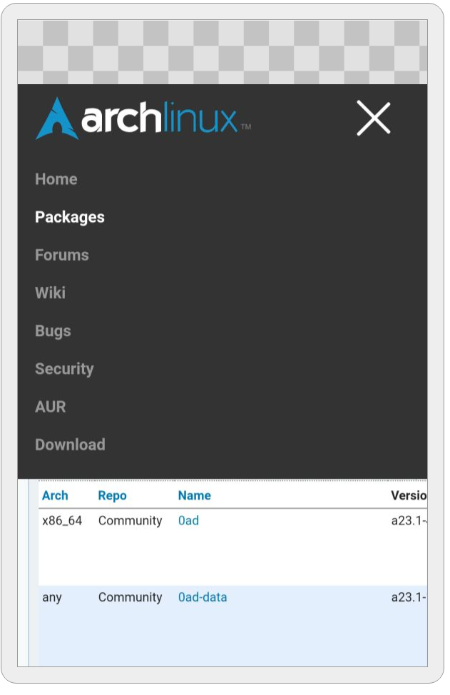
Thanks for the PR, playing with it right now. As a right handed I have a hard time selecting the right menu. I think it should be possible to make the whole "width" clickable. |
|
Good point, fixed it in cbd3079. Also made the nav bar stick to the top on mobile and overall more user friendly. |
This tag is essential for a mobile friendly layout. See
https://developer.mozilla.org/en-US/docs/Mozilla/Mobile/Viewport_meta_tag
for more info.
The markup is added before the actual archnavbarlist to make it possible
to select said list via the CSS sibling selector depending on hamburger
state/class.

Note that this commit removes the minium body width of 650px.
A new JavaScript file base.js is introduced and included in the base
template so the hamburger button will work on every page.
- Make navigation bar stick to top on mobile.
- Increase font size and spacing of navigation entries on mobile and
increase their clickable area.
- Expanded mobile navigation now spans the entire height.
 Phosphenius
force-pushed
the
responsive_layout
branch
from
Phosphenius
force-pushed
the
responsive_layout
branch
from
cbd3079
to
b33d468
Compare
It makes more sense for footer and devnavbar to be siblings of content, and not
children. Also, this step makes it way easier to properly layout everything
using flexbox instead of the outdated float mechanism.
- Layout switches arrangement of content depending on screen width using
flexbox
- Enable word-breaking for news articles. This is necessary because long words
like directory paths might otherwise overflow on small screen widths.
- The contents of the packages page are in correct order but there are
still fixed widths which mess up the layout on small mobile devices.
This is to prevent the headlines from overlapping with the article
timestamp.
- Every nav-sidebar items needs to be wrapped in a container to make
proper styling possible.
- nav-siderbar items will appear in columns of 2 or 3 depending on
available screen width on mobile.
This way the navbar content won't span the entire screen width on wide
monitors.
Table will be reformatted on mobile devices following the technique
described here: https://css-tricks.com/responsive-data-tables/
|
I think I'm mostly done... there are still a few rough edges here and there like the package detail page but for the most part things are kinda looking good on mobile. Please note that I also changed the desktop view a bit: I gave the entire page a maximum width so it won't span the entire screen width on (ultra)wide monitors (it even makes a difference on 1920x1080 already). |
Phosphenius
changed the title
|
@jelly what do you think? |
|
LTGM? The website right now is horrible to use on a mobile phone |
|
@jelly are there any plans to merge this or work on a mobile friendly layout? The current site really isn't a pleasure on mobile right now. |
I'll have to check this out after a rebase, the navbar menu should be made responsive in this project as that is now the "upstream" for it. Although archweb does not use it yet. The other changes I'll have to rebase and review. |
So far I've only done a hamburger button menu but I thought I'd better get early feedback so I don't have to change everything later.
I'll edit here to keep track of what has been done and what I'm working on.
Rel: #212