This repository has been archived by the owner on Sep 6, 2021. It is now read-only.
Extension Icon Guidelines
In Brackets, icons are used to:
- leverage globally understood visual concepts, or where icons usage is more conventional than text
- save space by using an easily understood symbol, where localization or text orientation is constrained direct the user visually and break down or differentiate elements (i.e. feature lists)
- enforce consistency within the application
- make the interface visually engaging.
- Use simple shapes that are not too detailed, use as less anchor points as possible
- Make sure it's flat i.e. without gradients, highlights, or shadows
- The corners are slightly rounded
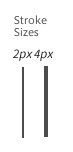
- Use thinner lines rather than thicker lines
- Try to use SVG instead of PNG.
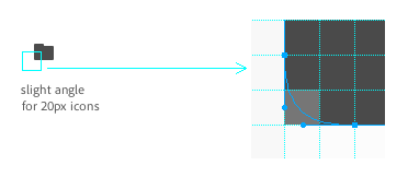
- A single icon is 24px × 24px with 3px padding so that the largest solid square you should have is 18px × 18px.
- For sprites use a 24x24 grid.
The icon should be #BBBBBB by default.
- Inactive/disabled state has an opacity of 0.4 set in CSS on the default icon
- Green (#91CC41) for "everything is okay right now"/success state
- Blue (#78B2F2) for on/active state
- Yellow (#E3B551) for warning state
- Red (#F74687) for error state.
###Icon Template
Download Extension Icon Template SVG
###CSS Example
#extension-name-icon {
    background-image: url(extension-name-sprite.svg);
}

#extension-name-icon.active {
    background-position: 0 -24px !important;
}
Ping @larz0 if you need help with your extension icon.