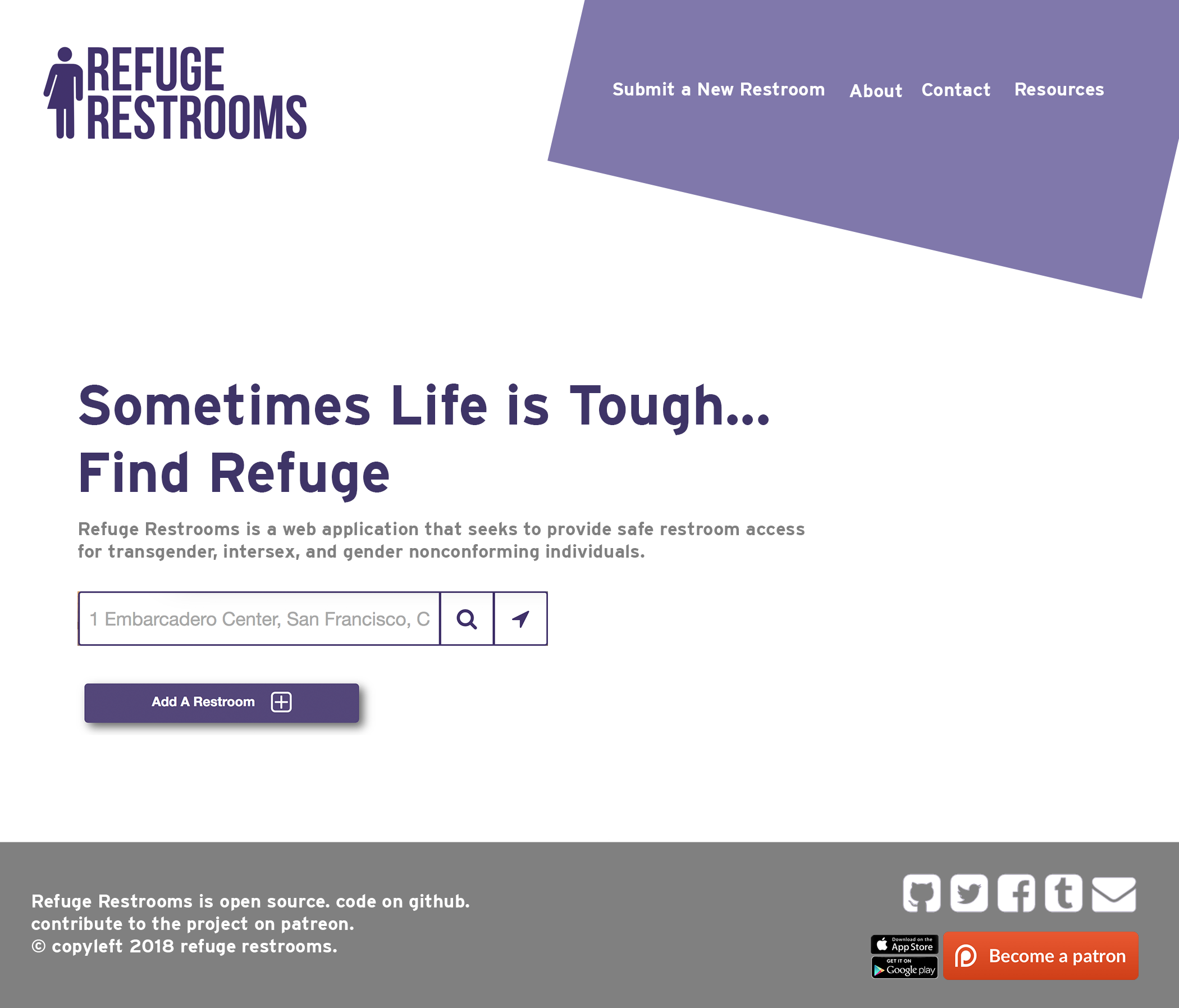
Mocking up the Refuge Restrooms re-design with web technology
This repo is based on the re-design by @fionawhittington in PR #2 over at the assets repo. This repo is a mini project to get the static mockup implemented as a working web page using HTML and CSS. Doing so should make it easier to understand how to bring the visuals from the static design to an actual implementation in the web app.
In other words, this is both a proof-of-concept, and a half-way step toward implementing the re-design in the Refuge Restrooms web app.
This is currently being mocked up in Firefox using Responsive Design Mode (Ctrl + Shift + M).
The Responsive Design Mode window I am using is fixed at 1050 x 898*, which is exactly half the size of the static mockup.
The Responsive Design Mode sub-window is scrolled to where its top pixel is at the top pixel of my Firefox tab.
I have the static mockup open in another tab, zoomed in at 50%.
I can compare pixel-per-pixel how close my web mockup matches the static mockup by switching back and forth between these two tabs.
Eventually, this can be enhanced with responsive design techniques. This is only for the splash page at the moment, as other pages have not been mocked up quite yet.
* (I am working at a page size of 1050 x 898, because I don't have a monitor wider than 2100 pixels;
Furthermore, one of the most common screen resolutions on the web is still 1366x768[1], so it's good to have a design that works on a 1366px wide display.
As mentioned above, responsive design techniques can make this layout work at any screen size. I just needed a set of dimensions to start with.)