
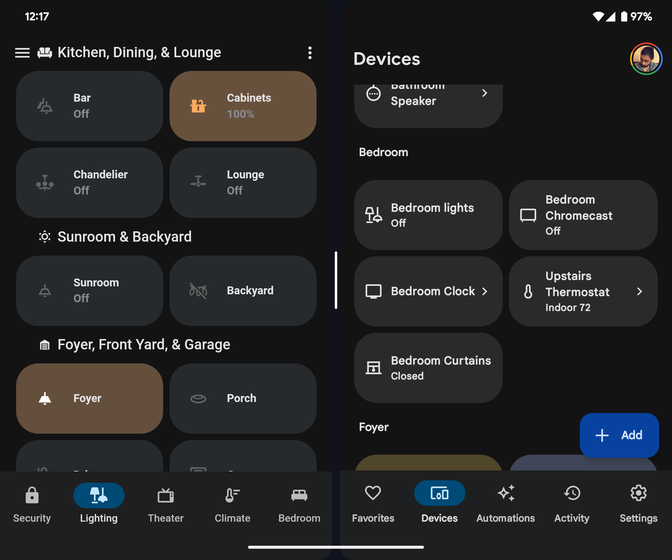
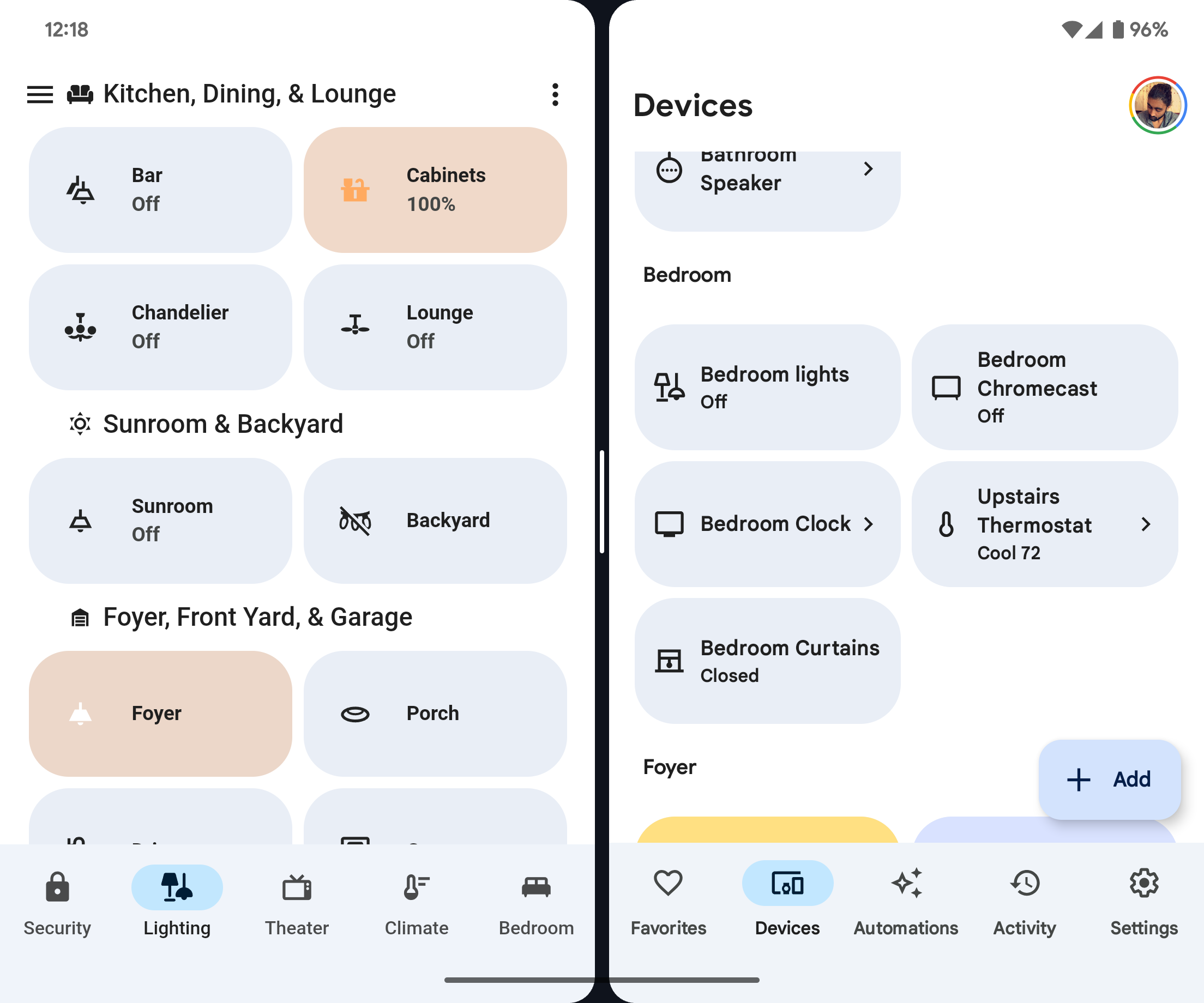
Themes for Home Assistant influenced by Material You by Google on Android.
This theme aims to match the styling of the Google Home app as closely as possible, so it may change over time as the style of the Google Home app changes. It also aims to implement Material You redesigns of elements.
Relies on card-mod for toolbar modifications, other Material You component redesigns, and Material You coloring. If you have card-mod installed and do not want these changes to apply, use the "No Mod" versions of this theme.
Don't like the blue accents? You can choose a different Material You base color! See below for more. Also requires card-mod.
This theme also includes "Transparent Card" versions with card backgrounds that match the view background.
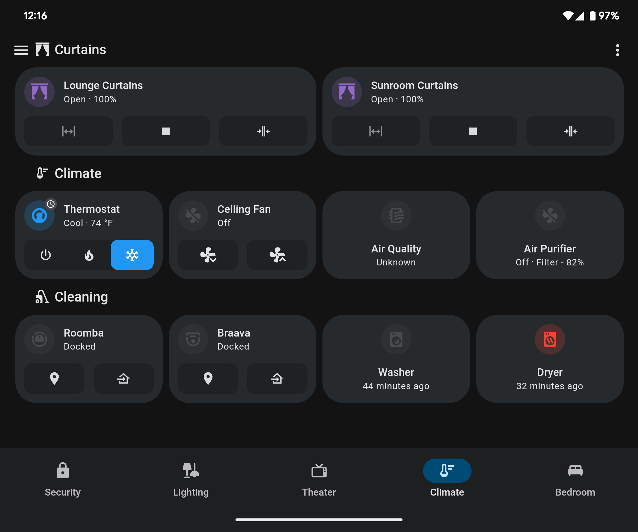
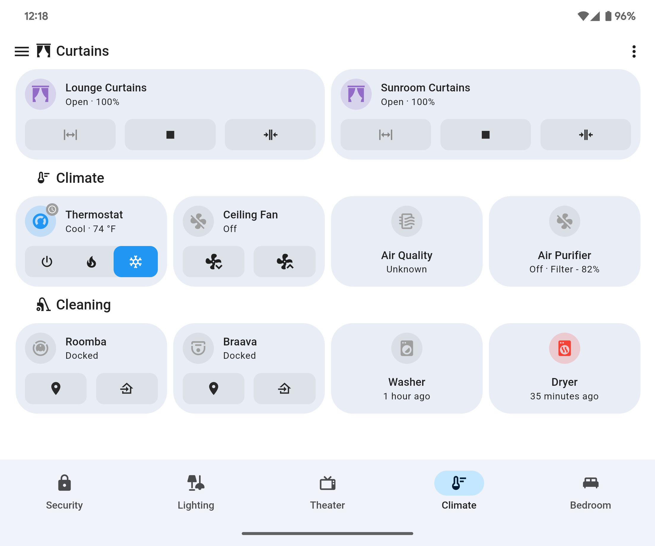
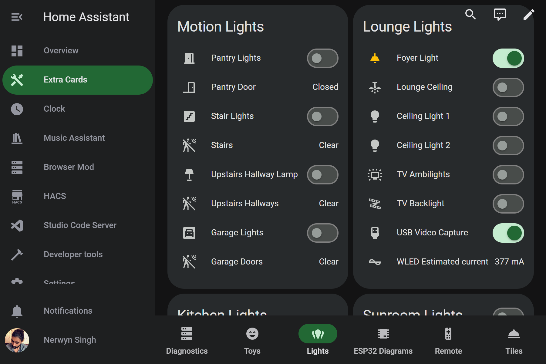
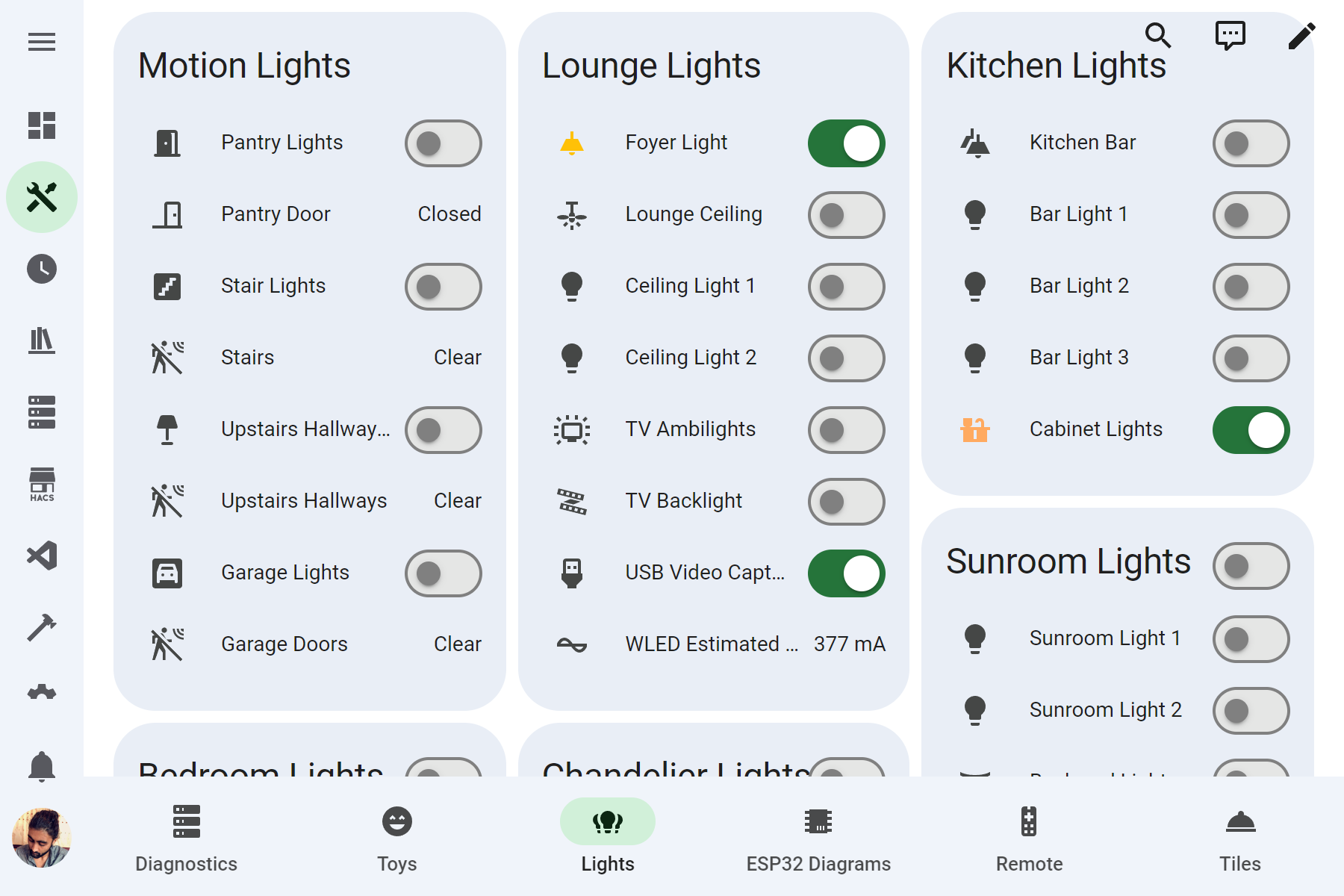
Light cards made using Big Slider Card.
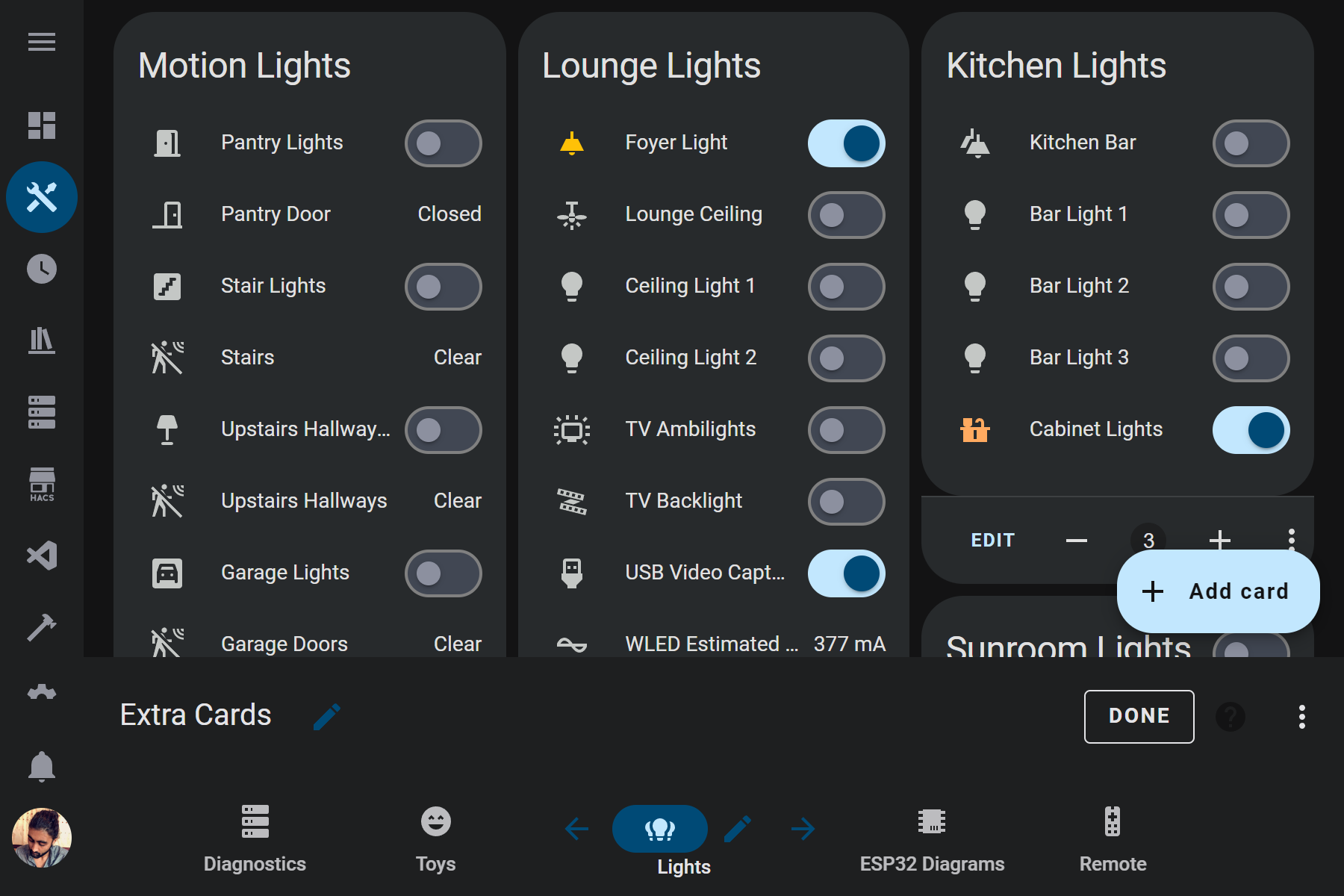
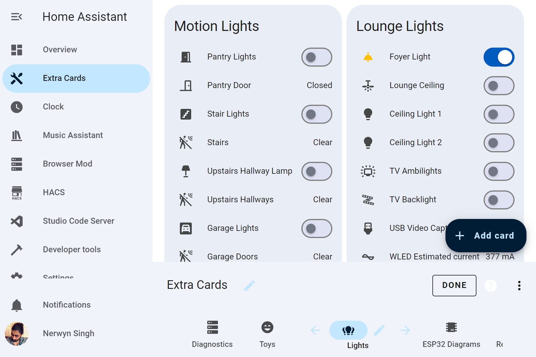
This theme is super-charged by card-mod! Using card-mod many components have received Material You design upgrades.
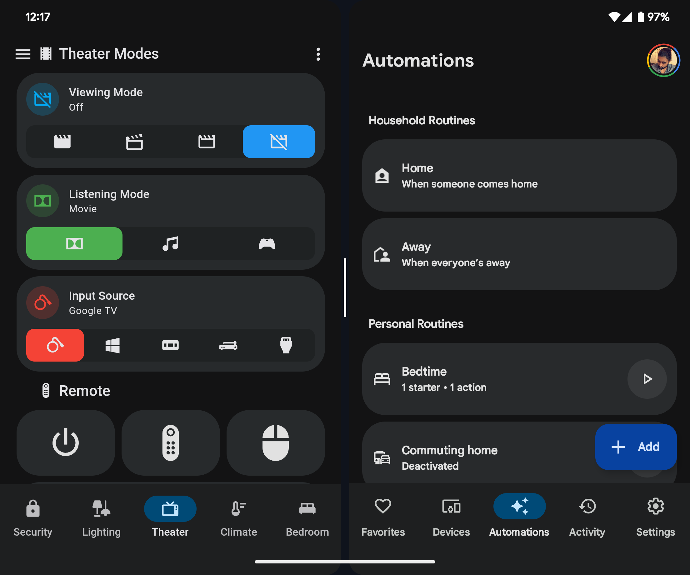
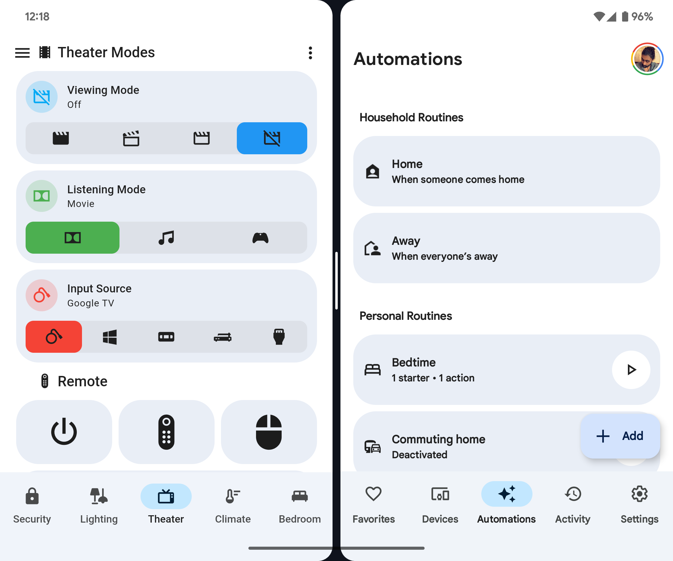
Redesigns the toolbar and sidebar buttons to follow Material You navigation component guidelines.
Separates out the sidebar toggle and dashboard menu (small width screens), and action items (large width screens) from the navigation toolbar into a separate top app bar.
- Non-view buttons appear at top of screen near their original locations.
- Buttons disappear when not scrolled to the top of the view.
- Buttons hover over the top of the view rather than the top app bar taking up space to give users the option to keep them as hover elements, or to create their own header using a card like markdown card or button-card as is done in the screenshots.
- Converts the header toolbar to a footer.
- Removes the default selection bar and ripple.
- Spaces the view icons evenly along the entire toolbar.
- WARNING: Subviews must be placed at the end of the toolbar for the view tab count to be correct, otherwise the view tabs will end up smaller than expected.
- Adds view names below the view icons.
- Highlights the current view with a colored icon and background behind the icon.
- Transition animation on view icon background when selected.
Desktop sidebar expanded and mobile.
- Icon and background of current view now uses primary and accent colors.
- Transition animation on view icon background when selected.
Desktop sidebar collapsed.
- Background of current view now uses primary and accent colors.
- Current view icon background is a circle to match Material You example of a navigation rail menu without labels.
- Track now encompasses thumb.
- Removes the default ripple in favor of a thumb that changes size when used.
- Uses primary and accent colors for the switch thumb and track.
- Adds a 12px margin to each side of the view to match the Google Home app.
- Add card button updated to better match the extended FAB specification.
If you do not want these changes, use the "No Mod" versions of the theme.
This theme supports Material You color theming! Create a helper template sensor named Material Rounded Base Color that returns the hex code of your preferred base color. The accent and primary color will be calculated using it, retaining your color's hue and saturation but altering it's luminance.
To create a template sensor helper:
- Navigate to
Settings>Devices & services>Helpers. - Click
+ CREATE HELPER. - Click
Template. - Click
Template a sensor. - Name the sensor
Material Rounded Base Color. The sensor entity ID should besensor.material_rounded_base_color. - Enter your Material You base color as a six digit hex code, like
238636or#db4437. You can also use a template to read a hex code from the state or attribute of a different entity, like{{ states("sensor.pixel_fold_accent_color") }}. - Click
SUBMIT.
You can also choose user specific colors by creating a sensor named Material Rounded Base Color Your Name, with your name being your person name as it appears on the Home Assistant people page. The sensory entity ID should be something like sensor.material_rounded_base_color_john_doe.
If you are using the Home Assistant Android companion app, you can enable the accent color sensor in the companion app settings to use your phone's Material You accent color as the theme base color:
- Navigate to
Settings>Companion app. - Click
Manage sensors. - Scroll down to the section titled
Dynamic colorand clickAccent color. - Toggle
Enable sensoron. It should now return your phone's Material You base color as a hex code.
NOTE: Card mod does not support all Home Assistant frontend elements like the developer tools and settings pages, and thew view configuration, add card, edit card configuration, and assist dialogues. These pages will still use the theme default colors on parts of the UI.
- Navigate to HACS (install from here if you do not have it yet).
- Navigate to
Frontend. - Click
+ EXPLORE & DOWNLOAD REPOSITORIESand search forMaterial Rounded Theme. - Open this repository in HACS and click
DOWNLOAD. - Refresh Home Assistant.
- Navigate to your Profile, and select
Material Roundedunder Theme along with your preference for light or dark mode.
Use Big Slider Card to create Google Home style button/slider cards for light entities. Use the following style settings to match the screenshots:
colorize: true
show_percentage: true
bold_text: true
height: 88
And for lights that do not have brightness control:
color: sandybrown
show_percentage: false
bold_text: true
height: 88
max: 0Check out Material Symbols to use updated material icons, as shown in the screenshots!
This theme was initially modified from the Graphite theme, as it was my favorite Home Assistant theme on HACS before I created this one. Therefore, it may contain some legacy variables from it.
Due to the multiple versions and complexity of this theme, I have split it into multiple CSS and yaml files and created a Python git pre-commit build pipeline to compile all of the files into a single Home Assistant theme file. You can either run this build pipeline by making a git commit (not to the main repo of course) running the file build.sh, or running the pre-commit.py Python file.
Four versions of a theme are created per base theme - with card mod, without card mod, transparent cards with card mod, and transparent cards without card mod. The no card mod versions of theme have the card-mod-theme fields removed and will have no design upgrades or custom colors. The transparent card versions of the theme use the same color for the background and cards, making them appear transparent (true transparency breaks overlays like dropdowns).
Any files under common that end in .yaml are treated as card-mod-*-yaml fields in the themes, and files ending in .css contain the actual card-mod CSS. Different overall version of the theme are included in separate folders, such as material_rounded. CSS files are copied into the card-mod yaml fields using jinja2 templates, allowing for repetitive styles that go in different shadow roots to all source from the same file.
The common folder also includes hex2hsl.jinja - a hex to HSL color formula ported to jinja2 for transforming user defined base colors into HSL. The HSL base color is used for calculating primary, accent, and other custom colors. How these custom colors are defined and used is determined at the theme folder level in user_colors.jinja. If possible, I would like to instead use Material You's HCT color system, but it would have to be ported to jinja2 along with a HCT to hex/rgb/hsl/etc function.