A storybook-based component library leveraging the Tailwind-Snowball plugin. The intent is to create a component library similar to TailwindUI, but with the ability to change the color palette and appearance through TailwindCSS configuration files.
The built storybook is hosted on GitHub Pages at https://lastcallmedia.github.io/snowball.
Whenever a commit is pushed to the main branch, a new version of the storybook is published. This is handled through the commited Build and Deploy GitHub Actions workflow.
All dependencies come from NPM. Using the yarn package manager, run
yarn installCurrently, the different TailwindCSS themes get built separately form webpack which runs the storybook. Each theme gets built individually. This is not a convenient process, and would be a great place for a PR in order to streamline this process.
cd ./src/themes/{THEMENAME}
npx tailwindcss -i ./main.css -o ./../../../public/themes/{THEMENAME}/output.css --watch
Run storybook in the hot-reloading development mode that allows for easy component development
yarn storybookBuild a static storybook site (used for artifacts such as GitHub Pages)
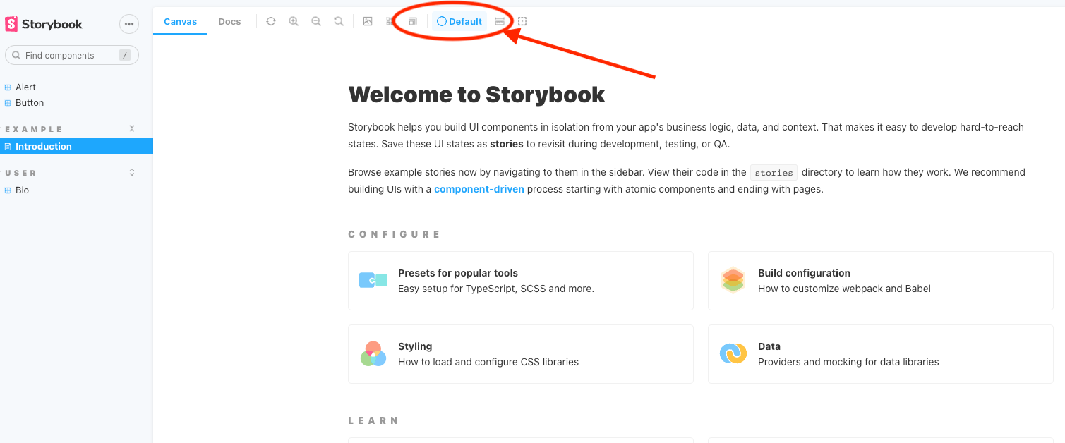
yarn build-storybookThe theme switcher is in the top bar. Click the theme selector, and choose your theme from the dropdown.
Only themes with built CSS will function.
The functionality for switching the theme lives in a custom decorator, located at ./.storybook/decorators/TailwindThemeProvider.js, and used in ./storybook/preview.js, where the decorator is used in decorators, and the themes and their CSS files are provided in globalTypes.