
Popover.js is a cross-browser, mobile compatible popover that can be easily customized and extended.
See the live demo here.
//Normal popover initialization
$(selector).popover([methods] or [config]);

//Options popover initialization
$(selector).optionsPopover([methods] or [config]); $("#exampleSelector").popover({
id: "exampleSelector",
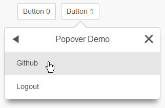
title: "Popover Demo",
contents: "<p>test</p>",
fontColor: "#000",
borderColor: "#000",
backgroundColor: "#000",
onCreate: null,
onVisible: null,
childToAppend: null,
keepData: false,
disableHeader: false
}
Info:
* id - When passed for initial menu, id must be the same as the id/class used in selector.
* eg) "exampleSelector"
*
* title - Title to be displayed on header.
*
* contents - popover: An html string to be inserted.
* - optionsPopover: An array of row data.
* //TODO: Document more.
*
* backgroundColor - Sets the background color for all popups. Accepts hex and color keywords.
* eg) "#000000", "black", etc.
*
* fontColor - Sets the font color for all popups. Accepts hex and color keywords.
* eg) "#000000", "black", etc.
*
* borderColor - Sets the border color for all popups. Accepts hex and color keywords.
* eg) "#000000", "black", etc.
*
* keepData - Boolean that indicates if header and content should be cleared/set on visible.
* WARNING: MAY BE REMOVED IN FUTURE VERSIONS.
* eg) truthy or falsesy values
*
* childToAppend - A documentFragment or dom element to be appended after content is set.
* WARNING: MAY BE REMOVED IN FUTURE VERSIONS.
* eg)
*
* onCreate - A function to be called after popover is created.
* eg) function(){ console.log("popover has been created!"); }
*
* onVisible - A function to be called after popover is visible.
* eg) function(){ console.log("popover is visible!"); }
*
* disableHeader - Boolean that indicates if a header should not be used on parent listener.
* eg) Truthy/Falsey values $("#exampleSelector").popover("methodName", argument1, argument2 ...);
Info:
* [Internal] - Functions needed for setup/initialization.
* _popoverInit - Internal function used to setup popover.
* Arguments: options_config, popover_instance
* _optionsPopoverInit - Internal function used to setup optionsPopover.
* Arguments: options_config, popover_instance
* [Public]
* disableHeader - Function used to disable header for a popover instance.
* Arguments: popover_instance
* enableHeader - Function used to enable header for a popover instance.
* Arguments: popover_instance
* lockPopover - Function used to lock all popovers. Prevents popover from opening/closing.
* Arguments: none
* unlockPopover - Function used to unlock all popovers.
* Arguments: none
* addMenu - Function used to add a new menu. Menus can be accessed by all popover instances.
* Arguments: id, title, contents
* closePopover - Function used to close popover.
* Arguments: none
* [Private] - Note: Only use if you have to.
* _getPopoverClass - Function used to return internal Popover class.
* Arguments: none
* $(document).on("popover.created", function () {
console.log("LOG: The popover has been created.");
});
Info:
* Triggers: Currently all events are namespaced under popover.* This may change in future versions.
* popover.created - Fired when popup is created and placed in DOM.
* popover.listenerClicked - Fired when root popup listener is clicked.
* popover.action - Fired when a menu changes.
* Arguments: DOM Element causing action.
* popover.visible - Fired when popover is visible.
* popover.updatePositions - Fired when left and top positions are updated.
* popover.resize - Fired when popover is resized.
* popover.closing - Fired before popover closes.
* popover.setContent - Fired after popover's contenet is set.- IE 9+
- Chrome ?+
- FF 3.6+
- Android 2.3+
- iOS 4+
- Twitter: @kellyje
- Email: kellyje@outlook.com
Licensed under the MIT License.