The picture element is an HTML element for declaring images based on different screen sizes or viewport without the need of writing CSS media queries. It takes in two properties, the —<source> tag which makes use of the srcset property to specify different images based on different screen sizes and a compulsory <img> tag that acts as a fallback image in case the browser doesn't support the picture element.
There are a few use-case scenarios in which the picture tag can be very useful, below are three examples of these cases.
- Image type support
- Image width
- Saving Bandwidth
<picture>
   <source media="(min-width: 768px)" srcset="desktop-image.gif" />
   <source media="(min-width: 500px)" srcset="tablet-image.png" />
   <img src="mobile-image.png" alt="Banner image" />
</picture>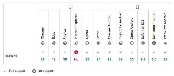
Source: MDN Docs