Home
This Wiki documents AvalonDock controls based on screenshots from their Generic User Interface (UI), as well, as class diagrams and pointers to source file definitions (see Navigation on right side of this page).
This information should be useful for implementing new features or finding and fixing bugs.
Additional feedback on corrections, additions, suggestions are always welcome 👍 .
AvalonDock provides a system that allow developers to create customizable layouts using a window docking system similar to what is found in many popular integrated development environments (IDEs).
AvalonDock adheres to an MVVM design. The Model is represented by the classes contained in the AvalonDock.Layout namespace.
The main layout classes are:
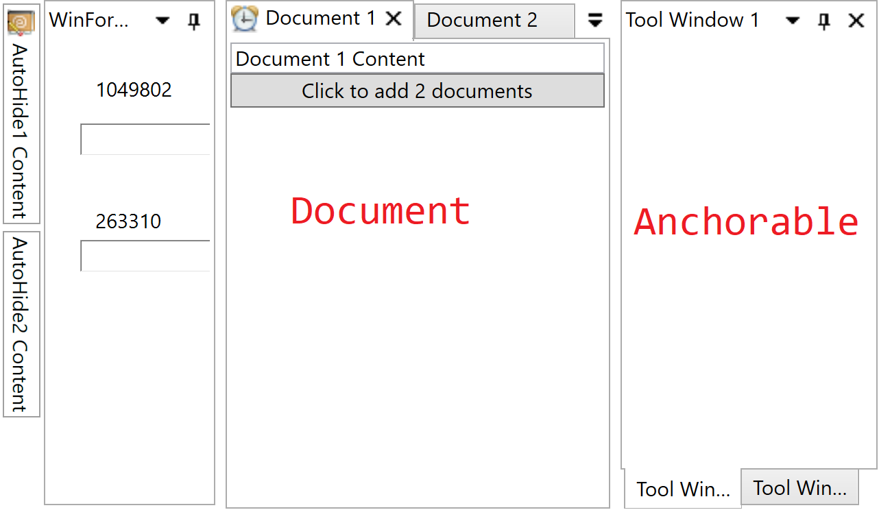
| Anchorable | Document |
|---|---|
| LayoutAnchorable | LayoutDocument |
| LayoutAnchorablePane | LayoutDocumentPane |
| LayoutAnchorablePaneGroup | LayoutDocumentPaneGroup |
The AvalonDock.Layout namespace contains layout elements from a layout model that is used directly in XAML (within the DockingManager) to describe how the layout is composed.
Review the XAML in each MainWindow of a demo applications folder and read Visual Tree Root versus Layout Tree Root to get a feel for how these views can be defined.
The view is represented by the classes contained in the AvalonDock.Controls namespace; these classes are a set of stylizable controls that show the user controls. The names of the view controls typically end with Control and correspond to a layout model class (for example, LayoutAnchorableControl is the view control that corresponds to LayoutAnchorable, which is the model element).
The DockingManager, which is contained in the AvalonDock namespace, uses various classes (such as the LayoutItem and its derived classes) to perform the role of the ViewModel, preparing the model to be consumed by the view.
The way in which a view is created is usually starting with a model and continues with the creation of an appropriate control for that model. This association is implemented in the UIElement DockingManager.CreateUIElementForModel() method, which calls the constructor of a control class with the given model. The constructor of each control stores the model as private member for later usage and manipulation.
Every control exposes a Model property that allows traversal of the model structure towards parents and root elements:
-
publicILayoutElement Model { get; } (see also LayoutElement)
The result of this concept is a Layout Model Control Graph that has to be maintained durring AvalonDock's livetime.
The DockingManager class is the core control of AvalonDock. Its Layout property contains the layout composition that is represented by the classes in the AvalonDock.Layout namespace. The class arranges the panes it contains and also handles auto-hide windows and floating windows (panes in turn contain, directly or indirectly, the two types of "content" elements, namely, LayoutAnchorable and LayoutDocument elements). The DockingManager class also handles saving and restoring layouts.
Among other properties, the DockingManager class provides several Template properties, for example:
| Anchorable | Document |
|---|---|
| AnchorableTitleTemplate | DocumentTitleTemplate |
| AnchorableHeaderTemplate | DocumentHeaderTemplate |
| ... | ... |
These Template properties and their customized templates allow designers and developers to specify the template for the elements contained in the layout.
The layout element classes are used within the layout model held in the Layout property of the DockingManager. The fundamental content-containing classes in AvalonDock are:
both of these classes derive from the LayoutContent class, which determines whether an element:
- can close,
- float (be dragged and transformed into a floating window), etc.
An anchorable is typically the container of application controls and can be dragged away from its container pane (LayoutAnchorablePane) and be re-positioned into another pane. Anchorables are always contained in a pane, which can be either be a LayoutAnchorablePane or a LayoutDocumentPane, whereas documents (class LayoutDocument) can only be contained in a LayoutDocumentPane. Anchorables can also be dragged to a border of the parent DockingManager, which causes them to appear above, below, to the left of, or to the right of all other anchorables or documents (except for autohide windows; see the LayoutAnchorSide / LayoutAnchorGroup section below for details). Anchorables can also be left in a floating state (LayoutAnchorableFloatingWindow). Unlike documents, anchorables can autohide, where their content collapses to one side of the docking manager and is represented only by a tab (see LayoutAnchorSide and LayoutAnchorGroup).
A document (LayoutDocument class) can be hosted only in a LayoutDocumentPane. This contrasts with the behavior of LayoutAnchorable, which can be hosted both in a LayoutDocumentPane and a LayoutAnchorablePane. Also, unlike anchorables, documents can't be anchored to a DockingManager border and can't be autohidden: they can only be positioned into a LayoutDocumentPane or floated in a LayoutDocumentFloatingWindow.
| LayoutAnchorable | LayoutDocument | |
|---|---|---|
| Container | LayoutAnchorablePane or LayoutDocumentPane | LayoutDocumentPane |
| Floating | LayoutAnchorableFloatingWindow | LayoutDocumentFloatingWindow |
| Drag to another Pane | Yes | No |
| Drag to Border | Yes | No |
| Auto Hide | Yes | No |
A LayoutAnchorableFloatingWindow or a LayoutDocumentFloatingWindow is created automatically when the end-user drags an anchorable over the DockingManager. Floating windows can also be created programmatically using the Float method).
LayoutContent-derived elements (LayoutAnchorable and LayoutDocument) are typically arranged as in a tab control. A LayoutAnchorablePane can be set to autohide and can be dragged over the DockingManager as floating window. A LayoutAnchorablePane can also be anchored to a border of the parent DockingManager (see LayoutAnchorSide for more details).
Unlike a LayoutAnchorablePane, a LayoutDocumentPane cannot be set to autohide or dragged over the DockingManager as floating window (although individual LayoutDocument elements can be floated). A LayoutDocumentPane also can't be anchored to a border of the parent DockingManager.
A LayoutPanel can also contain "pane group" elements (i.e., LayoutAnchorablePaneGroup or LayoutDocumentPaneGroup), which group child panes together and allow various characteristics to be determined, such as the initial width/height the docked group occupies, the initial width/height of floating windows created from content dragged from them, and the orientation of the panes in the group (which is independent of the orientation of the LayoutPanel). LayoutAnchorablePaneGroup represents an element in the layout model that can contain and arrange multiple LayoutAnchorablePane elements, which in turn contain LayoutAnchorable elements. LayoutDocumentPaneGroup represents an element in the layout model that can contain and organize multiple LayoutDocumentPane elements, which in turn contain LayoutDocument elements. The "pane group" classes are primarily used to determine the orientation of the panes they contain.
There is only one visual tree, which has the visual root properties of the DockingManager at its root. Even if a control is placed in a different window (i.e., an autohidden window or a floating window), it always belongs to the same logical tree below the DockingManager. At the same time, there is only one layout tree root implemented in the LayoutRoot.
These 2 root elements are implmented in the below DockingManager properties:
| Layout Tree Root (Models) | Visual Tree Root (Controls) |
|---|---|
LayoutRoot Layout
|
LayoutPanelControl LayoutRootPanel
|
LayoutAnchorSideControl LeftSidePanel
|
|
LayoutAnchorSideControl RightSidePanel
|
|
LayoutAnchorSideControl TopSidePanel
|
|
LayoutAnchorSideControl BottomSidePanel
|
|
LayoutAutoHideWindowControl AutoHideWindow
|
LayoutRoot Layout property of the DockingManager represents the root of the layout model.
The RootPanel property of the LayoutRoot class is set to an instance of the LayoutPanel class.
A LayoutPanel can contain child panes directly (that is, LayoutAnchorablePane and LayoutDocumentPane). Panes in turn contain the actual content (that is, LayoutAnchorable or LayoutDocument elements, both of which derive from LayoutContent). A LayoutPanel can also contain "pane group" instances (i.e., LayoutAnchorablePaneGroup or LayoutDocumentPaneGroup), which group child panes together and allow various characteristics to be determined, such as the initial width/height the docked group occupies, the initial width/height of floating windows created from content dragged from them, and the orientation of the panes in the group (which is independent of the orientation of the LayoutPanel).
The LayoutRoot class provides the same four Side properties as the DockingManager (e.g., LeftSide) do. These side properties are used in conjunction with the LayoutAnchorSide and the LayoutAnchorGroup classes to set up autohide LayoutAnchorable elements along the border of the containing DockingManager.
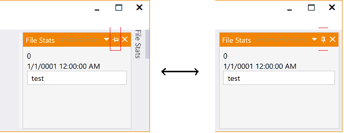
These elements can initially be collapsed to the side to which they are anchored, displaying only a tab, and the "pin" glyph is pointing to the left. If the pin glyph of an autohide anchorable is clicked so that the pin is pointing down, the anchorable is no longer autohidden and remains visible. Only LayoutAnchorable elements can be autohidden.
LayoutAnchorGroup represents an autohidden group of one or more LayoutAnchorable elements that can be anchored to one of the four sides of the DockingManager. To use LayoutAnchorGroup, add LayoutAnchorable elements to it, and add the resulting LayoutAnchorGroup to an instance of LayoutAnchorSide. The resulting LayoutAnchorSide is then assigned to a "Side" property (e.g., LeftSide, TopSide) of the LayoutRoot object held in the Layout property of DockingManager.
LayoutAnchorSide represents a "side" in a DockingManager. To use LayoutAnchorSide, add LayoutAnchorable elements to a LayoutAnchorGroup, and add the resulting LayoutAnchorGroup to an instance of LayoutAnchorSide. The resulting LayoutAnchorSide is then assigned to a Side property (e.g., LeftSide, TopSide) of the LayoutRoot object held in the Layout property of DockingManager.