- Installation
- Project Motivation
- Project Overview
- Project Details
- Dataset
- Results
- Key Insights for Presentation
- Why this project?
- Licensing, Authors, and Acknowledgements
This project uses Python 3 and is designed to be completed through the Jupyter Notebooks IDE. It is highly recommended that you use the Anaconda distribution to install Python, since the distribution includes all necessary Python libraries as well as Jupyter Notebooks. The following libraries are expected to be used in this project:
- Numpy
- Pandas
- Matplotlib
- Seaborn
This is an Udacity Nanodegree project.I was interested in using Prosper Loan Data to better understand :
- Univariate Exploration:
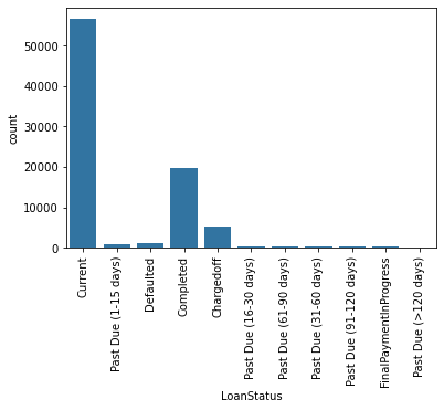
- Loan status
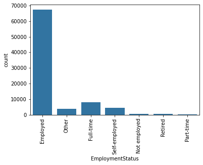
- Employment Status
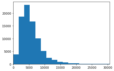
- Stated Monthly Income
- Bivariate Exploration:
- Status and Prosper Rating
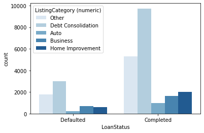
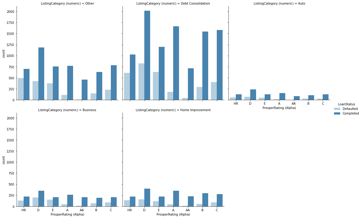
- Credit Start with Listing Category
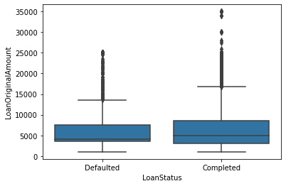
- Loan Status and Loan Amount
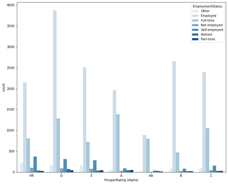
- Prosper Rating and Employment Status
- Multivariate Exploration:
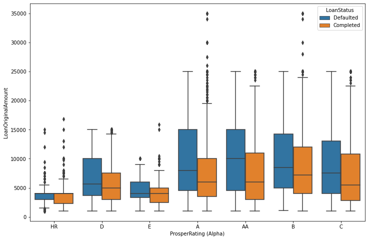
- Rating, Loan Amount and Loan Status
- Credit category, Credit rating and outcome of Credit
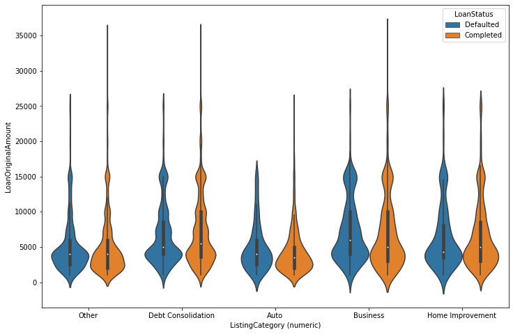
- Amount, Listing Category Loan and Loan Status Interact
This project has two parts that demonstrate the importance and value of data visualization techniques in the data analysis process. In the first part, you will use Python visualization libraries to systematically explore a selected dataset, starting from plots of single variables and building up to plots of multiple variables. In the second part, you will produce a short presentation that illustrates interesting properties, trends, and relationships that you discovered in your selected dataset. The primary method of conveying your findings will be through transforming your exploratory visualizations from the first part into polished, explanatory visualizations.
This project is divided into two major parts. In the first part, you will conduct an exploratory data analysis on a dataset of your choosing. You will use Python data science and data visualization libraries to explore the dataset’s variables and understand the data’s structure, oddities, patterns and relationships. The analysis in this part should be structured, going from simple univariate relationships up through multivariate relationships, but it does not need to be clean or perfect. There is no one single answer that needs to come out of a given dataset. This part of the project is your opportunity to ask questions of the data and make your own discoveries. It’s important to keep in mind that sometimes exploration can lead to dead ends, and that it can take multiple steps to dig down to what you’re truly looking for.
In the second part, you will take your main findings from your exploration and convey them to others through an explanatory analysis. To this end, you will create a slide deck that leverages polished, explanatory visualizations to communicate your results. This part of the project should make heavy use of the first part of the project.
First, you will choose a dataset from the Dataset Options.
Download the Dataset Options file for full details & descriptions from the Resources Tab.
- Click on Resources in the leftmost panel of your classroom
- Click the File Name to start download
Quick List Below:
Dataset Options
- Ford GoBike System Data
- Flights
- Loan Data from Prosper with Prosper Data Dictionary to Explain Dataset's Variables
- PISA Data with PISA Data Dictionary to Explain Dataset's Variables
It’s time to get to the interesting bits. Explore your data and document your findings in a report. The report should briefly introduce the dataset, then systematically walk through the points of exploration that you conducted. You should have headers and text that organize your thoughts and findings. Visualizations in this part of the project need not be completely polished: this is just your own exploration at this point. However, you should still make sure that you adhere to principles of using appropriate plot types and encodings so that accurate conclusions can be drawn, and that you have enough comments and labeling so that when you return to your work, you can quickly grasp your analysis steps.
At the end of your exploration, you probably have a bunch of things that you’ve discovered. Now it’s time to organize your findings and select a story that you will convey to others. In your readme document, you should summarize your main findings and reflect on the steps you took in your data exploration. You should also lay out the key insights that you want to convey in your explanatory report as well as any changes to visualizations, or note new visualizations that will be created to bridge between your insights.
Follow the plans you laid out in the previous step and create a slide deck with explanatory data visualizations to tell a story about the data you explored. You can start with code that you used in your exploration, but you should make sure that the code is revised so that your plots are polished. Make sure that you also pay attention to aspects of design integrity in your revisions.
Though not required, it is highly recommended that you try to get feedback from at least one person before you submit your project. By sharing your work with others, you can get input from a different perspective that catches things that you may have originally missed. Share your slide deck with someone in person and have them provide live feedback on what they get from your slide deck. Alternatively, you can also share your work with your fellow students.
You might need to ask specific questions to prompt your reader. The following questions might be good starters; be sure to follow up or come up with your own questions:
- What do you notice about each visualization?
- What questions do you have about the data?
- What relationships do you notice?
- What do you think is the main takeaway from the slide deck?
- Is there anything that you don’t understand from the plots?
There’s one last thing to do before you submit your project. You should closely read the project rubric.
This data set contains information on peer to peer loans facilitated by credit company Prosper. There are 113,937 loans with 81 variables. For the purpose of this investigation I've taken the following variables: Term, LoanStatus, BorrowerRate, ProsperRating (Alpha), ListingCategory (numeric), EmploymentStatus, DelinquenciesLast7Years, StatedMonthlyIncome, TotalProsperLoans, LoanOriginalAmount, LoanOriginationDate, Recommendations and Investors.
- Most of the loans in the data set are actually current loans. Past due loans are split in several groups based on the length of payment delay. Other big part is completed loans, defaulted loans compromise a minority, however chargedoff loans also comporomise a substanial amount.
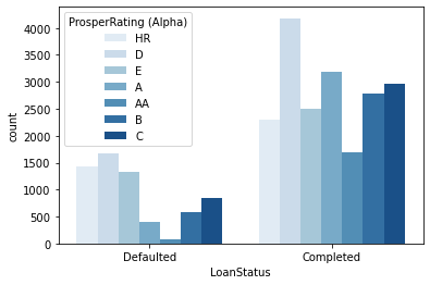
I've chosen key plots with high data-to-ink ratio for the presentation. The plots I've chosen shows distribution of main variables, Loan status, monthly income, Prosper rating and I've tried to tell a story what are major predictors for loan status and Prosper rating variables.
Data visualization is an important skill that is used in many parts of the data analysis process. Exploratory data visualization generally occurs during and after the data wrangling process, and is the main method that you will use to understand the patterns and relationships present in your data. This understanding will help you approach any statistical analyses and will help you build conclusions and findings. This process might also illuminate additional data cleaning tasks to be performed. Explanatory data visualization techniques are used after generating your findings, and are used to help communicate your results to others. Understanding design considerations will make sure that your message is clear and effective. In addition to being a good producer of visualizations, going through this project will also help you be a good consumer of visualizations that are presented to you by others.
Must give credit to Udacity for the data. You can find the Licensing for the data and other descriptive information at the Udacity Website.