UI redesign: compose box #24878
Comments
 terpimost
added
the
redesign
terpimost
added
the
redesign
|
Hello @zulip/design, @zulip/server-compose members, this issue was labeled with the "area: compose", "redesign" labels, so you may want to check it out! |
|
@terpimost I would like to work on this issue can you please assign this to me? |
|
@Ddharmani3 As noted in the contributor guide, please choose an issue with the "help wanted" label. Thanks! |
|
@karlstolley You have been unassigned from this issue because you have not made any updates for over 14 days. Please feel free to reclaim the issue if you decide to pick up again. Thanks! |
|
Has the collapsed compose box & draft behavior been considered as part of the design? I think the current behavior is somewhat confusing, where clicking or ESCing both hides the compose box and creates a draft. It's a bit too easy to accidentally click somewhere and send your message to a draft. My suggestion is that the collapsed compose box should be thought of as having the same state/content of the normal compose box, just condensed and read-only: that is, clicking/ESCing should continue to minimize the box, but the minimzed box should have the first line of text visible instead of the This relates to #18555, but it seems that is more about handling when drafts are stored to the server as opposed to keeping them in the same view when the box is minimized. |
|
The new design for the compose box, discussed here
Work on this issue is being tracked as:
We will likely file additional specific issues as we close out these ones. #28588 also tracks some follow-ups to be filed.
Live demo with the source code on GitHub. Here is the decomposed source code archive (possibly outdated; consult the GitHub links):
compose-decomposed.zip
The css code is split to decomposed areas but all the js code is in a single file. The file isn't big so it is easier to follow the logic of interactions between html and js.
Not all interactions are handled. Prototype is focused on styles and new interactions which are not currently present.
For example it doesn't suggest TAB order but does suggest focus styles on different elements.
The integration is expected to be complex. With clarifications and tuning during the process.
Notes on this interactive prototype
Inline editor
First editor is in not editable state and with a copy button:

Character counter should be enabled once the input reaches the limit (I didn't do that logic for inline editor)

Popovers
Drafts
Drafts button is present in the desktop version, but the counter of drafts should be shown only for the relevant conversations when there is any number. For other than desktop versions we hid this counter due to space limitation.
The space should be enough to fit all the translations of the Drafts keyword, but it is ok to cut it if it doesn't fit.
The maximum displayed number is 99+
Topics
Click on the topics selects the whole input
 . This is intentional, so the user can replace topic with another one.
This prototype assumes that we have feature of naming (no-topic) with General chat in english version. Here is one of the related discussions.
Go to topic button appears in front of the topic/users input field:

Streams
This prototype assumes that we have switcher to DMs with Streams selector:
 . DM should be shortened in the selected state, so input filed of users could be wider.
Banners
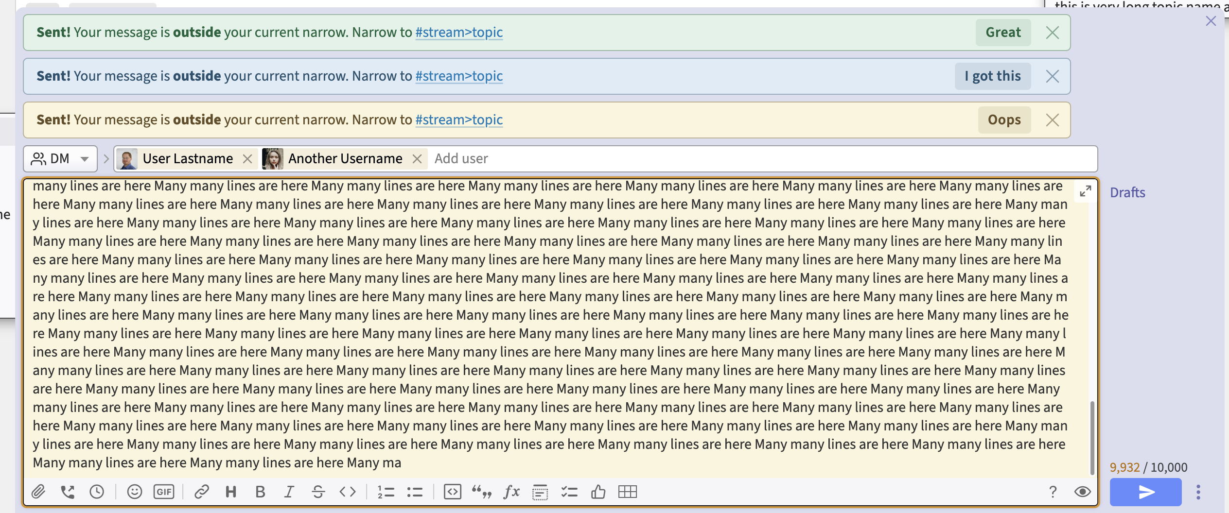
Updated styles of banners is provided. To see them, click on Send button: . Also input 9,500 characters and above 10,000 to see error and warning banners:

Message input field
The message input field is content editable block and not a text area. So many cases of pasting the content are not handled. For example images and their styles. If we are going to show images here their styles should have
width:100%to not extend the compose box width. Or there could be other ways to constrain the width of the message input box.The text was updated successfully, but these errors were encountered: