Feedback about the new design #154
Comments
|
@narimiran thanks for the elaborate feedback, the issues you mentioned involve a few people. I am going to discuss it with the team and will get back to you! |
|
Hi @narimiran, from a copy perspective, I worked closely with Kaushal and Zahary throughout the process. We went through multiple feedback rounds and ultimately had signoff. I'll address your specific comments here:

Happy to discuss copy requests with you and the Nimbus team. Thanks! |
|
Another big one, as pointed out by @tersec on Discord: The new website is completely broken with JavaScript disabled. Unlike the current/old site. |
|
A smaller issue: the logo appears to be stretched out horizontally. |
|
@narimiran Fixes we can make: I: This button might confuse people, I: Roadmap I: What's going on with these symbols between the links I: All other buttons have text of a 14px size. Why is this the only button with 13.33px font size? I: The old design has about 70-character line length. ... One of the first typography rules i I: The en-dash Brand and design elements we cannot change at this time: I: The video on the homepage of the statue I: Why such a large whitespace gap ... I: The font is too large for such a long I: Once again, too much text for a font this large. Or vice versa. I: Compare how bold text in the old design |
|
As requested by @liftlines I'm adding to this thread another issue that was flagged by the Nimbus team, plus the Figma design I put together with the proposed UX improvements that have been implemented on the other BU sites: https://www.figma.com/file/hZEAzWRtAczaoUI6dDGfXF/Untitled?type=design&node-id=607-2&mode=design&t=RMpOevYrrd5tiyWO-0
|


|
A key point for the nimbus site is that the copy needs to reflect all research and development that nimbus does - ie the staking client is but one of several projects that should be presented here - we have light clients, fluffy / portal, verifying proxy etc that all need to become part of this page at some point. Given the mostly unrelated statue takes up more space than anything else, I'm not sure where content will fit, if any. As discussed during a call, this site serves as an entry point to several projects that we want to promote / direct interest towards - this point seems to have been lost during the translation to the new site - ergo, a complete review of the copy probably needs to be made as well - assuming of course this wasn't a deliberate choice, in which case it should have been described as such, with a rationale. It remains hard to follow the work in this PR - here's a good introduction on the basics that ideally would be communicated / written down here so we don't lose track: https://developers.google.com/blockly/guides/contribute/get-started/write_a_good_pr#communicate-2 |
There's no work here :) It is just an issue where I tried to put in one place all things I found "strange" during my quick use of the new site. |
I'm using Vivaldi (which is based on Chrome) on Linux.
I have experienced the 'performance issue' on Vivaldi on Linux. Now I tried to open the page in Firefox on Linux and it is also happening. |
Right, I meant the big breaking PR ;) |
Thanks for raising this issue, it's been resolved. The website will be rendered in light mode when JS is disabled (Docusaurus's default behavior). |
|
I think the outcome here looks more or less like a 5th-grader was asked by the teacher to write a story filling a page so they used triple-width whitespace everywhere .. I'll assume our brand is not about "lack of substance", so .. what is the branding trying to say with all the emptiness / why is it there? Are we sure for example that there aren't simply leftover empty paragraphs from old formatting, space designated for images or something else causing it? There is simply a lot of it, so much that it gets in the way of consuming the site. The "dynamic" involved here is that one has to scroll a lot. Simple example: I open the page on a not-a-small screen and get to see bullet points 3 & 4 only as little number circles - the content is beyond scrolling range and cut in half, if we consider the 4 "highlights" a unit of information / a single "section". The outcome looks haphazard / random - if the whitespace created a "title page" with the heading on its own, one could motivate it (it would need to be balanced somehow, above and below). If the whitespace was design such that the 4 bullet points fit together with the "title page", that would work also. When the whitespace causes us to see the heading and cuts the next section in half, on the first impression of the site, something is amiss. Ditto the timeline - after lots of scrolling, one arrives at the timeline and the text of the timeline is so far from the header that one wonders if this is a new section or just some other random text. |


In this issue I'll try to mention some of the stuff I noticed with the new nimbus.team website that I find problematic. Click on the images for full resolution, if needed.
Let's start with the largest one (not only physically :P):
I get it that the revolving statue is something that all projects have on their homepage and it is something that will probably not change. Having said that:
a) Compare the amount of information that you see in the old website and in the new one. And this is on my 1440p screen with extra vertical space. In the new one you get (a very long) title, two sentences below it, and that's about it.
b) For a project that is proud of its lightness and performance (see the title above the statue), it is very ironic that its website is keeping CPU constantly busy, because of that rotating statue (I've tried it: removing the statue brings CPU back to 0%).
The Github link should point to the Nimbus repo, not the Status Github project.
This button might confuse people, as it might look like it will expand the statue. (And it fortunately doesn't :P)
a) I'm guessing this was tested on a 1080p screen, where this is on the bottom of the page ("Nimbus attributes" are not shown). But as you can see, the design breaks on higher resolution screens.
b) The button works correctly on a computer, but on mobile it doesn't scroll enough (after pressing the button, a half of the statue is still seen).
Why such a large whitespace gap between the title and text?
The font is too large for such a long (four sentences) text. It works for other points, which have 1 or 2 sentences, but here it starts to be overwhelming.
When you click on "three steps", you will see that there are five steps. But even if this is changed, you cannot "get up and running" in ONE of those five steps. You need all of them.
"Read more". Read more about what exactly? One of these four points above? Something else?
And it is something else. Something that on the old side had a link with much more informative text: "See our overview".
The same two errors as mentioned above.
The link text should be changed. Step-by-step guide is not "Get Nimbus". "Read the guide" would be more appropriate.
These look like titles which are missing something. Either links to more information or some text. Or both some text and links to more info.
Here both the link text and the URL it is pointing to should be changed.
This could be split in two rows with 4 items in each row, so all 8 steps are immediately visible. It would mirror that 1-2-3-4 "Nimbus attributes" from above that is also split in two rows.
Once again, too much text for a font this large. Or vice versa.
What's going on with these symbols between the links? If this is just some problem with my computer not having required fonts: I'm probably not the only one.
I've seen that other projects have a dot there, rendered properly.
All other buttons have text of a 14px size. Why is this the only button with 13.33px font size?
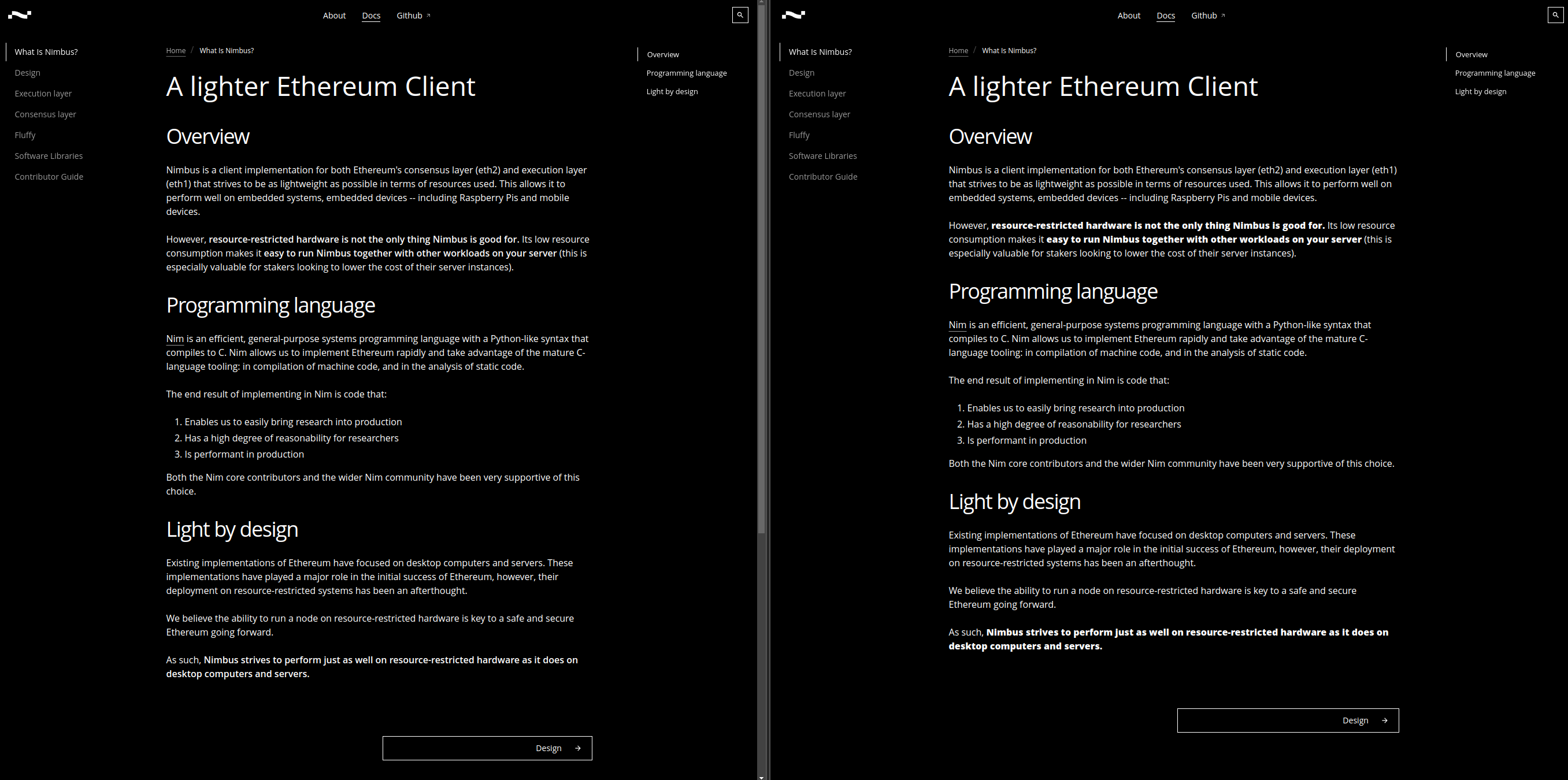
Compare the line length in the old and new design.
The old design has about 70-character line length. The new one has 110-character line length.
One of the first typography rules is that the line lengths should be kept under ~90 characters in length, to improve readability and look more professional.
The en-dash (–, written in markdown as
--) is not rendered properly in the new design.I'm guessing the em-dash (—, written in markdown as
---) would have the same problem.Compare how bold text in the old design really pops out, while in the new one is not that much different that the regular text.
In the old design, when you just quickly scan the page, you immediately notice all three bold sections, while in the new one you probably notice none.
My proposal: change the bold font weight from 600 to 800. This is the result (current design on the left, my proposal on the right):
These are just things from the top of my head that I noticed immediately. I could probably find even more stuff.
That's why I'm very surprised that none of these were caught neither by the design team nor anybody else who looked at any of the sites using the same design template.
Ok, some of these are maybe just my personal preferences and/or me being too nit-picky (it wouldn't be my first time :P) and not real problems, but still: wasting CPU cycles to rotate some oversized statue containing zero information about the "light and performant" project is at least funny, right?
The text was updated successfully, but these errors were encountered: