Skip to content
New issue

Have a question about this project? Sign up for a free GitHub account to open an issue and contact its maintainers and the community.

By clicking “Sign up for GitHub”, you agree to our terms of service and privacy statement. We’ll occasionally send you account related emails.

Already on GitHub? Sign in to your account

Changing the Plot Order to Effectively Gray Out Certain Paths #97

Open
ryanpapetti opened this issue Jul 22, 2020 · 0 comments
Open

Changing the Plot Order to Effectively Gray Out Certain Paths #97

ryanpapetti opened this issue Jul 22, 2020 · 0 comments

Comments

@ryanpapetti
Copy link

ryanpapetti commented Jul 22, 2020

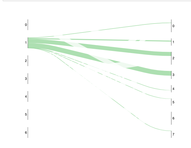
Is there a current way to change the Z-order of the plot? I would like the plot below to have the green lines plot on top of the (almost) transparent ones.
image

Code:

import pandas as pd, numpy as np
raw_sample_data = pd.DataFrame({'source': {0: '0',
  1: '0',
  2: '0',
  3: '0',
  4: '0',
  5: '0',
  6: '0',
  7: '0',
  8: '1',
  9: '1',
  10: '1',
  11: '1',
  12: '1',
  13: '1',
  14: '1',
  15: '1',
  16: '2',
  17: '2',
  18: '2',
  19: '2',
  20: '2',
  21: '2',
  22: '2',
  23: '2',
  24: '3',
  25: '3',
  26: '3',
  27: '3',
  28: '3',
  29: '3',
  30: '3',
  31: '3',
  32: '4',
  33: '4',
  34: '4',
  35: '4',
  36: '4',
  37: '4',
  38: '4',
  39: '4',
  40: '5',
  41: '5',
  42: '5',
  43: '5',
  44: '5',
  45: '5',
  46: '5',
  47: '5',
  48: '6',
  49: '6',
  50: '6',
  51: '6',
  52: '6',
  53: '6',
  54: '6',
  55: '6'},
 'target': {0: '0',
  1: '1',
  2: '2',
  3: '3',
  4: '4',
  5: '5',
  6: '6',
  7: '7',
  8: '0',
  9: '1',
  10: '2',
  11: '3',
  12: '4',
  13: '5',
  14: '6',
  15: '7',
  16: '0',
  17: '1',
  18: '2',
  19: '3',
  20: '4',
  21: '5',
  22: '6',
  23: '7',
  24: '0',
  25: '1',
  26: '2',
  27: '3',
  28: '4',
  29: '5',
  30: '6',
  31: '7',
  32: '0',
  33: '1',
  34: '2',
  35: '3',
  36: '4',
  37: '5',
  38: '6',
  39: '7',
  40: '0',
  41: '1',
  42: '2',
  43: '3',
  44: '4',
  45: '5',
  46: '6',
  47: '7',
  48: '0',
  49: '1',
  50: '2',
  51: '3',
  52: '4',
  53: '5',
  54: '6',
  55: '7'},
 'value': {0: 0.28378378378378377,
  1: 0.20270270270270271,
  2: 0.013513513513513514,
  3: 0.013513513513513514,
  4: 0.47297297297297297,
  5: 0.013513513513513514,
  6: 0.0,
  7: 0.0,
  8: 0.05042016806722689,
  9: 0.10084033613445378,
  10: 0.37815126050420167,
  11: 0.44537815126050423,
  12: 0.008403361344537815,
  13: 0.008403361344537815,
  14: 0.0,
  15: 0.008403361344537815,
  16: 0.1,
  17: 0.058333333333333334,
  18: 0.016666666666666666,
  19: 0.008333333333333333,
  20: 0.0,
  21: 0.0,
  22: 0.7333333333333333,
  23: 0.08333333333333333,
  24: 0.020202020202020204,
  25: 0.09090909090909091,
  26: 0.6464646464646465,
  27: 0.010101010101010102,
  28: 0.050505050505050504,
  29: 0.0,
  30: 0.06060606060606061,
  31: 0.12121212121212122,
  32: 0.3779527559055118,
  33: 0.13385826771653545,
  34: 0.023622047244094488,
  35: 0.28346456692913385,
  36: 0.12598425196850394,
  37: 0.007874015748031496,
  38: 0.047244094488188976,
  39: 0.0,
  40: 0.013333333333333334,
  41: 0.08666666666666667,
  42: 0.12666666666666668,
  43: 0.0,
  44: 0.006666666666666667,
  45: 0.0,
  46: 0.36666666666666664,
  47: 0.4,
  48: 0.34285714285714286,
  49: 0.0,
  50: 0.0,
  51: 0.0,
  52: 0.0,
  53: 0.6285714285714286,
  54: 0.0,
  55: 0.02857142857142857}})


from floweaver import *
raw_sample_data = pd.DataFrame(dispo_stv_data_mapping['Worcester'][0],columns = ['source', 'target', 'value'])
raw_sample_data['source'] = raw_sample_data['source'].apply(str)
raw_sample_data['target'] = raw_sample_data['target'].apply(str)

# sample_data['type'] = 'customer'
sample_data = Dataset(raw_sample_data)
size = dict(width=570, height=300)

# partition_june = sample_data.partition('source')
partition_june = Partition.Simple('source', np.unique(raw_sample_data['source']))
# partition_july = sample_data.partition('target')
partition_july = Partition.Simple('target', np.unique(raw_sample_data['target']))

nodes = {
    'June 2 Clustering': ProcessGroup(sorted(list(set(raw_sample_data['source'])))),
    'July 15 Clustering': ProcessGroup(sorted(list(set(raw_sample_data['target']))))
}

ordering = [['June 2 Clustering'], ['July 15 Clustering']]

bundles = [
    Bundle('June 2 Clustering', 'July 15 Clustering'),
]

source_broken_out_partitions = Partition.Simple('process',sorted(list(set(raw_sample_data['source']))))
target_broken_out_partitions = Partition.Simple('process',sorted(list(set(raw_sample_data['target']))))

nodes['June 2 Clustering'].partition = source_broken_out_partitions
nodes['July 15 Clustering'].partition = target_broken_out_partitions

size_options = dict(width=800, height=640,
                    margins=dict(left=100, right=100))

#to make custom colorings
class MyScale(QuantitativeScale):
    def get_palette(self, link):
        # Choose colour scheme based on link type (here, Employment Job)
        name = 'Greens_9' if link.source == 'June 2 Clustering^1' else 'Greys_9'
#         name = 'Greens_9' if link.source == 'June 2 Clustering^1' else 'Whites_9'
#         print(link);input();print(link.target,link.source,link.type);input()
        return self.lookup_palette_name(name)

    def get_color(self, link, value):
        palette = self.get_palette(link)
        if link.source == 'June 2 Clustering^1':
            return palette(100)
#         IS IT POSSIBLE TO SET VALUE TO FALSE OR NONE?
        return palette(0*value)


sdd = SankeyDefinition(nodes, bundles, ordering, flow_partition = partition_june)
my_scale = MyScale('value')
weave(sdd, raw_sample_data,link_color = my_scale).to_widget(**size_options) #NEARLY PERFECT PLOT BUT DOES NOT HAVE PROPER Z ORDER


Currently, I am subclassing QuantitativeScale as in the docs to only color based on the source. Perhaps it's possible to turn off the links somewhere as well?

Sign up for free to join this conversation on GitHub. Already have an account? Sign in to comment
Labels
None yet
Projects
None yet
Development

No branches or pull requests

1 participant