/
bivariate_map.qmd
233 lines (155 loc) · 6.27 KB
/
bivariate_map.qmd
1
2
3
4
5
6
7
8
9
10
11
12
13
14
15
16
17
18
19
20
21
22
23
24
25
26
27
28
29
30
31
32
33
34
35
36
37
38
39
40
41
42
43
44
45
46
47
48
49
50
51
52
53
54
55
56
57
58
59
60
61
62
63
64
65
66
67
68
69
70
71
72
73
74
75
76
77
78
79
80
81
82
83
84
85
86
87
88
89
90
91
92
93
94
95
96
97
98
99
100
101
102
103
104
105
106
107
108
109
110
111
112
113
114
115
116
117
118
119
120
121
122
123
124
125
126
127
128
129
130
131
132
133
134
135
136
137
138
139
140
141
142
143
144
145
146
147
148
149
150
151
152
153
154
155
156
157
158
159
160
161
162
163
164
165
166
167
168
169
170
171
172
173
174
175
176
177
178
179
180
181
182
183
184
185
186
187
188
189
190
191
192
193
194
195
196
197
198
199
200
201
202
203
204
205
206
207
208
209
210
211
212
213
214
215
216
217
218
219
220
221
222
223
224
225
226
227
228
229
230
231
232
233
---
title: "bivariate maps"
format: html
editor: visual
---
You can follow along with the `bivariate_map.qmd` file in the **nicar-2023-fancier-viz** project folder that you downloaded in the First steps link.
If you've downloaded the appropriate data files and put them in a data folder, you can just copy and paste all the code in the gray boxes in an R script.
This time, we're going to use a few packages: **biscale**, **cowplot**, **sf**, and **tigris**.
Let's load the libraries, import the state-level data and see the structure of the data we've imported.
```{r}
#| warning: FALSE
#| message: FALSE
library(tidyverse)
library(sf)
library(cowplot)
library(biscale)
library(tigris)
county_df <- read_csv("data/opioids_counties_combined.csv")
county_df_wide <- county_df %>%
pivot_wider(names_from="type", values_from="rate")
glimpse(county_df_wide)
```
This is how The Washington Post visualized the geographical relationship between [overdoses and purchases](https://www.washingtonpost.com/graphics/2019/investigations/dea-pain-pill-database/) in their first story.
{fig-align="center"}
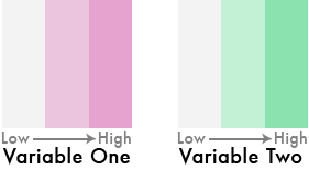
Very easy idea, right? Low values, lighter colors, high values, darker colors.
{fig-align="center"}
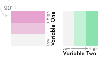
But what if we flipped one of the color schemes in the legend 90 degrees...
{fig-align="center"}
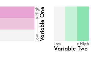
And theeeeen...
Blend them together like so...
{fig-align="center"}
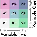
We've gone from three colors to nine!
This is a bivariate color scheme you've got going!
What's it take normally?
It's a little complicated-- it requires dividing up your values into quantiles.
{fig-align="center"}
Once you have the combined labels you can assign them to a color palette that matches the bivariate theme.
{fig-align="center"}
Okay, that's a lot of steps.
But someone made a package that simplifies it for us!
We'll use the [**biscale**](https://chris-prener.github.io/biscale/) package to quantile-ize and categorize the data for us.
First, let's look at the data again.
```{r}
glimpse(county_df_wide)
```
Next, we need to use the function `bi_class()` and feed it the arguments for the two columns we want to turn into quantiles. Also, we can set the dimensions to 3x3 (you could do 4x4, etc).
```{r}
#| warning: FALSE
#| message: FALSE
bi_df <- bi_class(county_df_wide, x = death_per_100k, y = pills_per_person, style = "quantile", dim = 3)
glimpse(bi_df)
```
Great, do you see the `bi_class` column? That's what we're looking for.
Now we can map it.
You can export the data frame above and bring it into Datawrapper and individually create an interactive choropleth map based on the **bi_class** column. It's totally doable! Check out their recent [blog post](https://blog.datawrapper.de/bivariate-map-scatter-plot/) on playing around with bivariate maps.
They haven't made the option seamless yet. It'll require a lot of tweaking.
In the meantime, just go ahead and make a map with ggplot2.
First, let's download the counties shapefile from the Census using the **tigris** package.
```{r}
#| warning: FALSE
#| message: FALSE
#| results: 'hide'
us_counties <- counties(cb = TRUE, resolution = "20m") %>%
shift_geometry()
glimpse(us_counties)
```
Just to check, let's see what it looks like without data.
```{r}
#| warning: FALSE
#| message: FALSE
ggplot(us_counties) +
geom_sf() +
theme_void()
```
Okay, now we can join the shapefile with the bivariate data.
```{r}
us_counties <- us_counties %>%
left_join(bi_df, by=c("GEOID"="countyfips"))
```
Now, we simply map it.
For the color, we need to use the function `bi_scale_fill()` to accurately represent the bivariate categories with colors. Check out all the [palette options](https://chris-prener.github.io/biscale/articles/bivariate_palettes.html). We're going go with "DkViolet"
```{r}
#| warning: FALSE
#| message: FALSE
map <- ggplot() +
geom_sf(data = us_counties, mapping = aes(fill = bi_class),
# changing the border color to white and the size of the
# border lines to .1
# and hiding the legend
color = "white", size = 0.1,
show.legend = FALSE) +
bi_scale_fill(pal = "DkViolet", dim = 3, na.value="white",) +
labs(
title = "Deaths & Pills"
) +
bi_theme()
map
```
Alright, we're not done, yet.
Let's create a legend with custom labels.
```{r}
#| warning: FALSE
#| message: FALSE
legend <- bi_legend(pal = "DkViolet",
dim = 3,
xlab = "+ death rate ",
ylab = "+ pills rate ",
size = 8)
legend
```
Pretty huge, yes.
But we're going to use the package **cowplot** to combine these two viz objects in one. It'll initiate with the function `ggdraw()`.
The numbers in `draw_plot()` represent the relative spots to anchor the viz.
```{r}
#| warning: FALSE
#| message: FALSE
finalPlot <- ggdraw() +
draw_plot(map, 0, 0, 1, 1) +
draw_plot(legend, 0.82, .2, 0.2, 0.2)
finalPlot
```
Now you can save it as a png or a svg file to edit.
```{r}
#| warning: FALSE
#| message: FALSE
#| eval: FALSE
save_plot("test.svg", finalPlot, base_height = NULL, base_width = 12)
```
Let's do it one more time but zoomed in on Tennesee.
We can do the same thing above but we'll simply filter it real quick before using the same code.
```{r}
#| warning: FALSE
#| message: FALSE
tn_counties <- us_counties %>%
filter(buyer_state=="TN")
map <- ggplot() +
geom_sf(data = tn_counties, mapping = aes(fill = bi_class),
# changing the border color to white and the size of the
# border lines to .1
# and hiding the legend
color = "white", size = 0.1, show.legend = FALSE) +
bi_scale_fill(pal = "GrPink", dim = 3) +
labs(
title = "Deaths & Pills in Tenn."
) +
bi_theme()
finalPlot <- ggdraw() +
draw_plot(map, 0, 0, 1, 1) +
draw_plot(legend, 0.82, .2, 0.2, 0.2)
finalPlot
```
And that's it.
Definitely check out the rest of the documentation of [biscale](https://chris-prener.github.io/biscale/articles/biscale.html).
Do we even have time to make a fifth viz? Let's give it a shot.
Move on to [ggtext](ggtext.html).