Releases: picoe/Eto
2.5.3
Bug fix release. Issues fixed
2.5.2 Hotfix release
This fixes a few issues:
- Bundling Mac64 apps with msbuild can cause an error #1701
- Mac: Fix issues setting width/height of a form when it has already been shown #1701
- Auto load the handler type when subclassing custom platform controls #1701
- Wpf: Fix huge performance issue when creating many small bitmaps using a Graphics object #1698
- Fix GraphicsPath.GetRoundRect when the width/height is smaller or equal to radius*4 #1694
- Fix
Application.Instance.Openon .NET Core #1695 - Gtk: Fix
PixelFormats.Format32bppRgb#1458 - Wpf: Fix
PixelFormats.Format32bppRgbwhen using a Graphics object #1458
2.5.1
This release brings in some fixes since 2.5.0, namely:
- Can now debug .NET Core Eto.Mac64 apps in VS for Mac
- Native macOS .dylib libraries are included with mkbundle --library option
- Added FontTypeface.IsSymbol and HasCharacterRanges
- Bindings now support child properties of struct properties
- Child property bindings can now be used with more than one control
- DropDown allows formatting the Font of each item
- MaskedTextBox/Stepper allow formatting the decimal and sign characters with a specific culture
- Added Screen.GetImage() to get a Bitmap representation of a screen
- Added APIs to set progress for long running tasks in the Taskbar.
- Many fixes
2.5.0
The 2.5.0 release is a culmination of new features, refinements, and fixes.
There have been over 680 commits and 948 files changed since v2.4.1. Thanks to the following for their very generous contributions included in this release: @couven92, @MartinRothschink, @SteveGilham, @harry-cpp, @e673, @halid-durakovic, @wjk, @acormier, @carlreinke, @oigami, @kike-garbo, @brtn, @allsorts46, @ItEndsWithTens
Also, a big thanks to everyone that submitted or contributed to issues and helped others on gitter. It is greatly appreciated!
New Features
Here are some of the most notable features of this release:
- Full support for .NET Core 3.x for WPF, WinForms, Gtk, and Mac64
- Updated extensions for VS for Mac 8.x and VS 2019
- Cascading Styles
- Drag images with cursor offset
- Drop descriptions (windows only)
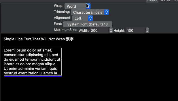
- New Eto.Drawing.FormattedText to draw wrapped and/or aligned text using any brush with the Graphics object
- New Windows.MovableByWindowBackground property
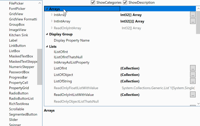
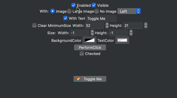
- New Controls: CheckBoxList, EnumCheckBoxList, PropertyGrid, ToggleButton, and SegmentedButton
- 32-bit macOS platforms are no longer supported (Eto.Platform.Mac and Eto.Platform.XamMac).
Please use Eto.Platform.Mac64 or Eto.Platform.XamMac2 instead.
.NET Core 3.x
This release brings support for .NET Core to all of the desktop platforms including Eto.Platform.Wpf, Eto.Platform.Windows, Eto.Platform.Mac64, and Eto.Platform.Gtk (which already had support for .NET Core 2.x). This means you can use the same libraries and runtime for all platforms, and use newer packages that depend on .NET Standard 2.1.
Note that this does not include Xamarin.Mac as it does not support .NET Core.
For the Mac64 platform it will automatically package up the .NET Core runtime into an .app bundle in Release mode, for other platforms you can use the standard dotnet publish to publish your app to run without anything pre-installed.
Note that you can only debug apps using .NET Core for Mac64 using VSCode on macOS. Support for debugging .NET Core using VS for Mac is forthcoming.
When targeting .NET Core, you must use separate launchers per platform, the combined launcher only works when targetting .NET Framework only.
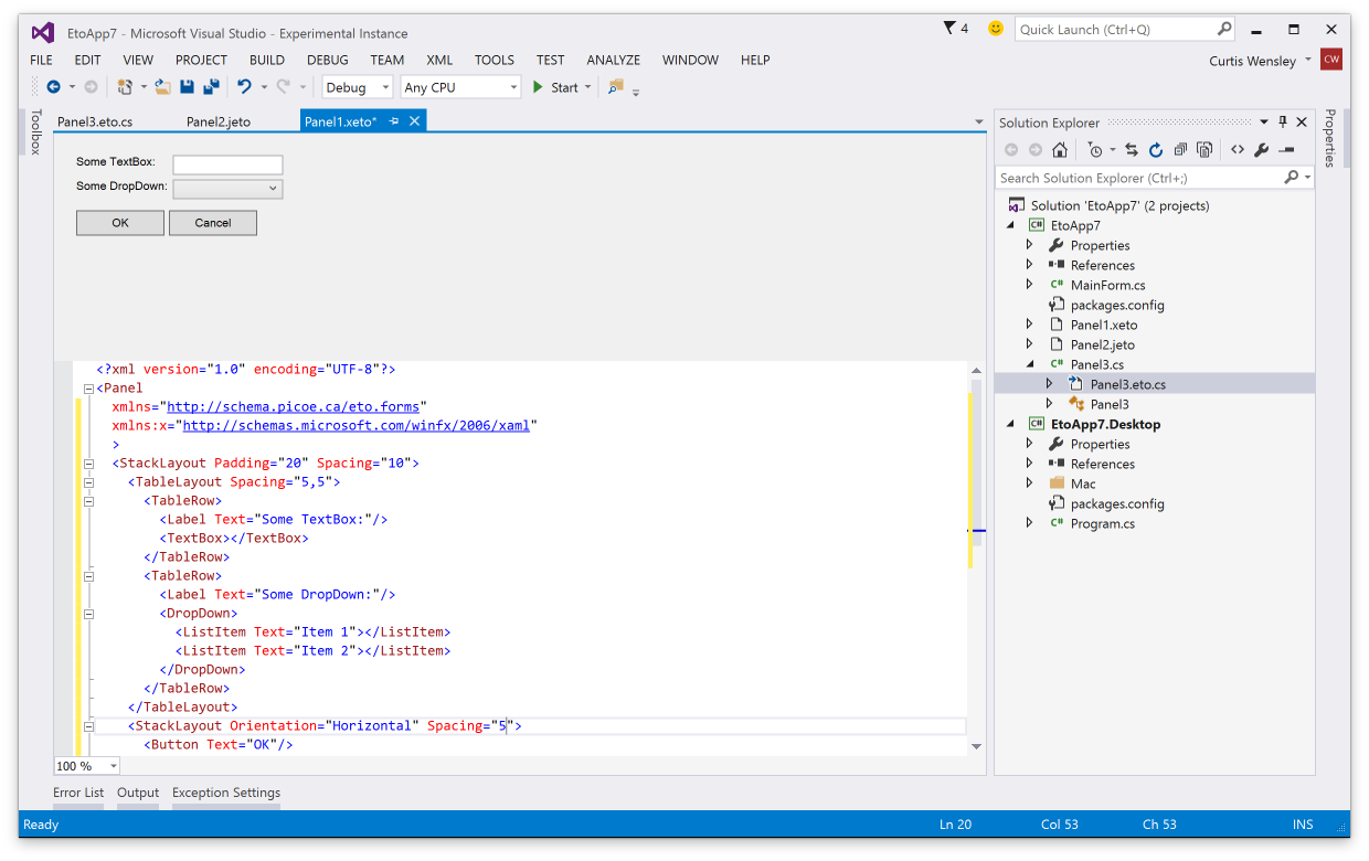
Visual Studio Extensions
The visual studio extensions have been updated for the latest VS for Mac and VS 2019, including the design preview for xaml (.xeto), json (.jeto), and code preview (.eto.cs).

Cascading Styles
Cascading styles allows you to apply styles to all controls within a specific container instead of globally. You can also provide your own style provider which could eventually support things like using .css files to define styles.
The syntax for adding styles is nearly identical to global styles, allowing you to optionally specify a style identifier. A simple example could be something like the following, which vertically centers all labels in a panel:
class MyPanel : Panel
{
  public MyPanel()
  {
    // make all labels vertically centered in this panel
    Styles.Add<Label>(null, l => l.VerticalAlignment = VerticalAlignment.Center);

    Content = new TableLayout {
      Rows = {
        new TableRow("First Name", new TextBox()),
        new TableRow("Last Name", new TextBox()),
        new TableRow("Birth Date", new DateTimePicker())
      }
    };
  }
}
Drag Images and Drop Descriptions
You can now specify drag images and drop descriptions for a Drag 'n Drop operation by using the new Control.DoDragDrop(DataObject data, DragEffects allowedEffects, Image image, PointF cursorOffset) override and DragEventArgs.SetDropDescription(string format, string inner = null).
These integrate with the standard functionality of each platform so your apps will work beautifully. On windows it uses the newer shell drag/drop to provide a more modern look for the link/move/copy actions.
Mac
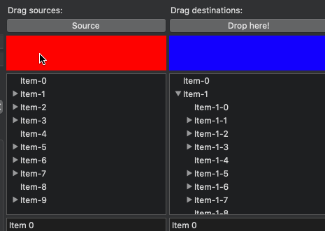
Windows (with drop description)

Note that the drop description is only supported on Wpf and WinForms, on other platforms it will be ignored. Drag images are supported on all platforms.
FormattedText
You can now draw formatted text with wrapping and alignment options, with any brush (solid, linear gradient, radial gradient, texture brush).
Mac and Xamarin.Mac Improvements
The macOS platforms have had numerous updates to improve layout performance, and also it now uses the alignment rectangle for sizing and positioning controls. This means that many standard controls, such as Button, Stepper, DropDown, etc that have had intrinsic padding no longer do and will now align to the control itself.
CheckBoxList and EnumCheckBoxList

PropertyGrid
The PropertyGrid can be used to edit object(s) and arrays, very much like the one included in Windows Forms. This combines the TreeGridView and PropertyCell to provide an editor UI you can use to allow you users to easily modify objects and its properties.
ToggleButton
The ToggleButton is perfect when you want something other than a check box to toggle a value.
SegmentedButton
The SegmentedButton presents a grouped set of buttons that can optionally be selected and optionally show drop down menus for each item.

Release Cadence
2.5.x will continue to be improved, and point releases will be distributed as often as necessary to bring the latest features and fixes to official nuget packages sooner than has been done in the past. This is thanks in part of the added CI automation provided by Azure DevOps.
2.4.1
2.4.0
Eto.Forms 2.4.0 is now released! This release brings many new cool things, such as a fresh new Gtk platform supporting Gtk+ 3.14 or later, addin updates for VS 2017 and VS for Mac, and many new controls. See below for details.
There have been over 500 commits and 2755 files changed since v2.3, with 7 authors. Thanks to the following for their very generous contributions:
.. and thanks to everyone that has submitted issues to help make Eto.Forms better!
Visual Studio Addins
All new addins have been created for VS 2017 and VS for Mac/MonoDevelop, including form preview for xaml, json, and code view definitions.
Download links for the addins are above!
dotnet new
Project templates are now based on the dotnet template engine. This means you can easily create project templates from the command line using the dotnet sdk or in IDEs like Rider and VS Code. First, install the template package:
dotnet new -i "Eto.Forms.Templates::*"
Now you can create a new application:
dotnet new etoapp
Add --help to that to get a list of options, such as creating a .sln, using xaml, etc.
.NET Standard
Eto, Eto.Serialization.Xaml, and Eto.Serialization.Json has been migrated to .NET Standard 1.0. They are still compatible with the same platforms and projects as before, but now are much friendlier with .NET Core. (see Gtk Platform)
Gtk Platform
Eto.Platform.Gtk is now Gtk 3.14+ and uses @cra0zy's exellent GtkSharp library. Works on Windows, Linux, and Mac. This platform is also the first to have full .NET Core support! Note that the project templates do not use .NET Core by default but you can easily change the target framework after.
Note that you can still use Gtk2 by installing the new Eto.Platform.Gtk2 package.
Mac Templates
Projects created on Windows or Linux now can be run directly when loaded in VS for Mac using the Mac/Mac64/XamMac2 platforms, and the Mac platforms all create the .app bundle for you instead of relying on a separate Eto.Platform.Mac.Template (which is now obsolete).
Drag 'n Drop
A long awaited feature is now here! Fully integrated with each native OS, and gives you great control over which nodes you can drag to for GridView and TreeGridView. See here for samples.

AboutDialog
Shows a dialog with all the information about your app. Uses the native GTK3 about dialog, and a custom themed dialog for the other platforms. It'll also automatically grab all the metadata from your assembly!

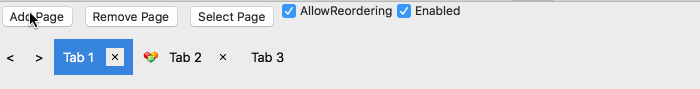
DocumentControl
A new control that is similar to a TabControl, but allows the user to close or optionally reorder tabs.
FilePicker
Pick files or folders.

FontPicker
Pick a font family, style, and size.

TextStepper and MaskedTextStepper
A custom stepper that you can control the text completely and react to up/down events.

2.2.0
We are proud to announce that Eto.Forms v2.2 is now released!
This release brings much better Xaml support, and huge advancements in the Visual Studio and Xamarin Studio tooling with the new visual designer.
There have been 163 commits and 679 files changed since v2.1.
Visual Studio & Xamarin Studio addins
Get started with Eto.Forms quickly using the new addins here.
Visual Designer
Both Visual Studio and Xamarin Studio/Monodevelop addins now support split screen form preview for Xaml, Json, and Code (C#, F#, or VB.NET) view definitions. Building your cross platform views has never been easier!
| Visual Studio 2013 / 2015 | Xamarin Studio / Monodevelop |
|---|---|
 |
 |
Xaml Autocomplete
Both Visual Studio and Xamarin Studio now have full autocomplete for xaml views, providing you with faster development of views while building them.
| Visual Studio 2013 / 2015 | Xamarin Studio / Monodevelop |
|---|---|
 |
 |
New template options
Both addins now provide more options when creating a new application, like whether you want to use Xaml, Json, or Code preview by default.

New Features
Xaml is now Portable
The Eto.Serialization.Xaml now uses a port of mono's System.Xaml to PCL called Portable.Xaml, with many fixed bugs and performance improvements. This finally allows proper support of markup extensions such as {Binding <property>}, {Resource ...}, etc.
This new Xaml engine is used for all platforms including windows to improve compatibility.
Xaml 'On' Markup Extension
In many cases you may want to tweak the UI, such as padding or sizes for certain platforms. A new markup extension for Xaml allows you to do this very easily and supports any property.
For example:
<StackLayout Padding="{On 10, Mac=5, Windows=10, Gtk=3}">...The supported options for platforms/operating systems are listed in the OnExtension class. The platforms (Gtk, Mac, WinForms, Wpf) take precidence over the operating systems (Osx, Windows, Linux) and target device (Desktop, Mobile)
CommandParameter support for ICommand binding
Controls with ICommand binding like the Button, LinkButton, ButtonMenuItem, etc now have a CommandParameter that you can use to pass to the command when executing, which should be familiar to developers coming from WPF.
RelayCommand<T> is now also available to easily set up commands in your view model, which passes the command parameter of a particular type. For example:
public class MyModel
{
    public ICommand MyCommand { get; set; }
        = new RelayCommand<string>(p => MessageBox.Show("Clicked: " + p));
}

//...

var myButton = new Button { CommandParameter = "Something" };
myButton.BindDataContext(c => c.Command, (MyModel m) => m.MyCommand);
Parent/Child logical tree vs. visual tree
The Parent/Child relationship of controls are now based on the logical hierarchy. New Control.VisualChildren and Control.VisualParent properties have been added to represent the visual tree. The layout controls have been updated to build the logical tree immediately as children are added/removed, so you can use the FindChild or the new FindParent helpers without waiting for the control(s) to be loaded on the form.
This is especially useful when loading a definition from Xaml or Json, where you can now find children by ID or other criteria to perform additional setup before the form is loaded.
New CustomCell and PropertyCell
The GridView and TreeGridView now support a new CustomCell which can be used to display custom controls on the grid for platforms that support it. The PropertyCell is a subclass of the CustomCell and implements an easy way to present different controls depending on the row value, usually based on its type.
Note that some platforms (e.g. WinForms and Gtk) still require a paint method for displaying the data, which the CustomCell provides for. But for WPF and Mac, the custom control can be used for the cell view and edit.
Check out the CustomCell and PropertyCell samples for how to use these new cells.
SystemColors
You can now get standard system colors using the new SystemColors static class, such as Control, ControlText, ControlBackground (e.g. background of a text box), DisabledText, Highlight, HighlightText, and WindowBackground. Note: in GTK, these may not return the correct result as there's no way to get the theme's colours (help getting this working correctly, if possible, would be appreciated).
2.1.0
Eto.Forms v2.1 builds on the 2.0 release providing many bug fixes, more consistent behaviour across platforms for many controls, and also tons of new features and controls.
Since 2.0, there have been 453 commits and 51 resolved issues.
Visual Studio & Xamarin Studio Addins
TL;DR: Get started with the VS or XS/MD addins here.
There are now F# and VB project and file templates to get you started quicker and easier than ever with your favorite language.
The addins for VS and XS have also been updated with an all new project template wizard to eliminate the confusion of multiple project template types. Check it out:
The Visual Studio extension is also now compatible with both VS 2013 and VS 2015.
Visual Studio Form Preview
You can now preview your Xaml, Json, and code-based forms and controls right within the Visual Studio IDE!
Building an extension for VS feels like mashing the keyboard until something works, but it will no doubt be very useful so the pain was worth it. An example of it in action:
Update: Also, forgot to mention that VS will also underline any Eto.Drawing.Color reference/constructor with its actual color. This only works if you pass numeric values to the constructor, or use any of the values in Colors.*.
New Features
StackLayout
The new StackLayout provides a very clean api for simple layouts, giving you a quick and easy way to create a horizontal or vertical set of controls.
By default, the StackLayout will keep all your controls auto-sized. The HorizontalContentAlignment and VerticalContentAlignment properties (depending on Orientation) specify if the controls are aligned to the Left/Top, Right/Bottom, Center, or Stretch to fill the container. Each StackLayoutItem can also control the alignment for each item individually, and also specify an expand property to tell it to fill the available space.
For example:
var layout = new StackLayout
{
    Orientation = Orientation.Vertical,
    Spacing = 5,
    Padding = new Padding(10),
    HorizontalContentAlignment = HorizontalAlignment.Center,
    Items =
    {
        new Button { Text = "Click Me" }, // implicit conversion
        new StackLayoutItem(new TextArea(), HorizontalAlignment.Stretch, expand: true)
    }
}
The StackLayout is built upon the very versatile TableLayout currently, but will eventually be transitioned to a full fledged control.
Xamarin.Mac Unified
The latest version of Xamarin.Mac (unified) is now fully supported in both the mobile and net45 profiles. This will allow you to bundle the mono runtime with your app and publish to the app store. To use Xamarin.Mac, you need to purchase a license from Xamarin.
Note that the MonoMac platform does not require a Xamarin license, but requires your end users to install mono.
Binding enhancements
For more advanced MVVM capabilities, the abilitiy to bind to a System.Windows.Input.ICommand in your view model has been added to controls such as Button, RadioButton, and LinkButton, to name a few. You can use the Eto.Forms.Command as an implementation of ICommand.
ICommand binding is useful by allowing your view model to define the action and the enabled state of the command, which is automatically reflected in the UI.
In the .NET 4.0 build, a custom type of Eto.Forms.ICommand has been added which can be used similarly to the .NET 4.5 interface.
For example:
class MyModel
{
    public ICommand MyCommand
    {
        get { return new Command((sender, e) => Console.WriteLine("Executed!")); }
    }
}

class MyForm : Form
{
    public MyForm()
    {
        var button = new Button { Text = "Click Me!" };
        // bind the button's Command to the view model
        button.BindDataContext(b => b.Command, (MyModel m) => m.MyCommand);

        Content = new StackLayout { Items = { button } };

        // set the view model for the form
        this.DataContext = new MyModel();
    }
}
Binding support has also been added MenuItem and ToolItem.
Implicit string as a Label
There is now an implicit conversion from String to a Control so when you're creating UI labels you no longer have to create instances of Label explicitly. Combined with the initializer pattern for controls like the StackLayout, this works really nicely:
new StackLayout
{
    Items =
    {
        "Some label",
        new TextBox(),
        "Some other label",
        new Button { Text = "Click Me!" }
    }
}
Xaml from PCL
The Eto.Serialization.Xaml nuget package can now be used from your PCL projects. It uses the bait and switch trick, so you also need to add the package to your startup project for it to work. This is currently only available for desktop platforms.
New Controls
RadialGradientBrush
Rounding out the Graphics capabilities of Eto, the RadialGradientBrush has been added for more gradient options.
GradientWrapMode.Pad has also been added which works for the existing LinearGradientBrush as well.
Keyboard
A new Eto.Forms.Keyboard static class is added giving you access to the state of keyboard modifiers and key lock states for the CapsLock, NumLock, and Insert mode. Note that not all platforms support all lock keys, so check the Eto.Forms.Keyboard.SupportedLockKeys for which lock keys the platform supports.
Expander
The new Expander wraps the existing WPF ang Gtk Expander controls, and a custom implementation for WinForms and Mac platforms. It provides a way to show or hide additional controls on your form using a toggle button.
MaskedTextBox
The MaskedTextBox provides an easy to use and extensible masked input control for things like phone numbers, serial numbers, postal/zip codes, and also variable length formats like a numeric input.
This control uses the IMaskedTextProvider interface to determine how the mask functions, which Eto.Forms provides a few implementations:
- FixedMaskedTextProvider, which wraps .NET's MaskedTextProvider, but is usable from PCL code.
- VariableMaskedTextProvider which is an abstract base to easility implement variable-length masks.
- NumericMaskedTextProvider which is an implementation of the
VariableMaskedTextProviderthat allows for numeric input of any standard .net type such asint,long,float,double, etc.
ProgressCell
The ProgressCell is usable for the GridView and TreeGridView to show a progress bar as column in your grid. It binds to your model using a nullable float, with values of 0 - 1.0.
Control Enhancements
There have been tons of enhanced controls, here are some of the more notable enhancements:
Window.Owner
A new Window.Owner property has been added to create modeless dialogs using the Form class. Setting this property to another window will ensure the form is always above its owner, and in some cases (e.g. OS X), the child window will move along with its parent.
Button.MinimumSize
The Button control now exposes a MinimumSize property, which allows you to shrink the button to the size of its content. For example, if you are showing only a small image as the button content, you can set the MinimumSize to Size.Empty.
The default value of MinimumSize may be different for each platform to ensure buttons look the correct size in typical use cases.
NumericUpDown.MaximumDecimalPlaces
The NumericUpDown control as a new MaximumDecimalPlaces for cases when you want to show many decimal places, but only if needed. This control has also received numerous updates on all platforms to make its functionality more consistent.
TabControl.TabPosition
The TabControl now supports tabs on the Bottom, Left, and Right of the content.
TextArea.SpellCheck/SpellCheckIsSupported
The TextArea can now show incorrect spelling when TextArea.SpellCheck is set to true. This is only a hint, so check the value of TextArea.SpellCheckIsSupported to see if the current platform supports this feature. Currently only supported on WPF and OS X platforms.
TextBox.CaretIndex/Selection/SelectedText
The TextBox now allows you to control where the caret should be placed, and get/set what text is selected. This functionality is used for the new MaskedTextBox.
TextInput event
The Control.TextInput event has been implemented on all p...