[Grid] Automatic height adjustment (Responsive Layout) #7602
Comments
This comment has been minimized.
This comment has been minimized.
|
I fully understand the fact that the basis of the code has remained simple, but the material specification declares: "Elements from a single-column format may reflow to fill the content area in various combinations." But currently the best I can do with Grid is this:
Then I seriously think that a code can remain simple while having funtionalities Thank, PS: If you know a SMALL component to make the same result as the specification, let me know. |

 oliviertassinari
added
component: Grid
oliviertassinari
added
component: Grid
|
Maybe you are looking for a masonry library: https://masonry.desandro.com/layout.html. |
|
Yeah, This is a good idea while awaiting native integration in Material UI If it comes one day :) PS: Can you consider the reopening of the issue ? Thank, |
 poupryc
changed the title
poupryc
changed the title
|
If you need help for integrate this feature, I think you can take support on the CSS code of the material framework of Google here Material ui is certainly the best set of React components ! |
|
I dont think that getmdl could do it, I havent checked but I am pretty sure that the link you provided is a static example. For dynamic content, I have seen it working only in angular material 2 grid list or angular material 1 grid list. But they use a complex algorithm ... |
|
Yep, you are right, but I never specified that the contents of the dashboard should not be static 😄 |
|
Actually, from what I understand, that something you can already implement with the responsive break points of the Grid |
|
Hello @oliviertassinari, I do not understand how I could implement it with the breakpoints, the grid does not allow a modification of its size ! The problem is here !
Why the second music card can not go sticking to the "aperçu" card ? This is contrary to the material specification. More generally, why grid does not leave the choice to the user to place his cards as he wishes ? I hope you will understand my request, and that you will reopen the issue |

|
oliviertassinari
added
support: question
|
Hum, I think I'll be able to cope, but if it is possible to add this example in the documentation for beginners asking the same question ? |
|
Hey, I would also like this feature, and I didn't understand how could it be implemented as suggested. HelloEdit, did you manage to get this working? can you provide an example? I think this use case should be in the documentation. |
|
Hey, I did not find a solution (use an external library like masonry could work) But none natively. I still maintain my idea to implement this feature natively! |
|
We ended up creating 2 columns and split the data evenly. The problem is that if one of the columns ends up with all the bigger cards, one side can be way longer than the other. |
|
I agree with @HelloEdit . This is a big problem to not be included in the grid. I feel kinda lame for ever using the Material-UI grid in the first place, because why would I want to use a grid that looks bad with ugly gaps most of the time and doesn't follow the Material-UI specifications? I don't have a single grid in my app where I would want it to work like the Material-UI grid does and your grid documentation page is too simplistic to show that this is how your grids work, so I didn't realize this was a "feature" of your grid before discovering it in my app. I did the same thing as @marco-silva0000 did in one instance, but it's an obvious hack and unless your items are all about the same size it's likely to look ugly at the bottom too. |
|
Please reopen @HelloEdit I agree this is a huge problem, the provided "solution" is not satisfactory. I understand you have a lot of work and your library is amazing, but this specific point is really problematic if you want to implement a fully responsive layout. |
|
@oliviertassinari Potential here for an example layout... |
 mbrookes
added
docs
mbrookes
added
docs
|
Any progress on this? |
|
Grid
|
|
If any solution to this issue is available, would appreciate an example? My vote towards the native support. I think this is kind of a fundamental functionality for the Grid component. |
|
Would something like this be what you want: https://codesandbox.io/s/p5v42zrrzm |
|
@joshwooding Based on what I can see on my iPad, looks very good! Will check tomorrow on desktop. EDIT after checking on desktop, couple of issues with this solution:
|

|
Masonry layout support in Grid would be awesome 👍, in theory using JS could work but not ideal css grid layout is not intended for this, see: w3c/csswg-drafts#945 |
|
A temporary solution will be creating columns as you want and spreading them |


|
Some news about this? |
|
When it's easier to just use flexbox surely there must be a problem. |
|
@CloudNineK Flexbox doesn't solve this problem (Grid is flexbox based). You need to use a masonary library if you wish to distribute content evenly between a varying number of columns. |
|
I would just like to chime in saying that I would like to have see some sort of masonry functionality from MUI as well. Maybe not change MuiGrid to support the functionality, but maybe add a new component that supports it instead. As such, I drew up a crude component to wrap MuiGrid for a Masonry effect. I hope that this can maybe be a start to creating a component? Here it is for those interested: https://codesandbox.io/s/masonryplusmui-xk8rr?fontsize=14 Of course there's problems though. The way it works currently works is that it takes predefined breakpoints (I pull that from theme.breakpoints.values) and it calculates how many columns to make based on that. I know that's not how any of MUI's components behave, but at this point, I could really only set the width of an entire column with this method. |
|
@weiluntong That also is a possible solution however I don't think it's elegant |
|
@nikandlv I completely agree with you. Currently the thing is in a sort of limbo where it's not quite MUI nor is quite a Masonry layout. I'd be more than happy to create a component and make a PR. In fact, that's what I was hoping would be my end goal here, but I created the sandbox because I wasn't sure where I'd start. Again, I was hoping it might be a start? Or am I completely left field as to the base structure of the component? I'd love input to get me going. |
|
@weiluntong I think you are on the right track with the component, it probably needs a bit more work. however, you should ask the maintainers if they want this as a part of MUI or just as a library you can publish
https://github.com/mui-org/material-ui/tree/master/packages/material-ui-lab |
oliviertassinari
removed
component: Grid
|
We would need more upvotes on the issue to consider solving the problem. |
oliviertassinari
added
new feature
|
If @weiluntong you still feel you got the time to prepare a proposal, I might cast my vote towards a separate dedicated masonry component. Might be the easiest option for maintenance, and use. |
|
I was using the |
|
I wouldn't mind putting together a proposal where we can consolidate upvotes. Is there a proposal template I should use? |
|
@weiluntong i guess as https://github.com/mui-org/material-ui/blob/master/CONTRIBUTING.md you should submit an issue and describe the component request there and ask for upvotes |
|
@weiluntong There is a template when you create a new issue. |
|
Correct me if I am missing something, but I was able to solve what appears to be this exact problem by applying this solution from stack overflow: |
|
Thats not the case @dylanmartin we don't want it to stretch out we want the next row fill that gap! |
|
Closing for #17000 |
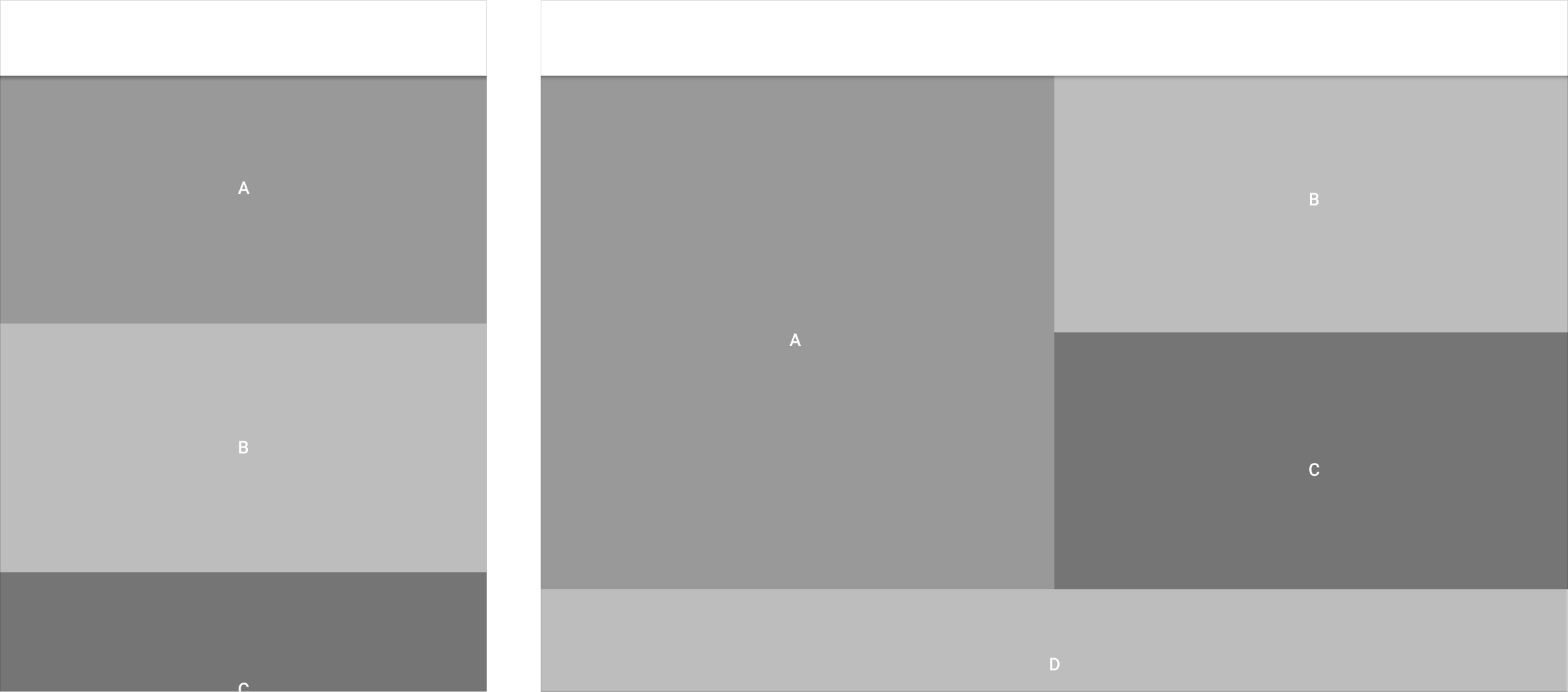
Problem description
Hello,
I work on a dashboard and actually, it's look like this:

I do not know if it is wanted, but grid could automatically push the music card against that from above ! It's could be a great feature !
Thank,
Material UI: next
The text was updated successfully, but these errors were encountered: