Right aligned container button dropdown UI gets squeezed #1033
Comments
|
Hi, Can I work on this bug? |
|
Yes, you may work on this one. |
|
Thanks! |
|
Hi, I can able to add containers by using the "+" button. But, I am not seeing ">" in Multi account containers window in OS X.
How should I proceed to reproduce the bug? |

|
I still see this behavior, but only when adding the button to my tab bar, in place of the default new tab button. |
|
In this location:
|

|
Yeah. I kinda got your point and trying to reproduce the bug. From the "Multi Account Containers" button, I clicked the "+" of the respective items such as "Personal, work, banking", etc. This in turn created this ">" button and also opened the new tab. I am seeing something like this: What is the next step which I should do to reproduce this bug? |
|
I see the same as you with the button in the same location. What you are missing is that the problem appears when the button is in the tab bar, not the toolbar with the location field. Use the UI customization to move the containers button up and to the right, into the tab bar. See my screenshot. The button is above the |
|
I tried doing this and it looks like this in my OS which seems fine and not nudging leftwards.
|

|
@tilgovi Thank you. I did UI customization to place the containers button on my tab bar and also removed the normal "new tab" button from it. Now, I am seeing something like this:
|

|
Very strange. Perhaps it only happens in full screen? I'll check tomorrow. Thanks for looking into it. It's a small thing, I know. |
|
@tilgovi You are right it is there Even I faced the same UI problem. |

|
So @groovecoder Can I take this up as my first issue under Outreachy contribution? |
|
@tilgovi Yes this issue still exists. And, yeah it reproduces only for full screen.
|

|
Thanks for looking, you all! It's really not a large issue and it's not the default placement, but I think it's nice to imagine this experience being so polished that it could replace the default ➕ for new tabs! |
|
@ShivangiKakkar It did produce for me as I mentioned earlier, have a look at my comment above. |
|
@yatri1609 The ➕(add a new container) button didn't seem to be squeezed. here If it did reproduce for you then I'd assume it's present for linux too. |
|
@ShivangiKakkar exactly |
|
Hello @groovecoder @maxxcrawford I am an Outreachy 2019 applicant, may I work on this as my first contribution? Thank you. |
|
@Aishat-Akinyemi I'm going to leave this un-assigned while you're working on #973 . |
|
hey @groovecoder May I take a shot at this? |
|
Yup, I'll assign to myself to hold it for you. Let me know if you work on something else so I can un-assign it if needed. |
|
@groovecoder apparently i cannot seem to reproduce the issue in windows(local machine on which I'm working in). No matter where I place the icon, it seems to work fine at least for Windows. |
|
@groovecoder you can unassign this as I have nothing to do here really and I'm working on another issue thanks |
|
@groovecoder @maxxcrawford can i take this task |
|
@osumgbachiamaka Absolutely. Good luck! |
|
working on it |
|
@maxxcrawford If this issue can not be reproduced on linux, please unassign me so i can move over to another task. |
|
Was able to reproduce this bug, would like to work on it. I'm an outreachy applicant |
|
@osumgbachiamaka Understood. Please tag me or @groovecoder in another issue. @oksmelnik I'm assigning this to you. Thanks! |
|
working on it |
|
From what I can see, the right side of this popup is actually off the screen. As a solution, I could move buttons to the left a bit, but not sure it's the right approach for such an edge case. What do you think, @tilgovi @groovecoder?
|


|
It might be fine not to fix it. I just noticed it and filed it when I saw it, but it's only cosmetic. It also might be a problem with how popups are placed. The arrow that connects the popup to the button moves to the left, which makes me think that some code, perhaps in Firefox itself, is trying to move the popup so that it's not off screen, but not moving it far enough. Maybe setting a fixed width for the popup, if it doesn't have one already, would help. Otherwise, I suspect the problem is not in the add-on, but in Firefox's placement of popups. |
|
Yes, seems like all the popups are being places this way. And the border around the new container button makes the overlap more visible. The width of the popup is fixed with inline-size property, I've experimented a bit, but ran out of ideas of what else could be done here.
|


|
It seems like there's nothing to be done here. I'll close the issue. Thanks, everyone, for looking into it! |
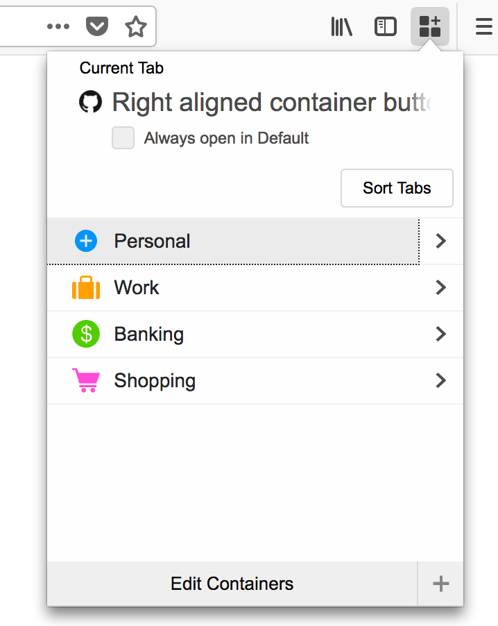
I can put the containers button on my tab bar and remove the normal "new tab" button from it. This customization results in a setup that's familiar for muscle memory and very clear.
In OS X fullscreen mode, this results in the button being placed at the very far right of the screen. The dropdown seems to nudge itself leftward to avoid being off the screen, but the new container button seems squeezed as a result.
The text was updated successfully, but these errors were encountered: