Inconsistent weight and use of color in iconography throughout UI #8017
Comments
|
+1, our icon set needs a champion that owns and fixes them. I would add on top that I was never a big fan of the icons we use in the activity bar... |
|
@bpasero what in particular about the activity bar icons; size, style? |
|
Yeah, activity bar could be smaller imho for what it provides. Basically all icons we use are pretty much 4 years old I would say, a general face lift might be cool to bring them all in sync. |
|
It so happens that the we have some new icons in the works that match the new Microsoft Design Language (cleaner and more modern icons that use strokes instead of heavy-weight fills). |
|
Great points @Tyriar. I think with our recent discussions around panels, colours etc that we should look at a UI and UX overhaul. We've built up enough UX and UI debt as the product has evolved that we need to address it. |
|
I must also admit that I am not a big fan of the recently introduced icons in the integrated terminal:
They do not seem to fit our other icon set at all. I also find the "Hide" icon questionable as one can easily confuse it with a dropdown menu. |

|
@bpasero the consistency of the icons will be solved in time as @bgashler1 mentions this is the way we're heading (there may be 1 or 2 releases where they're inconsistent though). @bgashler1 actually came up with some pretty nice looking icons that featured a mini terminal (box around >) and +/- symbols in the top corner, the argument against these was that the most important part of the icons (+/-) was the smallest. See #8018 for discussion on the new close icon. |
|
@bpasero I totally hear you on the consistency issue. What we could do is possibly get these icons ported into our old look (heavier stroke weight) to remain consistent while we await a new icon set. |
|
I would be interested to get a look at the icon set when it is available 👍 |
|
@bgashler1 any update on this? |
|
I want to get to this, but the priority shifted to some other things first. Also there was a bit of speed bump with this which I can speak more in person about. |
|
The dark border looks particularly awkward on a grey background.
https://marketplace.visualstudio.com/items?itemName=rebornix.nova |

|
@Tyriar this is a halo, and you are correct that it doesn't belong here. We'll be getting them out eventually. |
|
IMHO, aesthetics-wise, the icons are the worst part of the editor, by far. They should really be taken more seriously, this issue is more than 1 year old! Just look at the icons used for the "Output" panel:
Pretty much everything that could have gone wrong did: inconsistent shades of gray, style and shapes (X icon), the maximize/un-maximize icon doesn't properly illustrate it's function, the "toggle output scroll lock" icon seems taken straight from an iOS password manager or something, I prefer to hide it via some custom CSS than to have it displayed to me. Also, the whole "enlarge on click" effect is pretty distracting, I cannot think of any other app that uses it. Just look at this and tell me if you find it pleasing to watch:
|


|
Thanks for your comments @fabiospampinato. Unfortunately we do not have the capacity right now to address the issues with the icons. At some point we hope to, but as you have quite rightly pointed out, this issue is over a year old. |
|
/cc @chryw |
|
Something we should also do when tackling this is sharing the icon image files across components so we don't have multiple of the same image loaded into memory. |
|
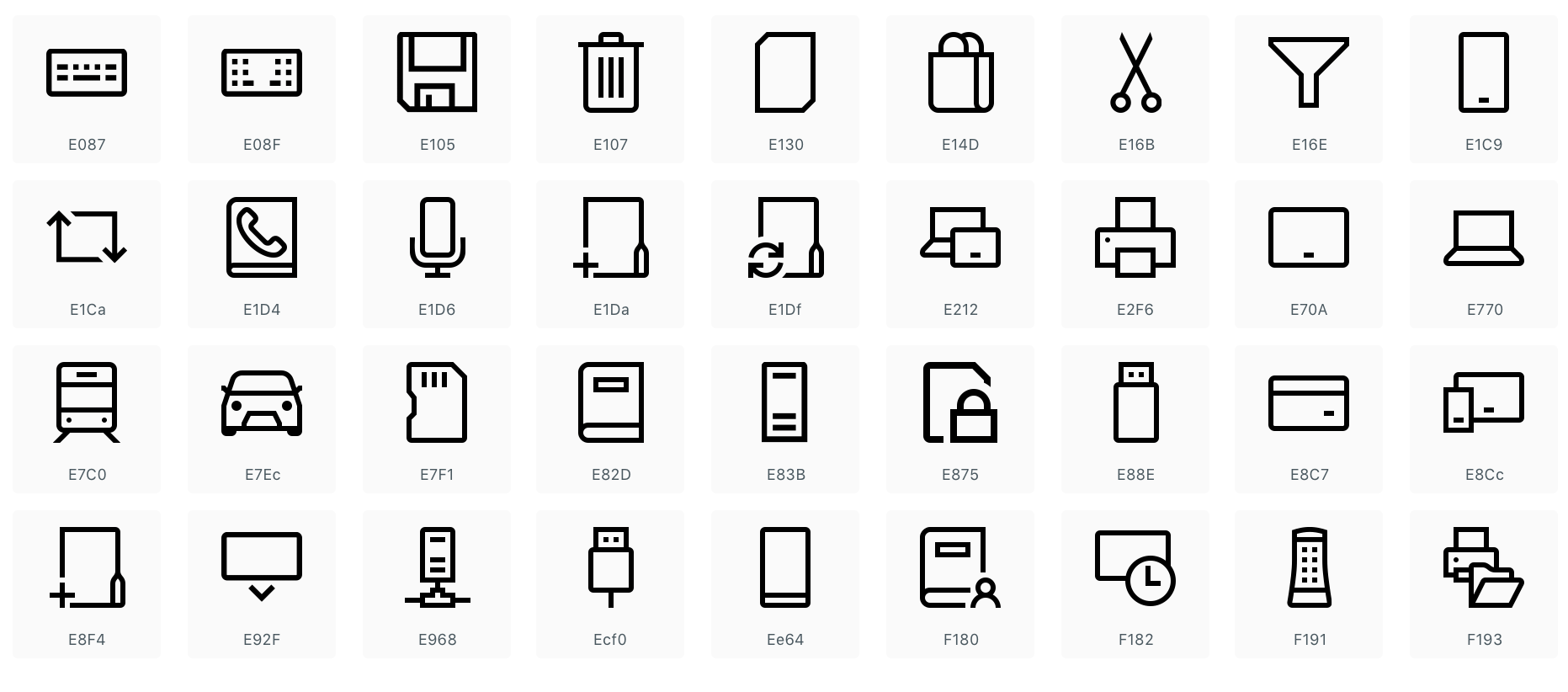
Perhaps octicons should be extended with all the needed icons. This way they could also be used by extensions. One, albeit minor, problem this would solve: I needed a The limitation of this is that all icons would have to be mono-colored, unless they are combined afterwards via CSS. |
|
They don't follow *those* guidelines because they're only for UWP apps.
Code isn't UWP, so it doesn't need to follow the standards. Anyway, MS's
brand is changing so at the end of the day the icons are bound to change
too. @10f
…On Thu, Aug 15, 2019 at 12:30 PM 10F ***@***.***> wrote:
Ok, so I appreciate the new design.
But the rounded edges on the Explorer and Extensions icons are not in
inline with Microsoft's icon guidelines.
<https://docs.microsoft.com/en-us/windows/uwp/design/style/icons>
The rounded corners are for corners that are somewhat round in real life
like the edges of the shell of the USB drive, but not the actual corners of
the metal port.
[image: 59722433-844b4680-91d8-11e9-9428-2b36137b0f0a]
<https://user-images.githubusercontent.com/18104031/63091392-7c9ce980-bf5e-11e9-846e-191fbfa7cc55.png>
The Explorer icon is 2 sheets of paper, I can't find any of the official
Microsoft icons that have sheets of paper in them, to have round corners
for the paper.
The Extensions icon, we can debate that, but if it is supposed to
represent building blocks, legos have pretty sharp edges.
Plus it will be much easier on the eye.
—
You are receiving this because you were mentioned.
Reply to this email directly, view it on GitHub
<#8017?email_source=notifications&email_token=AFKK6BOM5YVVPFHX2O4KHYDQEU44ZA5CNFSM4CHQNTN2YY3PNVWWK3TUL52HS4DFVREXG43VMVBW63LNMVXHJKTDN5WW2ZLOORPWSZGOD4LSESY#issuecomment-521609803>,
or mute the thread
<https://github.com/notifications/unsubscribe-auth/AFKK6BP2AC7ZTTBDXSW6IB3QEU44ZANCNFSM4CHQNTNQ>
.
--
Kind regards,
Hayden Young
hayden@haydennyyy.com
|
|
Apart from my general dislike, here are a couple of minor nitpicks.
|

UpdateThank you to everyone who's been providing feedback, we've been listening all week on here and on Twitter so we appreciate you taking the time to comment. There are some issues that have risen out of this and we've been trying to prioritize them so that we can address them soon. In terms of the feedback about the icons being too thin/hard to see, we've passed this feedback to our icon team that works on the Microsoft Design Language (MDL) icons and they are working to address this. Below is a list of the issues that have come up that we're actively tracking in case you are wanting to 👍 any (you can also see the full list of
|
|
I know this was already posted earlier, but I'd like to request an option for (or overall switch) a filled in version of the new icons:
[image originally posted by @misolori earlier in the thread] |

|
@Hum4n01d please see my post update right above your comment:
|
|
Ah, sorry 😅 I missed that |
|
Can I revert back to the old icons whilst still getting the new updates? I personally highly prefer the old ones over the new ones (specifically in the activity bar, others are fine), and the fact that this feature was not made as an opt-in is pretty nerve wracking. I've seen #78748 (comment) and no, I do not want to roll back to a previous version.
C'mon people.. Edit: I see potential in #79130 (comment) |
|
Hey guys, thanks for a great, free product but these new icons suck. There's no color in any of them... Why is that? What exactly is the value of "unifying things" to us and why does unification mean removal of color? |
I completely agree - MS please stop fixing things that are not broken! |
|
I love the update. Thanks guys! |
|
Changes like this will always leave some people unsatisfied. But I also personally love it! Thanks for the great update! |
|
What I don't like about the update is that all of the userland extension icons now don't match the new theme. Also, why are the icons smaller? Anyway, I guess I like the new update after all. |


|
Reading this PR, I understand why they were introduced, but when you combine rounded-corners with very thin stroke widths, you make the user do a lot of work. The trash can is blurry and split panel looks like a pillow: I'm not able to see the + in these first two icons: I would strongly suggest revising the icons so they render clearly on both regular and retina screens. Look into "pixel-fitting" techniques. Take a look at this fine post from 2012 by @dcurtis — https://dcurt.is/pixel-fitting |

|
After getting used to them a bit, most of new icons (sidebar, explorer) seem better overall. |
|
I am a big fan of the new outline icons for this simple reason; they are more readable the same way the written character is. |
|
new icons are indeed harder to interpret at a glance, didn't have that problem with old ones |
Depends on the screen, the lighting in the room and the person. The very fact that this is comment 309 on this issue (and this is one issue out of a bunch of related issues) should hint how many people are having problems with the new icons. |
|
I find the new activity bar icons harder to read. They also look pretty blurry for me. I use window zoom level -2 though. |
|
Not a regular user so I can't speak for all of the icons, but the prominent ones on the sidebar are now cleaner, and with the clutter gone it makes me feel more relaxed working in the editor for long stretches of time. 👍 Thank you! |
|
"if it works, don't touch it!" - i think this caused tons of comments for "reverting old icons back" |
|
And here is my humble contribution to this topic. The old git-related icons looked clearer on a low density screens (the current ones are almost as dust particles over the screen). Also inconsistency of icons became worse.
|

See images below of the various different icons across the UI at x2 with some comments. This is by no means exhaustive but contains the major icons:
/cc @bpasero
General comments
Explorer
-, why is it a different blue than the one used in the status bar?Search
xan inconsistent style with thexused elsewhere?Git
Debug
Problems
Editor
The text was updated successfully, but these errors were encountered: