EmptyMessage: Text needs to be more subtle #3476
Comments
|
Could be simple as adding the Source Sans Ultra Light or Light to the stack... |
|
Maybe a color change or font-weight change? Adding another download for the font seems like it would cut some performance. If we can avoid downloading a new font-set would like to do that. |
|
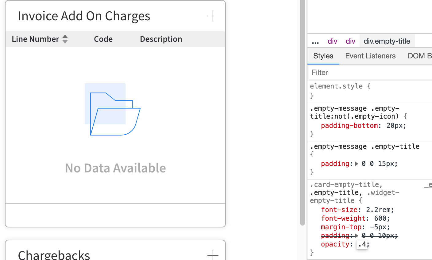
Fair. Somewhere between 40-60% opacity could work. |
|
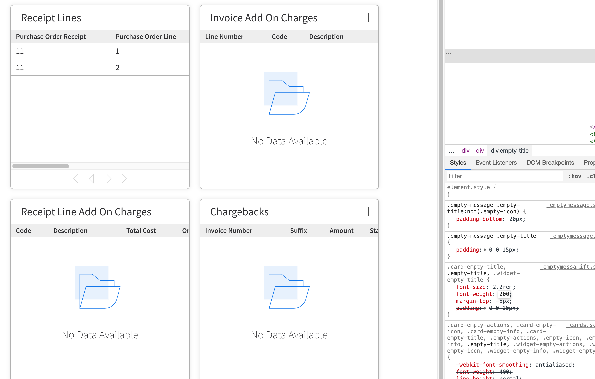
I took a look at this using the card example on the IDS website and noticed that the card titles and empty messages are using type sizes from the outdated type scale. This will be a good opportunity to fix a few items at once.
|
|
@jamie-norman Let me know if that proposed solution would work for your use case or if it's still to heavy on the page. |
|
@kentonquatman Yes, I think that could be an option. We don't seem to use the secondary text in most case. |
|
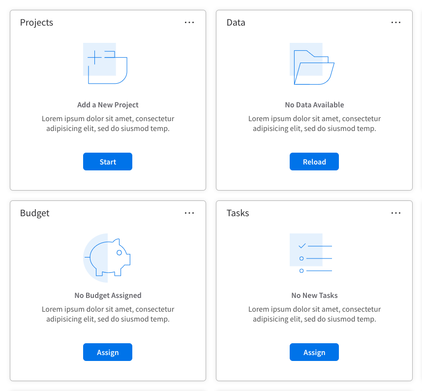
@tmcconechy Still planning on this one for April? At least one solution consultant noted that an empty state appeared to him like an error. I suspect some of that has to do with their visual weight, so hoping the proposed solution will find a better balance between an alert and something more informational. It will also be a change cycle for folks that are used to the old empty states, which were just text in the list footer. |
|
I put this in the end of the april (next sprint). But we can move it. What is the proposed solution though i see several here? I think that needs clarification... cc @inforandy |
|
I don't think we need to rush or re-prioritize. But I agree, we need some clarity. @kevinwhitedesign do we want to make a design decision? |
|
@jamie-norman Yeah I see this issue pretty clearly. This 'empty state' component was started with the intention that there would be titles, descriptions and actions. So just having the title throws off the visual weight here, we probably should have designed this with one-line from the beginning. I'll get to an example tomorrow. |
|
It looks like we're really emphasizing 'No Data Available' across the board here, while landmark probably has a slew of these instances. I wonder if it would be of interest to swap the title for body text here to achieve a more subtle description of what's going on? Thoughts @tmcconechy @jamie-norman ? |
|
Works for me. Can you show the suggestion with the optional additional informational text? Also is the icon the same size or should we reduce that (feel like its pretty big = emphasis) |
|
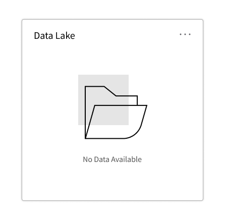
Not sure I follow, Kev. Are you suggesting in your example above that "Data Lake" becomes "No data Available?" |
|
One caveat was I had an icon size that was larger than Tim's production code. I had 150, he had 100. Now that that's cleared up: I went down to 80px. This feels appropriate to me. @jamie-norman data lake was just silly filler text for the card title. |

|
Looks much better to me. |
|
@kevinwhitedesign Gotcha. I like those options—definitely in line with what I was thinking. The outlines of the icon itself could even be lighter. |
|
Yep, something was wrong with my svgs actually. Fixed.
|

|
QA Passed. |
Is your feature request related to a problem? Please describe.
In general, the empty state messaging beneath the icons is too heavy, being displayed in 2.2rem source sans semibold. What we're seeing is that empty states often call too much attention to themselves and pull the eye away from more meaningful or priority information
Describe the solution you'd like
Consider either lightening the text color, maybe .7 opacity and/or make the font weight regular with similar lightening or decrease in opacity
The text was updated successfully, but these errors were encountered: