meta "viewport" doesn't act right #1099
Comments
|
Thanks for reporting this issue @Fatbat! The initial-scale value was discussed earlier. It was removed from the HTML5 Boilerplate because it caused a nasty bug on rotation of a mobile device: devices do not zoom correctly. My opinion on this topic is that we should not re-add the both parameters to the boilerplate but encourage people to change these and tell them more about it with a more detailed comment in HTML (also I would suggest to not only link to #37 but also to #824). Also, we could add more documentation on this in the wiki. |
|
Apologies for opening another issue. My Git etiquette isn't up to snuff. Should we continue talking here about this or should I discuss it in one of the previous threads on the subject? |
|
No need to worry. Just wanted to point you there. |
|
Thanks. Yes, additional documentation would be good. However, I feel the current behaviour, at least on the iPad2, isn't desirable. Even though I'm viewing the screen in landscape with 1024px available to me, my site is zooming as if I were looking at it in portrait mode at 768px. But it's not only zooming the text and other CSS elements on the page, it's also blowing up graphics and as such they are blurry. It's forcing the page to bump down one media query breakpoint when it doesn't need to do so. So we have the options already discussed: Which forces a 768px site into 1024px of space when in landscape mode artificially zooming all elements on the page. Portrait mode works as expected. Or: Which displays the site correctly in both landscape and portrait, displaying the right media query breakpoint for both. Although if you rotate from landscape to portrait the site gets clipped on the left the width of the scrollbar and requires a pinch to get it to center correctly. You can't zoom in unfortunately. Or: Which displays the site correctly in both landscape and portrait, also displaying both media query breakpoints for both. Again, if you rotate from landscape to portrait the site gets clipped on the left and requires a pinch to center it. Rotating back from portrait to landscape, however, leaves the site zoomed way in and also requires a pinch to scale it down and recenter it (is this the bug that was previously discussed?). Or: Leave the viewport meta off completely and the site scales to fit the page in portrait and the media query breakpoint is not respected and does not trigger at all. Are there any other options? |
|
Thanks. I've also come across this iPad bug /cc @alexgibson |
|
It doesn't seem like anyone wants to discuss this. Perhaps the issue was done to death already. I've gone with that can't zoom option myself. Since I'm making a mobile friendly site that should work at small sizes, with images that scale down and text that remains large, zooming shouldn't be necessary except for perhaps sight impaired people. If anyone else has any suggestions I'd love to hear them. |
|
I can only really echo what @drublic has already said here. Maybe we should give more info on the wiki on the available options and choices a developer should make when approaching this. But my personal opinion is that this is still the best default option for boilerplate. All fixes / hacks to date have their downsides, imho. |
|
Thanks Alex. Zooming websites on mobile is a key expectation and often used feature. We don't want to introduce an accessibility and usability problem by default, but the boilerplate is designed to be customized on a per-need basis. For now, we'll stick with the existing viewport option until something better (and robust) comes along. |
|
I'm really not a expert on the topic, but I did make 5-6 RWD sites and based on that experience I really don't see any point in allowing users the zoom option IF YOU ARE DOING RWD SITE. Most of my testing was performed on http://responsive.is/ and 320px was tested on mobile phone. While testing on mobile phone I really rarely had the need to zoom in/out because everything was really reeeeeally visible/readable. Orientation change was, and still is, THE thing that I hate about RWD. Not allowing zooming by using |
|
I don't think the default is satisfactory because responsive sites viewed in landscape mode on an iPad2 are simply broken, ie 768 pixels badly interpolated into 1024 pixels, making all graphics blurry. This can't really be fixed by the viewer either, unless they rotate to portrait, the site is stuck in that fuzzy mode. I think... is a better default option because responsive sites display correctly in both portrait and landscape mode. The bug I see on the iPad, at least, only occurs when rotating from portrait to landscape and can be fixed with a simple pinch down. Unfortunately I don't know about bugs on other devices. |
This same bug also occurs on the iPhone. I think the behaviour exhibited by this 'bug' makes sites appear more 'broken' than the OS performing its default behaviour, which is zooming on rotate. |
|
It's not zooming on rotate though. If you're browsing in landscape the site always loads by default as though it were 768px instead of 1024px and the user can't do anything about it. It's stuck at that resolution and everything is permanently blurry. Whereas with the other problem described, the user can solve the issue with a simple pinch and it only occurs if you rotate from portrait to landscape which people don't tend to do a whole lot IMO. People tend to surf in one orientation or the other based on their personal preference. |
|
Plus, I've actually seen this bug have pretty bad results, especially when you uses full-width elements (like topbars) with a constrained-width child. Looks totally broken as the calculation for the full-width element is incorrect and you can end up with the body's background colour showing in a column on the right with bits of text overlapping it, etc. A mess. |
|
@Fatbat - Perhaps you should just decide what is best for your site and it's users… the default in boilerplate is just that… a default starting point, it is not a rule to adhere to :) Personally, I rotate my iOS device to zoom in on Safari and read articles. This is just what Apple have decided Safari should behave like. Yes, images do look more blurred (retina images are a much bigger problem), but CSS and text are still sharp. If you don't want your site to behave this way, then it is up to you… but until Apple change viewport behaviour this is the situation. |
|
@alexgibson To be fair, the end result of this default can look pretty broken on iPad. I stumbled across it and we spent a while trying to figure out what CSS was causing it, until we realised it was the viewport meta. |
|
Perhaps this deserves some more investigation then… would be interested to find out more :) |
|
@necolas, same here. I was sitting here for quite awhile scratching my head trying to figure out what was wrong :) @alexgibson, please don't summarily dismiss me. I'm pretty much a noob compared to some of the knowledge and talent around these parts, but I think this is an issue. Websites aren't working as expected with this default and they don't look particularly good because of it either. Do they work as expected with the others? Probably not, but I think there might be a better option. |
|
@Fatbat - don't mean to be dismissive at all, your opinion and taking the time to open an issue is always appreciated :) I still have reservations about this property but if there are new issues around it they are worthwhile exploring. |
|
f4ca79034d4b0a3905682df4b8c506d98f35c5f6 This could be a fix? It's a line of jQuery which let's you use initial-scale=1.0, and fixes the zoom bug. |
|
@JCB-K - while this is a very clever solution to the zoom bug (and should certainly be linked to in the wiki), I think we should be cautious when deciding to include this as a default. It uses device accelerometer to listen for orientation changes, which is pretty CPU intensive and uses up battery quicker. |
|
@alexgibson Interesting, didn't even think about that. Any data on it? A user wouldn't rotate more than 2 or 3 times though, so is the battery use really an issue? |
|
AFAIK, accelerometer is always active once you listen for devicemotion, so it constantly polls data. |
|
Then I definitely agree it's not a feasible option. Let's just hope Apple fixes this bug in iOS 6 :). |
|
@alexgibson any link about "accelerometer always on" to share? |
|
How are orientation changes normally detected? |
|
Found some gold material on SO: |
|
@Fatbat There's different ways of detecting motion or orientation (2 different things!) on iOS. Normally you'd poll an API which tells you the current orientation (so no need to detect it yourself), but that doesn't work for this particular fix. The way the jQuery works is that it watches the accelerometer to see a rotation change coming up, then quickly disables the zoom, and when the rotation is done it enables the zoom again. Some background information on iOS Event API's can be found here. |
|
Hi folks! @necolas ping'd me to jump in here and provide some background on the linked workaround above. It's a technique I wrote, so I'll give you a balanced take on its advantage and drawbacks. So, the most lightweight way to work around this bug is to omit the Primarily, when changing to landscape orientation with The real bug here (accepted by Apple years ago in their tracker) is this: any time user-scaling is enabled, iOS actually always zooms the page by a multiple of The technique referenced above attempts to work around this issue (enforce reflow) while preserving user-scaling. It does so by listening to This workaround comes with costs like any other: namely, it introduces a bit of JavaScript running in the page that wouldn't have been there otherwise, and that is not needed in non-iOS devices (though there is a line of UA in it to ensure it at least only executes in iOS). The script listens to The code for the workaround is minified in the project README, and the un-minified source is here You can read more about the bug, this workaround, and other workarounds in the Device Bugs tracker as well: scottjehl/Device-Bugs#2 I hope this helps! |
|
@scottjehl made a great post. Any further thoughts on this issue folks? I too would like to know what kind of impact on battery life the jQuery fix would have when implemented on a site. Would the battery drain be much greater than normal or would it be negligible? |
|
We've generally avoided including JavaScript (esp. jQuery) workarounds. There might be some value in including this one in some form (e.g. not actually used but supplied in the JS dir). |
|
Thanks. Just to clarify, that workaround is not jquery-dependent.
|
|
Some good news people, apparently this is fixed in iOS 6! |
|
Saw this yesterday too - great news |
|
That is good news. What's the ETA on iOS 6? |
|
@Fatbat No official word is out yet, but most likely around October, coinciding with the likely iPhone upgrade. Adoption rates on iOS are very high, I reckon that by the end of the year 3/4 of users will be on 6, if not more. |
|
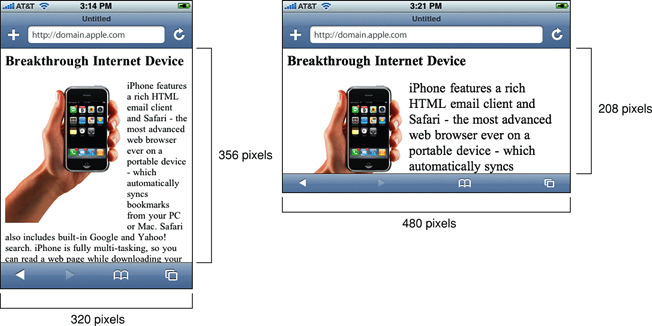
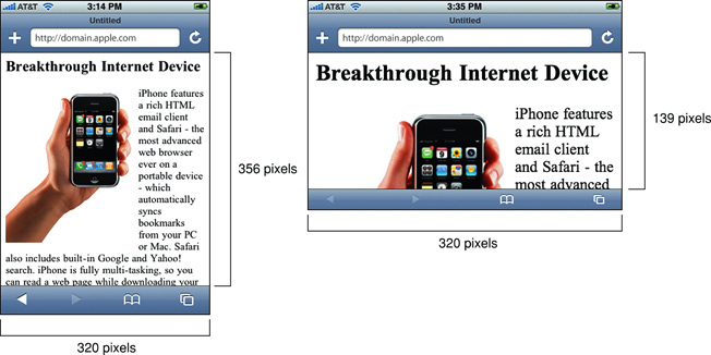
The original issue in this report is caused, as I understand it, when you have the iPad in landscape mode, but the page is saying with its viewport meta element that it wants the viewport width (currently mapped to the longer side of the iPad) to be the device-width (always the shorter side); hence why it uses the 768px CSS, looks zoomed in, etc. Having initial-scale=1 would fix this, but this then has the rotation bug on iOS. So, how about: So that you're not saying to a landscape device that it should have its viewport width set to its portrait width. https://gist.github.com/1410787 didn't test a viewport of just initial-scale, which I would have been very interested in. I've tested this meta viewport in Android and iOS (though can't find my iOS test results just now, sorry), and it appears to do what you would expect in both portrait and landscape, but I fully acknowledge I haven't done enough testing for it to be considered good (and it's late and now I'm worried that it has the iOS bug anyway and I've forgotten, but hey). But as it doesn't seem to have been considered, I thought I'd mention it. http://developer.apple.com/library/ios/#DOCUMENTATION/AppleApplications/Reference/SafariWebContent/UsingtheViewport/UsingtheViewport.html does say: "For example, if you set the scale to 1.0, Safari assumes the width is device-width in portrait and device-height in landscape orientation." - which is what you would want in terms of the default. |
|
Going to close this as "wontfix". The iOS bugs have existed for years, with no simple solution to them, and the fix is on the way in iOS6. Thanks for all the contributions and useful info. |
|
Looking ahead, what, if anything, would H5BP change the meta tag to, when just considering iOS6? |
|
Since the Mobile Boilerplate added Opinions? |
|
Following on from my comment above, after a recent blog post by Stu Robson, he and Bruce Lawson kindly did some testing last week on having just Note the Apple docs examples Figure 3-14 (having Just Patrick Lauke kindly provided the test file. Hope that's helpful in your deliberations. I'm definitely in favour of |
|
Chrome reports an error in actual form: meta name="viewport" content="width=device-width; initial-scale=1.0" Viewport argument value "device-width;" for key "width" is invalid, and has been ignored. Note that ';' is not a separator in viewport values. The list should be comma-separated. I think at least this can be changed... |
|
As the error says, you've used a semi-colon instead of a comma. The current boilerplate doesn't use either (hence this ticket)/ mobile boilerplate uses a comma. Use a comma and it's fine. |
|
I did not realized that the current version does not use either hence I On 5/13/2013 7:29 PM, Matthew Somerville wrote:
|
|
Fixed by ff37dba |
Cut down on some cargo-culting :-)

No need for the viewport tag to forbid user scaling. `width=device-width`
is also optional these days, as mobile browsers just do the right thing
by default.[1][2] Only initial-scale is required.

[1]: h5bp/html5-boilerplate#1099
[2]: GoogleChrome/lighthouse#641 (comment)

(Note also no need for `HandHeldFriendly` meta tag, since that was only
for some old Blackberry devices, no need for `MobileOptimized` since
that was only for very old versions of Windows Mobile, and no need for
a `X-UA-Compatible` tag since IE will automtically render in Standards
Mode when a valid <!doctype> is present and the user hasn’t set any
browser options to always render in compatibility mode.)

While I was there, I tidied up the charset tag too, although we serve
theyworkforyou.com with a charset HTTP header, so most browsers will
ignore this in-page tag anyway.

Part of #1421.
In the most recent HTML5BP the viewport is set like this in the header...
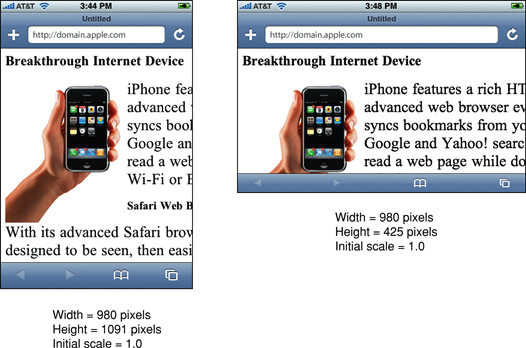
However, when viewed on an iPad2, horizontal/landscape mode a website that is designed for a responsive 960px grid scales up to what it might look like in 768px width instead, even though the iPad's 1024px is more than enough to accommodate the 960px page.
Why did you change this from...
which shows the right layout in 1024 width, and also changes it to the right layout when rotated to portrait at 768 width?
Sorry if I'm not understanding, but everything is zoomed in landscape mode with the current default settings when it shouldn't be. Graphics are blurry and this is triggering the wrong media query, one lower than it should be.
The text was updated successfully, but these errors were encountered: