Y-axis scale by percentile of data values #38245
Replies: 13 comments 1 reply
-
|
i think what you're asking for is covered by softMin/softMax?: #30326 |
Beta Was this translation helpful? Give feedback.
-
|
@leeoniya I don't think so, though I was certainly inspired by that change. I seem to leave a trail of wanting the opposite :-) |
Beta Was this translation helpful? Give feedback.
-
|
Playing with the new Time Series panel in 7.5, I notice that setting the Y-axis unit to "Percent (0-100)" is also setting the maximum to a hard 100. That's different from the Chart panel and not desirable. I don't see that I can undo that with another setting. I have a lot of cases where percentage can go above 100 (but want the values to say "%") and also several periods where we don't reach the 100% (especially when you're looking at one of the series in isolation). Should I open a separate issue to encourage you to keep those settings apart? |
Beta Was this translation helpful? Give feedback.
-
by % may not be fully baked yet. there's still more to do: #30564
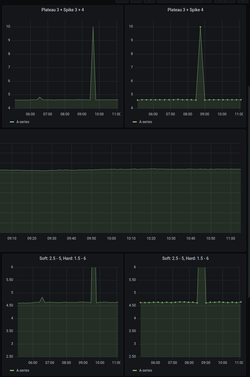
this case is covered by setting both the softMax and the hardMax. try importing this dashboard to see it in action: https://github.com/grafana/grafana/blob/master/devenv/dev-dashboards/panel-graph/graph-ng-soft-limits.json
yes, that is a side-effect and generally desirable, too.
|
Beta Was this translation helpful? Give feedback.
-
|
I will play a bit more with the new panel.
But I don't want to set the maximum so my dashboards can be used for systems with different value ranges, and also for when you select one of the series to study in isolation. |
Beta Was this translation helpful? Give feedback.
-
|
as with everything, it's a trade-off. i guess you're asking to clip outliers based on some % of a stat of the in-view data (like mean or geometric mean) but still auto-scale the Y dynamically based on the non-outlier range (which would make Y less stable, but more adaptive between different datasets). i can see this being useful, but not sure how much appetite there will be for additional settings in the UI. the softMin/softMax took a good amount of convincing to get the real-estate approved. we can leave this open to see how many upvotes it gets in a few months. |
Beta Was this translation helpful? Give feedback.
-
|
It helps when I finally managed to explain what I was suggesting. I don't think it has to take more real estate as you could have just a value plus an indicator whether that value is hard, soft, or computed percentile of the data. I think having separate soft and hard values is a bit too much. |
Beta Was this translation helpful? Give feedback.
-
it's actually absolutely necessary. you can read the entire, very long thread, but specifically: #979 (comment) |
Beta Was this translation helpful? Give feedback.
-
|
Thanks. And before I forget to say it, I am very pleased with what got into the new Time Series panel. |
Beta Was this translation helpful? Give feedback.
-
|
We're in the process of moving Grafana feature requests to GitHub Discussions. This issue is being moved to Discussions or has been moved from our issues list, depending on where you're seeing this message. We hope to use the discussion thread to continue building use cases, and additional evidence based on engagement/voting, in order to help us prioritize this feature request later on down the road. As with all things Grafana, we value your input and participation in this project and appreciate your patience during this transitional period. Looking forward to the discussion! |
Beta Was this translation helpful? Give feedback.
-
|
This discussion helped me understand I have a graph which represent the ETA of an operation, that operation on some server could have a "normal" ETA of 1h, on other server it can be normal that it completes in 2w. As it is an estimated value, it can very easily have huge spikes (when operation speed crawls down to 0, because of server load or anything)… having a "percentile max" I'd set a 90% percentile or something like that and it would work just as well to remove the 1 year spike in "~1h" data and the 1 year spike in the "~2w" data, but using Of course, since a "90% percentile cutoff" would always cut off 10% of the data (even when without spikes) so ideally I'd do it like this: set the scale such as the 90% percentile is at 90% of the Y axis, so that on average all data is shown, unless there are spikes. |
Beta Was this translation helpful? Give feedback.
-
|
I agree that the proposed feature is very useful and many scenarios are not covered by absolute soft/hard min/max thresholds. In our scenario we often see spikes in our metrics when our processes restart or network routes are changed or some other short events happen. But we have the same panel that is used with different selectors choosing different sources of data. We simply cannot pick thresholds valid for all sources of data. And even withing the same source, the mean value gradually shifts in time, so it changes as the time passes and if you select different time intervals. All this makes absolute thresholds near impossible to use. My proposal is very simple: allow expressions and variables for already existing thresholds. Then I would define |
Beta Was this translation helpful? Give feedback.
-
|
I'm not sure the implementation is that simple, but much depends on what the input for that expression is. For example I often have stacked series like this where some series are very small. Clicking on the legend, I can view one or more small series in isolation and expect the scale to be adjusted to span the range of those series, so the "grass" will show like a forest. |

Beta Was this translation helpful? Give feedback.
-
|
Hey there! We want to let you all know that we are moving to Github Issues for feature requests. You can read more about the move here. I will be closing this discussion, but if you’re still interested in this request being implemented please don’t hesitate to open a feature request. Sorry for the inconvenience, and thanks for your contributions! cc @grafana/dataviz-squad |
Beta Was this translation helpful? Give feedback.
-
What would you like to be added:
An option to have the Y-axis automatically scaled so a percentile of the data points, say 95%, fits on the chart. This would probably be a separate setting for both min and max of the scale.
Why is this needed:
This would allow the chart automatically show most of the data with good granularity such that a single brief peak does not turn the entire chart into "grass" when raising the Y-max. In most cases it is enough to see that a short peak was off-scale, and the actual value is rarely interesting (as it depends on when the spike exactly was, and whether it spans one or more intervals). You could still hover over the chart to see the actual value, or zoom in the time range so that the peak is most of the data and the Y-max is adjusted to capture it. This is also helpful when a derivative() is used and the first reading is off-scale.
You could achieve the same by setting a hard Y-max, but that defeats the purpose of the template variables to use the same dashboards for different systems (that have different typical good values).
Beta Was this translation helpful? Give feedback.
All reactions