Time-series panel: multiple y-axis of same unit #38242
Replies: 17 comments 3 replies
-
|
Thanks for creating this issue! We think it's missing some basic information. Follow the issue template and add additional information that will help us replicate the problem.
For dashboard related issues:
For authentication, provisioning and alerting issues, Grafana server logs are useful. Happy graphing! |
Beta Was this translation helpful? Give feedback.
-
|
Can you please rewrite your issue using our issue template? |
Beta Was this translation helpful? Give feedback.
-
|
I'm closing this one due to inactivity. Please respond and provide some more information if we should reopen this issue. |
Beta Was this translation helpful? Give feedback.
-
|
Since I just hit this problem I'll fill in the missing details: What happened: What you expected to happen: How to reproduce it (as minimally and precisely as possible): Anything else we need to know?: Environment: Grafana version: v8.0.2 |

Beta Was this translation helpful? Give feedback.
-
|
@tfylling have you considered using a single logarithmic axis? it feels like a better solution for exactly this use case.
|

Beta Was this translation helpful? Give feedback.
-
|
changed this to a feature request and awaiting evidence |
Beta Was this translation helpful? Give feedback.
-
|
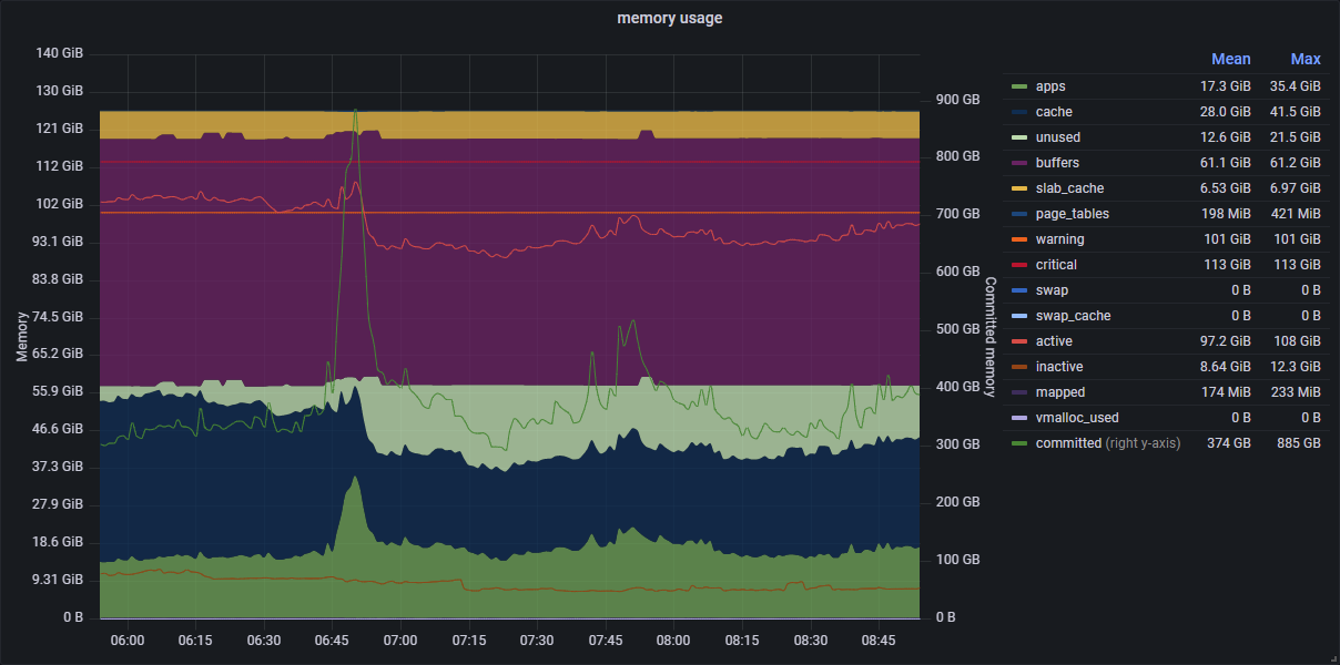
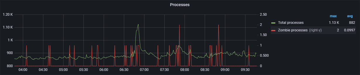
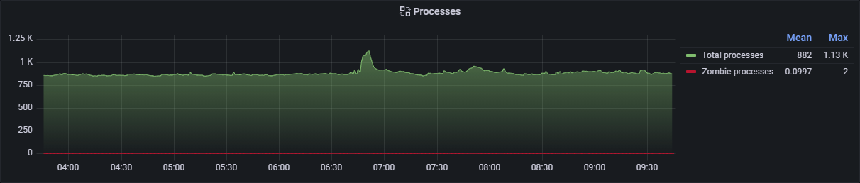
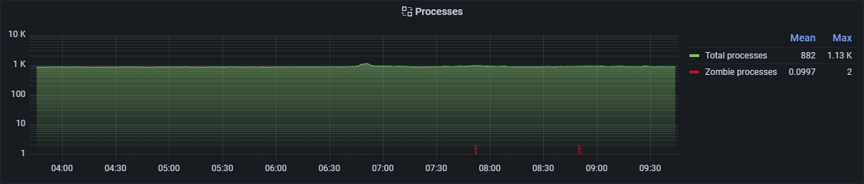
Logarithmic graphs are not really useful for stacked values. You lose fidelity and it is notoriously hard for uninitiated to read. Also all the other values here fall within the same range. Here is another example that I just hit when I started work to convert the old graph panels to time series panels. First the original graph panel: As converted to Time Series, again trying, and failing, to set Zombies on the right axis: |
Beta Was this translation helpful? Give feedback.
-
|
Another thought: Likely quite a bit more work, but wouldn't it make more sense, and give more flexibility, to treat the axis as separate entities in the option list, so you can add, remove and manipulate multiple individual axis at will and then assign them to metrics in the override list? That way you can also have any given axis align their zero (or any other arbitrary number) with a corresponding value on any other named axis, an option which now again seems to be entirely missing with this new axis handling. I would also dearly like to be able to use a value, eg. last non-zero, from a time series as min and max for an axis, as I often have those values in the data source. I guess that would be a separate ticket, which I can create if at all feasible. |
Beta Was this translation helpful? Give feedback.
-
|
Just stumbled upon this issue. Interestingly enough, if you simply add an override for 'unit' but do not chose any unit it still seems to work. |
Beta Was this translation helpful? Give feedback.
-
|
We're in the process of moving Grafana feature requests to GitHub Discussions. This issue is being moved to Discussions or has been moved from our issues list, depending on where you're seeing this message. We hope to use the discussion thread to continue building use cases, and additional evidence based on engagement/voting, in order to help us prioritize this feature request later on down the road. As with all things Grafana, we value your input and participation in this project and appreciate your patience during this transitional period. Looking forward to the discussion! |
Beta Was this translation helpful? Give feedback.
-
|
@LiMuBei it does display the axis on the left and right, but the axis with the override doesn't display the unit prefix e.g. $ |
Beta Was this translation helpful? Give feedback.
-
|
I managed to figure out a solution. You can just assign a custom prefix unit and it works e.g. |
Beta Was this translation helpful? Give feedback.
-
|
This workaround is only valid if you don't care about the convenient representation of built-in units, with correct prefix handling (for instance, when representing bytes(IEC), you get KiB, MiB, GiB ...) |
Beta Was this translation helpful? Give feedback.
-
|
Damn, yeah that's a bummer :{ I'm only using it for currency representation so haven't run into your issue. |
Beta Was this translation helpful? Give feedback.
-
|
Given how the work-around is possible and this seems like a regression from the old graph panel, I'd argue this is a bug rather then a feature request. Maybe I'm assuming too much, but as a user I'm under the impression that if a replacement feature is rolled out and the old one targeted for future removal (I believe this is the case for the old Graph panel?) then it should retain the same functionality and if not, have it be called out explicitly. |
Beta Was this translation helpful? Give feedback.
-
|
👍 Because this work-around isn't valid if you need the native representation of built-in types (that is, the suffixing of units and its scaling), I can only consider this a regression. |
Beta Was this translation helpful? Give feedback.
-
|
wouldn't it be easier if the preferred axis could be decided per-query? |
Beta Was this translation helpful? Give feedback.
-
|
Any word on when this will be fixed? I've got a few examples where I have outdoor and indoor temperatures and it would be nice to scale them separately on different y-axes rather than have a lot of empty space between them. |
Beta Was this translation helpful? Give feedback.
-
|
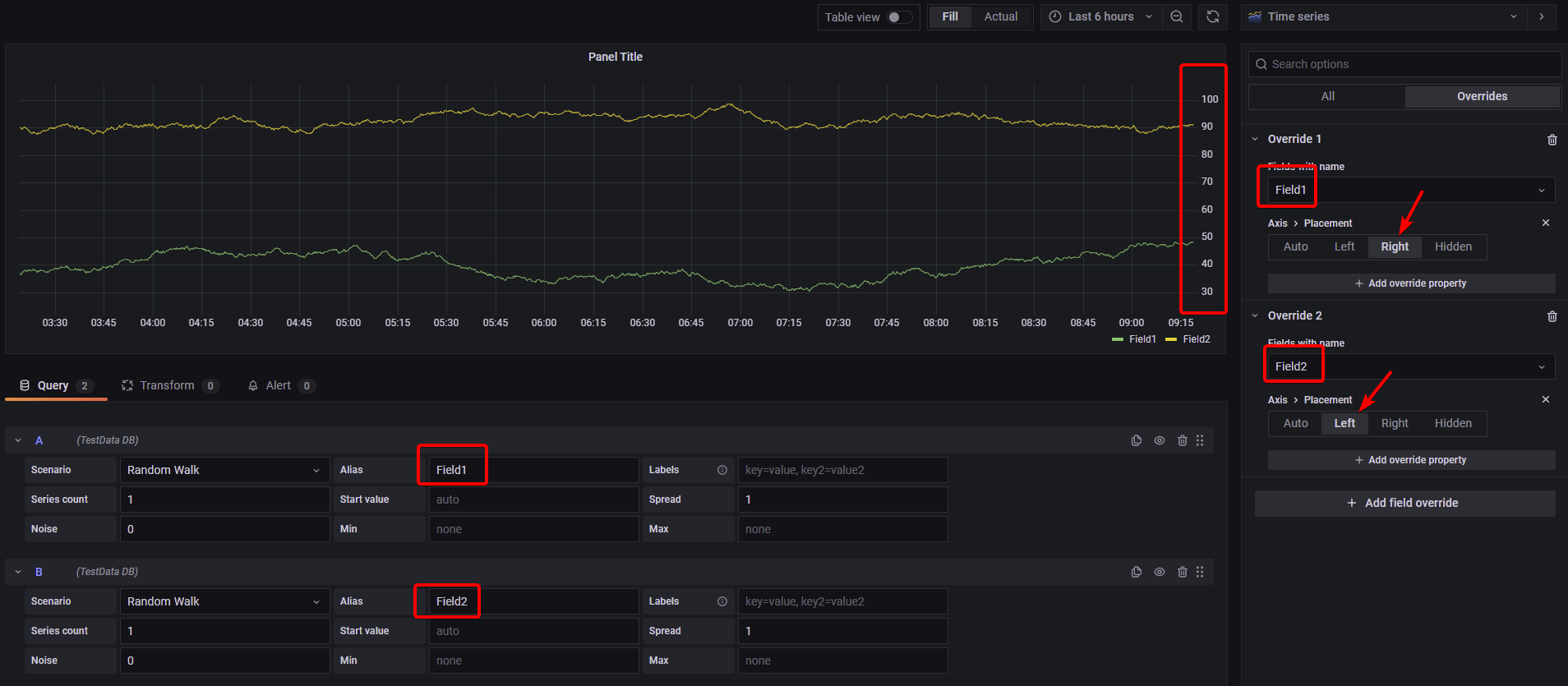
I had filed a bug (#40907) because I encountered this; it was closed and was redirected here. It seemed to work in the old panel. The exact sequence of steps - doesn't work in the new one. Therefore IMHO it seems to be a bug
I have 2 fields of the same units but different scales and want to show them on a Left and right axis |
Beta Was this translation helpful? Give feedback.
-
|
Support for this will come with Grafana v8.3.0 (ref #41635) |
Beta Was this translation helpful? Give feedback.
-
In the Graph panel, it's possible to set the left- and right-y axis to be the same unit. This is useful to compare two series with the same unit but different scales. In the new time-series panel, there seems to be no way to put a series on the opposite axis if it has the same unit.
Beta Was this translation helpful? Give feedback.
All reactions