Time series panel: Gaps are shown as empty values in the tooltip #38224
Replies: 10 comments
-
|
@roe1974 could you please share your data with us so that we could investigate this problem? My guess is you have data that contains gaps, pretty much the way I have setup up a simple example here: https://play.grafana.org/d/RzDXiCEGk/31309?orgId=1 |
Beta Was this translation helpful? Give feedback.
-
|
Thanks for creating this issue! We think it's missing some basic information. Follow the issue template and add additional information that will help us replicate the problem.
For dashboard related issues:
For authentication and alerting issues, Grafana server logs are useful. Happy graphing! |
Beta Was this translation helpful? Give feedback.
-
|
@dprokop |
Beta Was this translation helpful? Give feedback.
-
|
@roe1974 when thinking about this I personally find both approaches confusing. I would probably prefer to be explicit about the missing value (basically showing null / no data / or similar info) rather than focusing next closest data point that exist and displaying it's value. @torkelo @leeoniya do you have any thoughts about this? Introducing a behaviour similar to the one in the Graph Panel (focusing on closest point that exists) would require changes in uPlot I guess? |
Beta Was this translation helpful? Give feedback.
-
|
it's easy to do: https://github.com/leeoniya/uPlot/blob/master/demos/nearest-non-null.html if you're showing a single time value, it does become misleading, which is why that demo uses a table-style legend. if you can indicate in the tooltip that time is approx (~12:30pm) and include some kind of reasonable threshold for finding the nearest non-gap point, it might work okay. for slightly mis-aligned data it can be quite helpful. |
Beta Was this translation helpful? Give feedback.
-
|
Yeah, think you are right @leeoniya. Ok, I'm adding this to #30564 and making this issue a feature request :) Thinking about the solution, I'm not a fan of adding more info, especially additional timestamp to the tooltip, as there might be few close no-null datapoints what will result in a cluttered tooltip. I like the idea of having the "tooltip" information displayed in a legend format. That would require some config option for the legend to behave as if it was showing the info from the tooltip. But for a short-term solution, I think we should bring back the Graph panel behavior at least. |
Beta Was this translation helpful? Give feedback.
-
i'm not sure exactly what the old panel behavior was, or whether it's worth replicating. i did a pretty in-depth writeup here with problematic examples: #34542 (comment). nevertheless, i made a draft PR here: #34552. (tooltip is not updated in this PR) no-null-tip3.mp4 |
Beta Was this translation helpful? Give feedback.
-
|
i've landed #34552 please try the next nightly build or next beta release:
|

Beta Was this translation helpful? Give feedback.
-
|
We're in the process of moving Grafana feature requests to GitHub Discussions. This issue is being moved to Discussions or has been moved from our issues list, depending on where you're seeing this message. We hope to use the discussion thread to continue building use cases, and additional evidence based on engagement/voting, in order to help us prioritize this feature request later on down the road. As with all things Grafana, we value your input and participation in this project and appreciate your patience during this transitional period. Looking forward to the discussion! |
Beta Was this translation helpful? Give feedback.
-
|
Hello, as you may have heard, we are transitioning away from using discussions to discuss feature requests. This looks like it was implemented in #34552. Feel free to make an issue if this is not a solution and you would like to request the feature. |
Beta Was this translation helpful? Give feedback.
-
What happened:
If you move the mouse pointer over the graph, not all values are always displayed if there are more than 5 data series (with Vizualization "Time series") .
What you expected to happen:
All values are shown while moving mouse pointer over graph (Vizualization: "Time series")
How to reproduce it (as minimally and precisely as possible):
Anything else we need to know?:
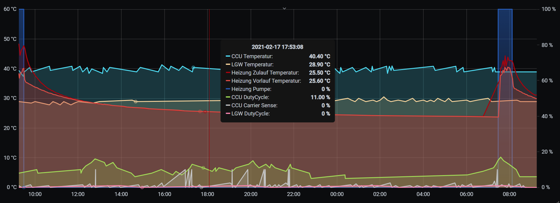
See two screenshots
first with Vizualization "Graph"
second with Vizualization "Time series

Environment:
Beta Was this translation helpful? Give feedback.
All reactions