Releases: fkhadra/react-toastify
v9.0.2
Contributors
Assets 2
v9.0.0
Release note
🚀 What is new in v9
Say hello to addons! What are addons? So, addons are like DLCs in video games but for react-toastify 😆. More seriously, you can think of it as utilities built around react-toastify. For example, custom theme, hooks, components etc...
useNotificationCenter
The first addon that I would like to introduce is the useNotificationCenter headless hook! As the name suggests, it let you build your notification center on top of react-toastify. See for yourself 👇
Screen.Recording.2022-05-03.at.21.24.02.mov
Another example using MUI.
Check the documentation for more details.

Stacked toasts
This second addon will be released later. There are a bunch of details that I need to cover and I don't want to release something too buggy. Nevertheless, I'm really excited about it and I think it's worth showcasing anyway.
I call it StackedContainer for now, it's an alternative to the ToastContainer component.

💥 Breaking changes
There are 2 breaking changes. The API change for toast.onChange and the removal of toast.configure.
toast.onChange
The previous API was returning the numberOfToastDisplayed and the containerId. Honestly, this API seems to be incomplete.
For example, with the old API, if I wanted to do some logging this would be very difficult because I don't have enough data to log.
toast.onChange((numberOfToastDisplayed, containerId) => {
  logger.info("nothing useful to log, ...")
})
The new API offers more possibilities. The callback will receive a ToastItem. The item provides a bunch of useful properties status, content, id, data, etc...
interface ToastItem<Data = {}> {
    id: Id;
    content: React.ReactNode;
    theme?: Theme;
    type?: TypeOptions;
    isLoading?: boolean;
    containerId?: Id;
    data: Data;
    icon?: React.ReactNode | false;
    status: "added" | "removed" | "updated"
}

const unsubscribe = toast.onChange((payload: ToastItem) => {
  switch (payload.status) {
    case "added":
      // new toast added
      break;
    case "updated":
      // toast updated
      break;
    case "removed":
      // toast has been removed
      break;
  }
});
For example, if I want to log something every time there is a new error notification, with the new API it's trivial
toast.onChange(payload => {
  if(payload.status === "added" && payload.type === toast.TYPE.ERROR) {
    logger.error({
      createdAt: Date.now(),
      content: payload.content,
      data: payload.data
    })
  }
})
toast.configure removal
toast.configure works fine for most cases but the current implementation has one main issue. It does not work with react context because it creates a new react tree.
That being said, having 2 APIs to do the same thing is a bad thing.
🕷 Bug fixes
v8.2.0
v8.1.1
Release notes
🕷 Bug fixes
- fix #702 autoClose duration start after the entrance animation finish
- fix #689 prevents promise without success to hang on to the pending state
- fix #645 and #618
onClosenow work as expected! - fix #694 Fix error in Chrome: remove preventDefault from passive listener
⚙️ Chore
- #703 the
ToastPromiseParamsis now exported - exit animation on safari are not conflicting with drag transition anymore
Thanks to @03c, @wilson-webdev, @essential-randomness for their contributions
Contributors
Assets 2
v8.1.0
v8.0.3
v8.0.2
v8.0.1
v8.0.0
React-toastify has been around for 5 years(will turn five the 8 November 🎂). Since the beginning, one of the goals was to provide a library that is highly customizable and also able to work out of the box. Every major release introduces breaking changes but this is for the best 👌.

🚀 Features
New look
Notifications of different types (toast.info, toast.error, toast.success, toast.warning) display an icon associated with the selected type. You can also notice that the progress bar color matches the type color.


Don't be afraid 😱, if you don't like those icons you can use your own or remove them. This is what it looks like in practice.
toast("Default toast behavior is untouched, no icon to display");
toast.info("Lorem ipsum dolor"); // same as toast(message, {type: "info"});
toast.error("Lorem ipsum dolor")
toast.success("Lorem ipsum dolor")
toast.warn("Lorem ipsum dolor")
toast.error("Without icon", {
  icon: false
});
toast.success("You can provide any string", {
  icon: "🚀"
});
// custom icons have access to the theme and the toast type
toast.success("And of course a component of your choice", {
  icon: MyIcon
});
toast.success("Even a function, given you return something that can be rendered", {
  icon: ({theme, type}) =>  <img src="url"/>
});
//Disable icons
<ToastContainer icon={false} />
Clear separation between type and theme
Prior to v8, toast.info, toast.error, etc... Would display respectively a blue notification, a red notification, etc... This is not the case anymore. There are 3 distinct themes: light, dark, colored. The theme can be applied globally or per notification.
//Set the theme globally
<ToastContainer theme="dark" />

// define per toast
toast.info("Display a dark notification of type info");
toast.info("Display a light notification of type info", { theme: "light" });
toast.info("Display a blue notification of type info", { theme: "colored" });
This separation will benefit theming in the future.
I promise this is new, I'll tell you if you await
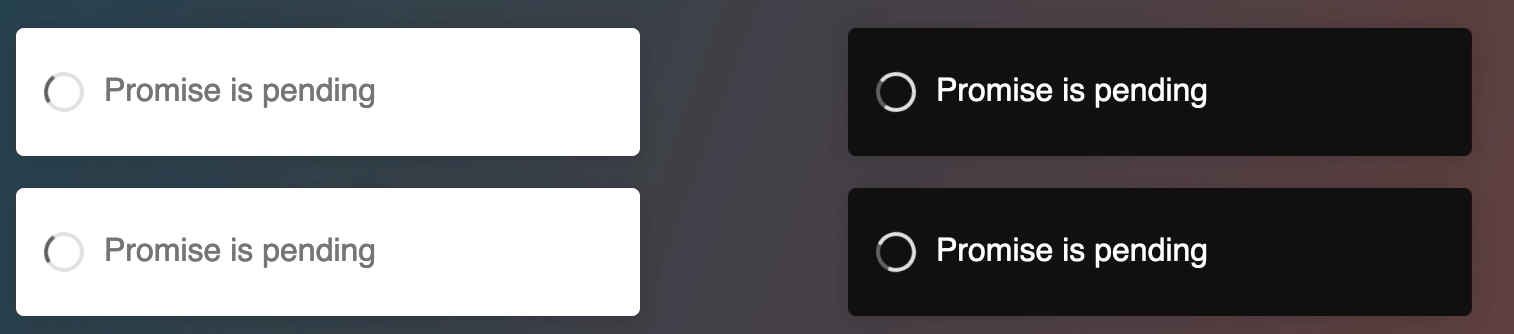
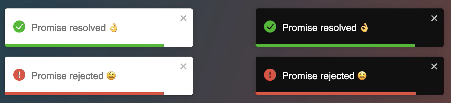
The library exposes a toast.promise function. Supply a promise and the notification will be updated if it resolves or fails. When the promise is pending a spinner is displayed. Again you hide it, I bet you already know how to😆.
Let's start with a simple example
const resolveAfter3Sec = new Promise(resolve => setTimeout(resolve, 3000));
toast.promise(
    resolveAfter3Sec,
    {
      pending: 'Promise is pending',
      success: 'Promise resolved 👌',
      error: 'Promise rejected 🤯'
    }
)
Displaying a simple message is what you would want to do in 90% of cases. But what if the message you want to display depends on the promise response, what if you want to change some options for the error notification? Rest assured, under the hood, the library uses toast.update. Thanks to this, you have full control over each notification.
const resolveWithSomeData = new Promise(resolve => setTimeout(() => resolve("world"), 3000));
toast.promise(
    resolveAfter3Sec,
    {
      pending: 'Promise is pending',
      success: {
        render({data}){
          return `Hello ${data}`
        },
        // other options
        icon: "🟢",
      },
      error: {
        render({data}){
          // When the promise reject, data will contains the error
          return <MyErrorComponent message={data.message} />
        }
      }
    }
)
If you want to take care of each step yourself you can use toast.loading and update the notification yourself.
const id = toast.loading("Please wait...")
//do something else
toast.update(id, { render: "All is good", type: "success" });
Pass data even when you are not rendering a react component
One way to pass data to the notification was to use the context api or provide your own component. Starting v8 a data option is now available to make it easier.
toast(({data}) => `Hello ${data}`, {
  data: "world"
})
I just want to change few colors
Most of the time, users are ok with the default style, they just want to change some colors to match their brand. I think one way to improve the DX for all of us is to embrace CSS variables. That's why the library has switched to css variables!
All you want is to change the color of the progress bar? No problem
:root{
  // this is the default value below
  --toastify-color-progress-light: linear-gradient(
    to right,
    #4cd964,
    #5ac8fa,
    #007aff,
    #34aadc,
    #5856d6,
    #ff2d55
  );
}
You can find the list of all exposed variables here
💥 Breaking changes
There are few breaking changes.
- The separation between theme and type. The type
darkhas been removed
// before v8
toast("hello", {
  type: "dark"
})
// toast.TYPE.DARK is no longer available

// in v8
toast("hello", {
  theme: "dark"
})
// or
toast.dark("hello")- Notifications of different types are not colored by default, but they look pretty by default now 😆. You can use the
coloredtheme to get the same behavior as the previous version
toast.info("hello", {
  theme: "colored"
})
// or apply the theme globally
<ToastContainer theme="colored" />- An icon is displayed by default for the notificaiton of type
info,error,warning,success
// to opt-out gloablly from this behavior
<ToastContainer icon={false} />

// or per toast
toast.info("hello", {
  icon: false
});- the following css classes has been removed
.Toastify__toast--dark {
}
.Toastify__toast--default {
}
.Toastify__toast--info {
}
.Toastify__toast--success {
}
.Toastify__toast--warning {
}
.Toastify__toast--error {
}
⚙️ Chore
- update all dependencies
That's it for this release. Thank you for using react-toastify and happy coding!