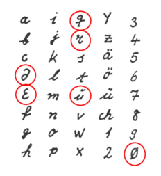
O's and 0's too close to each other #42
Comments
|
Isn't this okay for handwriting fonts though? In what contexts can this cause confusion? |
|
I'm in the boat where all characters should be differentiable. I make that slash when I handwrite the 0's in my email address. Why not allow for usernames and IDs to be decipherable? |
|
I agree. This is similar issue to
|

|
Hi, this looks interesting! Can I take this up? |
|
|

|
It is subtle, but seems good enough. I'm curious if @anumithaapollo12 has any additional ideas. |
|
For me it is very important that you can clearly distinguish all the characters. I learned that still in my youth, as a radio operator, when you listen to messages in groups of 5 in Morse code and write down the characters so that you can distinguish them clearly. For one thing, it was important to use a graphite pencil because it survives rain and water. On the other hand, the clear distinction between characters whose meaning is not obvious from the context in groups of 5.
That is why there was and still is an extra radio script that had to be learned. At least the German radio script is extremely well thought out, precisely with the goal of good distinguishability. https://www.qsl.net/dk5ke/bilder/abc.gif
|

The lowercase and uppercase O look great. The zero could be changed to make it look more zero like. Either by making it thinner, putting a slash through the middle, or something else.
The text was updated successfully, but these errors were encountered: