The following repository is the code for the following paper:
Automated Dependence Plots
David I. Inouye, Liu Leqi, Joon Sik Kim, Bryon Aragam, Pradeep Ravikumar
Uncertainty in Artificial Intelligence (UAI), 2020.
If you use this code, please cite this paper:
@inproceedings{inouye2020adp,
    author = {Inouye, David I and Leqi, Liu and Kim, Joon Sik and Aragam, Bryon and Ravikumar, Pradeep},
    booktitle = {Uncertainty in Artificial Intelligence},
    title = {{Automated Dependence Plots}},
    year = {2020}
}
How can we audit black-box machine learning models to detect undesirable behaviours?
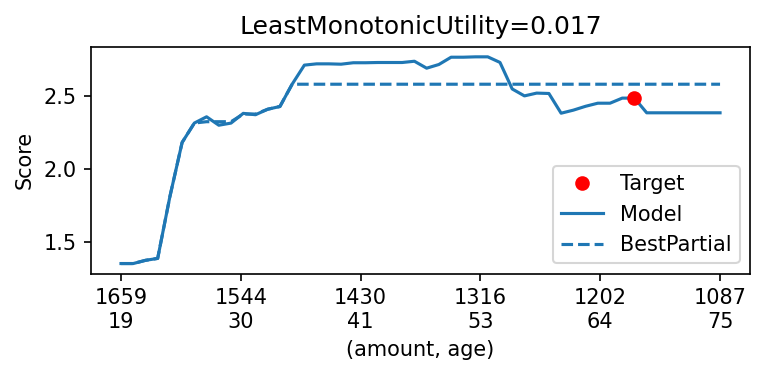
Visualizing the output of a model via dependence plots is a classical technique to understand how model predictions change as we vary the inputs. Automated dependence plots (ADPs) are a way to automate the manual selection of interesting or relevant dependence plots by optimizing over the space of dependence plots.
The basic idea is to define a utility function that quantifies how "interesting" or "relevant" a plot is---for example, this could be directions over which the model changes abruptly (LeastLipschitzUtility), is non-monotonic (LeastMonotonicUtility), or changes the most from a constant function (LeastConstantUtility). The steps are as follows:
- Define a plot utility measure (or use a pre-defined utility)
- Optimize over directions in feature space to find plots with the highest utility
- Visualize the dependence plot in this direction
For example, the following figure highlights the combination of two features over which a model exhibits the most non-monotonic behaviour, and displays the output of the model as you vary these features:
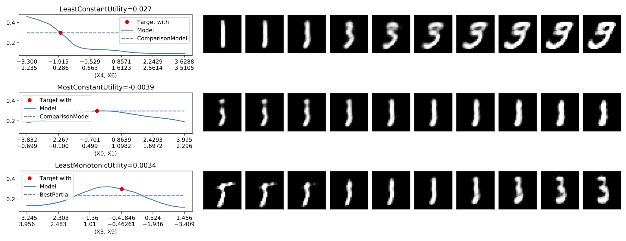
A more interesting example finds interesting directions in the latent space of a generative model (in this case, a VAE trained on the MNIST dataset):
This adp module contains four main submodules that can be used together or separately:
adp.curve- This submodule handles creating directional curves (defined by directional vectorv) in the input space centered on a target point usually denoted byx0. In particular, this module handles boundes for the curve based on a training dataset. There is also some simple support for handling categorical variables.adp.utility- This submodule defines multiple concrete utility measures for evaluating the interestingness or usefulness of various directional curves.adp.optimize- This submodule handles optimization over possible curves to automatically optimize the specified utility.adp.plot- This submodule handles plotting of curves including handling curves that vary in more than one dimension and showing the alternative models that depend on the utility selected.
To setup an environment (via conda), download data and pretrained models, and run notebooks to generate figures, simply run the following commands:
make conda-env
source activate adp-env || conda activate adp-env
make data
make models
make test
We have provided two Jupyter notebook tutorials to illustrate the use of ADPs:
- A real data tutorial based on a UCI dataset
- A toy example based on simulated data
These tutorials showcase the basic functionality and structure of the code. From here, users can extend these examples to custom plot utility measures and more complex datasets.
We use a recent version of scikit-learn (0.23) that includes partial dependence plots (might also be included in sklearn 0.22). To setup a conda environment and install requirements:
make conda-env
conda activate adp-env
Or to do it manually:
conda env create -f environment.yml
conda activate adp-env
To remove this environment:
conda env remove --name adp-env
For simplicity, it's probably best to download all data and pretrained models before going through the tests. The longest setup is for the GTSRB sign dataset but it should only take a few minutes. Just run the following make commands to setup both the models and data
make models
make data
Notebooks should be run by starting Jupyter notebooks in the notebooks folder. This is to make sure the relative paths work correctly for loading the module and data/models.
cd notebooks/
jupyter notebookNOTE: Figures may be slightly different than original paper because we updated to using sklearn 0.23 instead of 0.19 that was originally used in the paper. If you want to reproduce the exact figures, please see the tag v0.0.1 (note the environment is also different so you will need to create a new environment).
Each figure can be reproduced by running the following notebooks:
- Figure 1 - figure-loan-optimize.ipynb
- Figure 2 - notebooks/figure-contrast-with-local-approximation.ipynb
- Figure 3 - figure-lipschitz-bounded.ipynb
- Figure 4 - figure-loan-model-comparison.ipynb
- Figure 5 - figure-selection-bias.ipynb
- Figure 6 - figure-streetsign.ipynb
- Figure 7 - figure-vae-mnist.ipynb
- One appendix figure - figure-domain-mismatch-loan.ipynb
jupyter nbconvert --ExecutePreprocessor.timeout=-1 --to notebook --execute notebooks/NOTEBOOK_NAME.ipynbWe have provided a Makefile for running all the notebooks. Merely run the following command to execute all notebooks (output goes intout notebooks/results/NOTEBOOKNAME.out. An *.error file will be generated if the notebook failed and a *.success file will be generated if the notebook ran successfully.
make test