class: center, middle, gray-background
Radovan Bast (fosstodon.org/@radovan)

![]()
Text: CC-BY 4.0
.left-column30[
![]() ]
]
.right-column70[
-
Theoretical chemist turned research software engineer.
-
I write research software and teach programming to researchers and lead the CodeRefinery project.
-
I lead the high-performance computing group and the research software engineering group at UiT. ]
We teach all the essential tools which are usually skipped in academic education so everyone can make full use of software, computing, and data.
.left-column50[

- https://coderefinery.org
- https://coderefinery.org/workshops/past/ ] .right-column50[
-
Data visualization for .emph[publications and presentations] within and outside academia
-
.emph[Practical] recommendations
-
.emph[Reproducibility] for you and others
-
Know which tools exist -> .emph[good starting points]
-
Programming languages and technical details of tools
-
Data visualization for the general public (newspapers, television)
.quote["One thing I have learned over the years is that automation is your friend. I think figures should be autogenerated as part of the data analysis pipeline (which should also be automated), and they should come out of the pipeline ready to be sent to the printer, no manual post-processing needed."]
.cite["Fundamentals of Data Visualization", C. O. Wilke]

.cite[https://twitter.com/kara_woo/status/1134878080567091200]
-
If data or requirements change, somebody will have to update figures.
-
Automation makes it a bit easier.
-
So that we don't have to study the plot for 20 minutes with eyes hurting to get the message.
-
Font size, colors, suitable representation, good title, and caption.
class: center, middle, inverse
.left-column60[
 ]
]
.right-column40[ All four plots have the .emph[same] mean of x and y, sample variance of x and y, correlation between x and y, linear regression line, and R^2 coefficient.
.cite[https://en.wikipedia.org/wiki/Anscombe%27s_quartet]
.cite[https://seaborn.pydata.org/examples/anscombes_quartet.html] ]

.cite[A. Cairo, "Datasaurus: Never trust summary statistics alone; always visualize your data"]
464418163541729611394089491019
103214981928889407852268902875
389879353920237244649469321810
290602004777144868218046078720
522890797338149835404330684291
.cite[Inspired by https://courses.cs.washington.edu/courses/cse512/23sp/, in turn inspired after J. Stasko]
464418163.red[5]41729611394089491019
1032149819288894078.red[5]226890287.red[5]
3898793.red[5]3920237244649469321810
290602004777144868218046078720
.red[5]2289079733814983.red[5]404330684291
.cite[Inspired by https://courses.cs.washington.edu/courses/cse512/23sp/, in turn inspired after J. Stasko]
Data visualization is a
.cite["Fundamentals of Data Visualization", C. O. Wilke]
- position
- length
- shape
- size
- color
- line width
- line type
- (there exist many more)
- Both calculations and graphs will contribute to understanding
.left-column50[
- Presentations/papers: facilitate understanding
- Communication with the public
.quote[reflect on how important and powerful data visualization is: COVID-19, politics, climate change, ...] ]
.right-column50[
- And we often copy the style and culture ]
class: center, middle, inverse
(reflect about the value of a good visualization)
class: center, middle, inverse
-
Sometimes: Sketch with pen and paper
-
Browse directories/galleries for inspiration: Vega-Altair, Matplotlib, Seaborn, Plotly, Bokeh, ggplot, PyNGL, K3D, ggplot2, Shiny, Data-Driven Documents, ...
-
Take an example that is close to what I want
-
Try to rerun it with original example data
-
Try to replace example data with my own data
-
Tweak and refine


[This list is adapted from a similar list in a presentation by L. Garrison, "Share Your Science: Visualization for Communication"]
-
Define your goals
-
Show the data (go beyond summary statistics)
-
Be honest with your visuals
-
Consider accessibility
-
Avoid taxing working memory
-
Tell a story
-
Reflect on uncertainty and unknowns
-
"Before you start, define your goals in 1-3 sentences" .cite[L. Garrison, "Share Your Science: Visualization for Communication"]
-
Audience?
-
Time constraints

Examples with disproportional data/ink ratio:


.cite[Both figures from https://www.callingbullshit.org/tools/tools_proportional_ink.html]

.cite[Citation needed]
... unless you are plotting something inherently 3D (molecular structures, structure of an enzyme, a 3D relief of a terrain)

.cite[https://matplotlib.org/3.1.1/gallery/mplot3d/scatter3d.html]
class: center, middle, inverse
"We need five colors for the plot: black ... red ... green ... blue ... ... ... orange?"
.left-column50[
 ]
]
.right-column50[
-
4% of the population is affected
-
View your color figures under CVD simulations
-
Use color scales designed to be CVD-friendly ]
- .emph[Discrete/qualitative] color scales: designed to distinguish

- .emph[Sequential/continuous] color scales: represent data values


- .emph[Diverging] color scales: visualize deviation of data values relative to a neutral midpoint .cite[ColorBrewer pink to yellow-green]

.left-column50[
-
Great for scatter-plots.
-
What if you need more than 8 colors? Use direct labeling instead.
.cite[Okabe, M., and K. Ito. 2008] ]
.right-column50[

.cite[https://seaborn.pydata.org/examples/multiple_regression.html] ]
.left-column50[
-
Great for choropleth plots (here plotting unemployment rate).
-
Color vision deficiencies less of a concern for this type.
-
Avoid rainbow scales. ]
.right-column50[

.cite[https://altair-viz.github.io/gallery/choropleth.html] ]
.left-column50[
- Great for heatmaps.
.cite[ColorBrewer pink to yellow-green] ]
.right-column50[

.cite[https://seaborn.pydata.org/examples/many_pairwise_correlations.html] ]
- https://clauswilke.com/dataviz/color-pitfalls.html
- https://blog.datawrapper.de/beautifulcolors/
- Okabe, M., and K. Ito. 2008. "Color Universal Design (CUD): How to Make Figures and Presentations That Are Friendly to Colorblind People."
- https://seaborn.pydata.org/tutorial/color_palettes.html
- https://colorbrewer2.org/
- https://www.fabiocrameri.ch/colourmaps/
- https://venngage.com/tools/accessible-color-palette-generator
- So that we know what to search for
- Source of inspiration
-
https://clauswilke.com/dataviz/directory-of-visualizations.html
-
https://github.com/ft-interactive/chart-doctor/tree/master/visual-vocabulary
class: center, middle, inverse
See also: https://viz.wtf

.cite[Figure from https://twitter.com/GraphCrimes]

.cite[Figure from https://www.callingbullshit.org/tools/tools_proportional_ink.html]

.cite[Figure from https://twitter.com/GraphCrimes]

.cite[Figure from https://www.callingbullshit.org/tools/tools_proportional_ink.html]

.cite[Figure from https://twitter.com/GraphCrimes]
.left-column50[
 ]
]
.right-column50[ .cite[Figure from https://twitter.com/GraphCrimes] ]

.cite[Figure from https://twitter.com/GraphCrimes]

.cite[Figure from https://twitter.com/GraphCrimes]

.cite[Figure from https://twitter.com/GraphCrimes]

.cite[Example taken from "Fundamentals of Data Visualization", C. O. Wilke]

.cite[Example taken from "Fundamentals of Data Visualization", C. O. Wilke]

.cite[Example taken from "Fundamentals of Data Visualization", C. O. Wilke]
class: center, middle, inverse

.cite[https://www.edwardtufte.com/tufte/minard]
- Another great example: 1854 Broad Street cholera outbreak
class: center, middle, inverse

.cite[(c) Scriberia for The Turing Way, CC-BY]

.cite[Heidi Seibold, CC-BY 4.0, https://twitter.com/HeidiBaya/status/1579385587865649153]
.quote["On which of my external hard-drives is my script?"]
.quote["Can you please give me access to your plotting scripts?"]
.quote["How can I convert this file format?"]
.quote["I wish I could reuse this for my new data!"]
class: center, middle, inverse

- .emph[Format]: Limited interoperability with other programs
- .emph[Error prone] (see e.g. this famous example)
- Difficult to parse ("understand") by scripts: .emph[difficult to automate]
- Not in tidy format (more about this later): .emph[difficult to extend/modify]
.left-column50[


--
.right-column40[ For the moment let us not focus on the tool, but the .emph[data structure]
How can these 3 examples be problematic for .emph[automated data visualization]?
- In the compact structure we need to divide at the comma
- If we add more species or more observation sites, we need to adapt the visualization pipeline ]
.left-column40[
 ]
]
.right-column60[
-
Columns are variables
-
Rows are observations/measurements
-
"Long form"
-
Order does not matter
-
.emph[Easy to extend] with more species and more sites
-
.emph[Structure for storing data] - this does not mean that this is ideal for tables in presentations or publications
.cite[H. Wickham, "Tidy Data"] ]
.left-column50[
Species,Observation site,Number of sightings
arctic fox,A,3
arctic fox,B,1
walrus,B,1
walrus,C,1
reindeer,B,10
reindeer,C,1
polar bear,A,1
polar bear,C,1
seal,A,2
seal,B,1
seal,C,2
- CSV is often a good choice
- Most visualization tools can read CSV data ]
.right-column50[
- JSON
- XML
- GeoJSON
- NPY (NumPy arrays)
- HDF5
- SQL
- Many domain-specific formats (such as NetCDF)
- .emph[Use standard formats, don't invent your own] ]
- Often we want to visualize data sets with inconsistent or missing entries:
Date,Organization,Number of participants
2020-09-27,UiT,20
Oct 10 2020,UiT Norges arktiske universitet,15
"Nov. 11, 2020",UiT The Arctic University of Norway,40
2020-12-12,UiT The Arctic University of Norway,-
Data cleaning is a bit outside the scope of this course but still good to know:
- There are tools to clean and merge inconsistent data sets (e.g. OpenRefine, see also this Data Carpentry lesson)
- This does not have to be done manually
class: center, middle, inverse
-
You will have to choose what fits best you and your group
-
We will show examples using .emph[Python, R, and JavaScript]
-
This will bite you when you need to regenerate 50 figures one day before submission deadline or regenerate a set of figures after the person who created them left the group.
-
Use software that can be scripted: batch processing and reproducibility (more about that in next section).
-
Even if the university pays for a license, what happens after you leave university or after they stop paying? How can other groups build on your work?
-
.emph[Python and R are free], and popular for "notebook"-based pipelines, but also a number .emph[JavaScript frameworks] exist, especially for maps.
-
Plain text files for small datasets.
-
Standard formats instead of proprietary formats.
For any academic discipline it will be a good investment to learn a bit of Python or R if you want to do data visualization
Two main families: procedural (e.g. Matplotlib) and declarative.
.left-column50[
- Vega-Altair: declarative visualization
- Matplotlib: MATLAB users will be at home
- Seaborn: statistical functions built in
- Plotly: interactive graphs
- Bokeh: also here good for interactivity
- ggplot: R users will be more at home
- PyNGL: used in the weather forecast community
- K3D: Jupyter notebook extension for 3D visualization ]
.right-column40[
- ggplot2: system for declaratively creating graphics, based on the grammar of graphics
- Shiny: interactive graphs and notebooks
class: center, middle, inverse
https://coderefinery.github.io/data-visualization-python/
(co-created by the author of these slides)
class: center, middle, inverse
class: center, middle
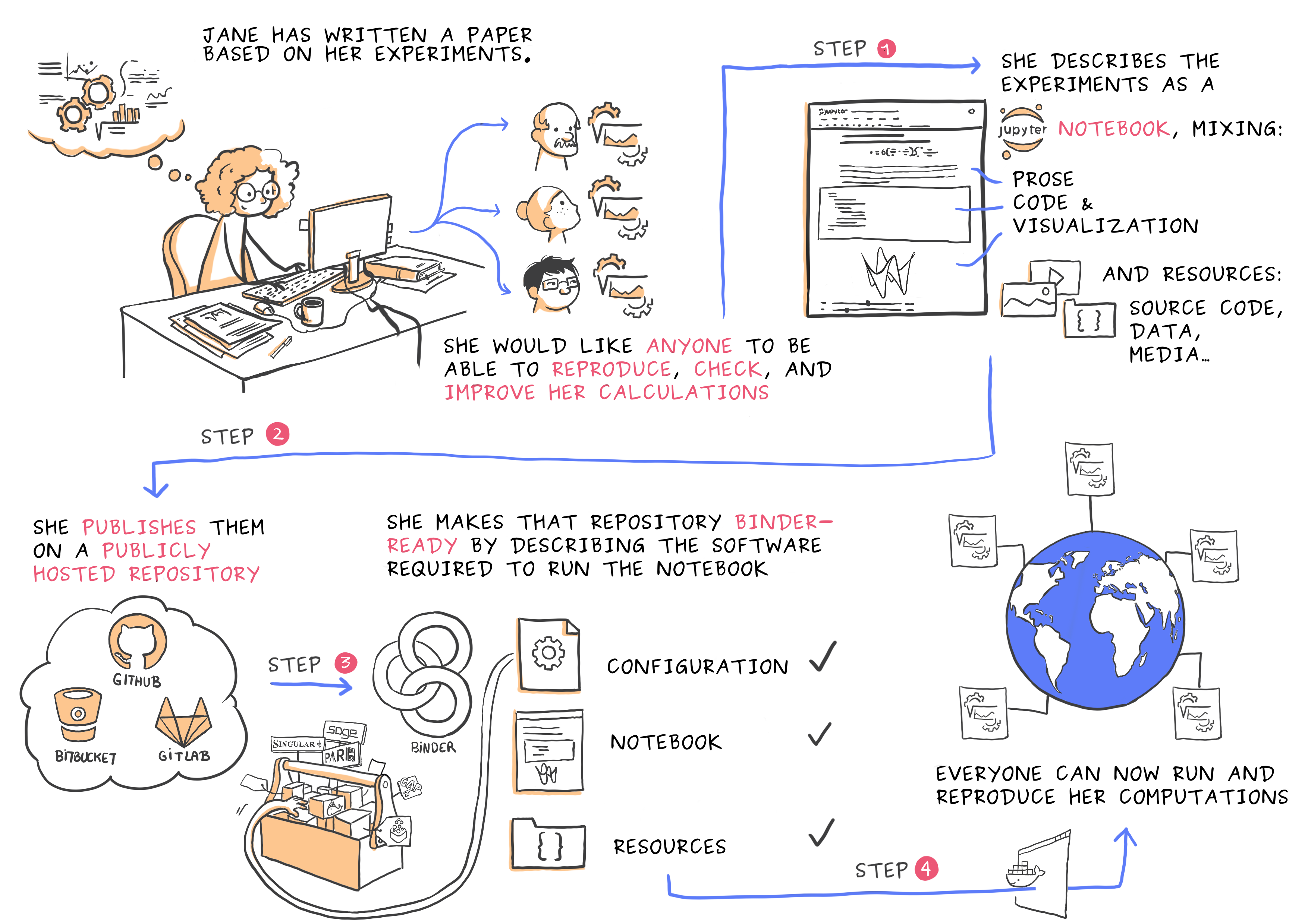
.cite[Juliette Taka, Logilab and the OpenDreamKit project (2017), https://opendreamkit.org/2017/11/02/use-case-publishing-reproducible-notebooks/]
.emph[Demo]: visualization pipeline on Binder
-
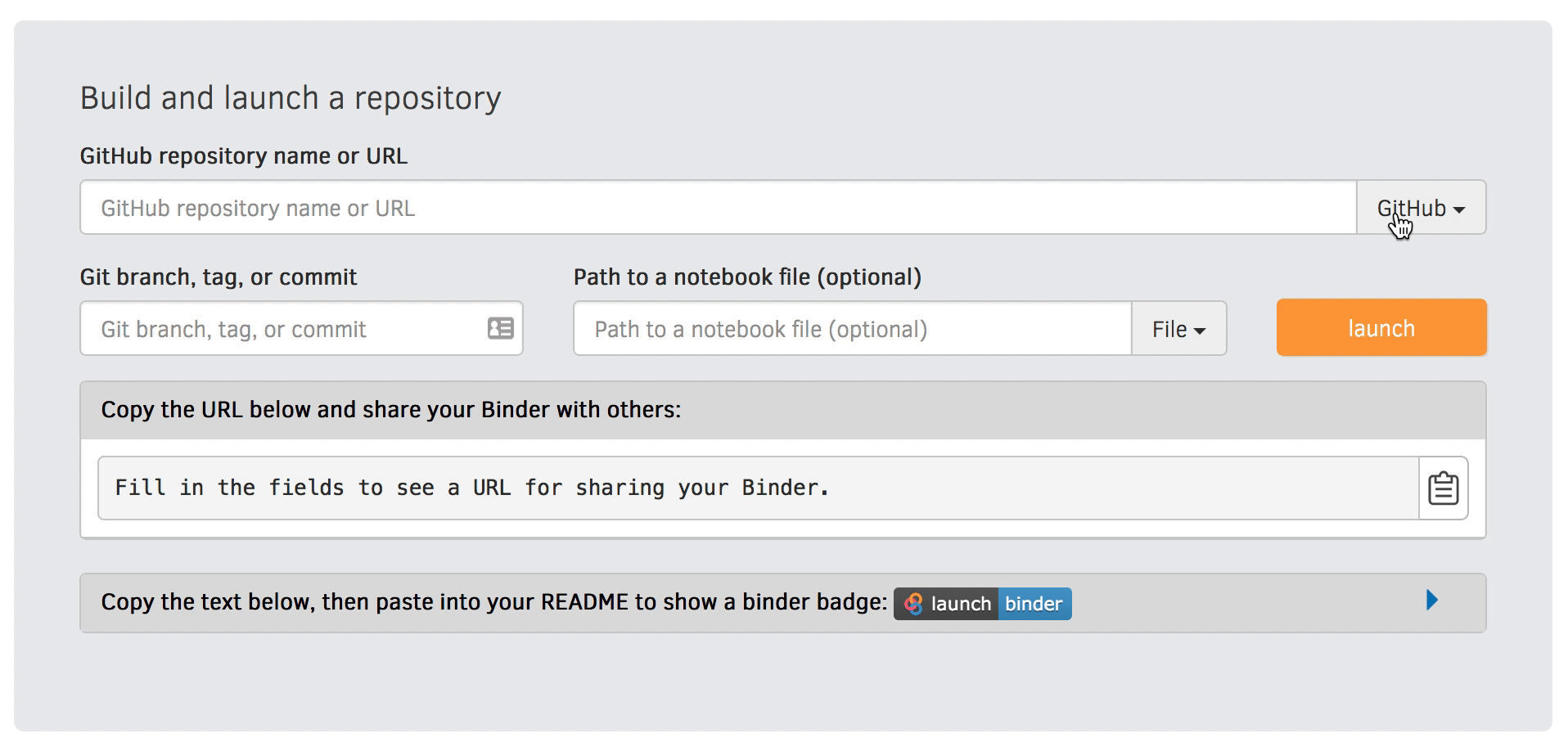
Python/Altair on Jupyter served via Binder: https://github.com/bast/jupyter-binder-example
-
R/ggplot2 on RStudio/R Markdown served via Binder: https://github.com/bast/rstudio-binder-example
-
Interactive plots with Shiny
Zenodo can give you a persistent identifier (DOI) and make your pipeline citable
Rather than specifying a GitHub repository when launching Binder, you can instead use a Zenodo DOI.
- Start with a working example and try adapting it
- Learn the very basics
- Learn a bit of Python
- Or R
- It can be a good idea to start learning right away in a notebook
- Python: Jupyter
- R: R Markdown in R Studio
- Quarto
- Later try Binder
- Later learn how to get a DOI for your Binder
- Now your plotting recipe can be cited and is reproducible
.quote[If I had six hours to chop down a tree, I’d spend the first four hours sharpening the axe.] .cite[Abraham Lincoln]
-
Don't forget to tell a story
-
FAIR principles and reproducibility will be good for you (and for others)
-
Document all tools and dependencies used .emph[with versions]
-
Prefer .emph[free tools]
-
"Data visualization clinic" next week
- "Fundamentals of Data Visualization", C. O. Wilke
- "Data Visualization: A practical introduction", K. Healy
- "Data Visualisation: A Handbook for Data Driven Design", A. Kirk
- https://coderefinery.github.io/data-visualization-python/
- https://courses.cs.washington.edu/courses/cse512/23sp/
- https://swcarpentry.github.io/visualization-novice/
- https://www.ub.uio.no/english/courses-events/events/all-libraries/2020/research-bazaar/visualisation.html
- https://ajstewartlang.github.io/SIPS_2019/SIPS_presentation.html