Ant Design 4.0 RC released! #20661
Comments
|
加油ヾ(◍°∇°◍)ノ゙,一直在用antd,希望ant design pro也尽快跟上 |
|
酷 |
|
ant design pro 迁移有问题 怎么更改ant design pro layout 依赖额 |
|
最后一张配图有问题 |
|
期待 antd pro(pro-layout、pro-table、pro-blocks)跟进 antd 4.0 |
|
Ant design pro. When will this updated? |
|
爱了爱了o(╥﹏╥)o |
|
期待完善的功能,学习学习😋 |
|
圆角的变化这个👍 |
|
form不再forceUpdate了吗,什么时候发stable版呢 |
|
table组件的很多typescript interface按照之前的引入方式都引用不到了 |
|
从v3最新版迁移v4,小项目表示很轻松! |
|
wonderful! |
|
What about babel-plugin-import, is it still recommended for 4.0? Related chapter is still present in docs, but if I use this plug-in it adds extra 1mb (icons, generally) to bundle. |
|
Wonderful. I would save a lot of time if you could provide the UI kit for Adobe XD. Thanks a lot. |
|
Form.create的mapPropsToFields在4.0中可以用什么方法代替呢? |
这个是Form组件有值的改变反应到上层,怎样把父组件的数据动态绑定到子Form组件呢? |
|
有个小问题,新版 Icon 改动之后,类似 Menu 组件这种经常需要从后端拿 Icon 名字再渲染 Icon 的应该怎么去迁移成新的用法呢?求解答。 |
|
一个笨办法:菜单对应路由,全部菜单会用到哪些icon是已知的,挨个引入用数据结构组织起来,比如编个key对应,动态菜单输出时匹配获取来使用! |
|
"We have rewritten the date component as a whole to decouple it from moment. You can generate Picker components for custom date libraries using the generate method we provide. To maintain compatibility, the default Picker component still uses moment as the date library. Please refer to here for custom date library." the link "here" > 404, thx! |
|
@crazyx13th thx, link updated, please retry. |
|
大部分使用antd的都是使用antd pro来使用的,所以希望antd 4.0快点发正式版本,antd pro能更进,这样才可以“大”干一场了。 |
|
文档都看过了,还是没明显看明白 怎么用4.0-rc的npm包 |
npm install antd@next 或者指定版本 npm install antd@rc-0 |
|
@HazySoda 看你使用场景,csr的话动态加载会出现图标闪烁情况,ssr使用loadable-component的话是没问题的 |

|
觉得是问题的,可以提issue跟踪。 |
|
antdesign的文档打开太慢了,站点是部署在了国外吗? |
|
Form.Item validateFirst 明明已经废弃 不存在 官方文档还未更新,大家都用V4生产了吗 ,我一天都在issue,真心不推荐现在用V4 |
|
正式版本什么时候可以发布啊? |
|
@kaoding 我觉得issue清理到100以内并且没有重点问题后。 |
|
Are there any plans to translate the 4.0 sketch resources into English? |
|
看到第一个圆角就一愣,哈哈哈哈之前就听设计小姐姐提到过,antd真是太有爱了~ |
|
Input 和 Form 组件 为何 Input组件脱离 Form.Item 就不能设置验证状态 就算依赖到一起用 为何又必须 noStyle 为false 才显示 在构建复杂的Form 时 真的好难 |
|
It seems that date pickers still require |
|
Is there anything we should do to have the tree shaking working with the new release? I just tried to upgrade, and the image size in the bundle is worst than before, plus it's there 2 times. Note that I don't use any icon in my project. I made sure to delete node_modules and also package-lock.json to make sure their is not any old version loaded.
|

|
@francisl please search issues, there are a few issues(and solutions) about this already. |
|
2.29 正式版本会来到吗? |
|
4.0.0 is out. #21656 |
|
Attempted import error: 'SmileOutlined' is not exported from '@ant-design/icons'. 这是什么原因? `import { SmileOutlined } from '@ant-design/icons'; import { DtInput, DtButton } from "dt-react-ant" function App() { ` |
|
if table components both have children list and expandable, what can i do for control expandable rows after children row?? |
 and others
Introduction
Since "Ant Design 4.0 is in progress!", It has been 7 months. In the meantime, we fixed a large number of bugs and added a lot of new features into change log. 2462 commits were submitted, 53 versions were released, and 15314 stars were added.
After 6 months of development work, we released the v4
betaversion in December. After collecting feedback, we ended the beta version on January 4th, and released the rc (Release Candidate) version. You can safely upgrade the project to this version. Our components have been rewritten, refactored, and redesigned. They are ready for production environments 🎉. At the same time, themasterbranch of v3 will merge into3.x-stable, and4.0-preparewill merge into themasterbranch. Before the official version is released, we will continue to collect issues and iterate on the rc version, and continue to add design documents and fix details.We will list some major updates in v4 below. The complete update document can be [check here] (https://next.ant.design/changelog). v4 document address: https://next.ant.design
Design specification upgrade
We have adjusted the base rounded corners from
4pxto2px. The fillet itself is a detail, and in the middle and background scenes, we take efficiency as the first priority, so we reduce the visual details of the interface and improve the efficiency of interface information reading. In addition, we have adjusted the shadows to make them more consistent with real shadows, while also emphasizing the information hierarchy.Dark theme
We have upgraded the color system based on the v3 version, and v4 provides a dark theme. You can click the switch theme function on the page to see the dark theme effect:
Compatibility adjustment
Ant Design 3.0 has made a lot of efforts to be compatible with older versions of IE. However, according to industry statistics, both the global and domestic IE9 / 10 browsers are shrinking with Windows system updates. We stopped supporting IE 9/10 at 4.0 (but will still support IE 11). Therefore, some low-performance components in the past will also gain performance with the new css features.
At the same time, we also upgraded the minimum version of React that v4 depends on to React 16.9. This means that the v4 version will provide more hooks to simplify your code.
In addition, we have removed some obsolete APIs that were warned in the v3 release. We strongly recommend that you upgrade your current project to the last version of v3 and update the deprecated API based on the warning message.
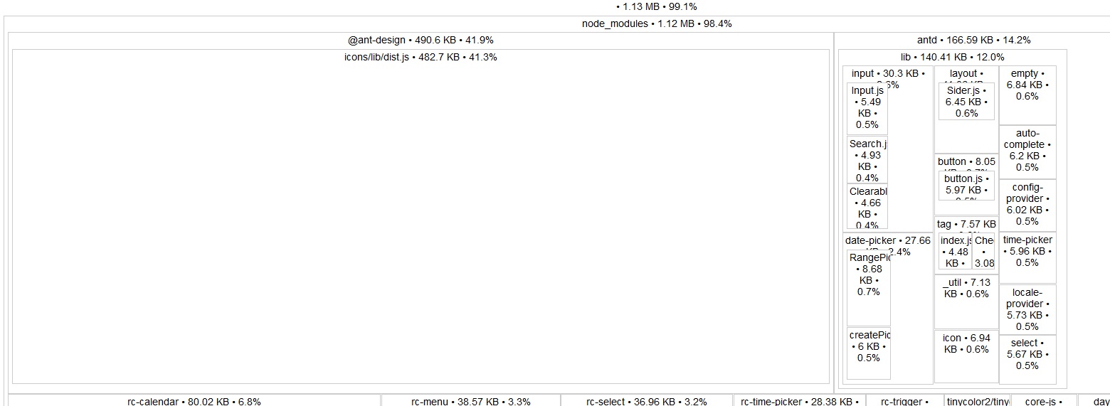
Smaller size
In
antd @ 3.9.0, we introduced the svg icon ([Why use the svg icon?] (Https://github.com/ant-design/ant-design/issues/10353)). The icon API using the string name cannot be loaded on demand, so the svg icon file is fully introduced, which greatly increases the size of the packaged product. In 4.0, we adjusted the icon usage API to support tree shaking, reducing the default package size of Antant by about 150 KB (Gzipped).Legacy Icon usage will be discarded:
In 4.0, it will be introduced on demand:
  import { Button } from 'antd';

 // tree-shaking supported
- import { Icon } from 'antd';
+ import { SmileOutlined } from '@ant-design/icons';

  const Demo = () => (
    <div>
-    <Icon type="smile" />
+    <SmileOutlined />
     <Button icon={<SmileOutlined />} />
    </div>
  );

  // or directly import
  import SmileOutlined from '@ant-design/icons/SmileOutlined';
In addition, we have also removed some related dependencies to reduce gzipped bundle size:
Component rewrite
Form rewrite
Form, as a high-frequency component, has a slightly redundant API. The user needs to obtain the form instance through the HOC of Form.create, and use form.getFieldDecorator to perform data binding on the component. In addition, the entire form is re-rendered every time the data changes, which makes performance worrying in big data forms. In the v4 version, Form will come with a form instance. You can directly bind data through the
nameproperty of Form.Item, thereby simplifying your code:Besides, Form provides the hooks method
Form.useFormto allow you to control the form example:At the same time, we provide the Form.List component, so that you can easily control the list fields:
Table rewrite
Because we have adjusted the minimum requirements for compatibility, we have changed to the implementation of fixed columns using the
stickystyle, thereby greatly reducing the performance consumption when the form has fixed columns. For IE 11 that does not supportsticky, we take downgrade processing.At the same time, we provide a new
summaryAPI to achieve the effect of the summary line:The sorter provides a multi-column sorting function:
In addition, we adjusted the underlying logic so that
fixedColumn,expandableandscrollcan now be mixed. Provides abodyAPI for customizing table content implementations, from which you can implement effects such as virtual scrolling.New DatePicker, TimePicker and Calendar
We have rewritten the date component as a whole to decouple it from
moment. You can generate Picker components for custom date libraries using thegeneratemethod we provide. To maintain compatibility, the default Picker component still usesmomentas the date library. Please refer to here for custom date library.In addition, we provide a full set of time, date, week, month, year selectors and corresponding range selectors. You can set it through the picker property, instead of implementing the special selector through the controlled method of mode:
For range selector, we have also optimized the interaction. You can now select the start or end time individually, and it perfectly optimizes the manual date entry experience.
Virtual scroll
In v4, we have upadated Tree, TreeSelect, and Select. By default, they use virtual scrolling technology to optimize their performance to carry a large amount of option rendering.
Living demo
In addition, keyboard interaction and accessibility are optimized.
More new features / features / optimizations
directionconfiguration to supportrtllanguage internationalization.sizesetting including component size.suffixattribute.stepssubcomponent.onResize.flexlayout.You can click here to see the full update log.
How to upgrade
To make the upgrade as easy as possible, we maintain maximum compatibility. But there are still some breaking changes that need attention. You can first try to migrate using the codemod tool provided by us, and manually migrate some parts that cannot be migrated. Please refer to the document for upgrading.
Above all
The birth of Ant Design 4.0 is inseparable from the contributions and support of community volunteers. Thanks to @saeedrahimi for the internationalization of
rtl, [@shaodahong](https: / /github.com/shaodahong) Contributions to Compatibility Packs, and everyone involved in helping development. It is your contribution to open source that makes Ant Design even better!4.0-rcis a stable release and no major breaking changes will occur. Welcome everyone to start using it ~引言
Ant Design 自发布《Ant Design 4.0 进行时!》以来,已经经历了 7 个月的时间。在此期间,我们修复了海量 Bug、以及增加大量新功能更新日志。提交了 2462 个 commits,发布了 53 个版本,新增了 15314 个 stars。
在经过 6 个月的开发工作后,我们于 12 月份发布了 v4
beta版本。在收集完反馈之后,我们于 1 月 4 日结束beta版本,转而发布rc(Release Candidate)版本。你可以放心的将项目升级到该版本,我们的组件已经完成了重写、重构、重新设计,已经准备好了用于生产环境 🎉。于此同时,v3 的master分支会合入3.x-stable,而4.0-prepare将合入master分支。在正式版发布之前我们会持续收集问题进行 rc 版本的迭代,并且持续补充设计文档和修复细节。以下,将会列举 v4 版本中主要的一些更新内容。完整的更新文档可以点击此处。v4 文档地址: https://next.ant.design
设计规范升级
我们将基础圆角调整,由
4px改为2px。圆角本身是一种细节,而在中后台的场景中,我们以效率为第一优先级,所以减少界面视觉细节,提高界面信息阅读效率。此外,我们对阴影进行了调整,使其更符合真实阴影,也同时将信息层级更好体现。暗色主题
我们基于 v3 版本的色彩系统进行了升级,v4 提供了暗色主题。你可以在页面中点击切换主题功能查看暗色主题效果:
兼容性调整
Ant Design 3.0 为了兼容旧版 IE 做出了非常多的努力。然而根据业界统计,IE9/10 浏览器无论是在全球还是在国内份额都在随着 Windows 系统更新而在不断缩减。我们在 4.0 版本,停止对 IE 9/10 的支持工作(但仍然会支持 IE 11)。因而过去一些低性能的组件,也会随着新的 css 特性而获得性能提升。
与此同时,我们也将 v4 依赖的 React 最低版本要求升级到了 React 16.9。这意味着,v4 版本将会提供更多的 hooks 以简化你的代码。
此外,我们也将在 v3 版本警告的一些废弃 API 进行了移除。我们强烈建议你将当前项目升级到 v3 的最后一个版本,并根据 warning 信息将废弃 API 进行更新。
更小的尺寸
在
antd@3.9.0中,我们引入了 svg 图标(为何使用 svg 图标?)。使用了字符串命名的图标 API 无法做到按需加载,因而全量引入了 svg 图标文件,这大大增加了打包产物的尺寸。在 4.0 中,我们调整了图标的使用 API 从而支持 tree shaking,减少 antd 默认包体积约 150 KB(Gzipped)。旧版 Icon 使用方式将被废弃:
4.0 中会采用按需引入的方式:
  import { Button } from 'antd';

  // tree-shaking supported
- import { Icon } from 'antd';
+ import { SmileOutlined } from '@ant-design/icons';

  const Demo = () => (
    <div>
-    <Icon type="smile" />
+    <SmileOutlined />
     <Button icon={<SmileOutlined />} />
    </div>
  );

  // or directly import
  import SmileOutlined from '@ant-design/icons/SmileOutlined';
此外,我们也对相关依赖进行了精简,从而降低打包尺寸(Gzipped):
组件重做
Form 重做
Form 作为高频使用的组件,其 API 略显冗余。用户需要通过
Form.create的 HOC 方式获得表单实例,而通过form.getFieldDecorator来对组件进行数据绑定。此外,每次数据变更便会进行整个表单的重新渲染,这使得在大数据表单中性能堪忧。在 v4 版本中,Form 将自带表单实例,你可以直接通过 Form.Item 的name属性进行数据绑定,从而简化你的代码:此外,Form 提供了 hooks 方法
Form.useForm允许你对表单示例进行控制:同时,我们提供了 Form.List 组件,使你可以非常方便的实现列表字段的控制:
Table 重做
由于我们提升了兼容性的最低要求,我们改成使用
sticky样式进行固定列的实现,因而大大减少了表单拥有固定列时的性能消耗。而对于不支持sticky的 IE 11,我们采取降级处理。同时,我们提供了新的
summaryAPI 用于实现总结行的效果:对于 sorter 提供了多列排序的功能:
此外,我们调整了底层逻辑,现在
fixedColumn、expandable、scroll可以混合使用。提供了bodyAPI 用于自定义表格内容实现,你可以由此实现诸如虚拟滚动的效果。全新 DatePicker、 TimePicker 与 Calendar
我们对日期组件进行了整体重写,因而将其与
moment进行解耦。你可以通过我们提供的generate方法生成自定义日期库的 Picker 组件。为了保持兼容,默认的 Picker 组件仍然使用moment作为日期库。自定义日期库请参考此处。此外,我们提供了全套的时间、日期、周、月、年选择器以及对应的范围选择器。你可以通过
picker属性进行设置,不再需要通过mode的受控方法来实现特地的选择器:在范围选择器上,我们也对交互进行了优化。你现在可以单独的选择开始或结束时间,并且完美优化了手动输入日期的体验。
虚拟滚动
v4 中,我们将 Tree、TreeSelect、Select 进行了改造,其默认使用虚拟滚动技术进行性能优化以承载大数据量的选项渲染。
Living demo
此外,也对键盘交互以及无障碍进行了优化。
更多新功能/特性/优化部分
direction配置以支持rtl语言国际化。size设置包含组件尺寸。suffix属性。steps子组件。onResize。flex布局。你可以点击此处查看完整更新日志。
如何升级
为了尽可能简化升级,我们保持了最大兼容。但是仍然有一部分 breaking change 需要注意。你可以首先尝试使用我们提供的 codemod 工具进行迁移,对部分无法迁移的内容进行手工迁移。升级请参考该文档。
以上
Ant Design 4.0 的诞生离不开社区志愿者的贡献与支持,感谢 @saeedrahimi 实现了
rtl的国际化功能,@shaodahong 对于兼容包的贡献,以及每个参与帮助开发的人。是你们为开源的贡献让 Ant Design 变得更加美好!4.0-rc是一个稳定版本,不再会出现重大的 breaking change。欢迎大家开始使用起来~The text was updated successfully, but these errors were encountered: