Allow users to customize keyboard shortcuts #3218
Comments
|
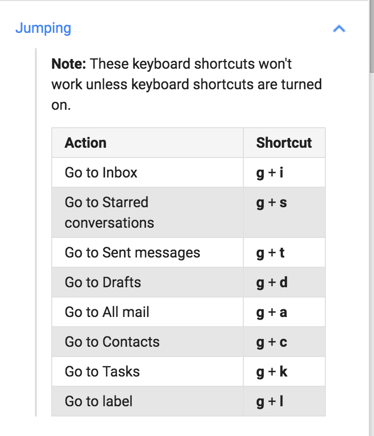
Gmail for example, does use Cmd/Ctrl + Shift shortcuts but uses also single key shortcuts or combinations of character keys:
As mentioned in #3084 single key shortcuts work, when not inside an editable field. Screen readers use single key shortcuts but they already have their own mechanisms to jump through landmark regions. |

|
Drive-by commenting here, but are we primarily concerned with only Latin or Western languages? If so, then finding a shared key may be possible (if awkward). If not, then prior i18n experience suggests different languages / sets of languages will need to have different key mappings and we'll still need to allow users to customize anyway. |
|
Quoting ATAG A.3.1.5 https://www.w3.org/TR/2015/REC-ATAG20-20150924/#sc_a315
|
|
Investigating on #5847 / #6144 I've read some Mousetrap (the tool used by Gutenberg to implement keyboard shortcuts) documentation. Reference: Worth noting that also sequences of keystrokes work, see https://craig.is/killing/mice#api.bind.sequence and also shortcuts that include sequences and combinations. For example, pressing |
|
I do not know where else to put this, but please be cautious when applying keyboard shortcuts, particularly when using Slack as an example. Slack has made its accessibility worse for screen reader users who rely on keyboard navigation. This Twitter exchange between a skilled SR user and the Slack guy in charge of accessibility demonstrates that disconnect: https://twitter.com/LeonieWatson/status/974615133044359168 Further, many screen reader users and many keyboard-only users have motor impairments that make many complex (or even simple) combos possible. Shortcuts may be a nice add-on for many users, but they are not a guaranteed accessibility fix (so it is ok to have them, but don't make those the only means of interaction for a feature). |
Fired it up with NVDA. The first example on the page is to hit the In order to pass the key through to the OS, bypassing NVDA, I need to use In my experience, few screen reader users know what their passthrough key combo is, let alone know when or how to use it. That being said, in a very quick glance at the library, I saw no statements about how to implement it and account for screen readers. The answer from the developer may be "Meh", which should be documented if that is the approach. |
|
@aardrian thanks. Yep I'm aware the passthrough key is not so used, and I'd say it's not acceptable to ask users to use it. I haven't looked at the Mousetrap examples, however the good part is that Mousetrap is "agnostic" and allows to really use any shortcut. It's up to the implementation to make them work with AT for example making SR enter forms mode or application mode where appropriate. Shortcuts are probably more useful for pro-keyboard users (non screen reader users). Worth nothing the |
|
Ah, I get it. The things you want to designate as targets for |
|
Yep, it's an attempt to emulate landmarks for non-screen reader users 😆 |
|
Just to confirm the "Ctrl + backtick" shortcut doesn't work on various non-English layout keyboards and thus the ability to jump through the main editor sections is not available to all users (see also #1182):
|
Facebook has an interesting approach to landmark navigation. A landmarks menu as an early tab-stop on the page, where you'd often find a skip-to-main link. I think it's notable, because I presume a lot of keyboard users have found it already. I'm not a Facebook user myself, but it's used on the sign-up screen too, so I played with it there. Description here: https://a11ywins.tumblr.com/post/170270963528/facebook-ax-navbar |
|
That's interesting approach. I actually logged in to Facebook the test it out, worked as described. |
|
@fuzzbomb interesting. I see they use However, you made me think at a core Trac ticket that asked to make the existing Skip link accessible to developers (see https://core.trac.wordpress.org/ticket/36644). While the proposal there is not exactly the same thing, I'm now wondering: what if we try to make the existing Skip link extensible, i.e. more skip links can be added there via a filter or something?
Then, it should be changed to an ARIA menu with arrows navigation and it would be great to have a customizable shortcut to invoke it. |

|
@afercia Same here with |
|
@samikeijonen thanks. That's the point, we need a tool users can access when focus is in the Gutenberg UI 🙂 |
For the sake of argument and pretending it would be the easiest thing in the world: what if we were to add regions to all of the WordPress UI, not just Gutenberg — would this be an a11y benefit? |
|
Sure, the Facebook landmark navigation can be accessed via a keyboard shortcut, but you can also get there quickly by tabbing after loading a page. The ALT+slash would be just another customizable shortcut. The thing that interests me about Facebook's approach, is it includes links to their accessibility help pages too, but keeps the whole region to a single tab-stop. The region isn't just a fancy skip-link alternative, it's a region for a11y tools in general. Now, you could potentially add other things there too, like a headings navigation drop-down, or... links to customize accessibility settings per user. So that's where a mechanism to customize keyboard shortcuts could live - in an a11y-tools region, just one TAB key (and a couple of arrows) away from the start of the page. If ALT+/ doesn't suit you, a keyboard-only user could still find a way into customizing that without much effort. An always-visible button to reveal the "accessibility tools" region could live on the main toolbar, quite unobtrusively. So the a11y tools region is easily reached by a single TAB after loading the page, or lots of Shift-TABs form somewhere in the middle of the page, or a mouse click, Dragon, or whatever keyboard shortcut it has. I don't know how many shortcuts are being proposed, but I think something on the scale of Gmail is too much. One way to avoid excess would be a system where lots of actions can have a keyboard shortcut, but most of them are unassigned by default (an empty setting). KDE Plasma desktop and GNOME desktop do it this way. (For what it's worth, Ctrl+backtick is used by Ubuntu Unity desktop for "cycling through windows in the current application", while KDE Plasma uses Alt+backtick, and GNOME uses Win+backtick, and macOS uses Splat+backtick for the same task. So it goes.) Going even further, keyboard shortcuts could be completely turned off by default - users would have to opt-in, but there'd much less risk of frustrating assistive tech users with key conflicts. For users who want them, I'd trust the handbook, and all those "10 things to do after installing WordPress" articles to get the word out. Imagine if everyone was told to check out the accessibility settings link.... P.S. I'm a Drupal a11y maintainer, rather than a WordPress contributor. I found this issue because I follow WP-a11y news. We don't have any keyboard shortcuts yet, we've preferred basic sequential keyboard controls. I expect it's a matter of time before we need to look at this issue in Drupal's authoring tools initiative too. |
|
@enriquesanchez I think that flow is perfect. Thanks for explaining it. I like the most how you are able to focus on one shortcut at a time instead of having a big list of shortcuts with text fields. You intentionally need to click on Edit button first per shortcut. How might conflicts be handled? E.g. setting shortcut 1 to X and shortcut 2 to X. Will there be some type of alert? Thanks. |
|
Thanks so much for the proposal and to help this issue finally move on. Very first observations:
I have some reservations on the following things:
Re: @alexstine's concern on conflicts: yes there should be a mechanism to detect conflicts and warn users that a keyboard shortcut is already in use. I think this is technically doable but yep, it's about implementation details while we're still on the initial design phase 🙂 |

|
Thank you for the feedback, @alexstine and @afercia! Here's an iteration on the design that addressed some of the points you made. Since we'd want to have the options to Edit, Disable and Restore for each individual keyboard shortcut, I'm looking at having these options surfaced in a popover menu instead:
The image above shows a list of keyboard shortcuts. For each item, there's a label/description on the left followed by the shortcut keys to the right in the same row. Next to that, there's an ellipsis menu button, similar to what's found in the editor and block toolbars. On one of these keyoard shortcuts, the ellipsis menu button is activated and a popover with three menu items appears below it: 'Edit shortcut, 'Disable shortcut', and 'Restore to default'. That last one, 'Restore to default' should only appear when/if the keyboard shortcut has been customized. If I were to click on 'Edit shortcut', a dialog would appear in place. I agree with you @afercia, that this dialog should not replace any content. What I'm proposing is that the dialog sits on top and aligned with the keybord shortcut row for clarity and proximity. What I like about this solution is that the shortcut label/description is kept visible, so it's easier to correlate the two.
The image above shows a UI dialog that contains an input field with the keyboard shortcut combination, and a Save and Cancel buttons to the right of it. As for conflicts, I think we need to show an error message in place, near the input field. Here's what I'm proposing:
The image above shows the previous UI dialog that appears when editing a shortcut. The input field has a red border around it to indicate an error state, and below it there's an error message that reads "This shortcut is already being used.". The 'Save' button is in a disabled state because the action cannot be performed. What do you think about this iteration? I believe it addressed the feedback your brought up. |


|
@enriquesanchez Sorry, now I am gonna be difficult.
From my point of view, I think a menu inside a dialog is not a good idea. It adds another required selection to get in to the menu and then find edit, delete, or restore. Anyway to just not put those in a menu? I can see both sides... It will probably not fit well on smaller screens, but just something to think about. Thanks. |
Not at all @alexstine, I really appreciate your feedback and understand your point. My reasoning for having these three options inside a menu was that having them exposed and repeating in every row, in a list of dozens of shortcuts, will add a lot of clutter and visual noise. That can make this UI hard to parse for some folks. I'll definitively look at alternatives. One idea I had initially but haven't fully explored is to have these options exposed once you click on the 'Edit' button for the shortcut. We'll need a bigger dialog to fit everything, but I think it's worth a try. |
|
Latest iteration feels close. Couple details to consider, but aren't blockers:
|
@kellychoffman To focus on the keyboard settings in this issue, I wrote a more general answer over here: #24965 (comment) In short: I think Save-Buttons could be used contextually in relation to the preference category. Maybe keyboard settings could profit from one general Save button. What is better accessible? One single Save button or a save button for every shortcut? (Maybe that relates to the question when and where conflict errors should show up.) |
|
@mariohamann This is great feedback Mario. Thank you!
I think it depends. If I'm only going to change one keyboard shortcut, then having the confirm button right there next to the shortcut field is definitively easier for most folks. I wouldn't have to navigate to find the Save button somewhere else below the list. If I were to be changing a lot of these shortcuts, then maybe having only one Save button will be easier. That said, I suspect the latter will be the least common case here, and we should optimize for single-edit actions. |
Thank you! Here are some iterations that address your feedback, @kellychoffman
I like the direction of using the default notices banner we use elsewhere. The notice is prominent and because it appears inside the modal, it's near where the error happens. There's also the benefit that these notices get properly communicated to assistive technologies with I also explored alternatives on how to access the editing options (Customize, Disable, and Restore). In the previous exploration I looked at having a dropdown menu next to each shortcut with the three options:
The image above shows a list of keyboard shortcuts. For each item, there's a label/description on the left followed by the shortcut keys to the right in the same row. Next to that, there's an ellipsis menu button, similar to what's found in the editor and block toolbars. On one of these keyoard shortcuts, the ellipsis menu button is activated and a popover with three menu items appears below it: 'Edit shortcut, 'Disable shortcut', and 'Restore to default'. This time I looked at how we could condense all three actions into a single dialog:
The image above shows a list of keyboard shortcuts. For each item, there's a label/description on the left followed by the shortcut keys to the right in the same row. Next to that, there's an Edit menu button. On one of these keyboard shortcuts, the Edit button is activated and a dialog sits right under it. The dialog has a text field with the shortcut key. This is where the user will be able to customize the shortcut. Below this text field, there's a toggle control with the label 'Disable shortcut'. This is the control users will activate if they want to diable the keyboard shortcut. Below follows a row of three buttons. The first one is 'Restore to default', which should only appear if the shortcut has been customized. Then follows 'Cancel' and 'Save'. I'm torn between these two. On the one hand, I like the clarity of choices on the previous version and how it keeps the edit dialog minimal. But on the other, I like how this last exploration simplifies the flow by just offering one choice to make up front. I'd love to hear your feedback or suggestions. |


|
Really like those explorations. I would like to add some thoughts about the visuals, I hope that's fine:
Mockup of all three suggestions below.
|


|
Here's one last update from me on this issue. I've made some minor updates to the flow:
Here's a GIF of the updated prototype:
And some static mockups for a more detailed overview:
Description: The image above shows the keyboard shortcuts modal open in the block editor. The modal contains a list of all the shortcuts available and next to each an edit button (a pencil icon).
Description: Clicking the edit button for any of the shortcuts will display inline a text field with the currently assigned shortcut. Users can enter a different shortcut if needed. There is a save button next to the field.
Description: If the user enters a shortcut that is already being used, we display an error message "Shortcut already in use." below the field and highlight the field in red. This error message needs to also be communicated to Assistive technologies.
Description: If a field is left empty, the shortcut is disabled and a label "None" appears in place of the shortcut. Once a shortcut has been edited/modified, we display a little dot indicating that the shortcut has been customized. This should help uses keep track of which shortcuts they've modified. The dot should include a tooltip for clarity and this state change should also be communicated to assistive technologies. If we find that the dot does not work here, we can also opt for an asterisk instead:
Description: A shortcut that has already been modified will show an additional "Restore" button when editing it. This restore button will appear next to the Save button. Clicking on restore returns the shortcut to the default value and closes the edit field. I think the above is in a good place to try for a v1 of this feature. I did not spend much time on this, but for a follow up effort it'll be great to consider @mtias suggestion:
This could be as simple as adding an option to import a key bindings configuration:
Description: The image above shows the same keyboard shortcuts modal from this proposal with an additional button that says "Import configuration" just below the modal's description. If we give this option to users, we should also offer a way for users to restore and go back to defaults. And lastly, I also mocked up what the keyboard flow for this feaure will look like. Considering that this will be a feature that will greatly benefit keyboard users and users of assistive technologies, I thought it'll be important to consider how the flow will work in that scenario:
_Description: the gif above shows the keyboard focus flow of the same shortucts modal described above. It's a step by step flow of each focus stop needed to customize one shortcut field. |


|
Really like those explorations! |
|
What do you think about directly using an "Undo" icon to indicate changes and make it reversable? (Raised the space between "Undo" and "Edit" icon a bit in the following screenshot.) That would even make the "Edit" flow cleaner, as the "Undo" there wouldn't be needed anymore. (In my opinion clicking outside of the edit area or pressing
|

|
I'd just like to add my meager support to this effort. I find most of the keyboard shortcuts to be extremely laborious and unintuitive and would like to change most, if not all of them. The various mockups that I see above look wonderful, so I hope it'll get some focus soon to bring it to fruition! |
|
Nice! If/when implemented, will we be finally able to add shortcuts to things like superscript, subscript and strikethrough while editing, so we don't have to stop typing to use the mouse/menu? That would be fantastic! |
|
Would love to see this implemented! 👀 ❤️ |
|
This would be a very beneficial change for some users; if we can get some dev attention on this, it would be much appreciated. |
|
Thanks for noting. This does look like a big undertaking as is. Does this feel higher priority than other items you've mentioned? |
|
I would not call it high priority compared to the other fires right now but would be nice to get it on the roadmap considering all the work already being done around commands in the site editor. There is no reason we shouldn't give users more power to choose their shortcuts to make editing a better experience. I do not want to see it become a forgotten issue. |
|
After ongoing interesting discussion on #52386 I'm wondering if we could take a different approach for this important issue. Trying to deal with all the potential keyboard shortcuts conflicts across different operating systems and browsers is almost impossible. There will always be conflicts. Additionally, when other software is running, for example screen readers, some keyboard shortcuts may conflict with the screen reader ones. See for example #11154 Instead of allowing users to customize the entire set of keyboard shortcuts, I'm wondering whether customizing only the modifier would be more effective. Even better, consider to introduce a 'WordPress key' as a customizable modifier for all the WordPress keyboard shortcuts. Let's try what screen readers do. Likely, screen readers are the ones who have to deal with keyboard shortcuts the most. Fort this reason, thei use their own modifier keys. Each screen reader has its own main modifier key and it calls it in a different way. VoiceOver refers to it as the
NVDA calls it the NVDA key. It's either the JAWS calls it the What if we introduce a |

|
I think it would be fantastic! Having a settings page where we can customize whatever we want is ideal. I have a Stream Deck, for example, so things like superscript could be assigned to a button and I could use any key combination that doesn't produce conflict without even worrying about its usability, as to me it would be a single button like Bold and Italic. 😁 |
Edit: Discussed during today's (March 1st 2018) bug scrub and agreed to consider a generic mechanism to allow users to customize keyboard shortcuts. Chances of conflicts are very high for any shortcut and many users would be unable to use the related features.
----- Original description:
Follow up to #3084
Keyboard navigation through the editor regions is currently implemented with the shortcuts
ctrl+backtickandctrl+shift+backtick, inspired by what Slack does.However, not all the keyboard layouts have a physical key for the backtick. See for example the Italian keyboard layout. See the relevant discussion on #3084
Worth noting Slack has preferences for the language and the keyboard layout, though at the moment that's limited to just 4 languages.
A few options to consider:
The text was updated successfully, but these errors were encountered: