Revisit documentation strategy of forms in the Console #2664
Comments
|
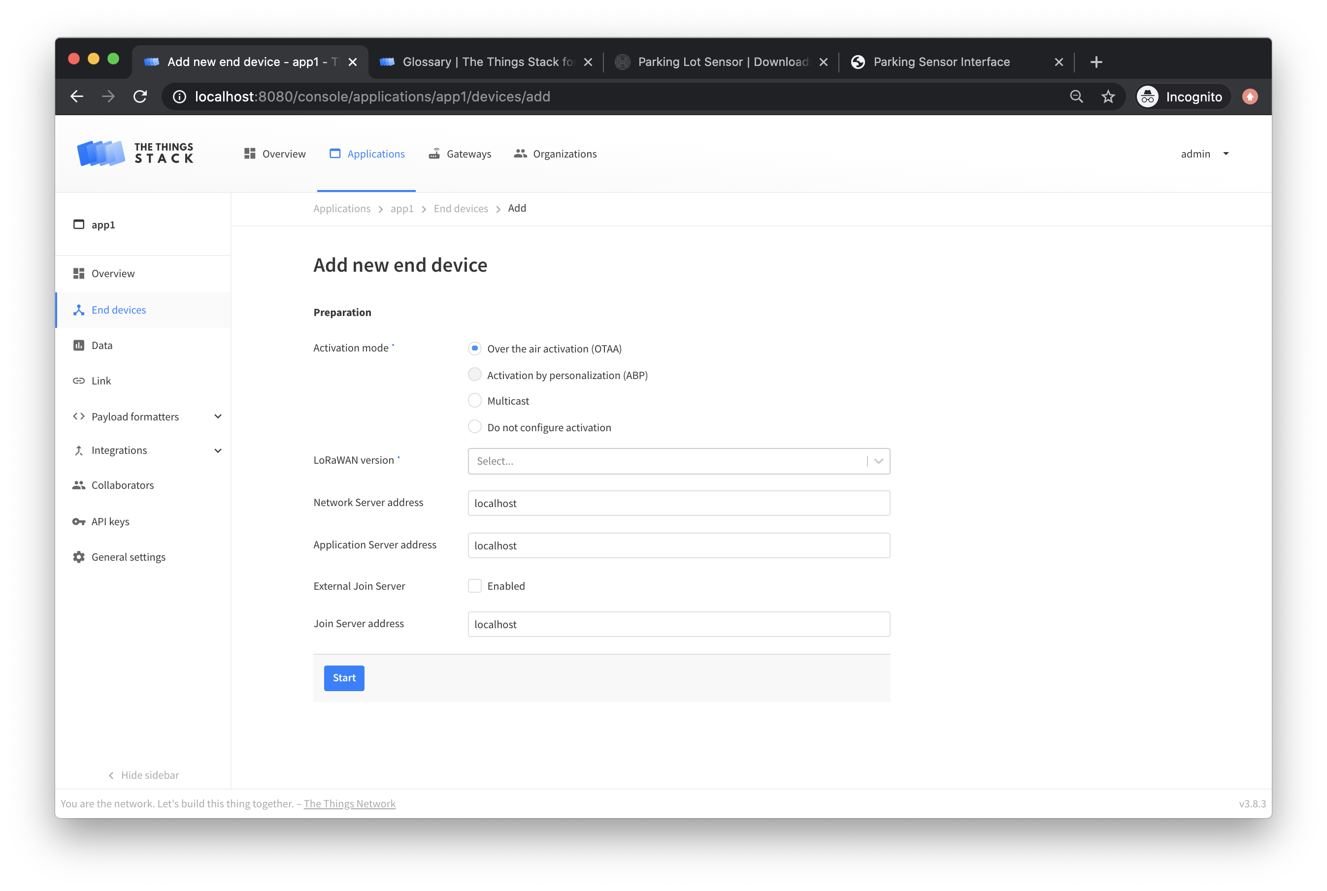
I'm walking though the device wizard now.
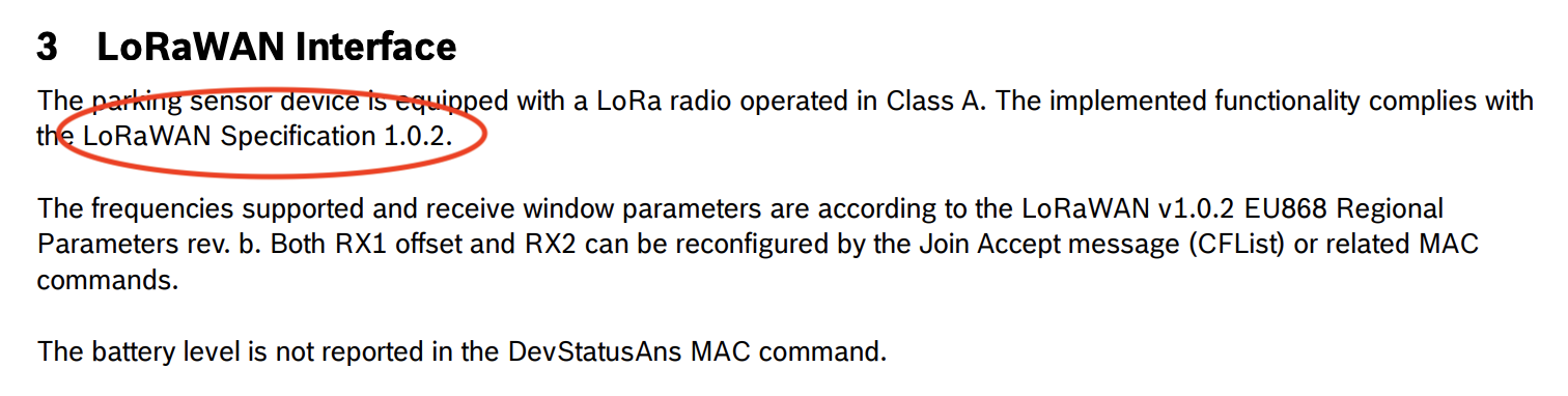
On page one let's use a hover-over tooltip to answer 'what is this' and 'where do I find this' for Let's take the description from the glossary, and a small snippet from a product description like this with circles or arrows for LoRaWAN version
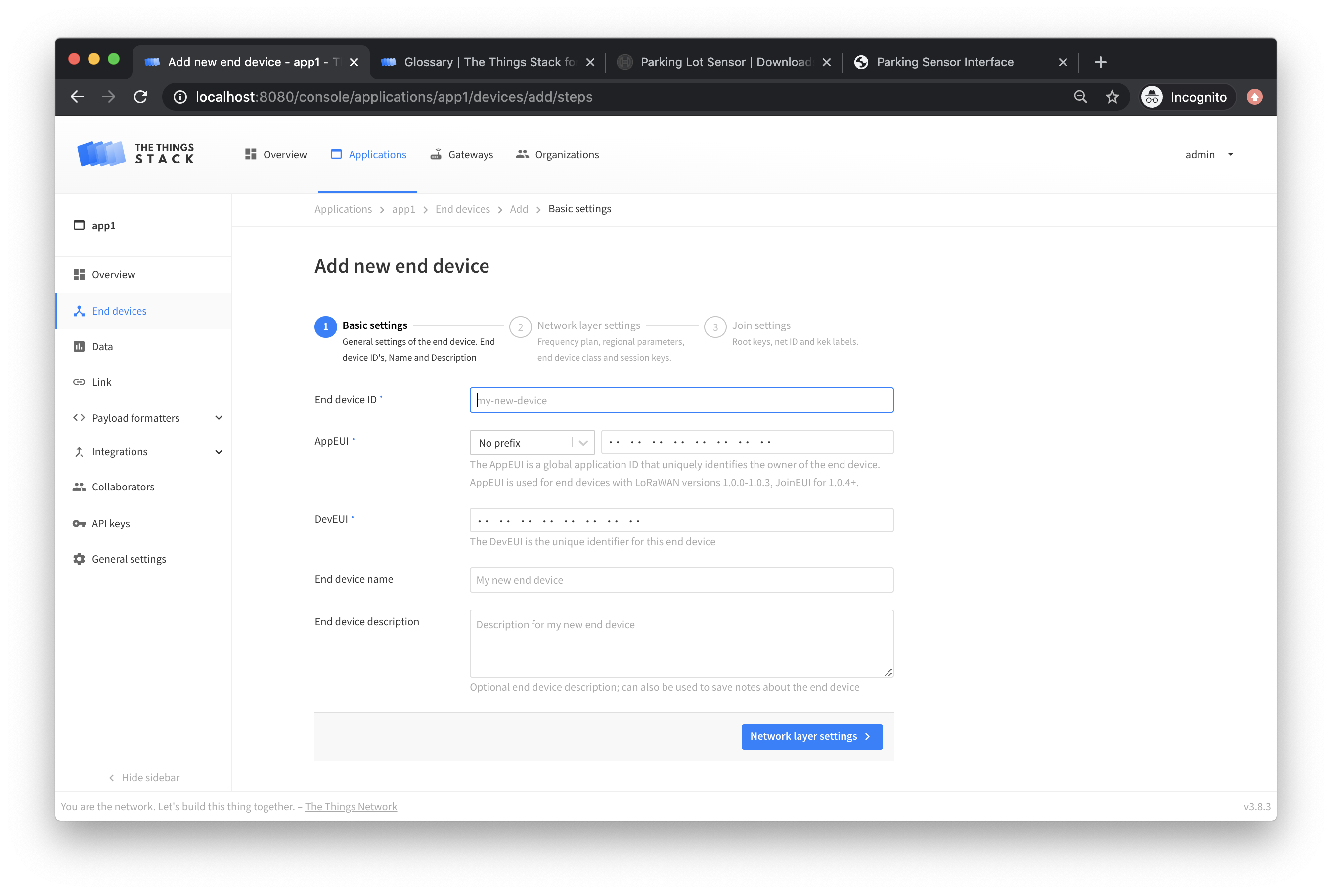
On Basic Settings, same thing for AppEUI and DevEUI
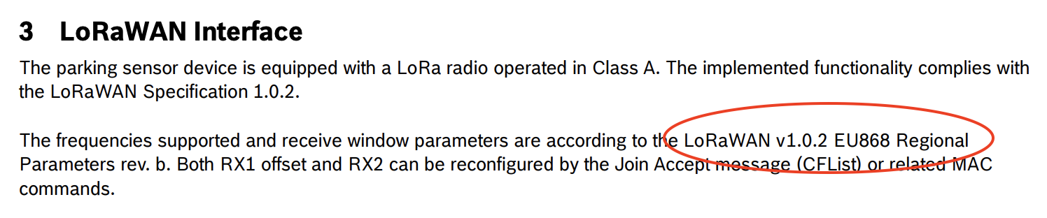
On Network Settings, a 'what is this' for Frequency Plans, and then the same 'how do I find this' for Regional Parameters with a snippet from some product info
On join settings, I'm not sure what any of these mean except AppKey, so I will add them to the glossary and we can do 'what is this' and 'where to find it' for stuff that comes from the device mfr I'll post inline field descriptions in another comment. |

|
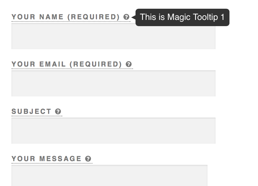
For the descriptions, instead of inline, maybe we just put a question mark next to the field term, and pop up this information in a tooltip like so: I'm going to update the glossary with exactly these definitions, so we can pull this info from there. Activation mode: LoRaWAN version: The LoRaWAN version is the LoRa Alliance LoRaWAN specification your device conforms to, which defines which MAC features it supports. End Device ID: A unique, human-readable identifier for your device. You make it up, so be creative. Device IDs can not be reused. JoinEUI: The Join EUI (formerly called Application EUI) is a 64 bit extended unique identifier used to identify the join server during activation. This should be provided by the device manufacturer for pre-provisioned devices, or by the owner of the join server you will use. DevEUI: A 64 bit extended unique identifier for your device. This is programmed by the manufacturer and should not be changed. It should be provided to you by the manufacturer, or printed on the device. Frequency Plan: A Frequency Plan defines data rates and channels which comply with the LoRaWAN Regional Parameters for a band or geographical area. Devices are configured for a particular Frequency Plan as part of activation, and can use any Frequency Plan within a supported band. Regional Parameters version: The Regional Parameters specify frequency, dwell time, and other communication settings for different geographical areas. The Regional Parameters version is the version of the LoRa Alliance specification which your device supports. This should be provided by the device manufacturer in a datasheet. Supports Class C: Class C devices extend Class A by keeping the receive windows open unless they are transmitting. This allows for low-latency communication but is many times more energy consuming than Class A devices. Not all devices support Class C, this information should be provided by the device manufacturer in a datasheet. |
|
Setting blocking/release since we need to get some of these changes/improvements in together with the release of the end device wizard (#2663 ). I'll follow up ASAP. |
|
Thanks @benolayinka for these descriptions. After looking at it again I think it's better to use a documentation strategy like this:
I'll add this to our design guidelines together with the PR that will introduce the glossary tooltips. The next step is to update the glossary accordingly and to implement #2663. Putting this on blocked until these are ready. |
Glossary is ready with these terms #2741 |
|
What is the status here? |
|
This whole complex of form UX needs a bit of consolidation into actionable issues. It's still on my list to work on after current high priority issues. |
|
Great! Removing discussion state to make it more actionable. Please revert if necessary. |
|
Can we make this actionable? @kschiffer can we start with low hanging fruit? |
|
Replaced by #3522, which has a concrete and actionable plan of the new form layout and documentation strategy. This will also partially integrate the work from @benolayinka in this issue. |
Summary
After adding a lot of content to our documentation recently, as well as a glossary, it's time to revisit the way we assist users with documentation in our forms.
Why do we need this?
What is already there? What do you see now?
What is missing? What do you want to see?
How do you propose to implement this?
I have already created an issue for displaying glossary entries in the console. I think this will already assist users a lot as it allows them to obtain additional information right in place without having to disrupt the process.
That will give us three different way to assist users with documentation:
There is also an
<InfoField />component which can be used to display longer text and documentation links. It might be useful in some situations where important information has to be shown inline and it would not fit into field descriptions. Generally, I would suggest avoiding using this element.I propose the following usage strategy for these three distinct types:
Inline field descriptions
LoRaWAN Version->The LoRaWAN version (MAC), as provided by the device manufacturerGlossary tooltips
…, to not run into display issuesDocumentation links
Can you do this yourself and submit a Pull Request?
Should be a joint effort between @benolayinka, me and/or @pgalic96
Please let me know your thoughts.
I think the next actionable step would be @benolayinka going through the forms and writing up action/improvement points, in line with my suggested strategy above. That is, unless you have any suggestions for a different strategy of course.
The text was updated successfully, but these errors were encountered: