Backpack React Native text input component.
| Day | Night |
|---|---|
 |
 |
 |
 |
| Day | Night |
|---|---|
 |
 |
 |
 |
Check the main Readme for a complete installation guide.
import React, { Component } from 'react';
import { View, StyleSheet } from 'react-native';
import BpkTextInput from 'backpack-react-native/bpk-component-text-input';
import { spacingBase } from '@skyscanner/bpk-foundations-react-native/tokens/base.react.native';
const styles = StyleSheet.create({
container: {
flex: 1,
justifyContent: 'center',
padding: spacingBase,
},
input: {
marginBottom: spacingBase,
}
});
export default class App extends Component {
render() {
return (
<View style={styles.container}>
<BpkTextInput
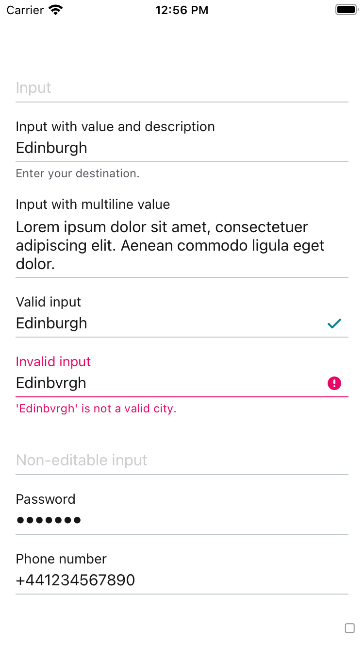
label="Airport"
style={styles.input}
value=""
placeholder="3 letter airport code"
/>
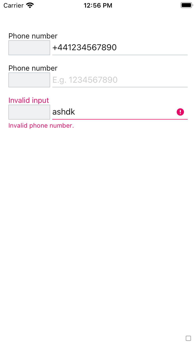
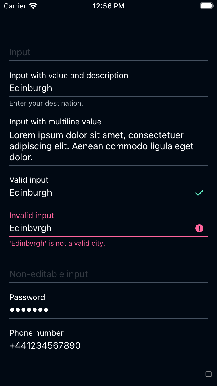
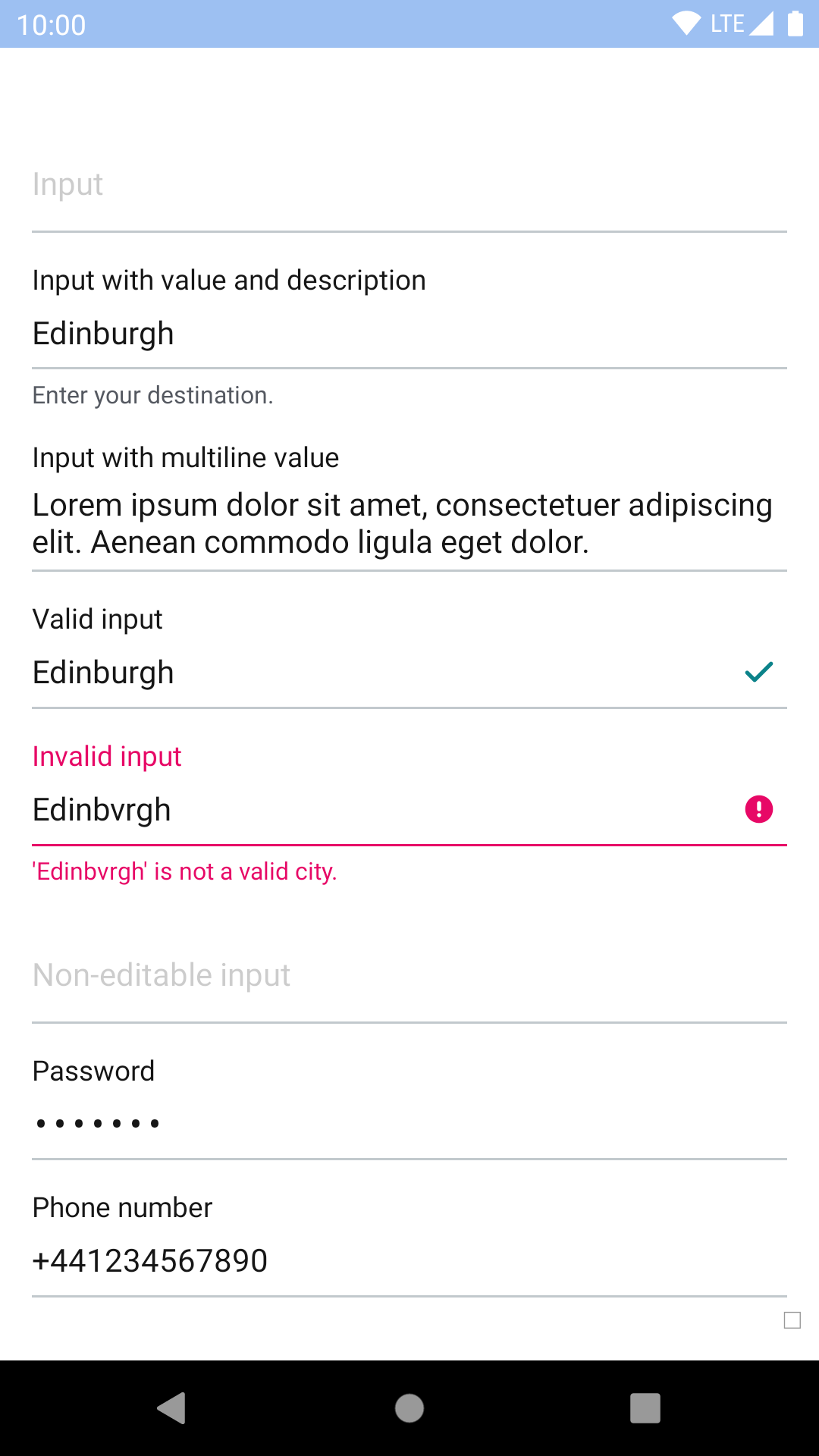
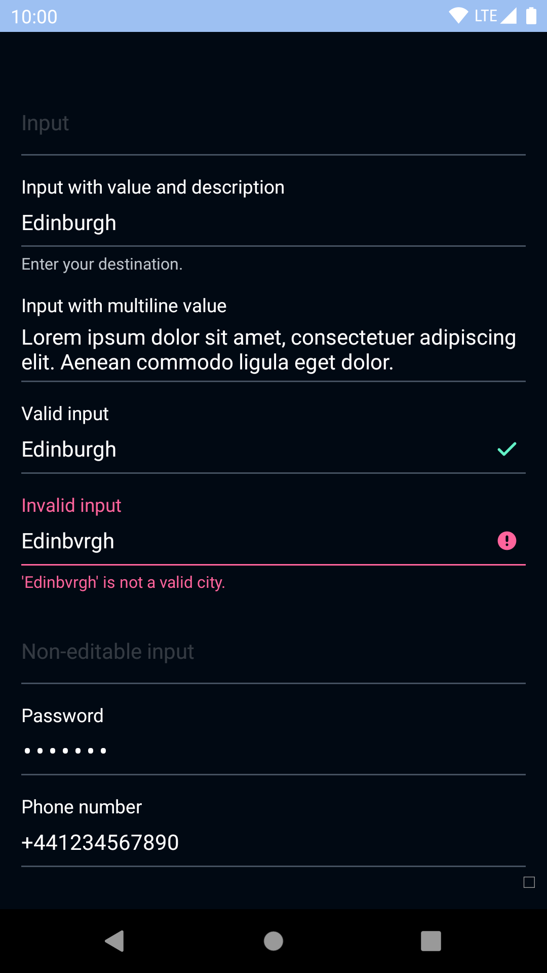
<BpkTextInput
label="City"
style={styles.input}
value="Edinburgh"
description="Enter your destination."
/>
<BpkTextInput
label="City information"
style={styles.input}
value="Edinburgh is the capital of Scotland. Come for the castle, stay for the penguin parade at the zoo."
multiline
/>
<BpkTextInput
label="City"
style={styles.input}
value="Edinburgh"
valid
/>
<BpkTextInput
label="City"
style={styles.input}
value="Edinbrvgh"
valid={false}
validationMessage="Edinbvrgh is not a valid city."
/>
<BpkTextInput
label="City"
style={styles.input}
editable={false}
value="Edinburgh"
/>
<BpkTextInput
label="Password"
style={styles.input}
secureTextEntry
value="password"
/>
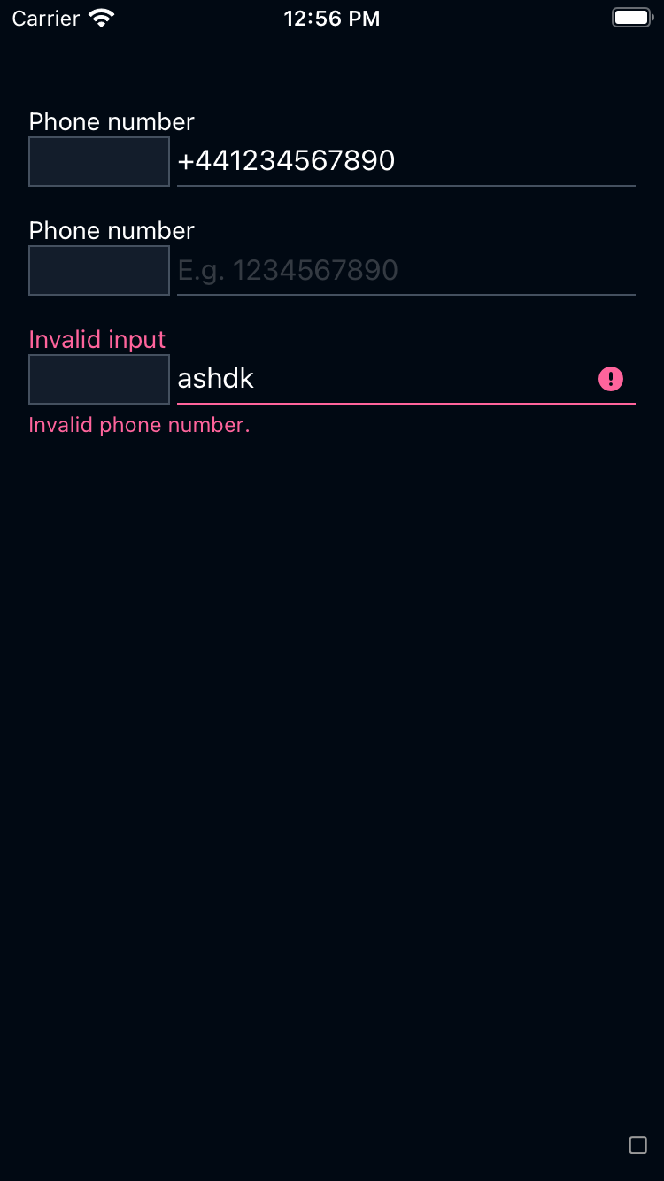
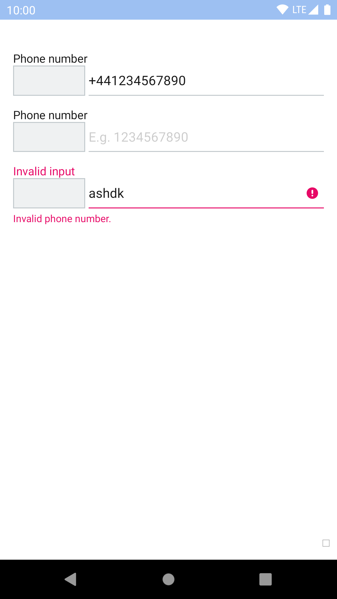
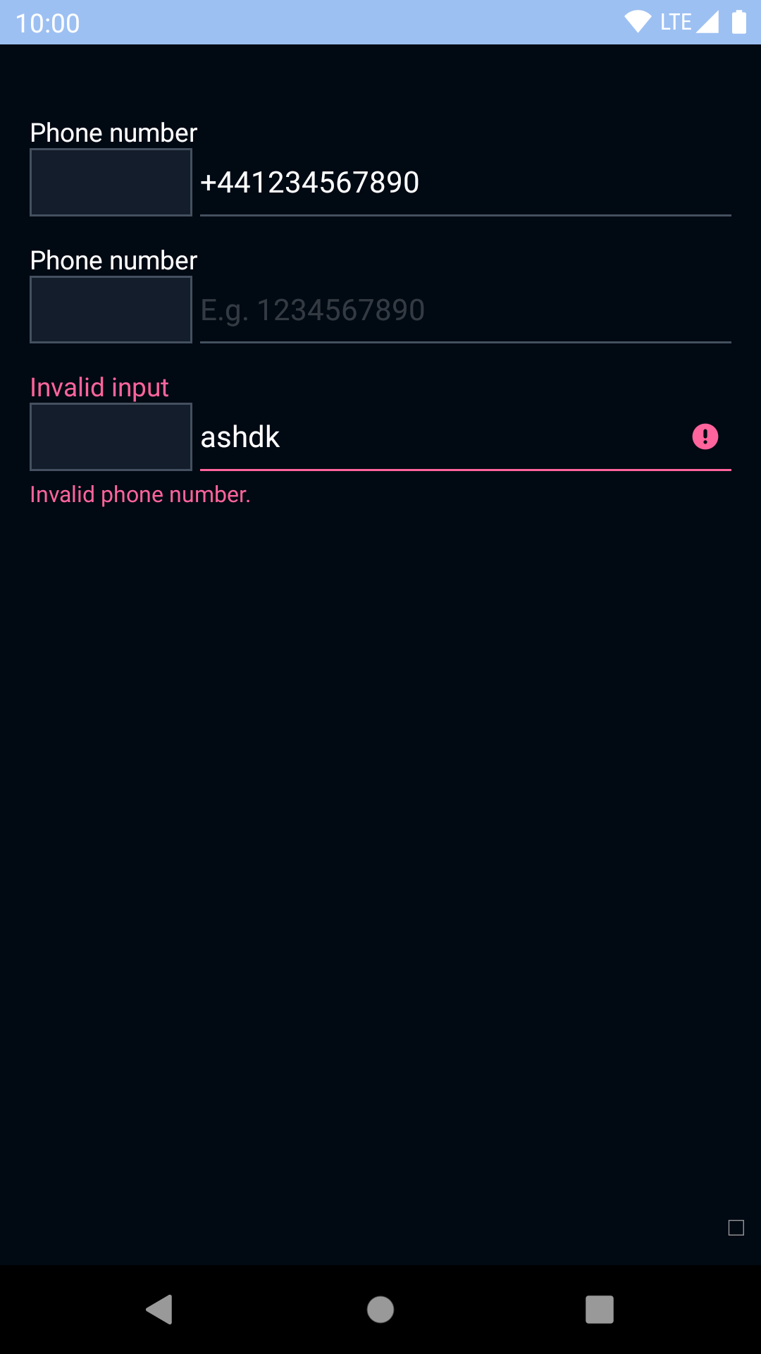
<BpkTextInput
label="Phone number"
style={styles.input}
keyboardType="phone-pad"
value="+441234567890"
/>
<BpkTextInput
label="Date"
mask="99/99"
maxLength={5}
style={styles.input}
/>
<BpkTextInput
label="Card number"
mask="9999-9999-9999-9999"
maxLength={19}
style={styles.input}
/>
</View>
);
}
}| Property | PropType | Required | Default Value |
|---|---|---|---|
| label | string | true | - |
| value | string | true | - |
| clearButtonMode (iOS only) | oneOf('never', 'while-editing', 'unless-editing', 'always') | false | while-editing |
| description | string | false | null |
| editable | bool | false | true |
| mask | string | false | null |
| inputRef | func | false | null |
| valid | oneOf(true, false, null) | false | null |
| validationMessage | string | false | null |
| style | style | false | null |
| accessoryView | node | false | null |
More details about how to use and define a mask can be found here: https://github.com/benhurott/tinymask
textInputFocusedColor
textFontFamily