Backpack React Native badge component.
Check the main Readme for a complete installation guide.
import React, { Component } from 'react';
import { View, StyleSheet } from 'react-native';
import BpkBadge, {
BpkBadgeIcons,
BADGE_TYPES,
BADGE_DOCKED_TYPES,
BADGE_ACCESSORY_VIEW_ALIGNMENTS,
} from 'backpack-react-native/bpk-component-badge';
import BpkIcon, { icons } from 'backpack-react-native/bpk-component-icon';
import { spacingBase } from '@skyscanner/bpk-foundations-react-native/tokens/base.react.native';
const styles = StyleSheet.create({
container: {
flex: 1,
justifyContent: 'center',
padding: spacingBase,
}
});
export default class App extends Component {
render() {
return (
<View style={styles.container}>
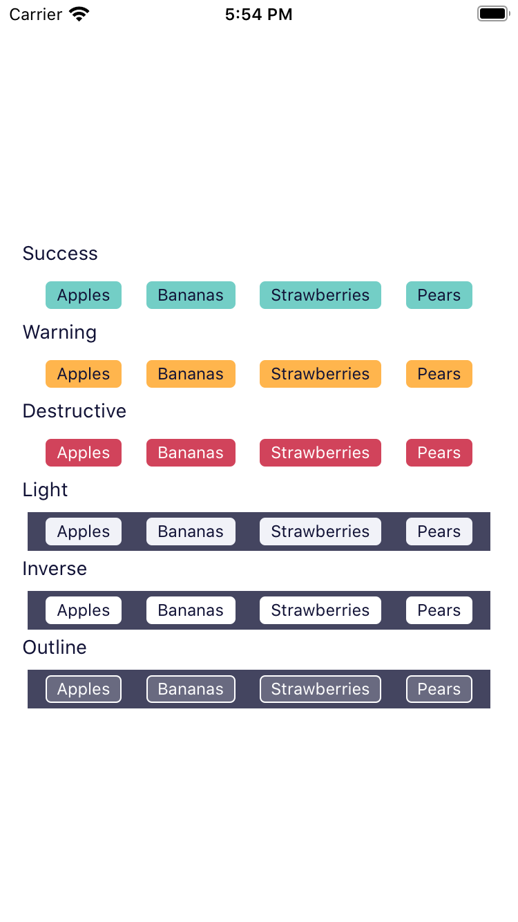
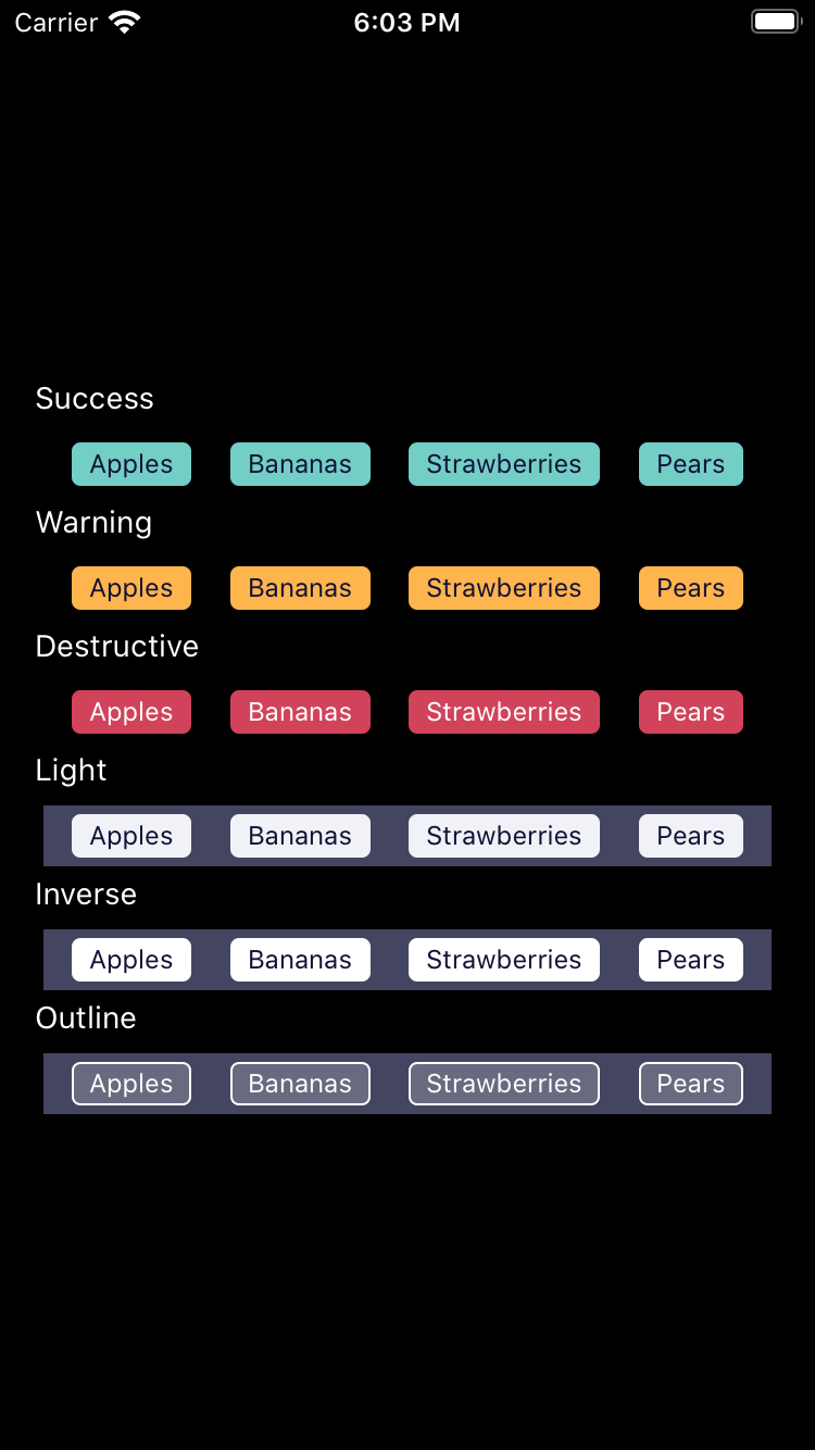
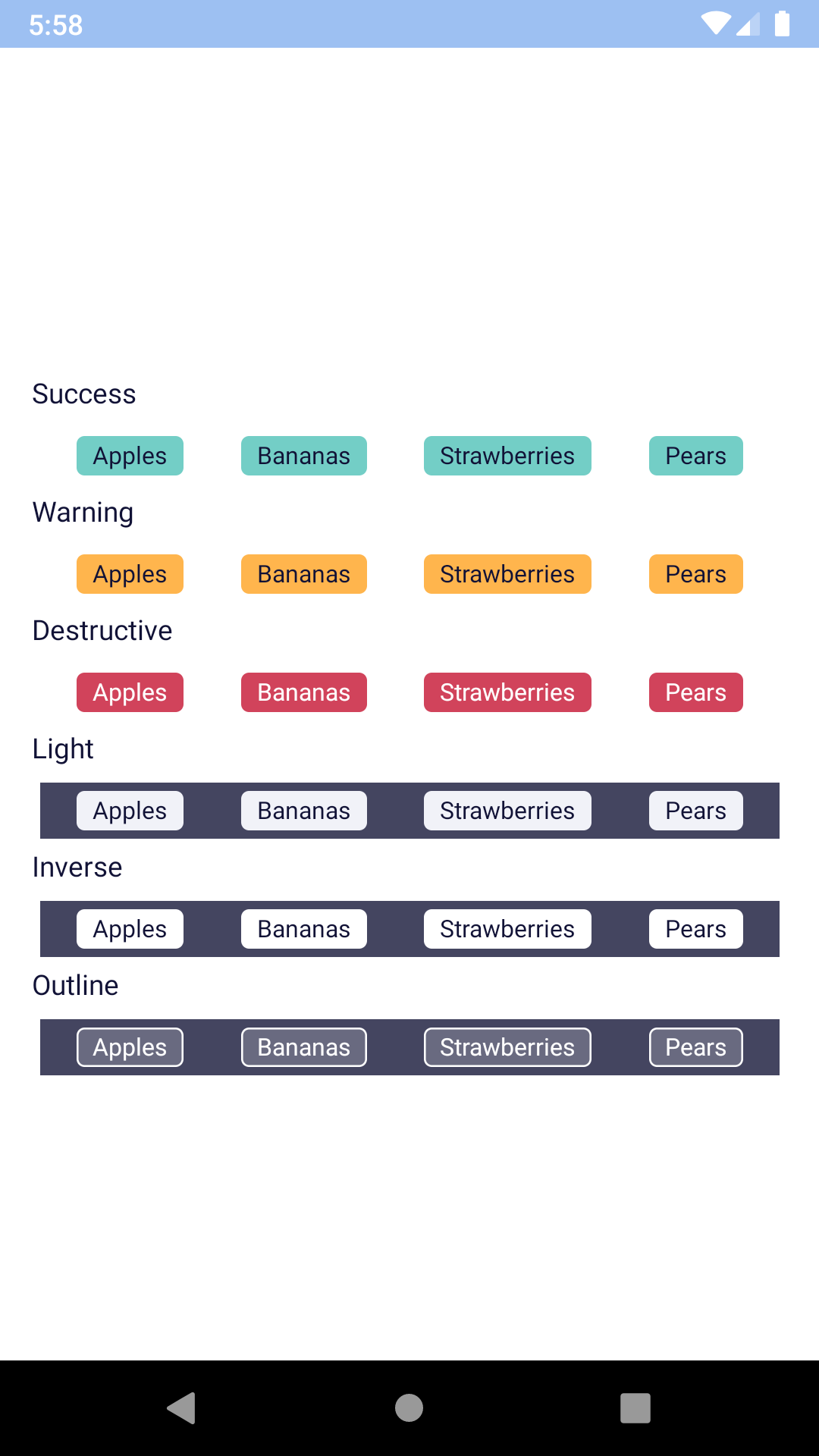
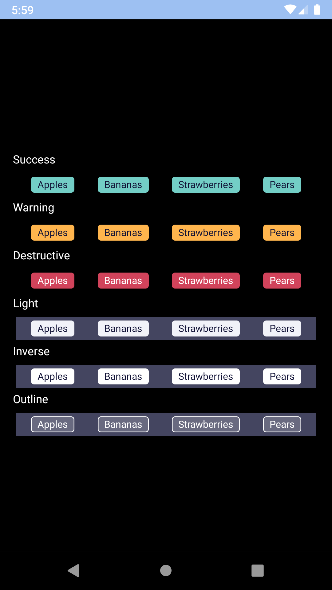
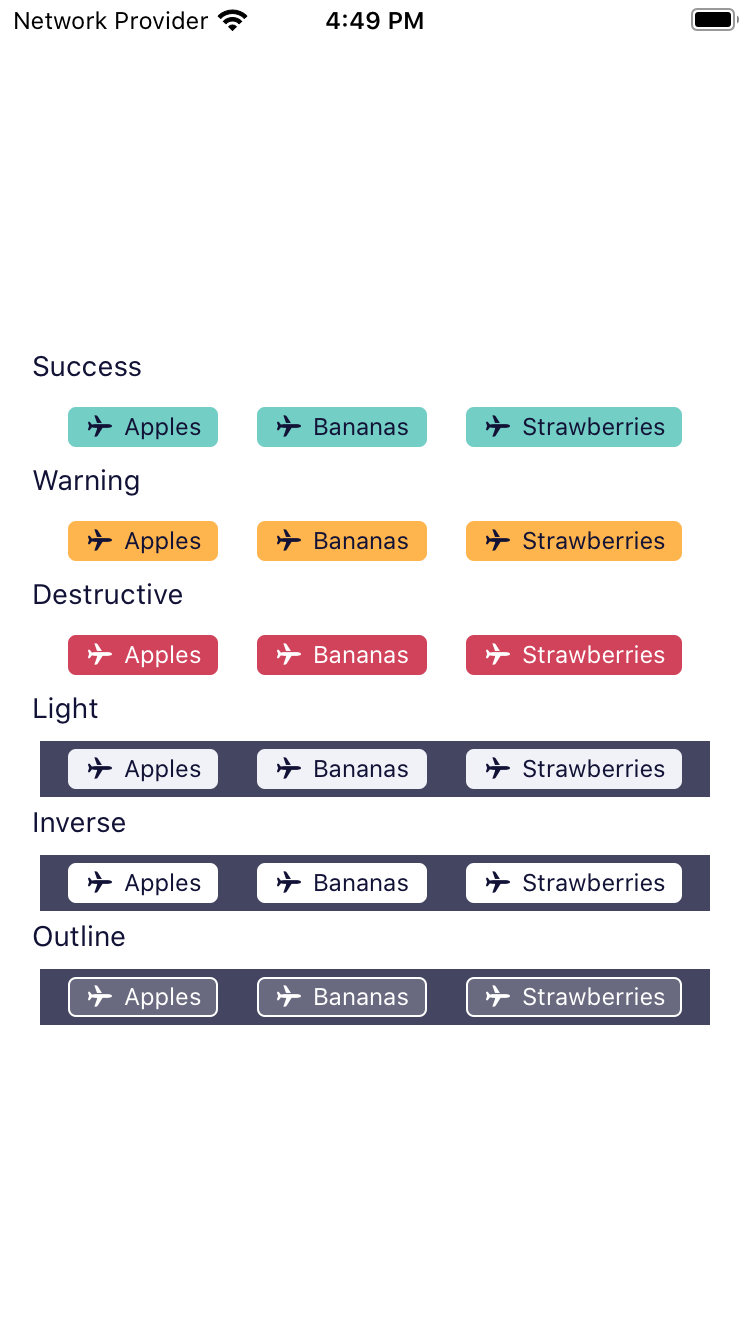
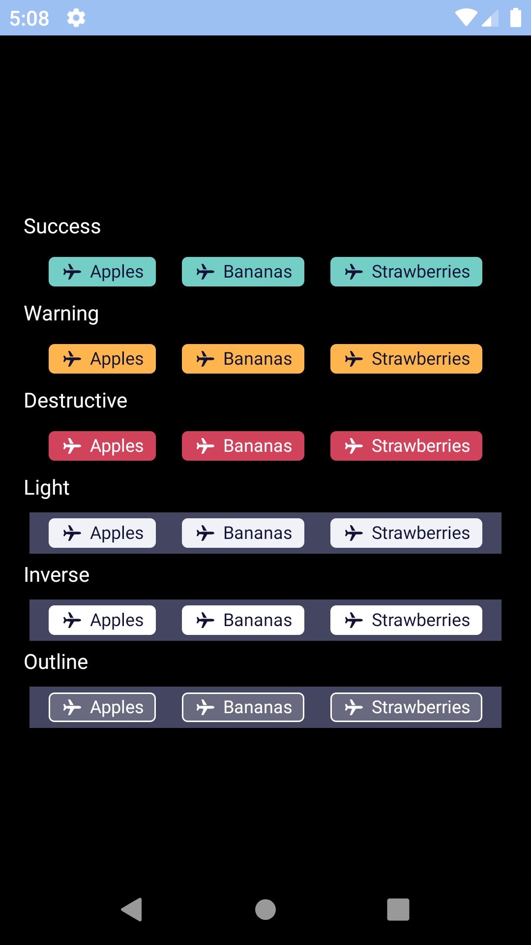
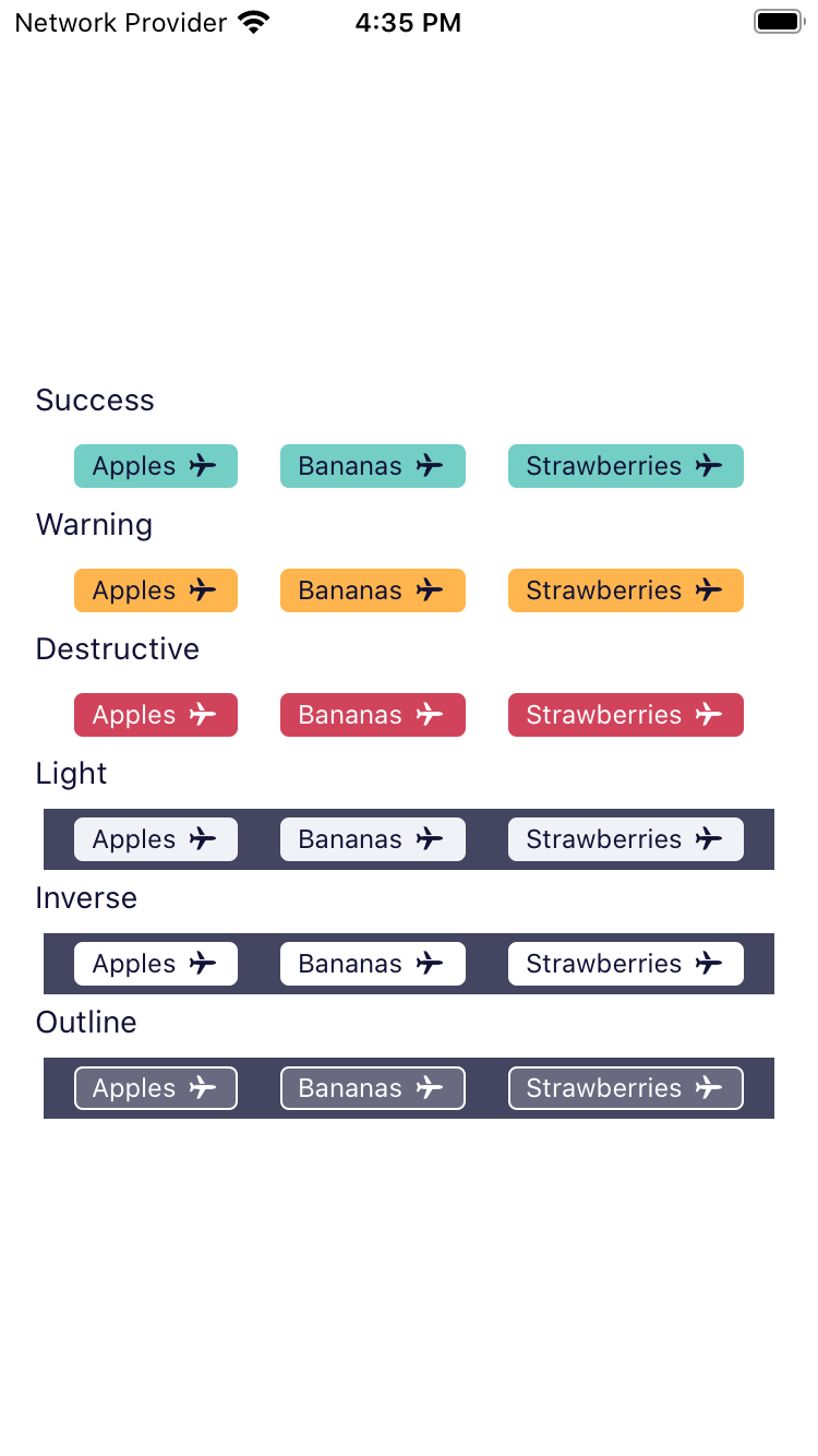
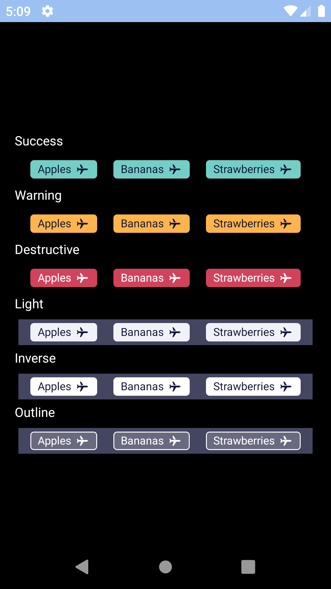
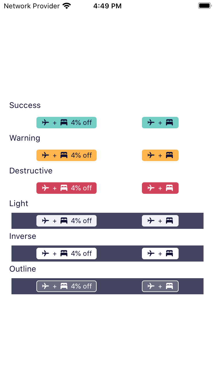
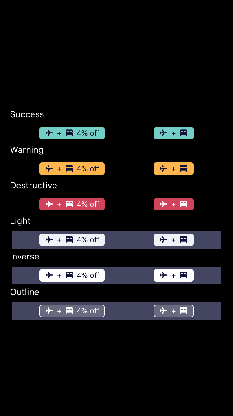
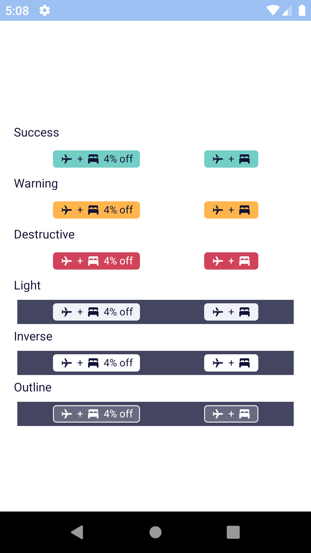
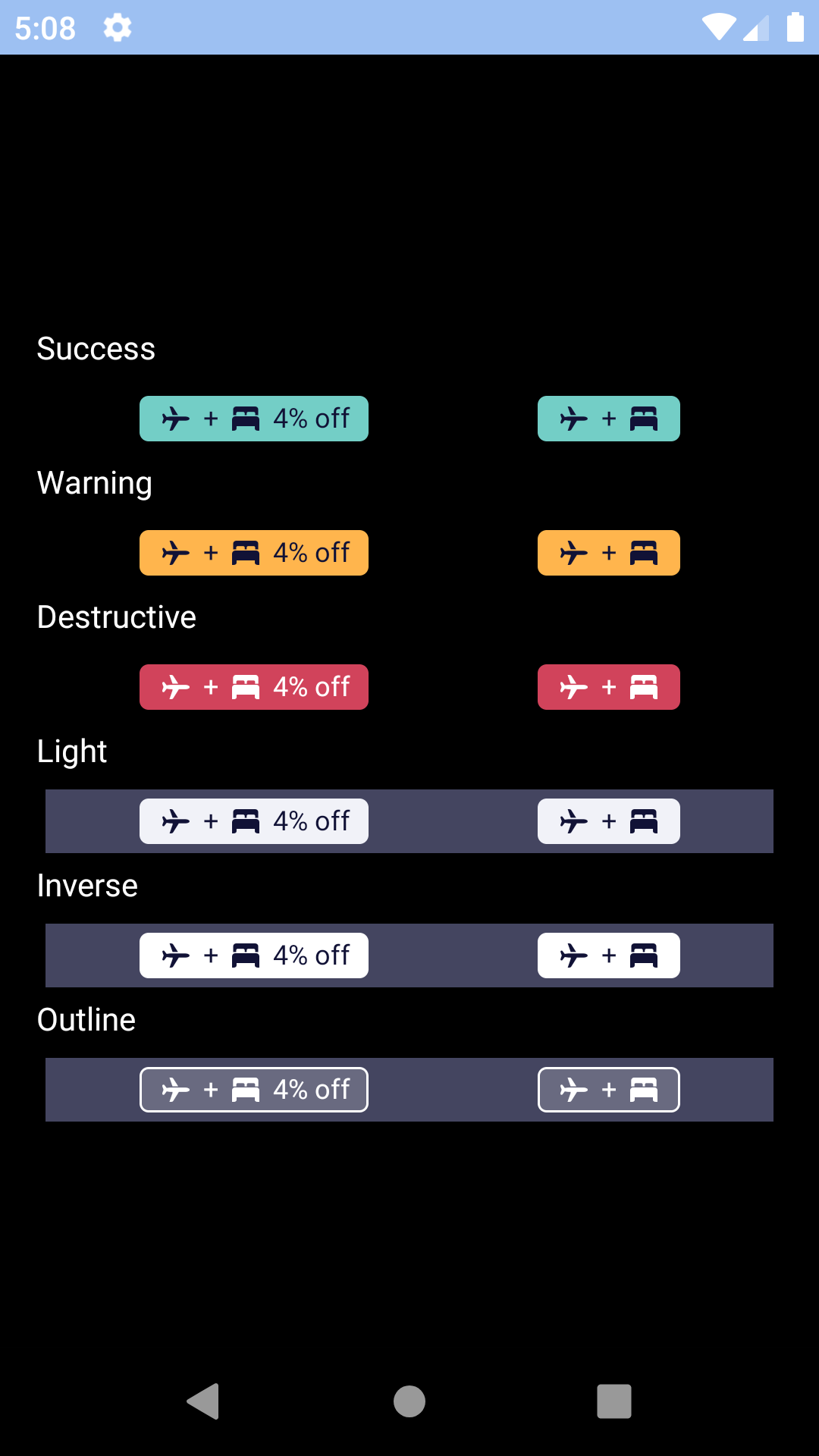
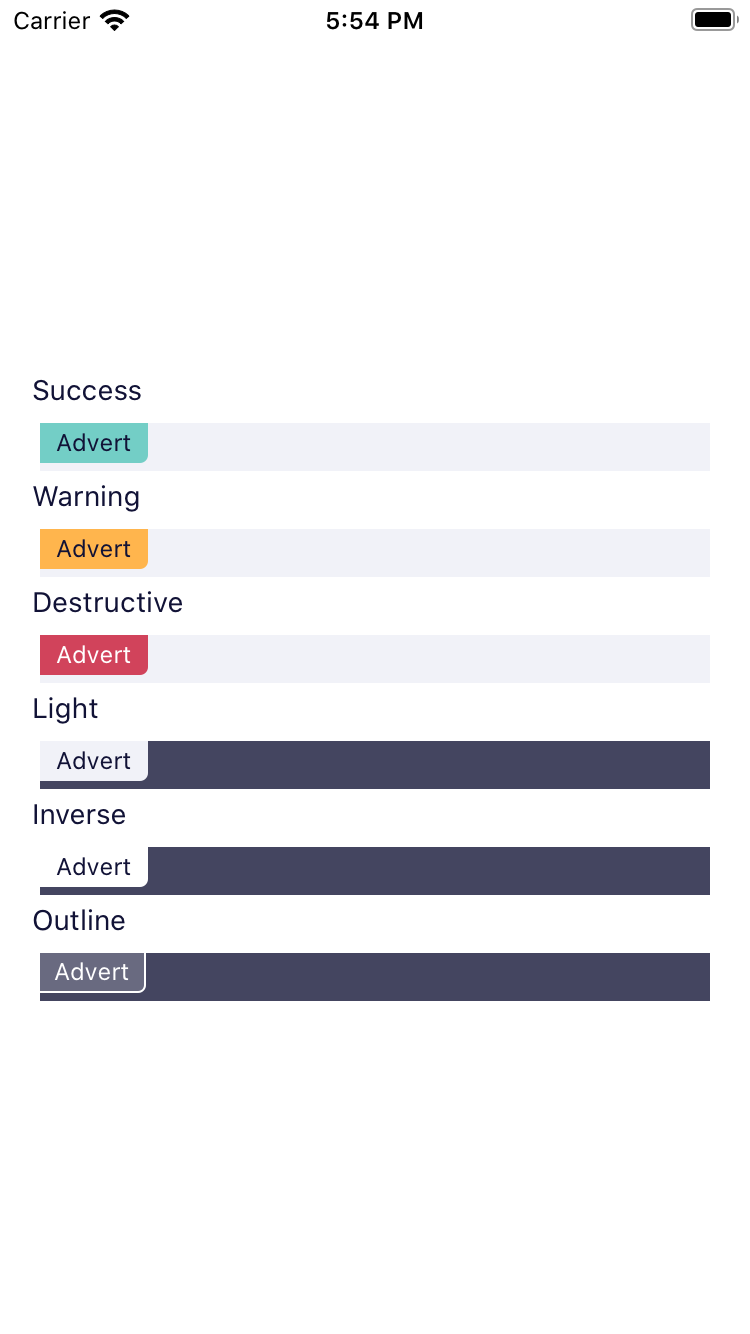
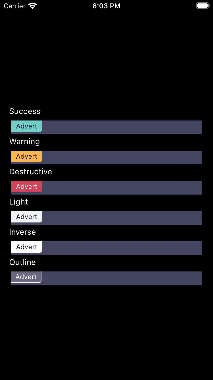
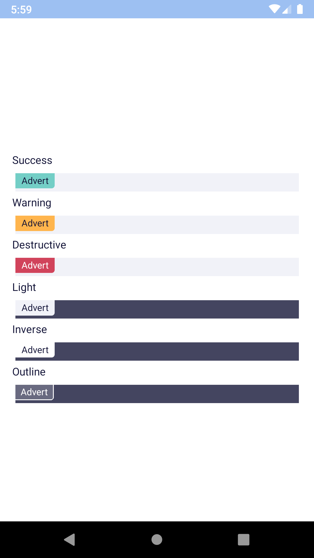
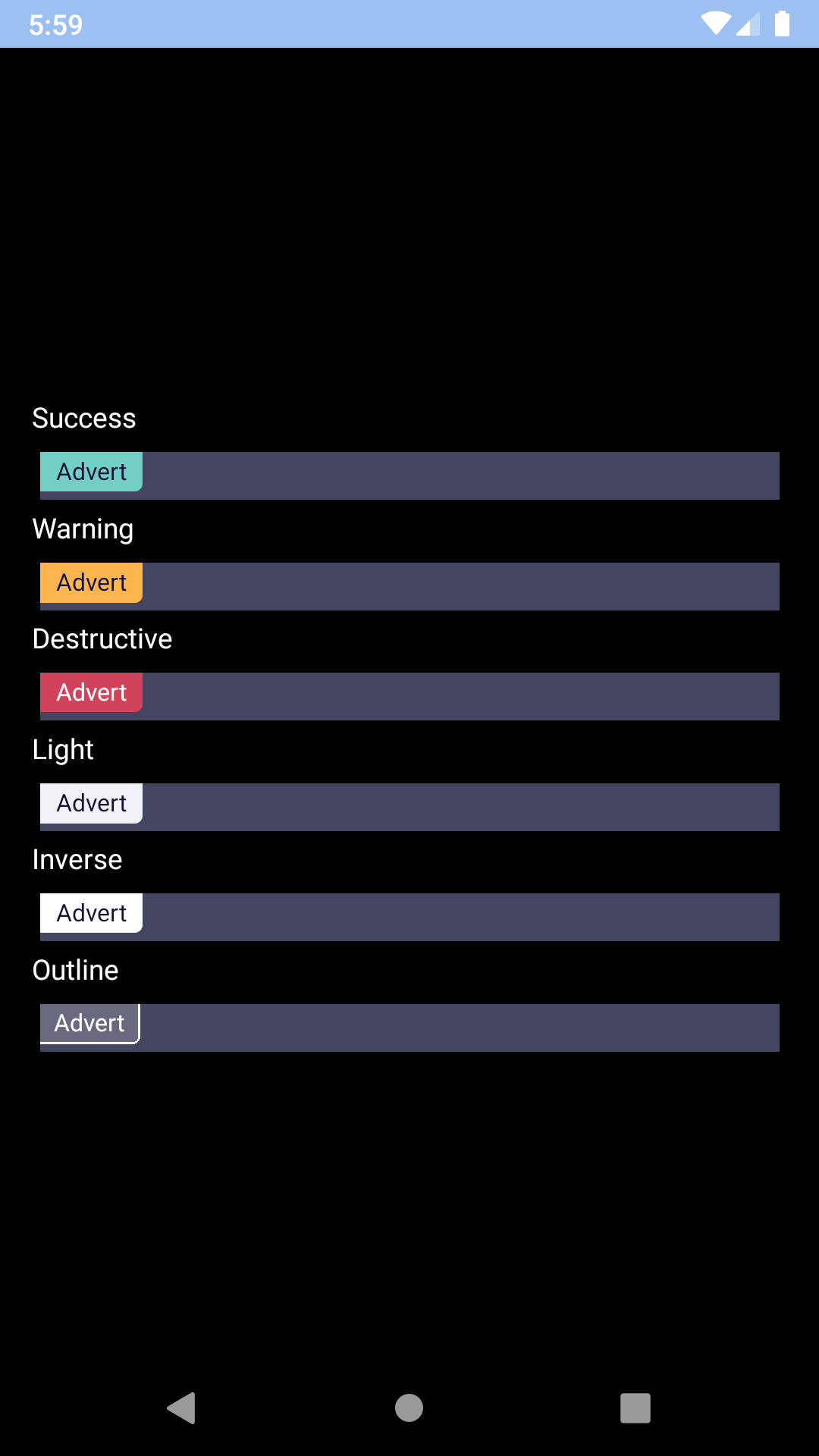
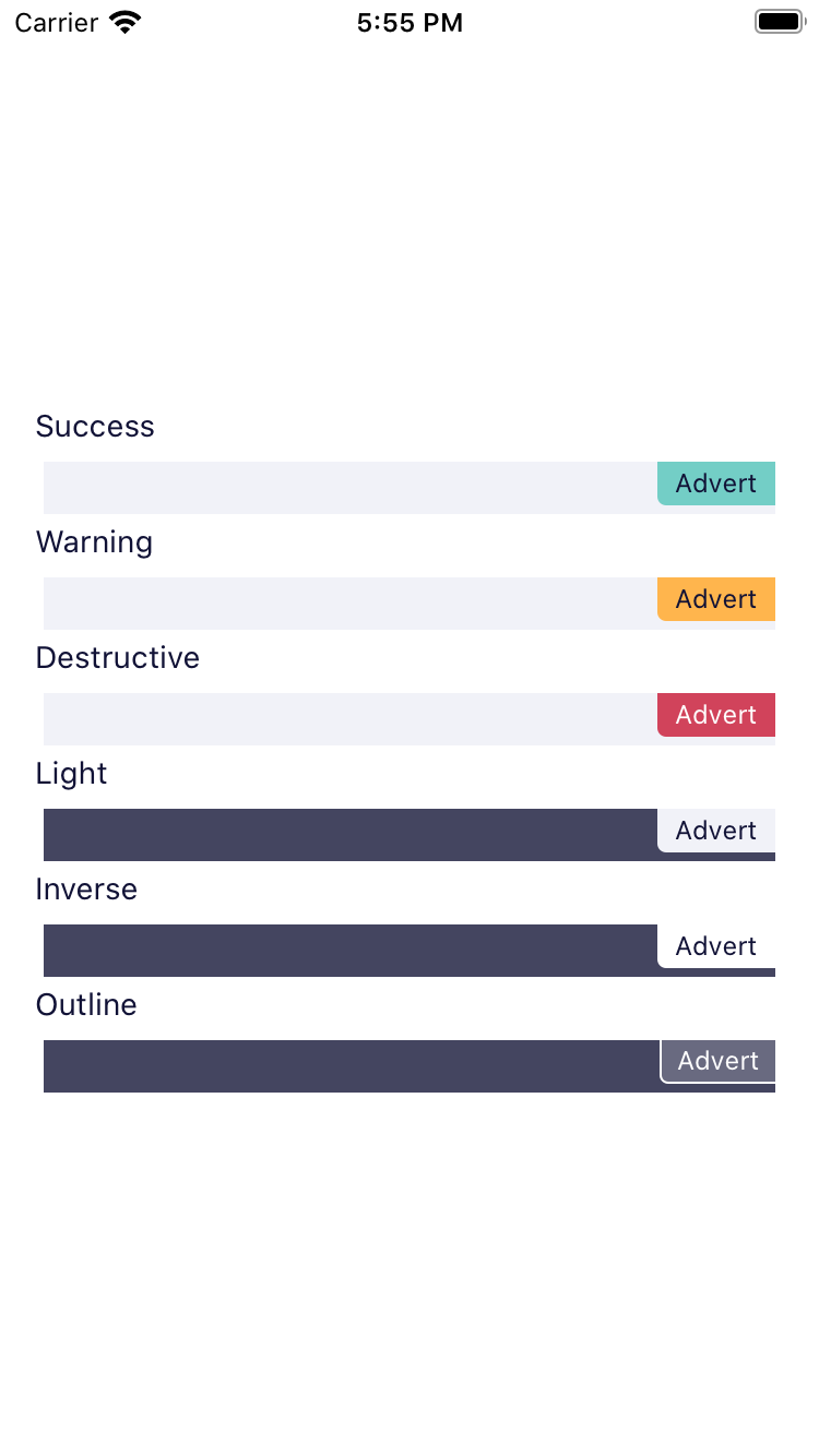
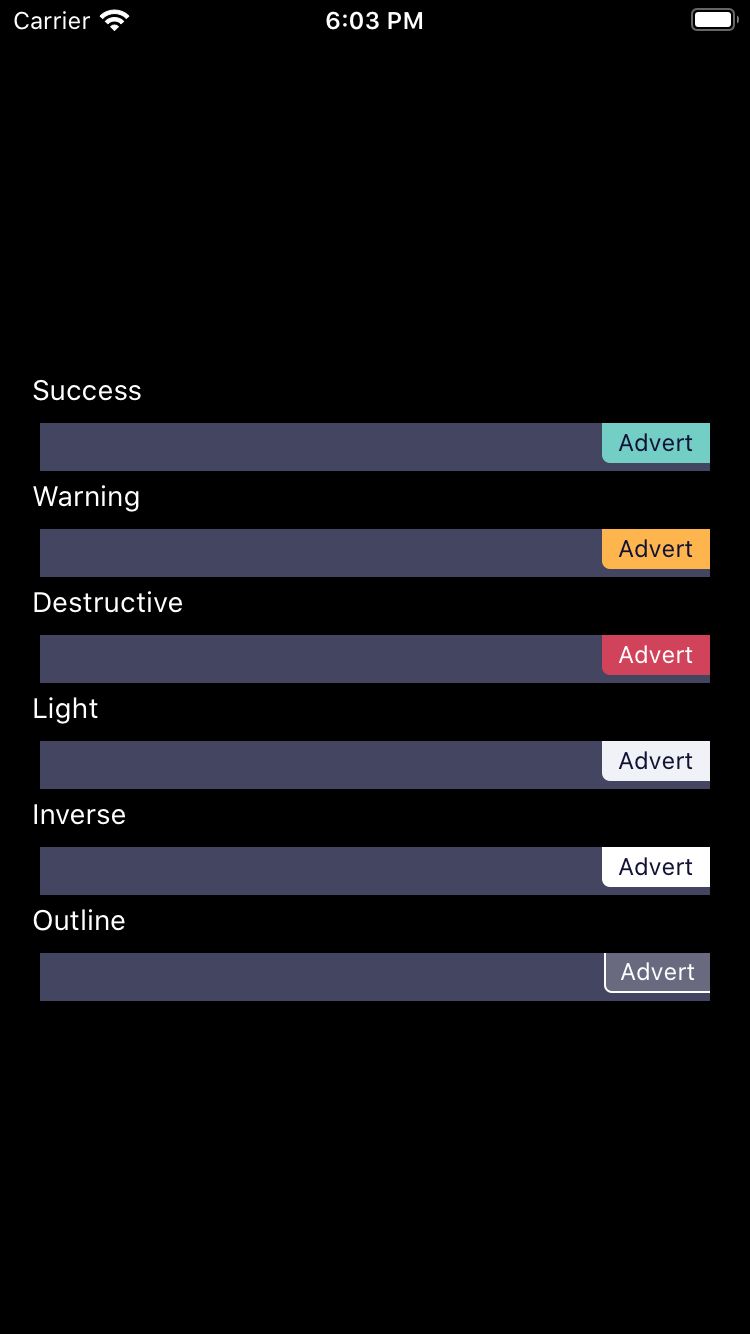
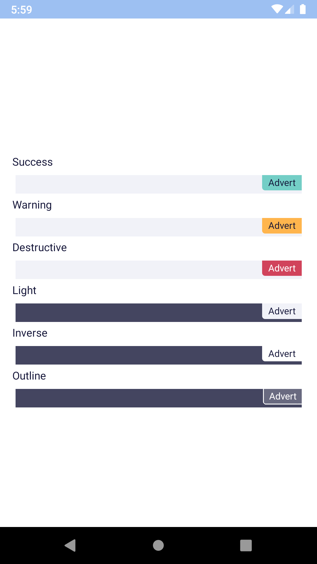
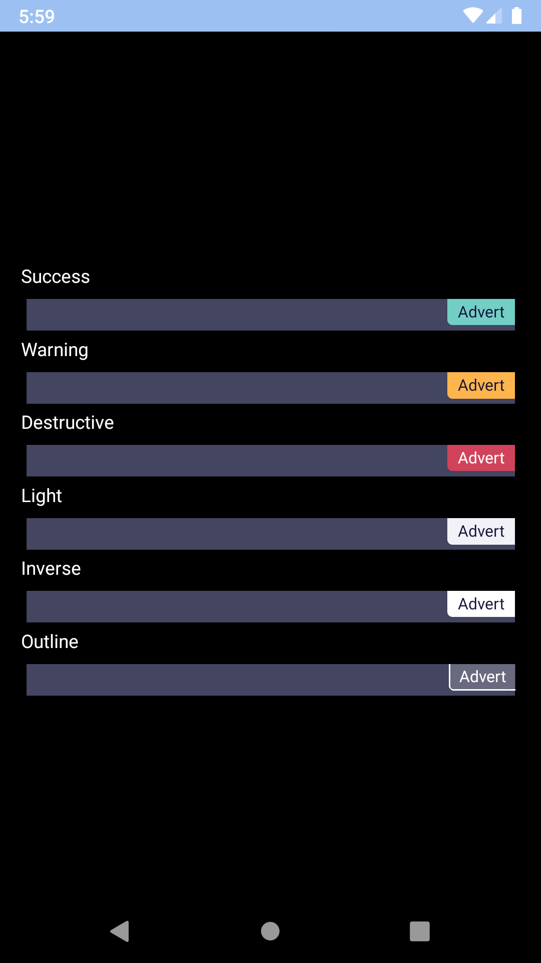
<BpkBadge message="Badge" accessibilityLabel="This is a badge" type={BADGE_TYPES.success} />
<BpkBadge message="Badge" type={BADGE_TYPES.warning} />
<BpkBadge message="Badge" type={BADGE_TYPES.destructive} />
<BpkBadge message="Badge" type={BADGE_TYPES.inverse} />
<BpkBadge message="Badge" type={BADGE_TYPES.light} />
<BpkBadge message="Badge" type={BADGE_TYPES.outline} />
<BpkBadge
message="Badge"
type={BADGE_TYPES.success}
accessoryView={
<BpkBadgeIcons
icons={[<BpkIcon icon={icons.flight} />, <BpkIcon icon={icons.hotels} />]}
separator="+"
/>
}
accessoryViewAlignment={BADGE_ACCESSORY_VIEW_ALIGNMENTS.leading}
/>
<BpkBadge message="Badge" docked={BADGE_DOCKED_TYPES.start} type={BADGE_TYPES.warning} />
<BpkBadge message="Badge" docked={BADGE_DOCKED_TYPES.end} type={BADGE_TYPES.destructive} />
</View >
);
}
}
| Property |
PropType |
Required |
Default Value |
| accessibilityLabel |
string |
if message === null |
props.message |
| accessoryView |
element |
false |
null |
| accessoryViewAlignment |
oneOf('leading', 'trailing') |
false |
'leading' |
| docked |
oneOf('start', 'end') |
false |
null |
| message |
string |
false |
null |
| type |
oneOf('success', 'warning', 'destructive', 'light', 'inverse', 'outline') |
false |
warning |
The accessory view allows for icons to be placed in front of the text inside the Badge component in conjunction with BpkBadgeIcons.
Renders icons suitable to be placed inside a Badge.
badgeSuccessBackgroundColorbadgeWarningBackgroundColorbadgeDestructiveBackgroundColorbadgeSuccessTextColorbadgeWarningTextColorbadgeDestructiveTextColor
| Property |
PropType |
Required |
Default Value |
| icons |
arrayOf(BpkIcon) |
true |
- |
| itemStyle |
style |
false |
null |
| separator |
string |
false |
null |