| layout |
|---|
simple |
Accessible Perceptual Contrast Algorithm is a new method for calculating and predicting readability contrast. APCA is a part of the larger S-Luv Accessible Color Appearance Model known as SACAM (formerly SAPC). These models are specifically optimized for accessible color appearance on self-illuminated RGB computer displays & devices, and also for modeling accessible user needs, with a focus on visual readability.
APCA is the candidate contrast method for the future WCAG 3, and is also developing as the APCA Readability Criterion, an independent standard hosted by Inclusive Reading Technologies.
The APCA generates a lightness/darkness contrast value based on a minimum font size and color pair, and this value is perceptually based: that is, regardless of how light or dark the colors are, a contrast value of Lc 60 represents the same perceived readability contrast. This is absolutely not the case with WCAG 2.x, which overstates contrast for dark colors to the point that 4.5:1 can be functionally unreadable when one of the colors in a pair is near black. As a result, WCAG 2.x contrast cannot be used for guidance designing "dark mode".
The APCA contrast value is perceptually uniform, and pivots near the point where the CS curve flattens due to contrast constancy. Halving or doubling the APCA value relates to halving or doubling the perceived contrast. There is a subtle weighting for higher contrasts to smaller, thinner fonts, and a small boost for very dark colors.
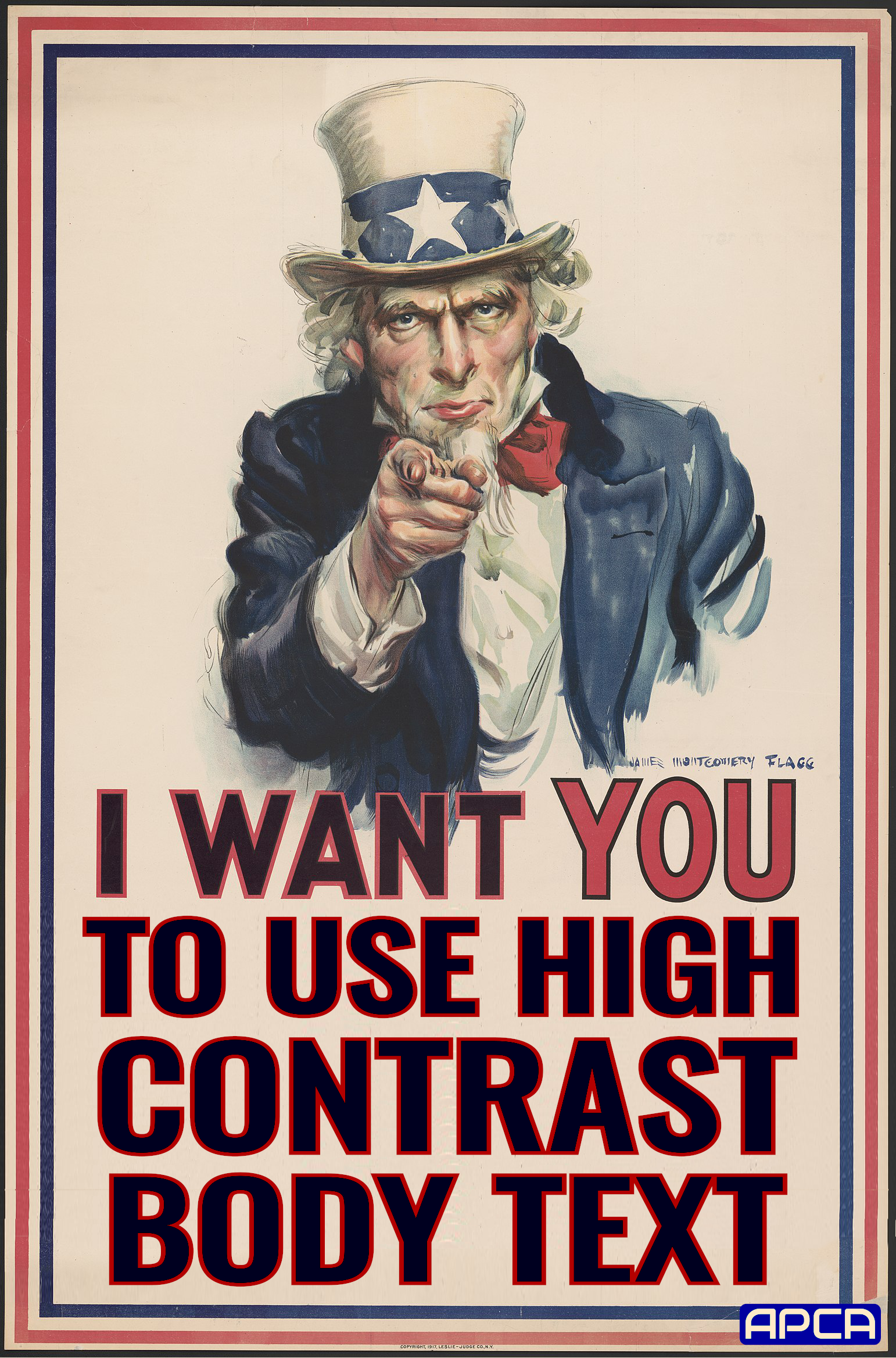
The APCA-RC Bronze Simple Mode has a set of threshold levels related to use cases — for instance, Lc 90 is preferred and Lc 75 is the minimum for body text. This makes for an easy way to use ACPA, very similar to the old WCAG 1.4.3 in terms of ease of use.
The APCA also has optional advanced levels Silver and Gold which add in lookup tables, to associate font weight/size to the lightness contrast (Lc value). The lookup tables allow for even greater accuracy and therefore greater flexibility in design.
A key takeaway is that a strict pass/fail with a blanket contrast ratio is not instructive as a guideline, and does not necessarily solve a given user need. In fact, user needs when it comes to contrast are conflicting—what is good for one can be harmful to another. This is even true of font size.
This points to the importance of real user personalization, an area where the technology is literally missing (and a work in progress). For the guidelines though, we can set ranges for targets and expectations toward making the web readable for all, with the recommendation that the user is able to choose at least one light mode or one dark mode color scheme.
These general levels are appropriate for use by themselves, without the need to reference a lookup table. APCA reports contrast as an Lc value (lightness contrast) from Lc 0 to Lc 105+. For accessibility, consider Lc 15 the point of invisibility for many users, and Lc 90 as preferred for body text.
- Lc 90 • Preferred level for fluent text and columns of body text with a font no smaller than 18px/weight 300 or 14px/weight 400 (normal), or non-body text with a font no smaller than 12px/400. Also a recommended minimum for extremely thin fonts with a minimum of 24px at weight 200. Lc 90 is a suggested maximum for very large and bold fonts (greater than 36px bold), and large areas of color. Small fonts do not have a maximum.
- Lc 75 • The minimum level for columns of body text with a font no smaller than 24px/300 weight, 18px/400, 16px/500 and 14px/700. This level may be used with non-body text with a font no smaller than 15px/400. Also, Lc 75 should be considered a minimum for larger for any larger text where readability is important.
- Lc 60 • The minimum level recommended for content text that is not body, column, or block text. In other words, text you want people to read. The minimums: no smaller than 48px/200, 36px/300, 24px normal weight (400), 21px/500, 18px/600, 16px/700 (bold). These values based on the reference font Helvetica. To use these sizes as body text, add Lc 15.
- Lc 45 • The minimum for larger, heavier text (36px normal weight or 24px bold) such as headlines, and large text that should be fluently readable but is not body text. This is also the minimum for pictograms with fine details, or smaller outline icons.
- Lc 30 • The absolute minimum for any text not listed above, including text considered as "spot readable". This includes placeholder text and disabled element text, and some non-content like a copyright bug. This is also the minimum for large/solid semantic & understandable non-text elements such as "mostly solid" icons or pictograms. Generally no less than 5.5px solid in its smallest dimension.
- Lc 15 • The absolute minimum for any non-semantic non-text that needs to be discernible, and is no less than 5px (solid) in its smallest dimension. This may include dividers, and in some cases large buttons or thick focus-visible outlines, but does not include fine details which have a higher minimum. Designers should treat anything below this level as invisible, as it will not be visible for many users. This minimum level should be avoided for any items important to the use, understanding, or interaction of the site.
These define the basic minimum levels, what you might think of as AA in the old WCAG 2. For the equivelent to AAA, simply increase the contrast values by Lc 15.
NOTES ON FONT SIZE
- Font sizes listed above assume an x-height ratio of 0.52.
- Font weight is based on highly standardized reference fonts such as Helvetica or Arial.
- "px" means the CSS reference px, not device pixels.
- One reference px is defined as 1.278 arc minutes of visual angle.
- When selecting, or testing, a font size, all that needs to be done is to compare the x-height to the reference.
- For instance Times New Roman has an x-height ratio of 0.45, so it needs to be increased about 16% in size.
- For font weight, simply set a line of test text in the reference Arial or Helvetica at 400 weight and then below that the same text text in the new font. Try different weights to find the closest match.
- As an example, the font Raleway 400 weight is closest to Helvetica 300.
- So, increase the weight of Raleway by 100 to be equivalent.
- Note that some fonts change weight differently, and should be compared at other weights, such as 700, if those weights are to be used.
- See this how-to guide for more on font matching.
- Consider the font design as well as the basic size and weight, and the potential impact on readability. See this PDF "Evaluating Fonts" for general guidance and a comparison of a few dozen fonts for accessibility.
Instead of arbitrary pass/fail binary scoring, the APCA Readability Criterion has a sliding scale across the visual range, and is divided among use cases, as different uses have different contrast needs.
The overall approach improves design flexibility and readability at the same time. Readability is improved by increasing contrast in blocks of body text where it is most needed, and design flexibility is achieved by relaxing contrast for large non-text elements which do not need brute-force contrast levels, due to their larger size (i.e. lower spatial frequencies use lower contrasts).
For demonstration purposes, the example tool provides real-time updates of minimum font size and weight vs contrast: https://apcacontrast.com click on the color patches to bring up a color-picker.
See this Linktree for a short-list of resources for further reading: linktr.ee/myndex
- Spatial or spatially: relating to size, weight, or thickness.
- Hue: the uniqueness of a given color vs other colors, i.e. blue vs red.
- Chroma/saturation: the intensity or purity of a color vs no color.
- Luminance: a physical measure of light, disregarding hue.
- Lightness: the human perception of a given luminance. Also darkness and brightness.
Would you like to help create a more readable world for all? Please let us know! We have several studies planned for 2023, and it requires minimal time on your part to participate. Please send an email to perceptex@myndex.com with "volunteer" in the subject line.

- Linktree of Selected Resources A good place to start.
- Main Catalog of APCA Resources and Links For the much deeper divers.
Maintained by Inclusive Reading Technologies Inc., a California Non-Profit.
- Draft ARC Guidelines for implementing APCA and related technologies.
- Bronze Simple Mode is designed as an introductory mode that does not require look-up tables or matching to a reference font. Instead it's designed as a simple set of threshold levels, similar to how WCAG 2 works but using perceptually uniform math.
- APCA Calculator, the official technology demonstrator for APCA, includes explainers.
- Listing of Third Party Tools and Systems that have adopted APCA.
- An Accurate Colorblind Simulator based on the well respected, peer-reviewed, Brettel et alia model.
- Readability Forum questions and comments welcome.
- DISCUSS: Using APCA with other fonts Draft method for font weight conformance.
- DISCUSS: Inline text links theory and practice Draft guidance regarding link identification.
- DISCUSS: Draft Dark Mode Guidance Draft guidance regarding darkmode from light mode, and more.
- DISCUSS: Legal Issues of WCAG2 vs APCA Discussion of current and future legal status and incorporation into legislation.
A listing of third party and peer reviews of APCA and related technologies. This directory includes journal-published peer-reviews, trade-published evaluations, and less formal comparative analysis, covering the usage, math, efficacy, implementation/integration, workflows, and more.
-
The Realities And Myths Of Contrast And Color Published by Smashing Magazine. A brief but comprehensive primer to vision, color, and contrast for design, with an emphasis on typography, readability, and visual accessibility needs.
-
Better Reading on the Web Published by UX Collective, this article discusses and demonstrates issues with automated testing and WCAG 2 contrast math, methods, and guidelines.
-
The Tangled Web tech blog (TangledWeb.xyz):
- Please Stop Using Grey Text This popular article debunks one of the worst myths regarding design contrast.
- What’s Red & Black & Also Not Read? examines the nature of color insensitivity and readability.
- Busy Background Breaks Bulletin Examples of how to destroy readability by choosing the wrong image as a background. And also, how to fix it.
- Hats off to ALL CAPS myth-busting misunderstandings regarding dyslexia, are special dyslexia fonts even useful, and the shift from using ALL UPPERCASE LETTERS for various text elements.
- A Contrast of Errors looks at the history and the current international readability crisis.
- Contrasting Theories Background on the first two years of R&D.