Skip to content
New issue

Have a question about this project? Sign up for a free GitHub account to open an issue and contact its maintainers and the community.

By clicking “Sign up for GitHub”, you agree to our terms of service and privacy statement. We’ll occasionally send you account related emails.

Already on GitHub? Sign in to your account

Map div does not support 100% height CSS property #1266

Closed
ibalajiarun opened this issue Jan 11, 2013 · 13 comments
Closed

Map div does not support 100% height CSS property #1266

ibalajiarun opened this issue Jan 11, 2013 · 13 comments

Comments

@ibalajiarun
Copy link

I tried to spread a map on to the full document. Unfortunately, when I set height css property as 100%, the map does not render. But, the map renders for static height pixels. I have created the following jsfiddle for reference: http://jsfiddle.net/QbP2U/5/

@mourner
Copy link
Member

mourner commented Jan 11, 2013

JSFiddle doesn't open for me for some reason, but Leaflet does support 100% height without problems — you're probably doing something wrong. See http://leafletjs.com/examples/mobile.html

@mourner mourner closed this as completed Jan 11, 2013
@ibalajiarun
Copy link
Author

I was wrong. I did not set height property to body tags. Thanks

@Omgan
Copy link

Omgan commented Oct 25, 2016

$(window).on("resize", function () { $("#map").height($(window).height()); map.invalidateSize(); }).trigger("resize");

Use this code to make it responsive height of the window

@dstrickler
Copy link

Omgan's comment above worked great for me with leaflet 1.0.2
I added a small change which was:
.height() - 220);
as this helped me adjust the alignment to the menu I was using. Also, I needed to remove any CSS I was trying to use to solve the problem.

@josejaner
Copy link

josejaner commented Jul 2, 2017

this works perfectly, but the setting worked with (- 40)
$(window).on("resize", function () { $("#map").height($(window).height()-40); map.invalidateSize(); }).trigger("resize");

@carsnwd
Copy link

carsnwd commented Jul 8, 2017

I followed what Omgan, dstrickler, and josejaner did. Also since I had my map initialized in a separate function initMap() I had to trigger resize in there as well like below....

function initMap() { map = L.map('mapid').setView([40.060620, -77.523182], 17); L.tileLayer('https://api.mapbox.com/styles/v1/mapbox/{id}/tiles/{z}/{x}/{y}?access_token={accessToken}', { maxZoom: 18, id: 'streets-v9', accessToken: 'xxxxx' }).addTo(map); tilesLoaded = true; $("#mapid").trigger("resize") }

@stripathix
Copy link

Using height in CSS like below:

#map { height: calc(100% - 44px); width: 100%; position: absolute !important; }
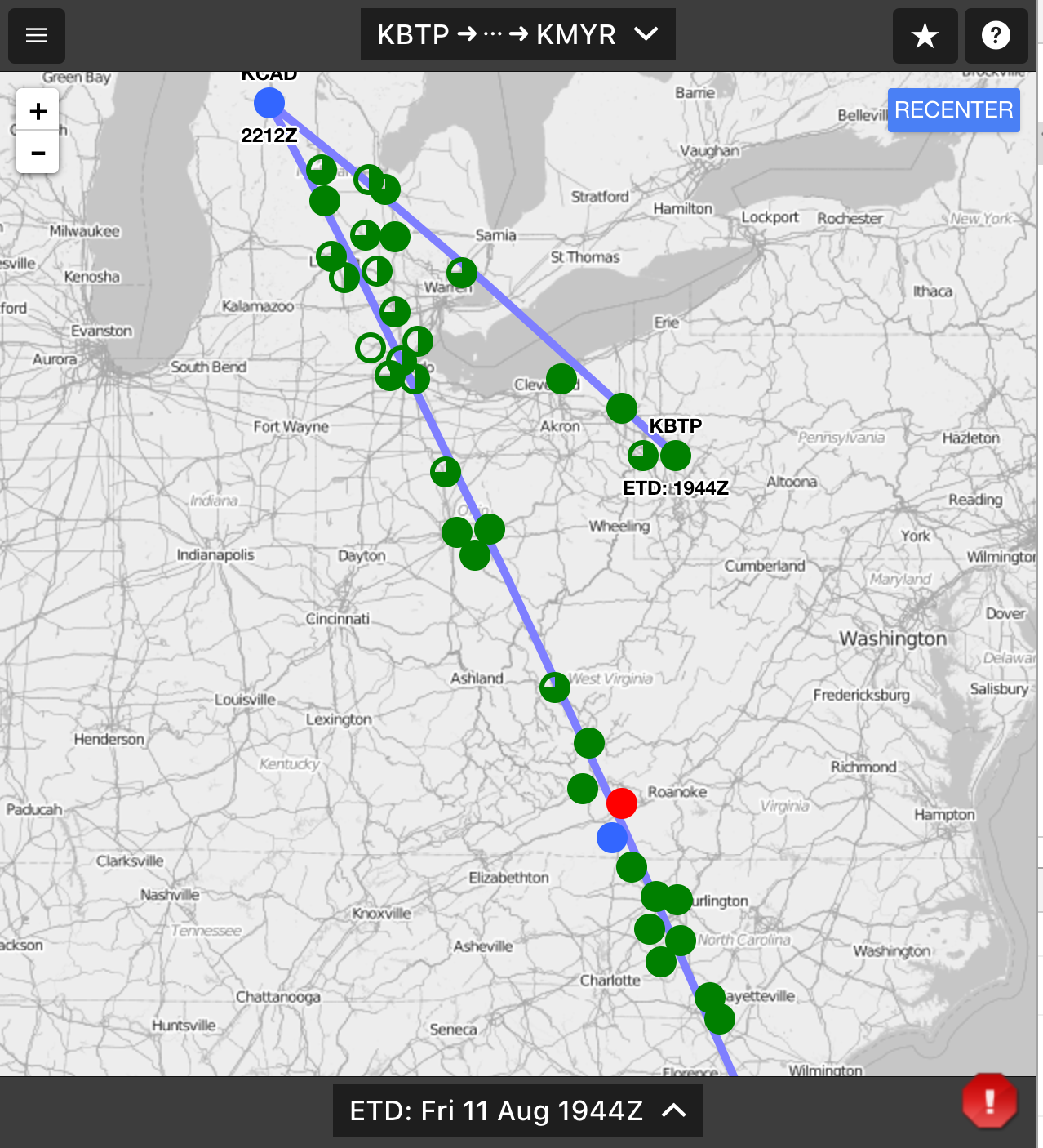
Full screen works fine but bounds no longer work correctly. All markers not visible. But if i set height like 800px the bound works fine.
screen shot 2017-08-12 at 1 15 02 am

@perliedman
Copy link
Member

@stripathix if you think this is an issue, I suggest you open a new one with a clear example illustrating the issue.

Given the information you provided, it sounds highly unlikely this is a Leaflet problem, but rather an issue with how your application uses it. For example, if your map container ever changes size after the map is initialized, make sure to call invalidateSize on your map instance.

@robert-prib-polestar
Copy link

robert-prib-polestar commented Dec 8, 2017

You use a wrapper container set to position fixed or absolute to get height 100% working.
e.g.

.map-wrapper { width: 100%; height:100%; position: fixed;}
#map { width: 100%; height:100%; position: relative;}

See https://jsfiddle.net/robertpribpolestar/xg41w12v/3/

It, of course, means you have to use fixed and absolute positing which can be annoying, but better than having to include in JS watching the browser resize.

@dhanyn10
Copy link

in my case, this css solve the problem:

#map{
    position: absolute;
    top: 0;
    left: 0;
    width: 100%;
    height: 100%;
}

and give its container position: relative
you can use vw and vh to make your container responsive too.

@luciodale
Copy link

@dhanyn10 position: absolute; did the trick!

@MuhammadSulman
Copy link

$(window).on("resize", function () { $("#map").height($(window).height()); map.invalidateSize(); }).trigger("resize");

Use this code to make it responsive height of the window

its perfectly fine working hack for it, i searched for this kind of solution for last couple of hours but at last i did found it and i am really happy. I test its responsiveness also, which is correct.

@IvanSanchez
Copy link
Member

Oh FFS just use 100vh. And read https://developer.mozilla.org/en-US/docs/Learn/CSS/Introduction_to_CSS/Values_and_units about vh and vw and what 100% exactly mean.

@Leaflet Leaflet locked and limited conversation to collaborators Feb 21, 2019
Sign up for free to subscribe to this conversation on GitHub. Already have an account? Sign in.
Labels
None yet
Projects
None yet
Development

No branches or pull requests